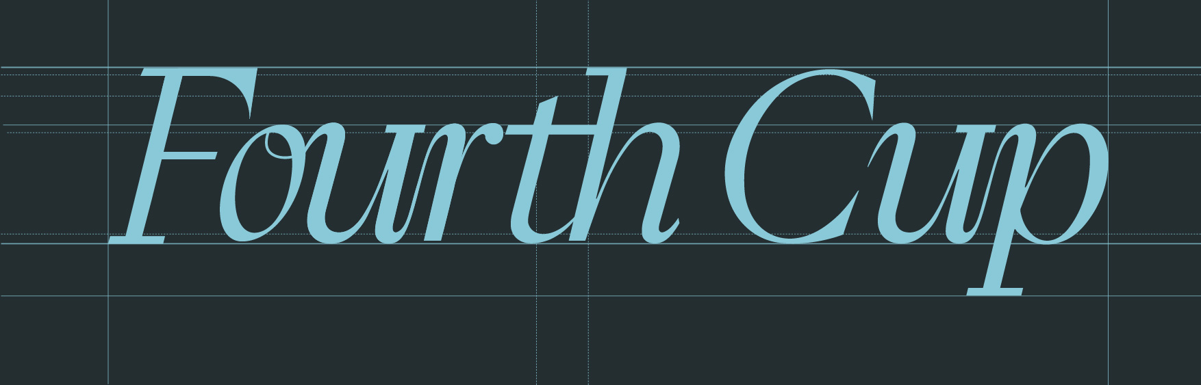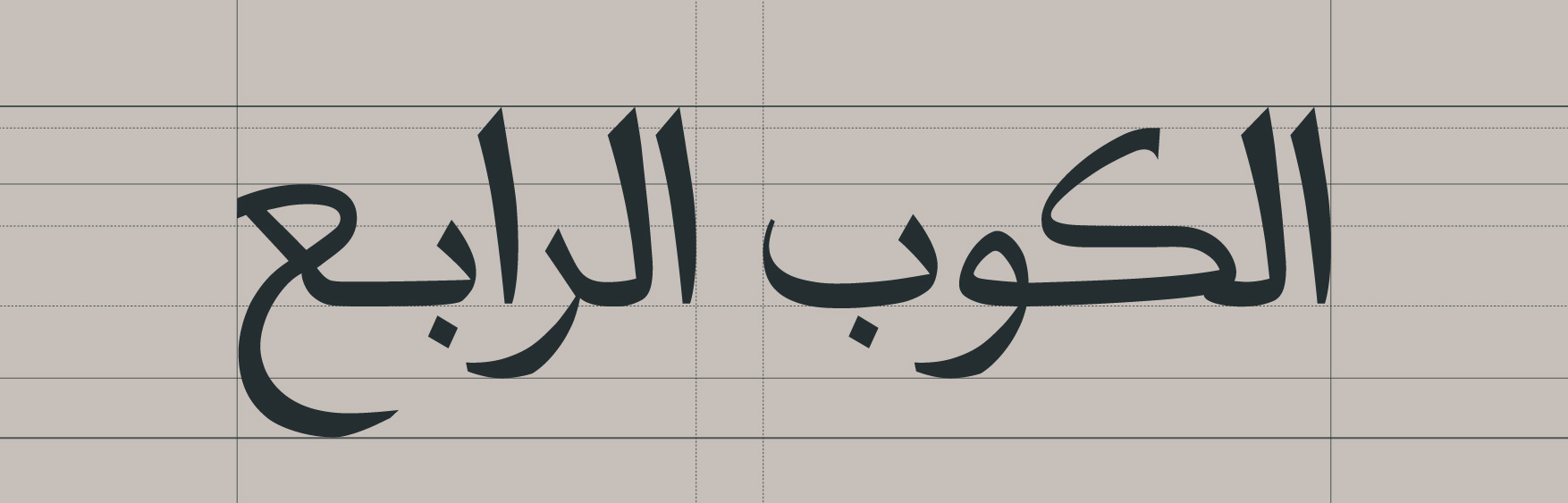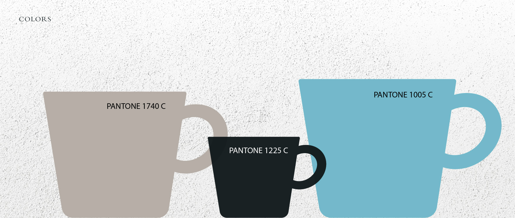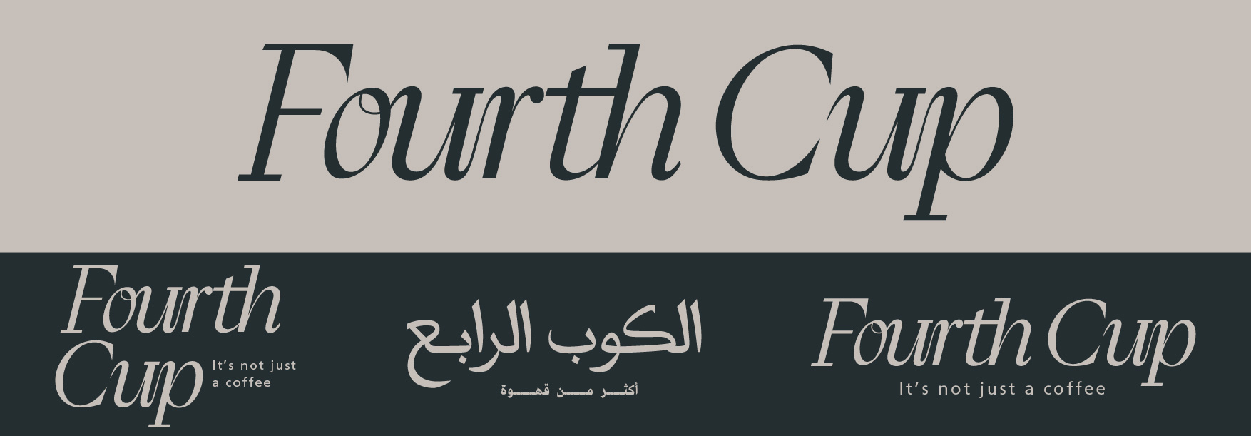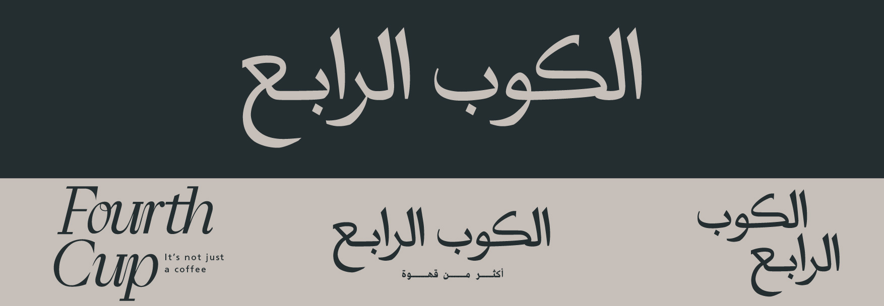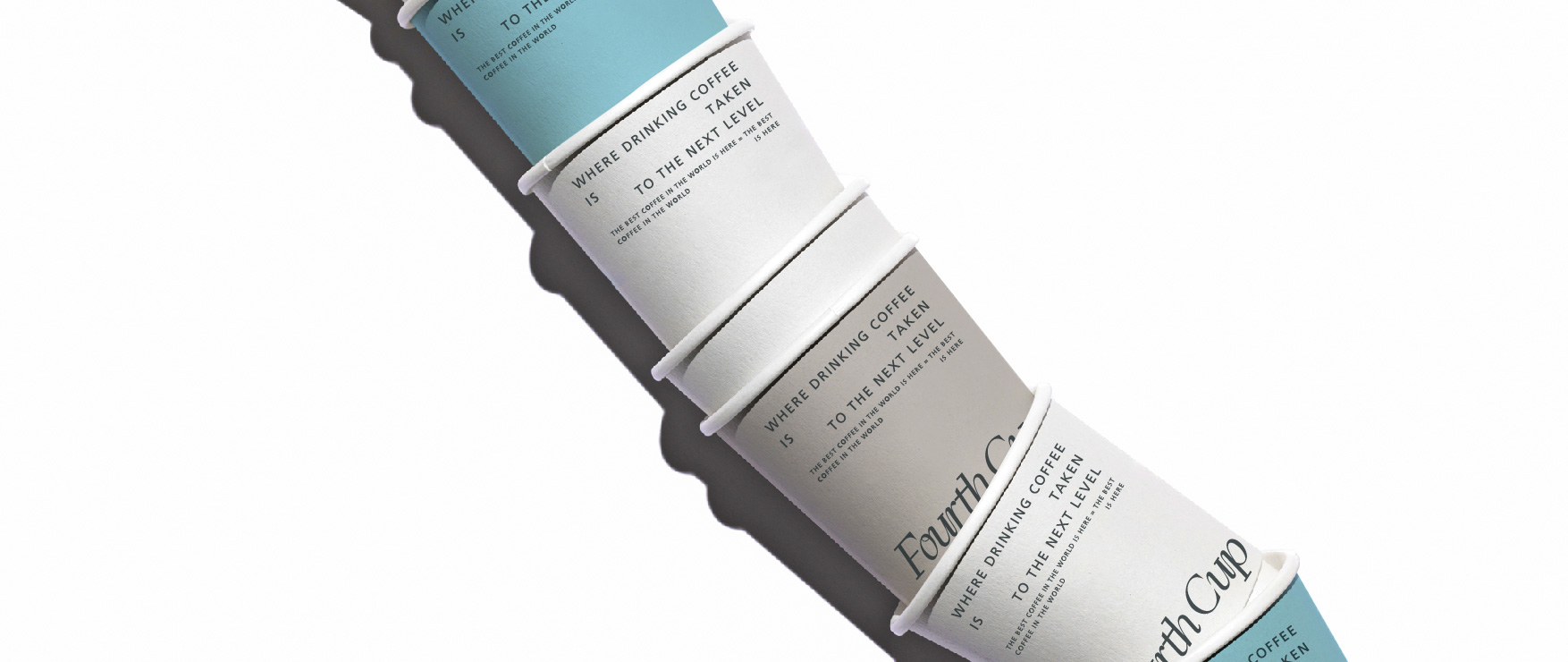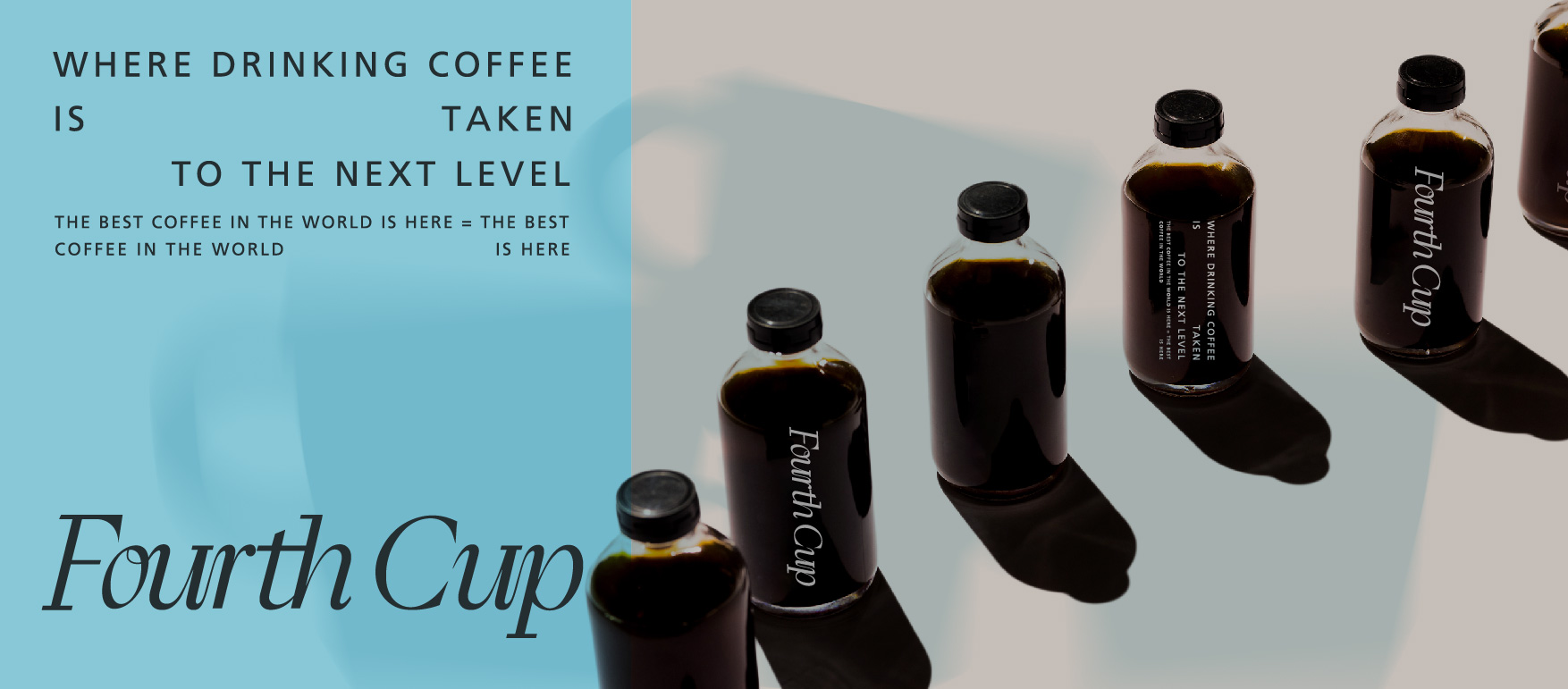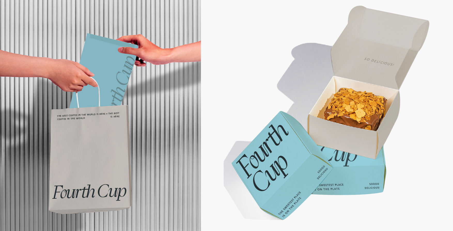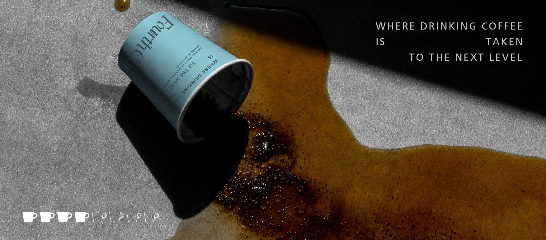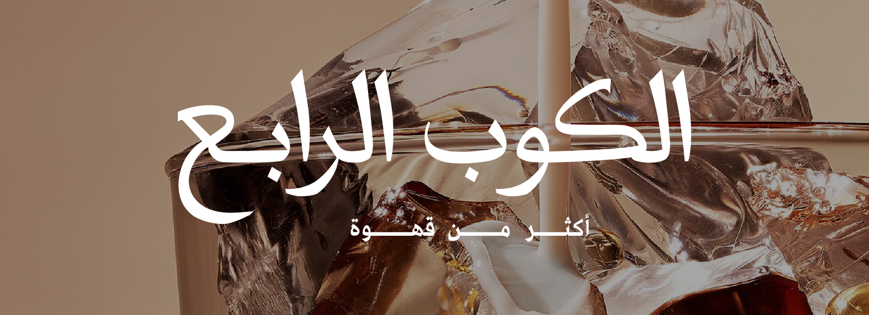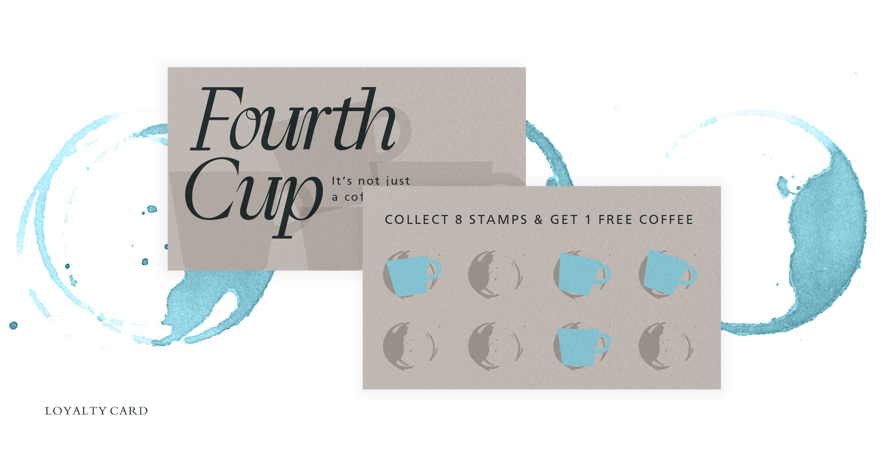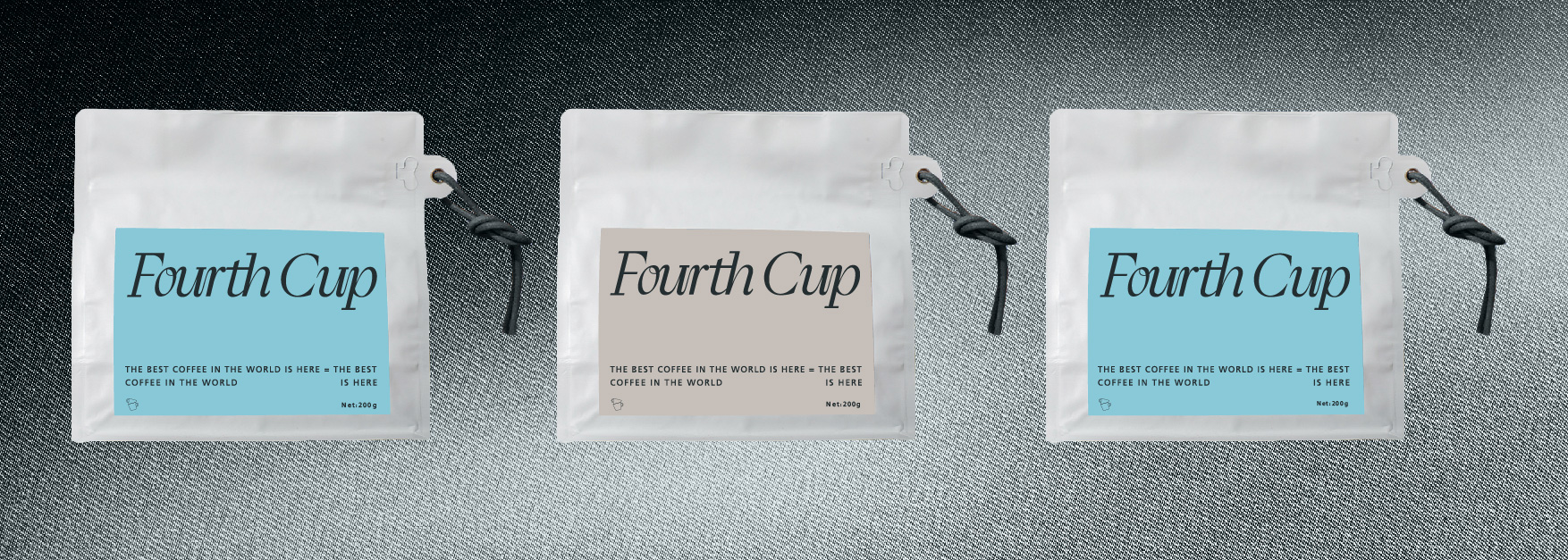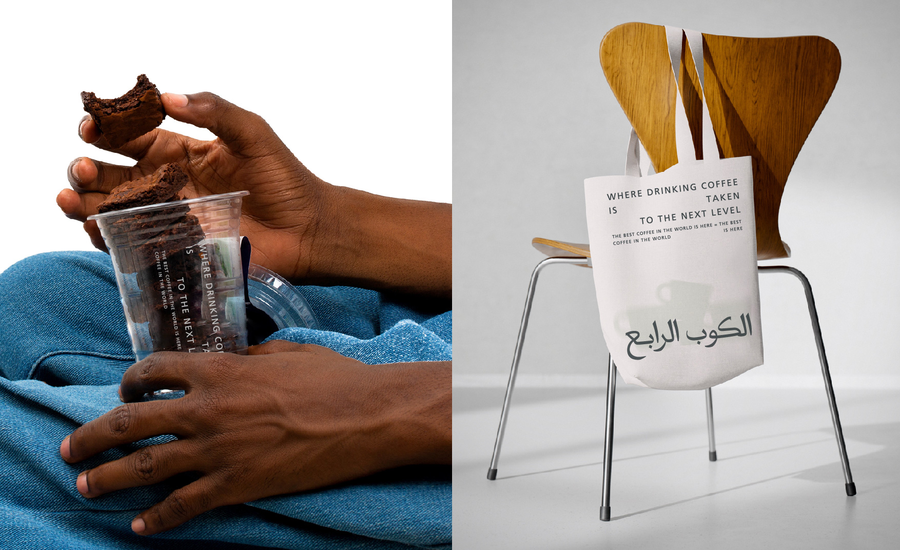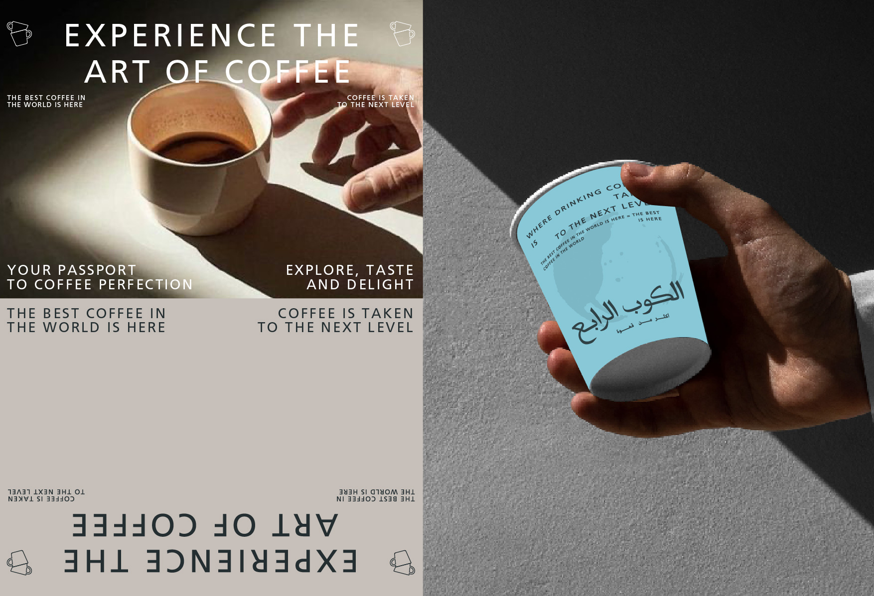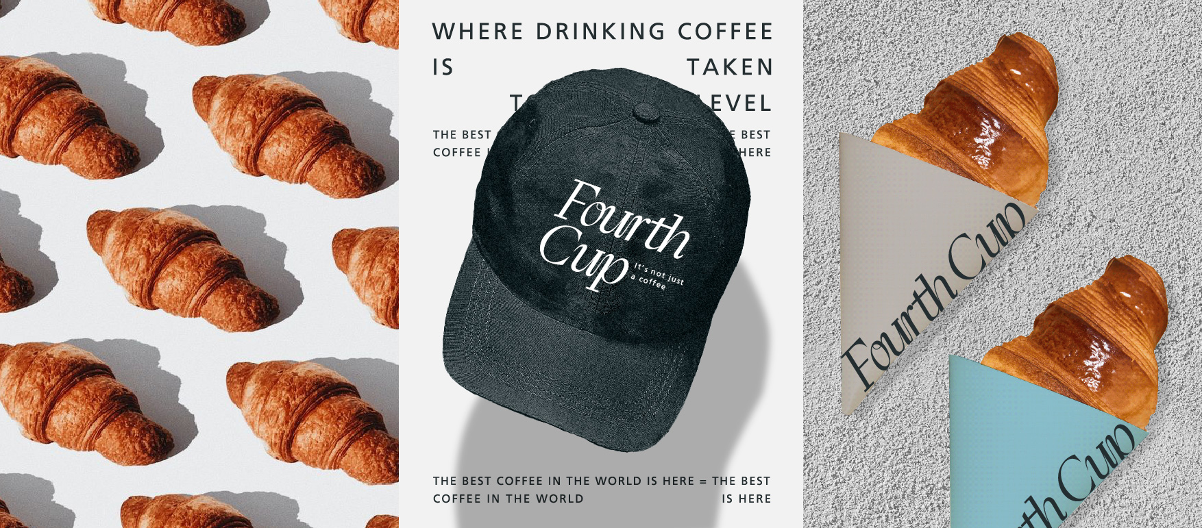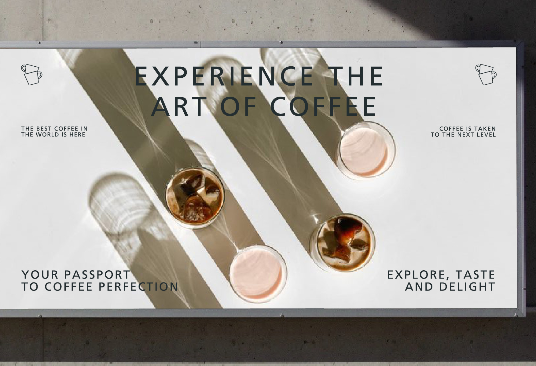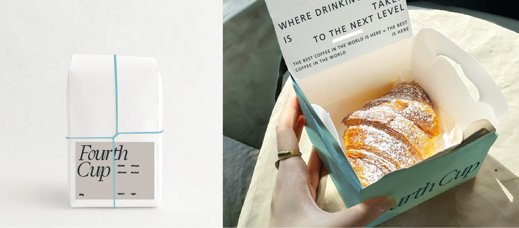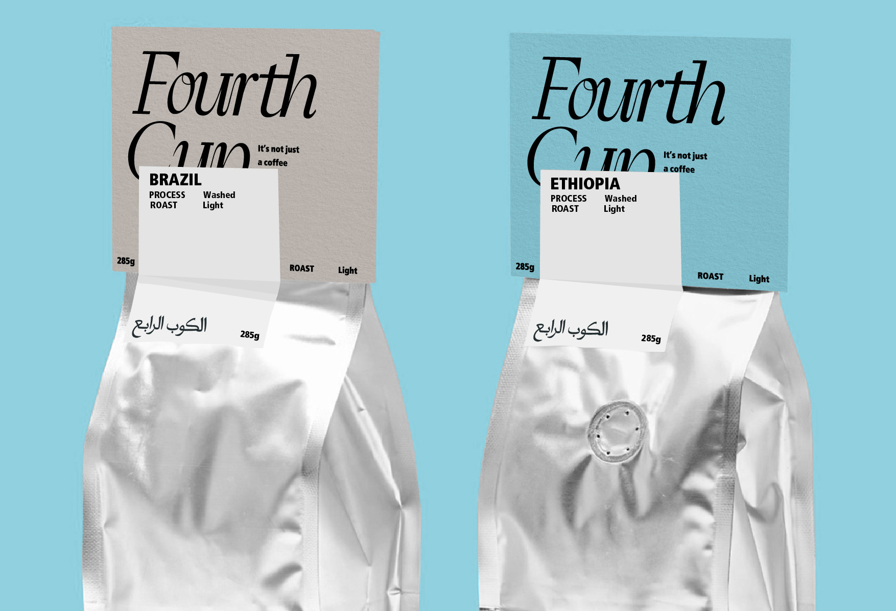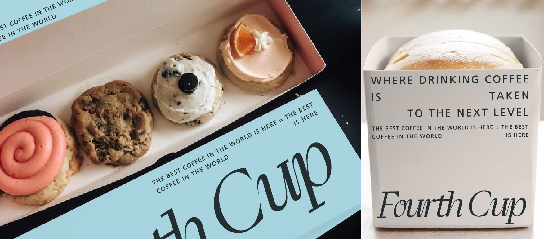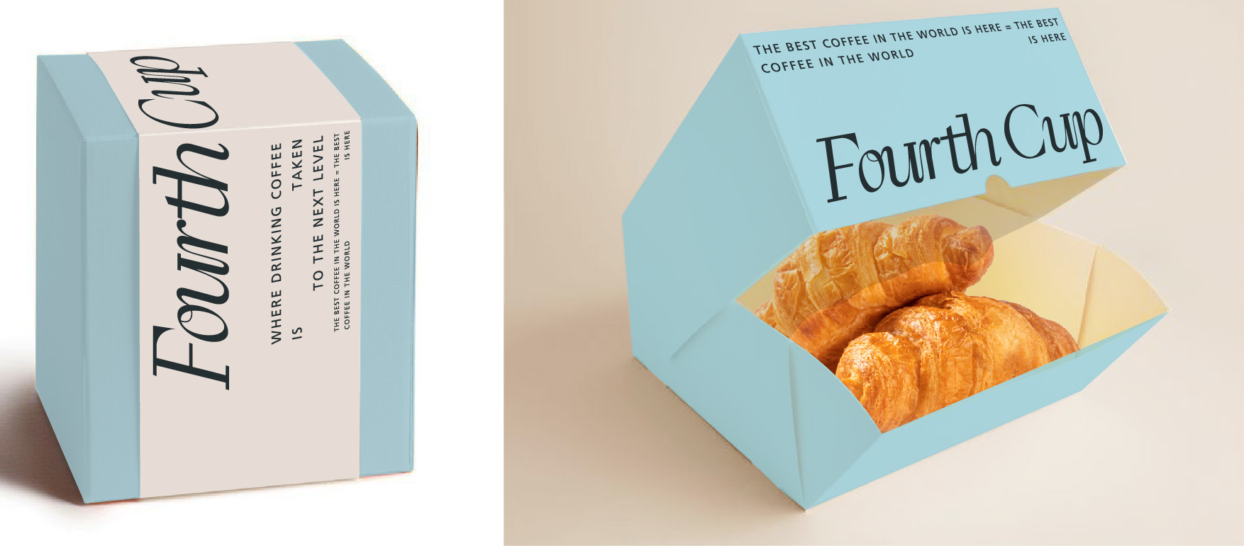
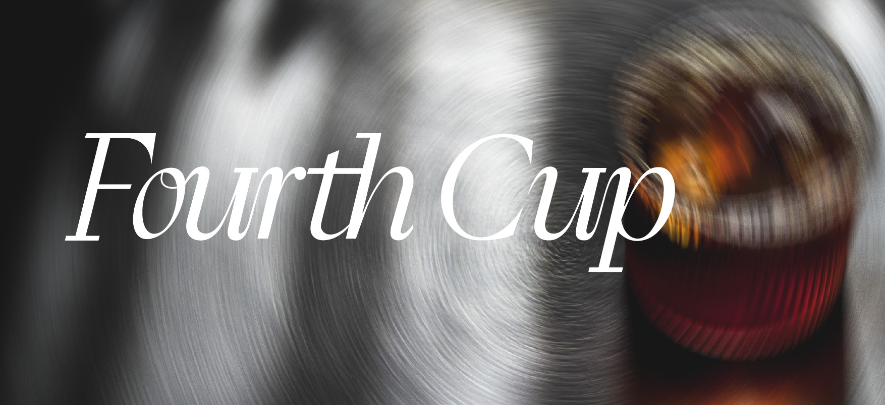
The Fourth Cup rethinks coffee culture with a sharper, more editorial identity. The rebrand centres on expressive typography, restrained neutrals, and unexpected blue accents that give the brand its edge. Packaging keeps the system clean but never quiet, with bold layouts, short statements, and a strong typographic rhythm. The Arabic identity sits naturally beside the English, giving the brand a confident bilingual presence. It feels considered, current, and made for people who take their coffee seriously.