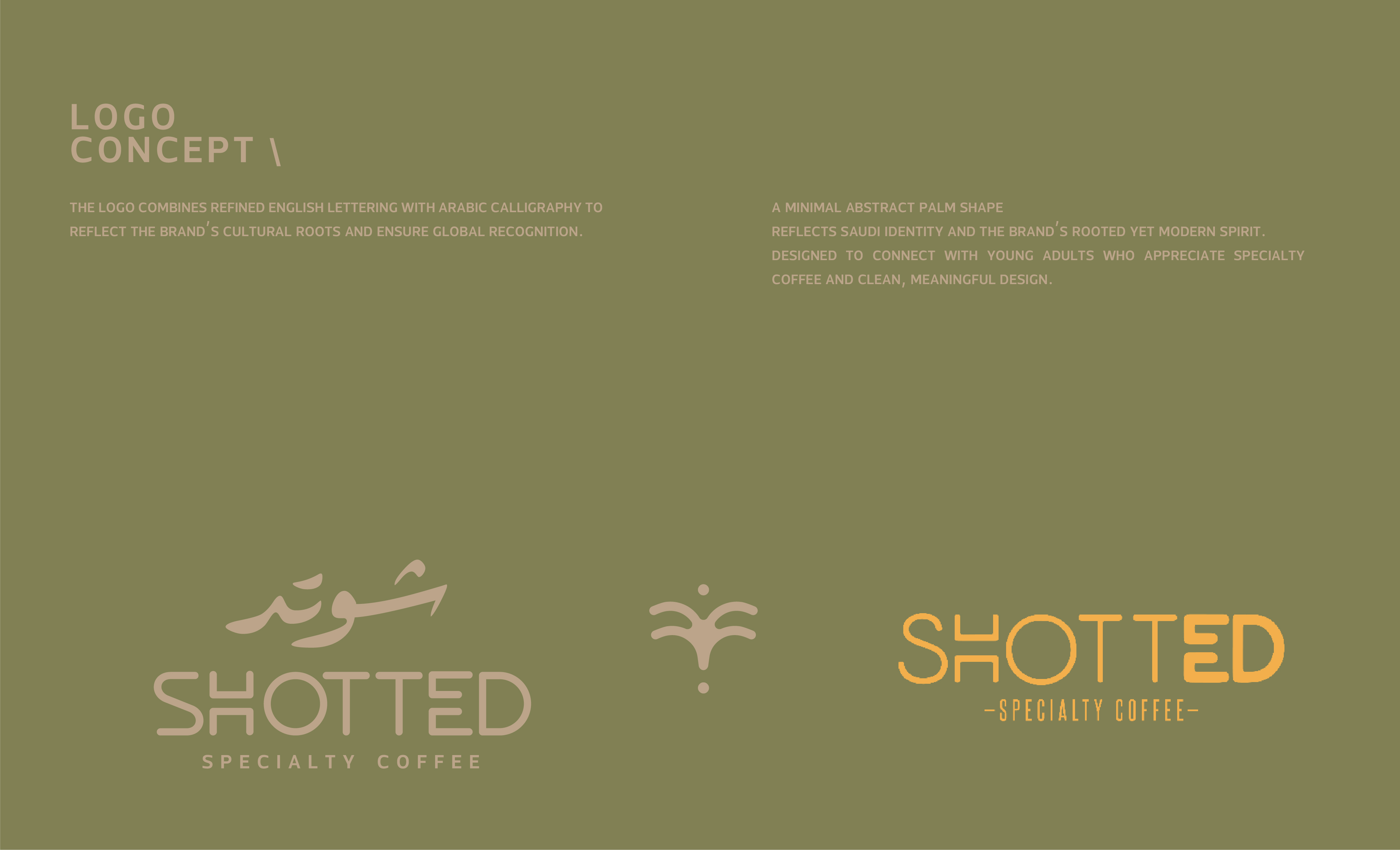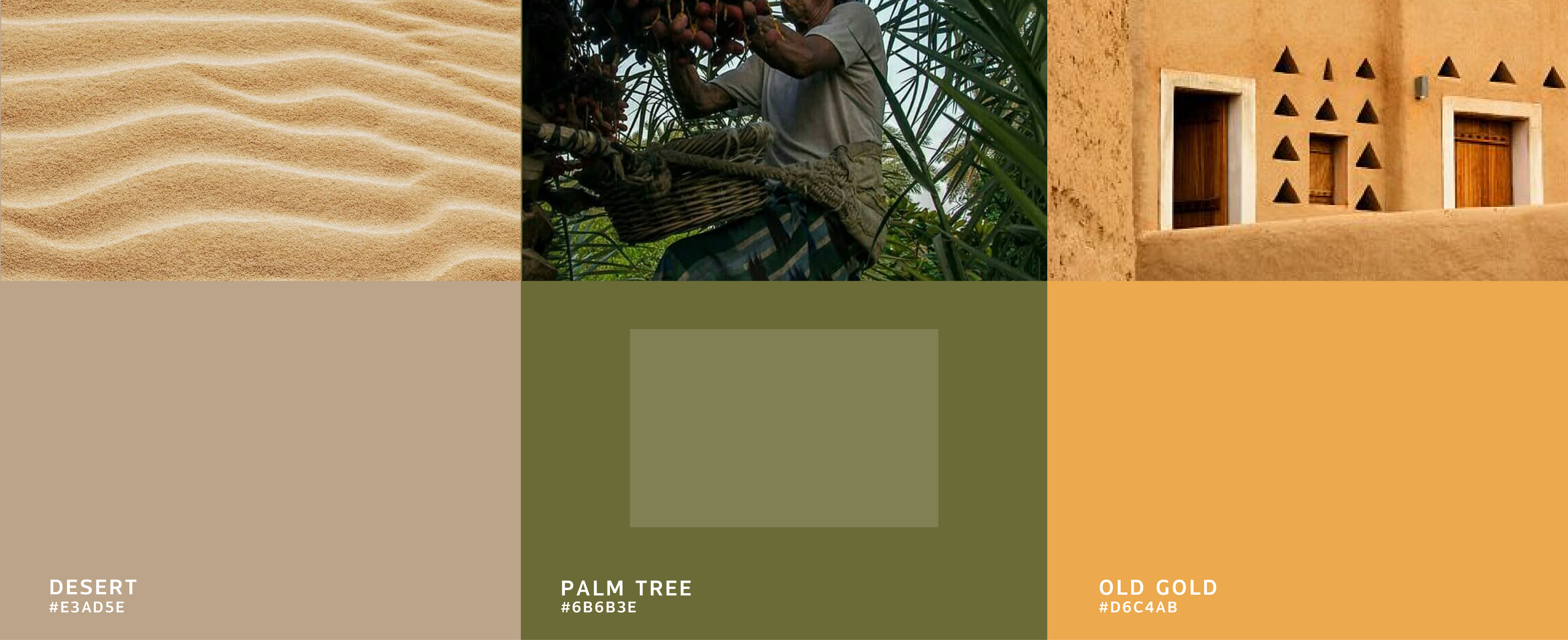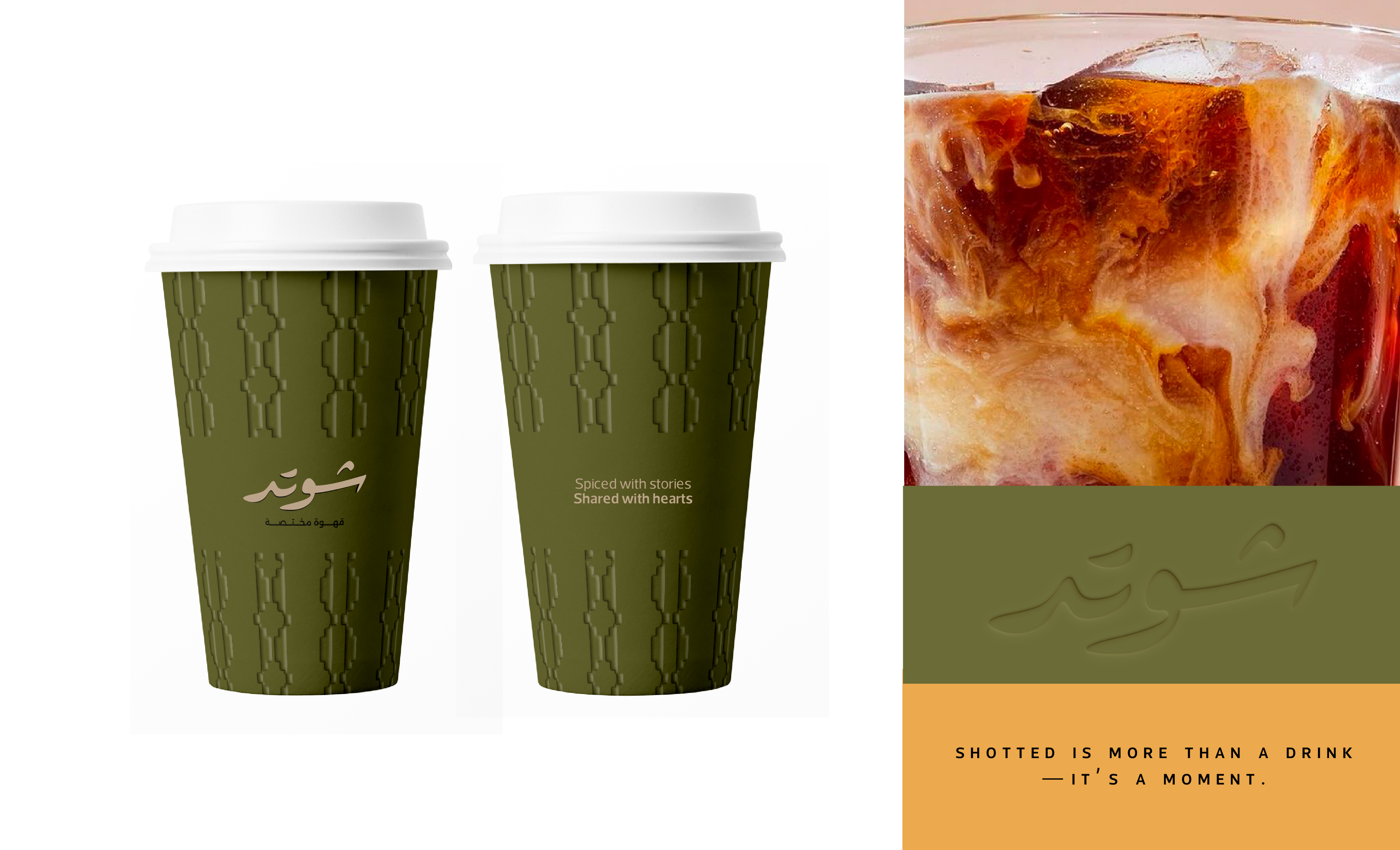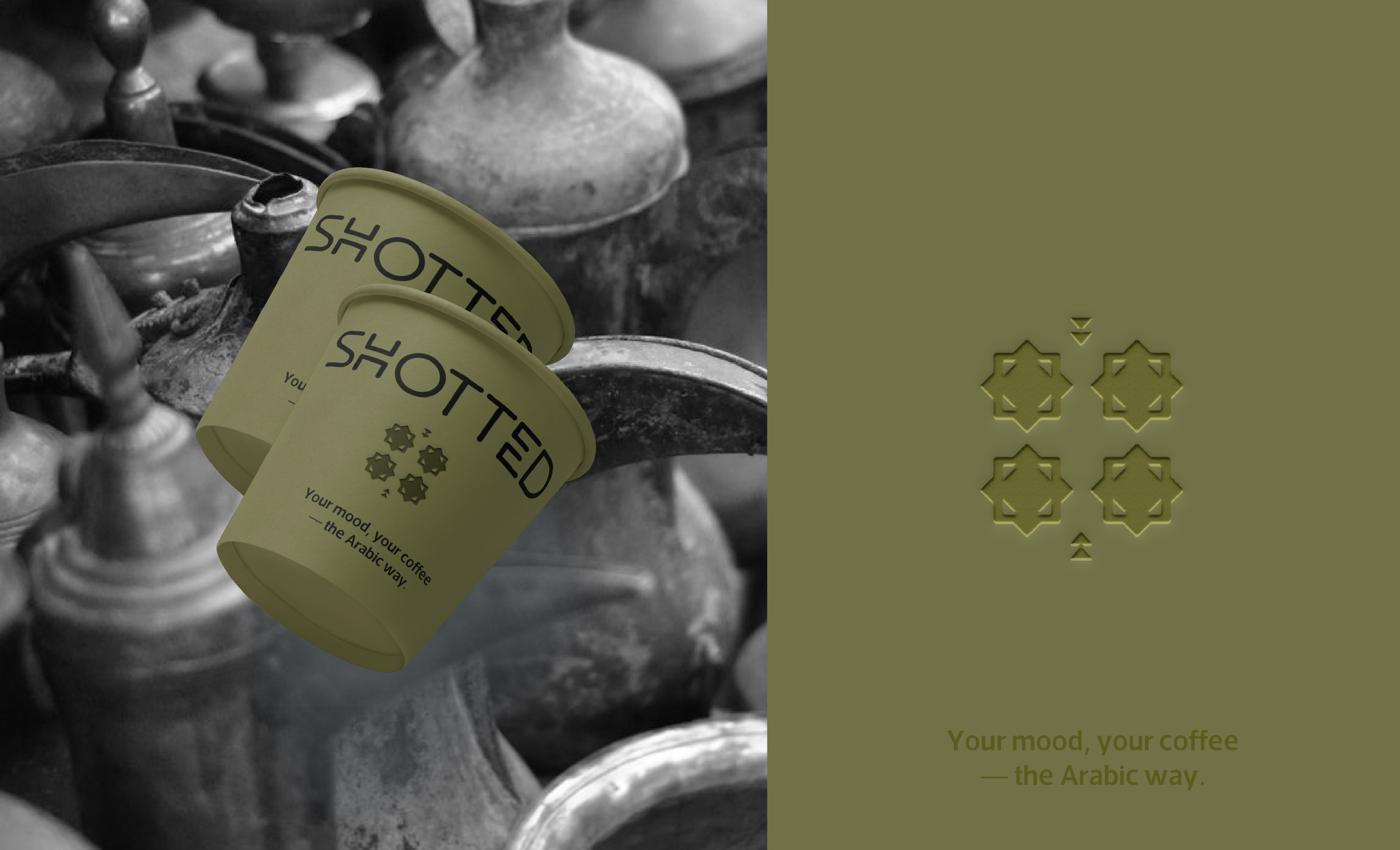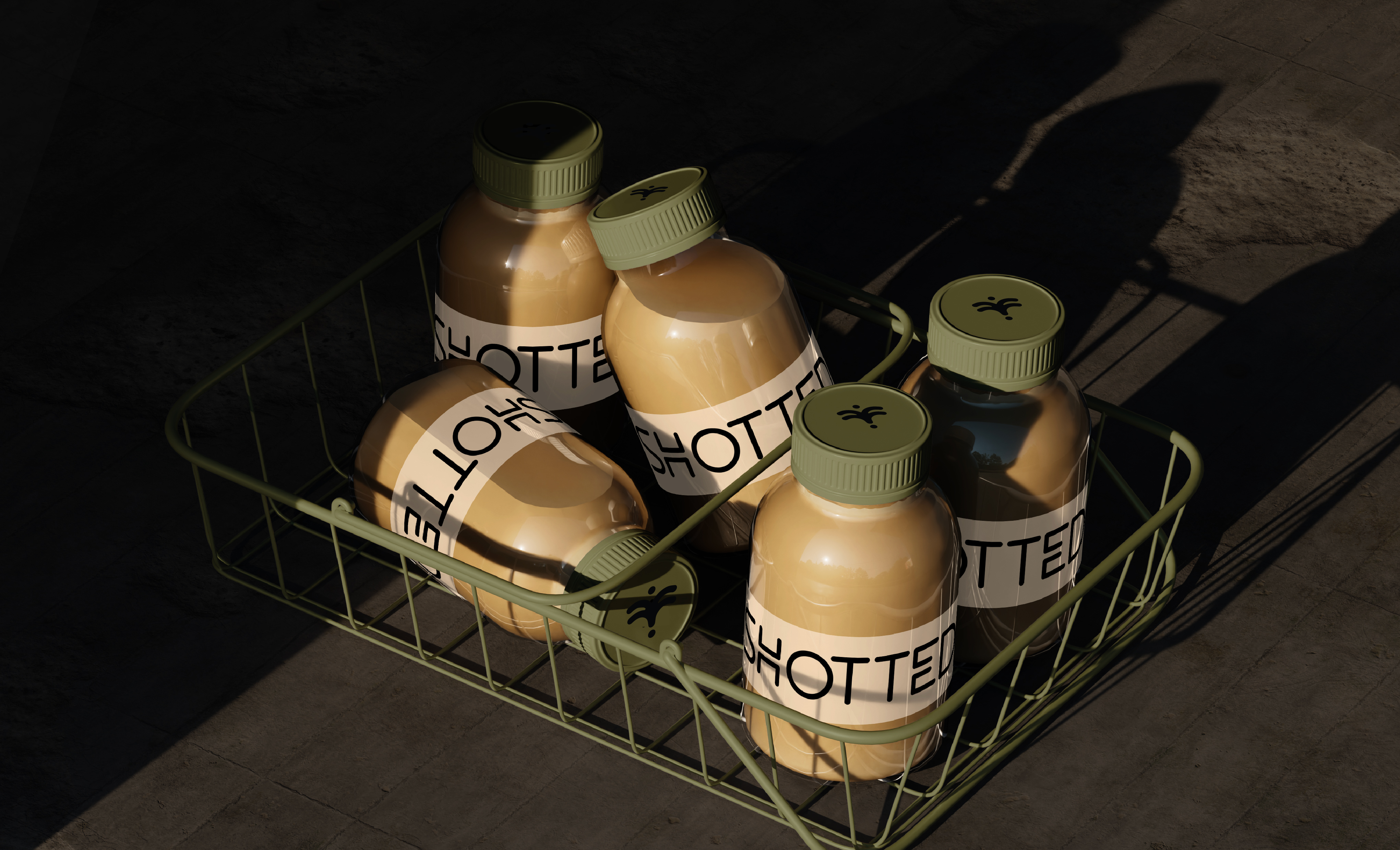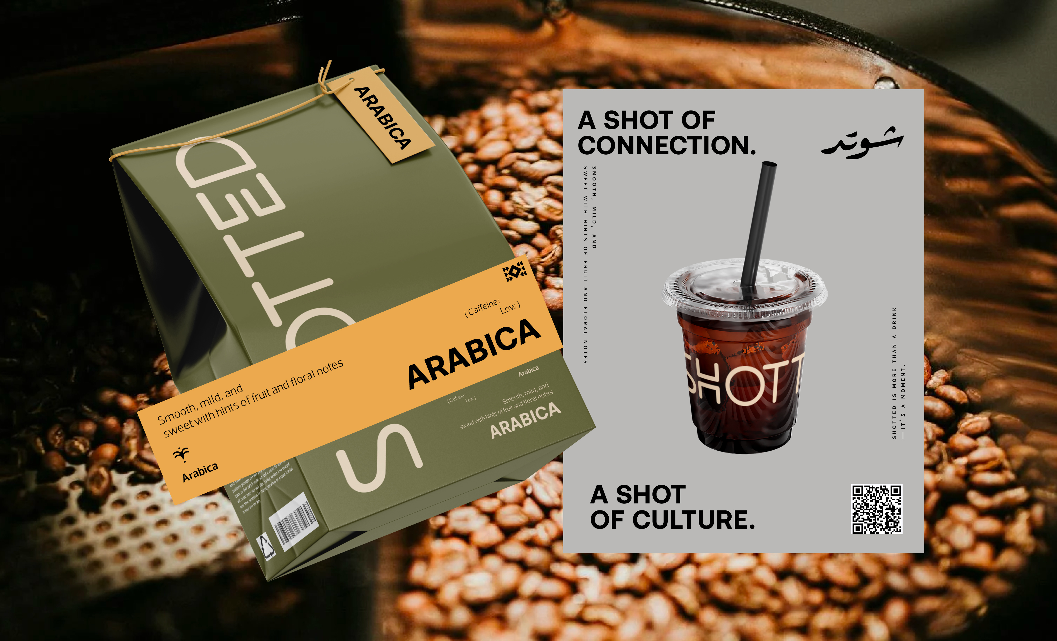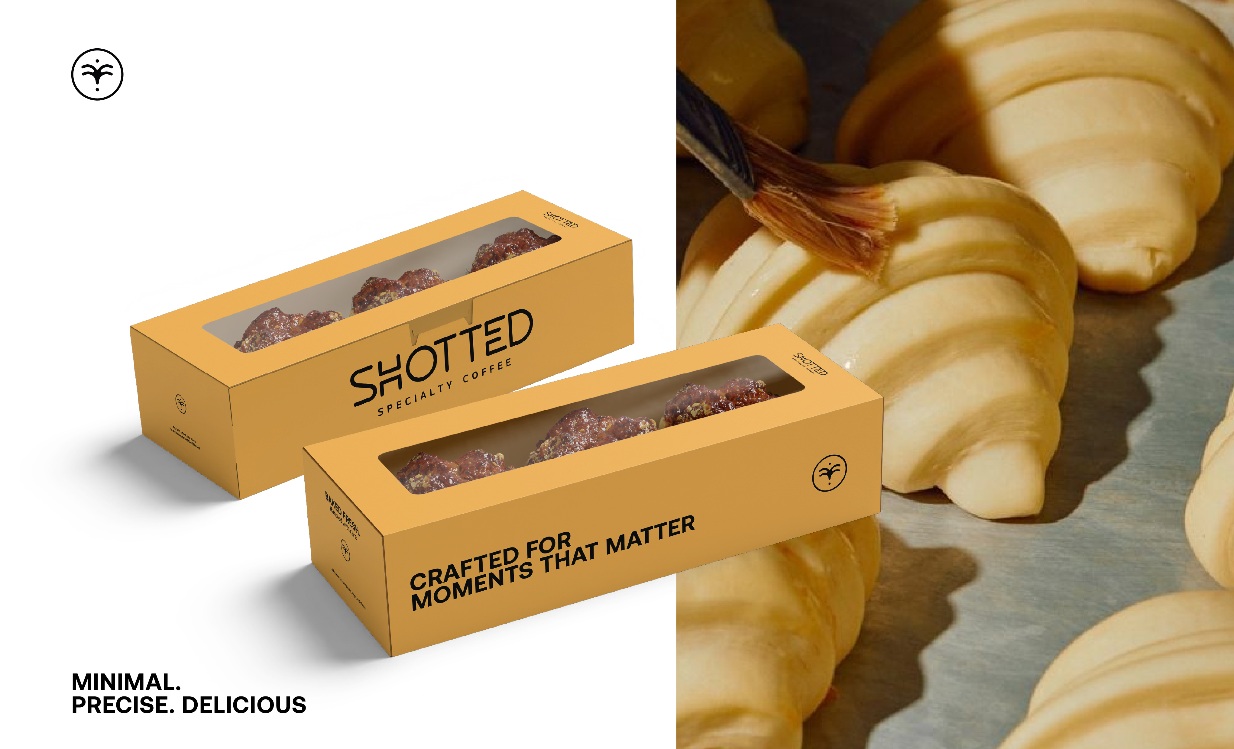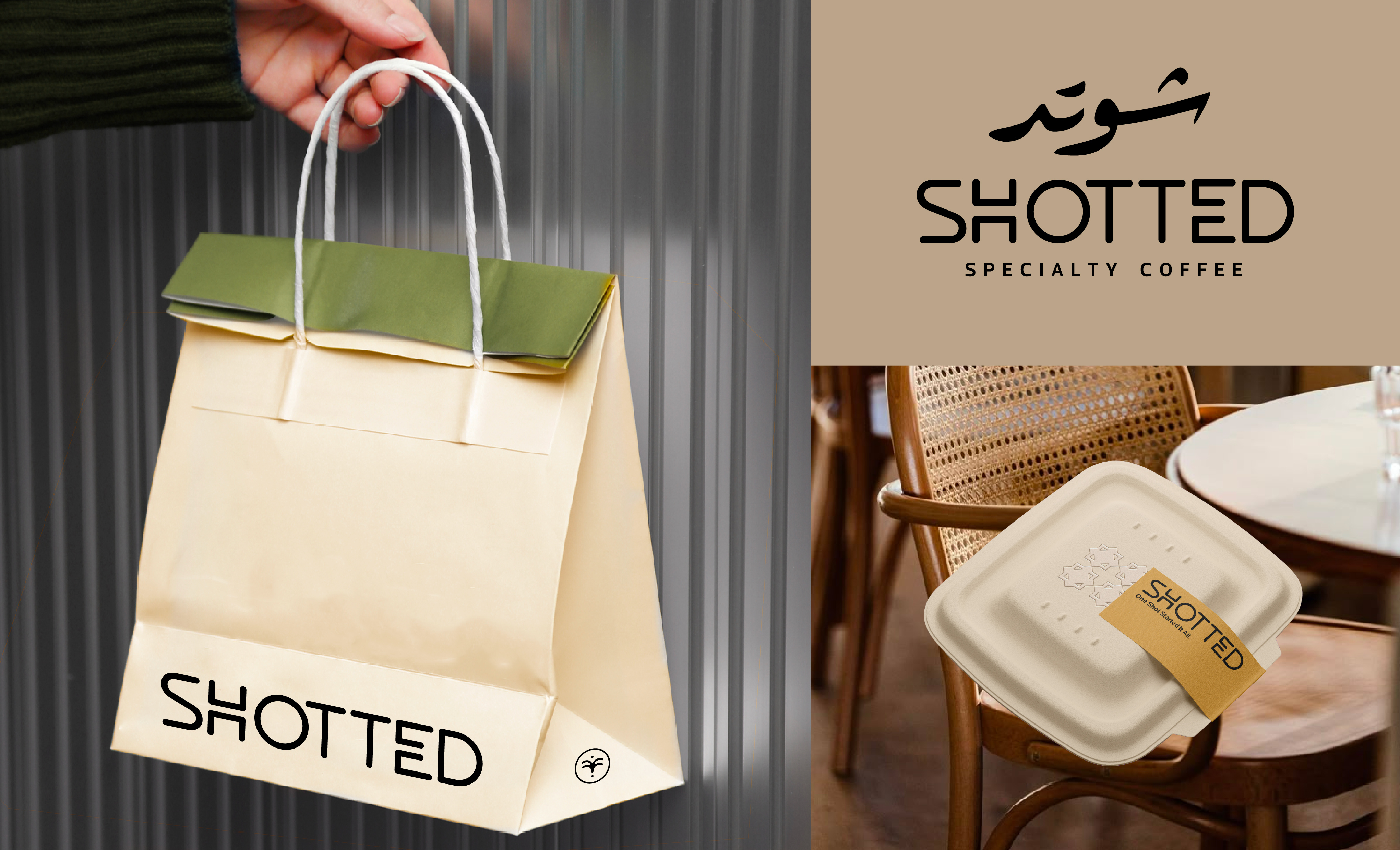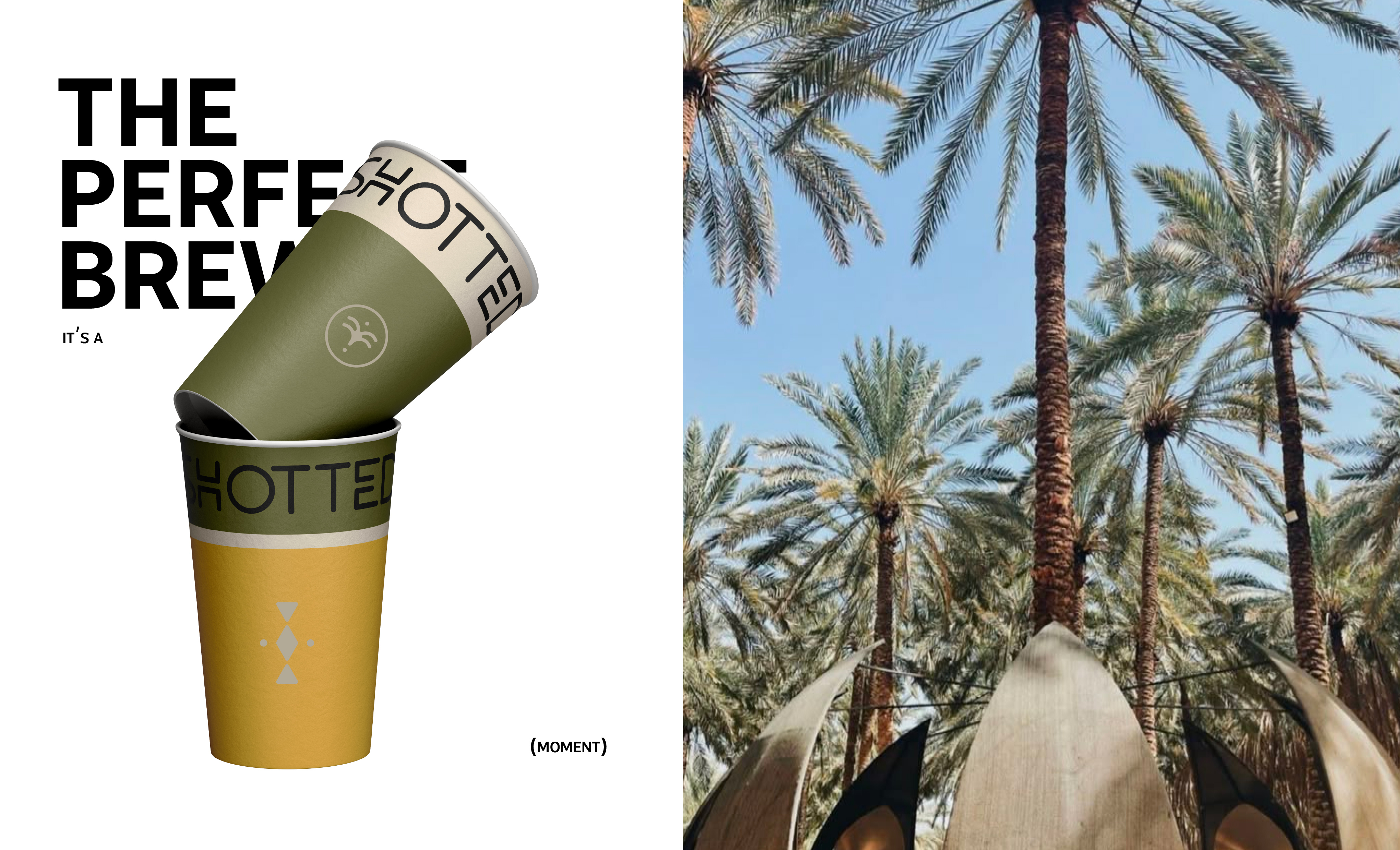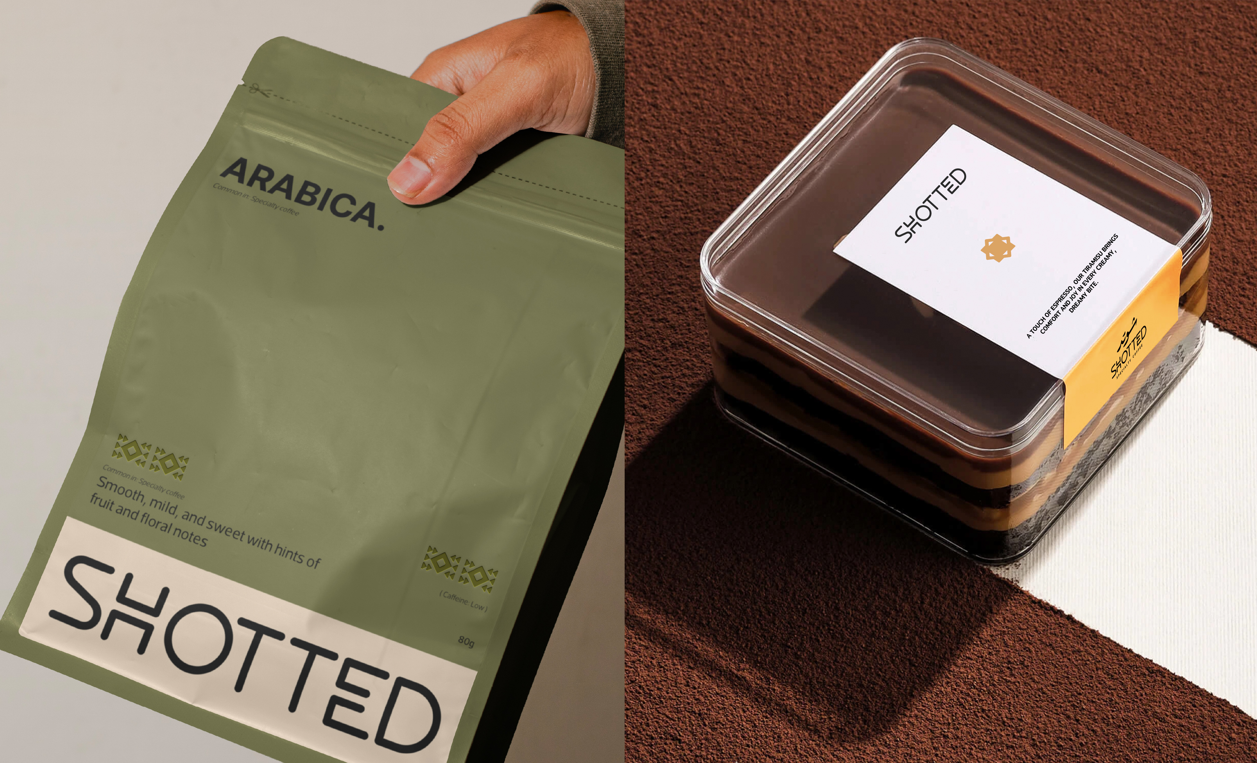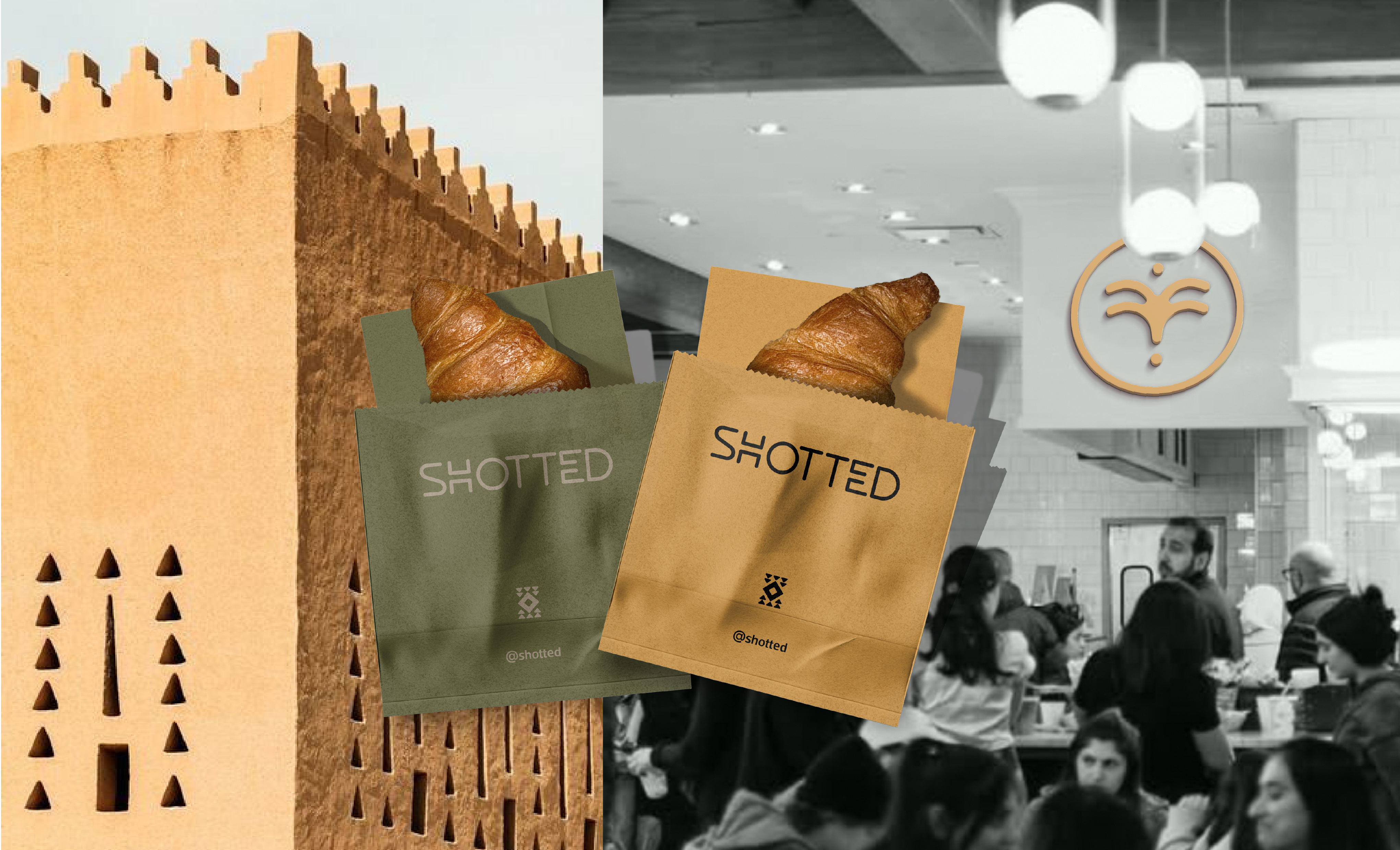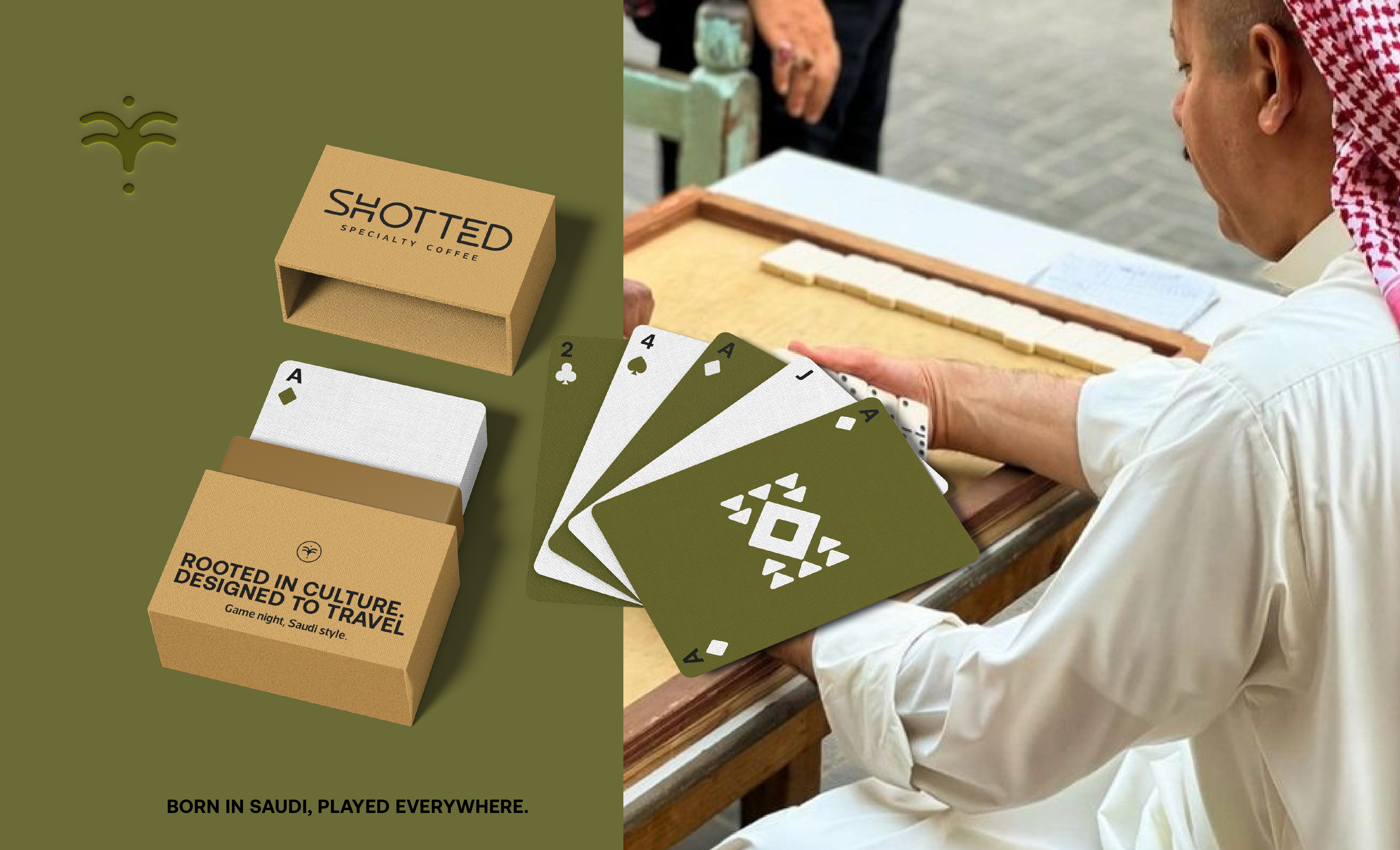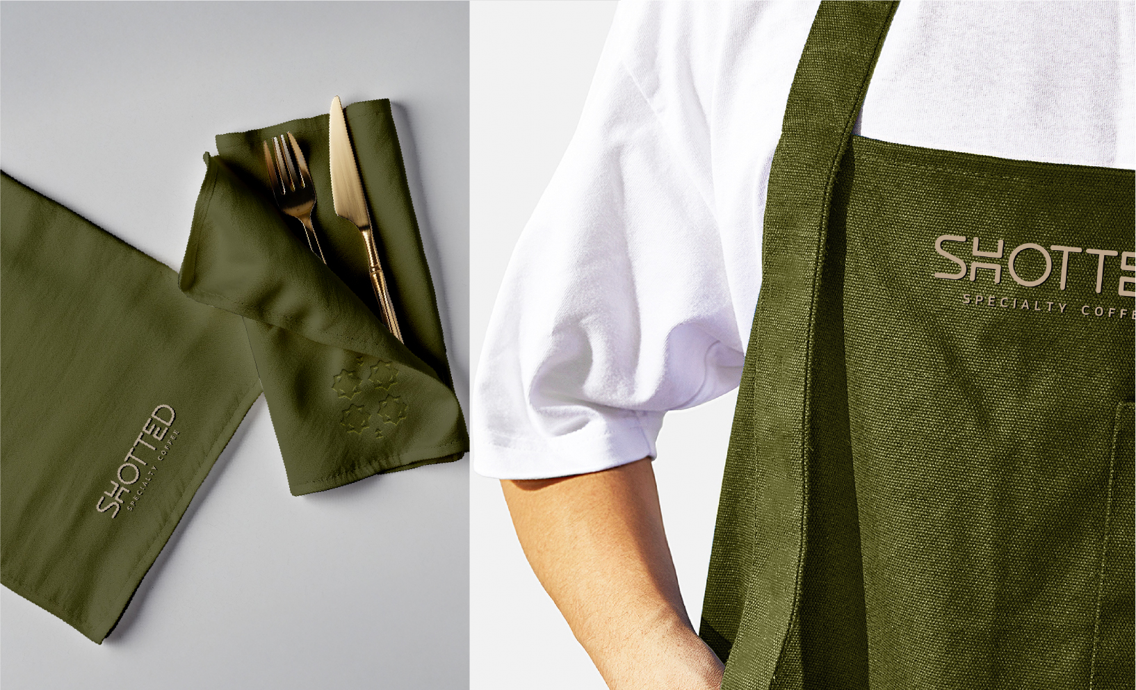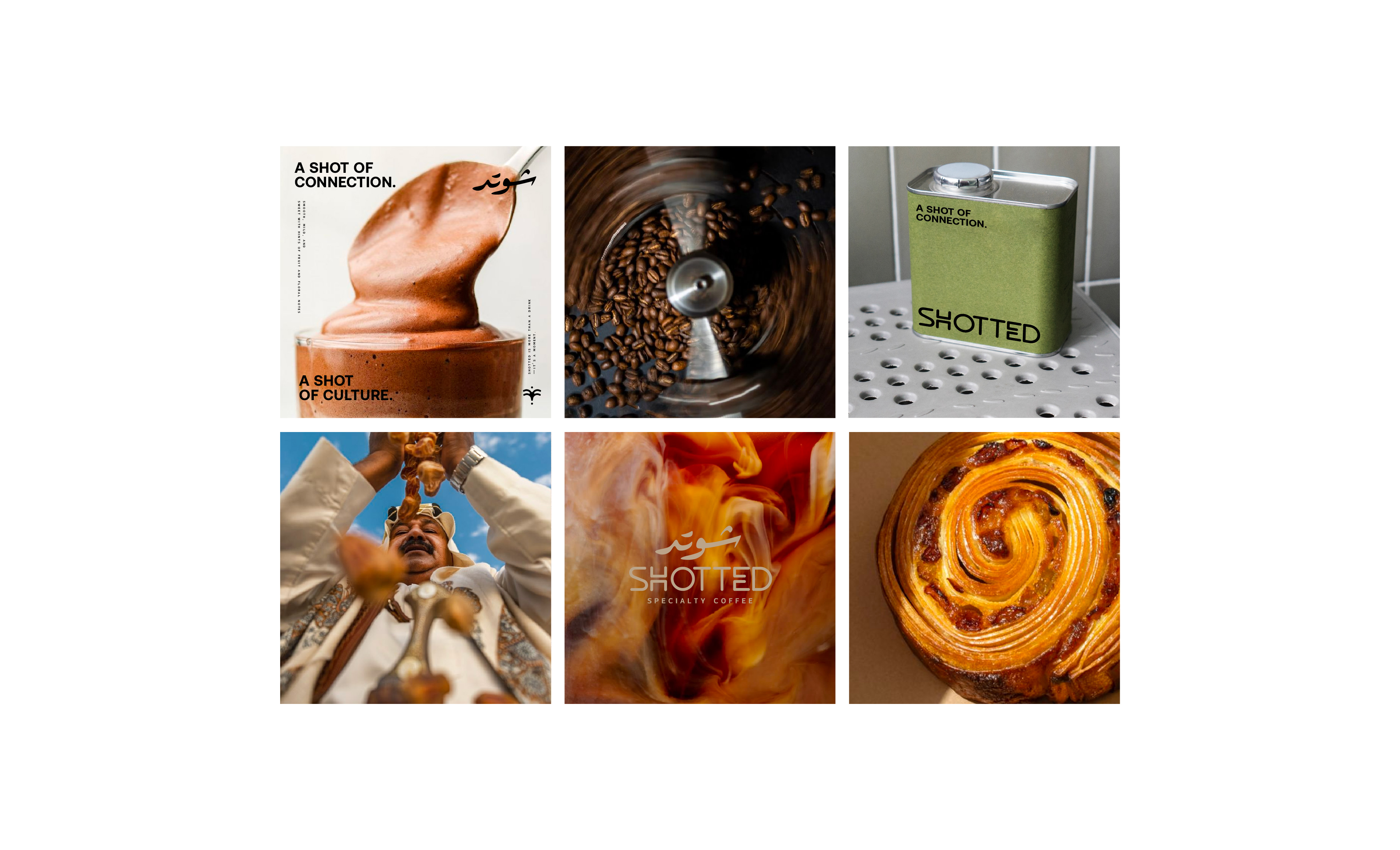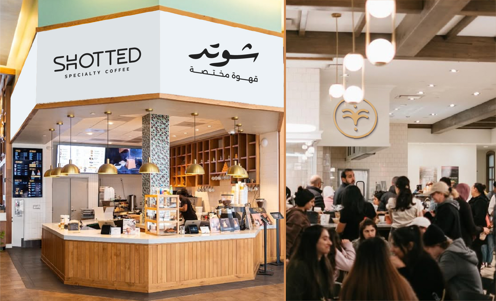

Shotted is a specialty coffee packaging and branding system built for clear recognition across cups, sleeves, and cartons. It uses a strong SHOTTED wordmark paired with “SPECIALTY COFFEE,” plus a secondary coffee/bean icon for small-format applications and visual consistency The packaging keeps typography minimal and organized in a repeating grid, so brand and key messages stay readable in takeaway use. Cup and sleeve designs follow the same palette (olive/green base with warm neutral blocks and an orange/gold accent) and include Arabic support for bilingual visibility. Cardboard/box layouts use structured panels with coffee/ingredient visuals placed where they won’t fight the brand hierarchy, supported by lightweight background textures/patterns. Overall, the result is a cohesive, retail-ready identity that scales across all packaging pieces while staying premium and simple.