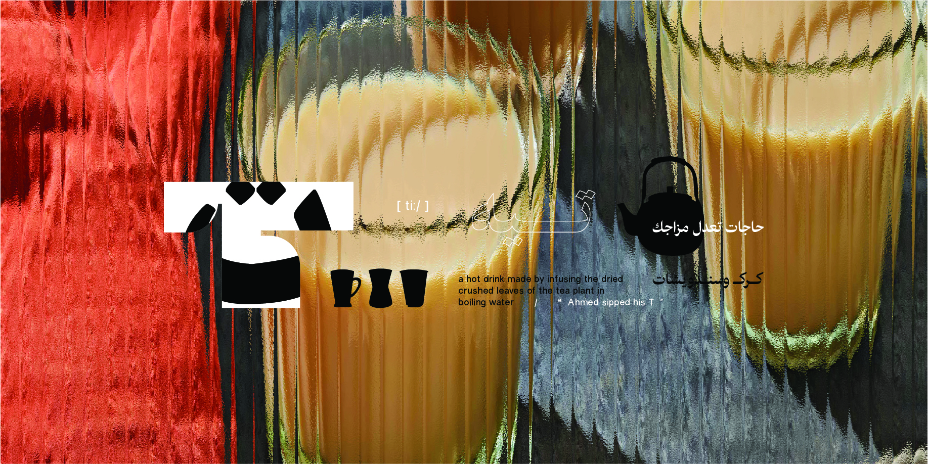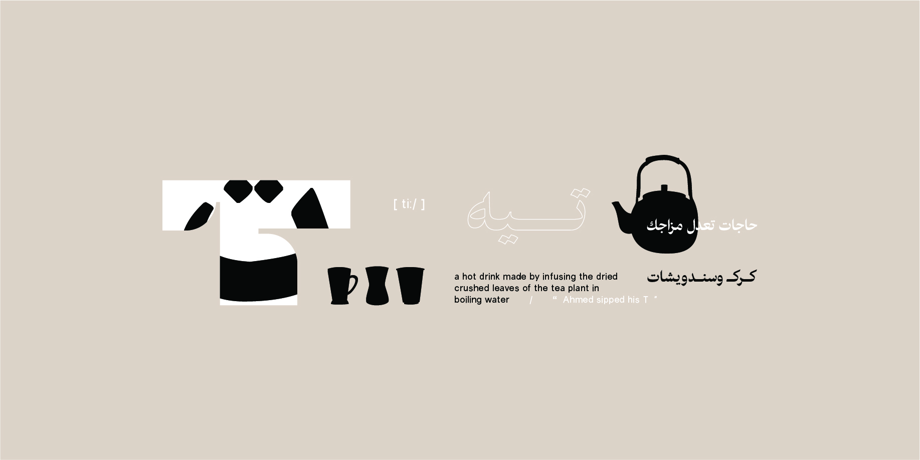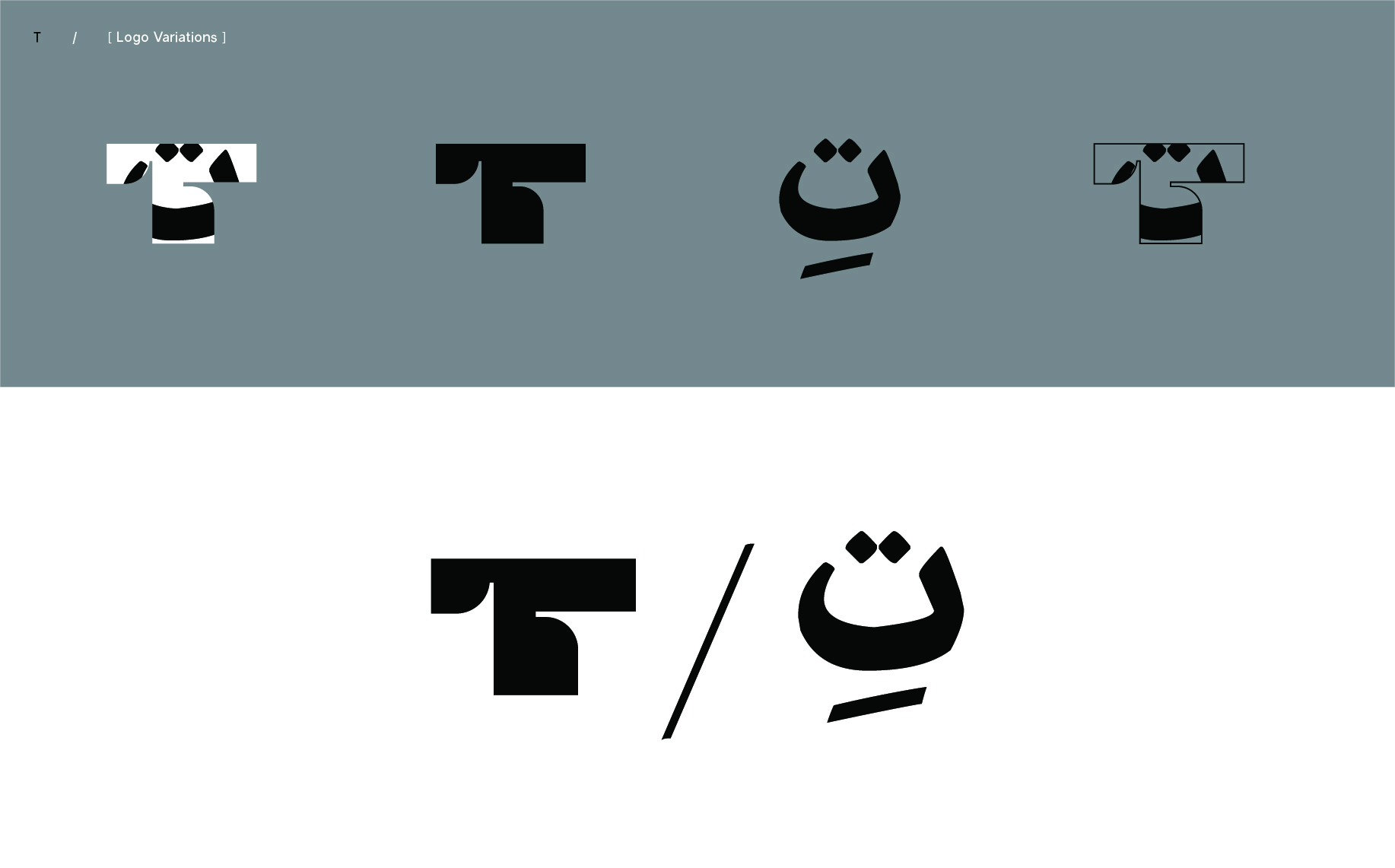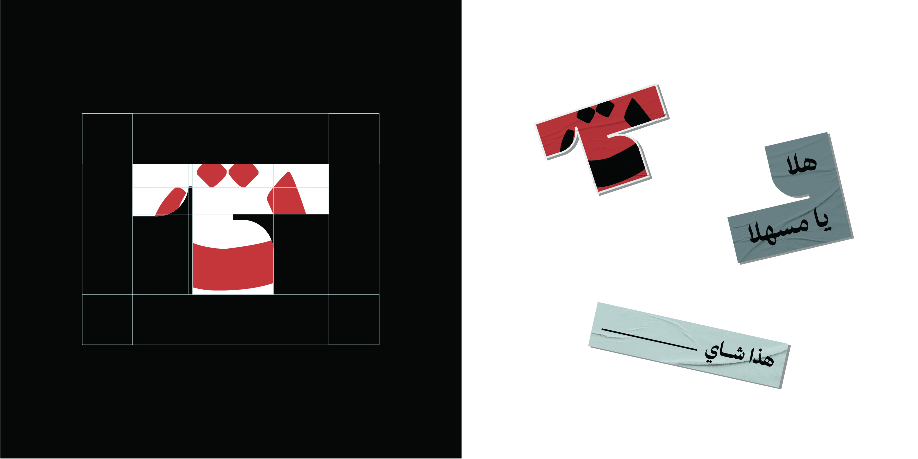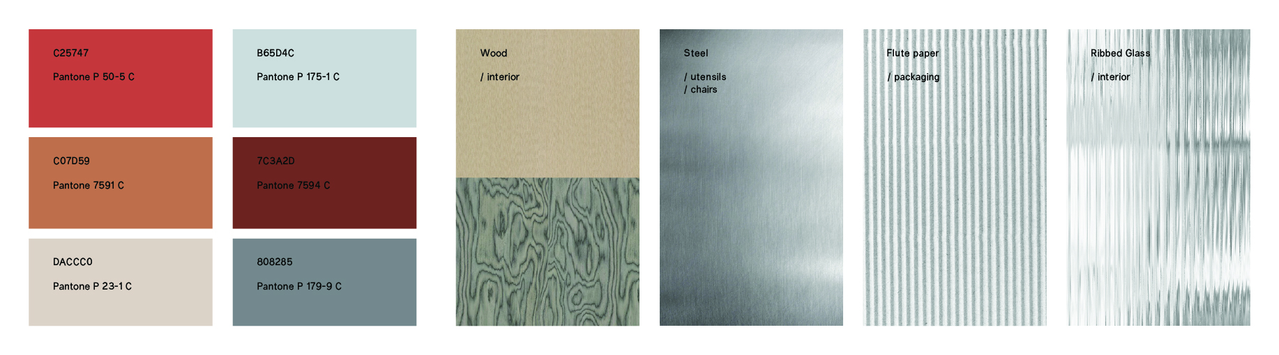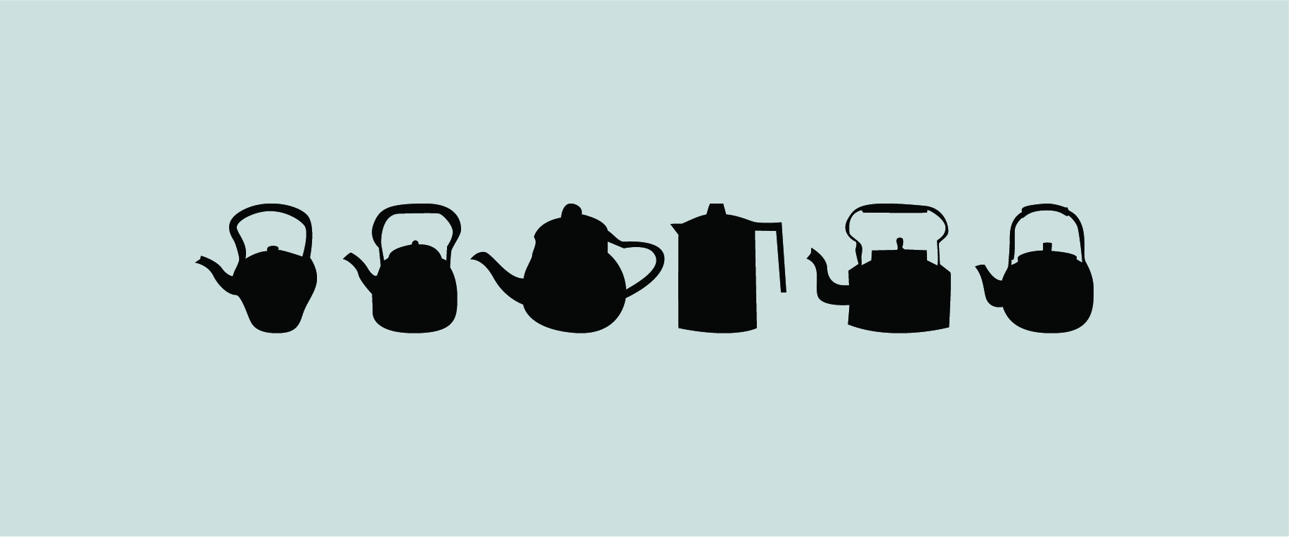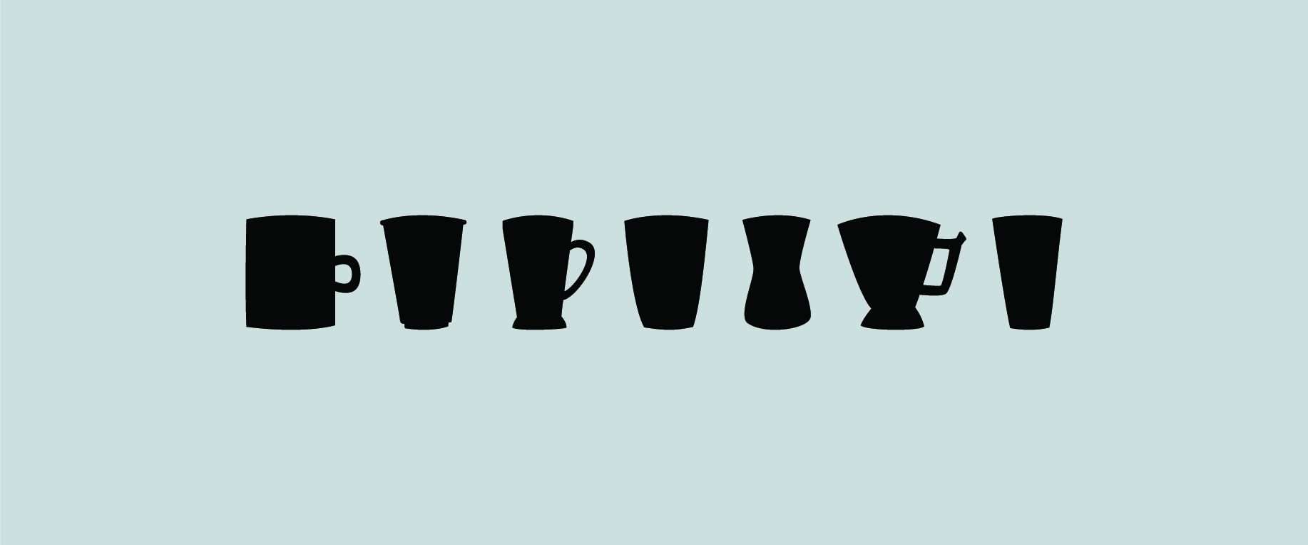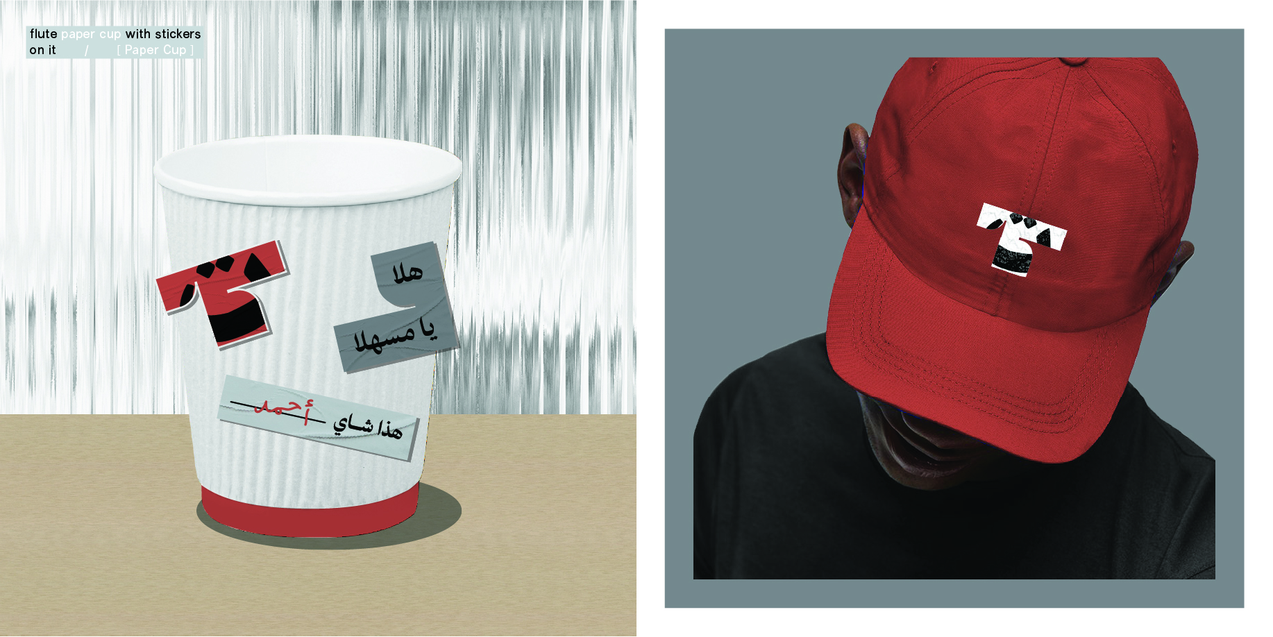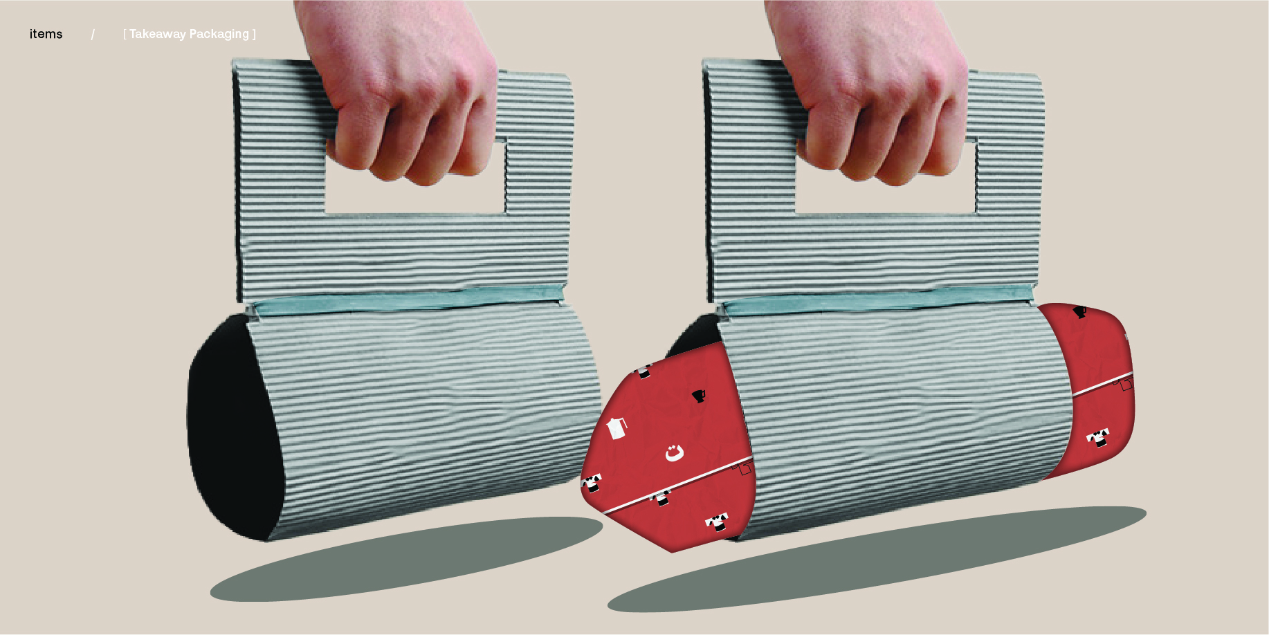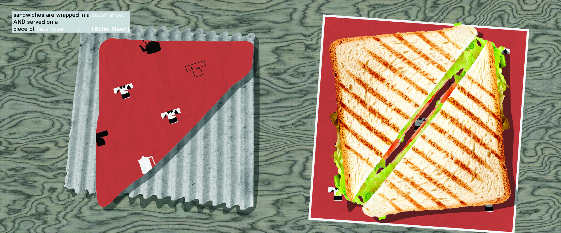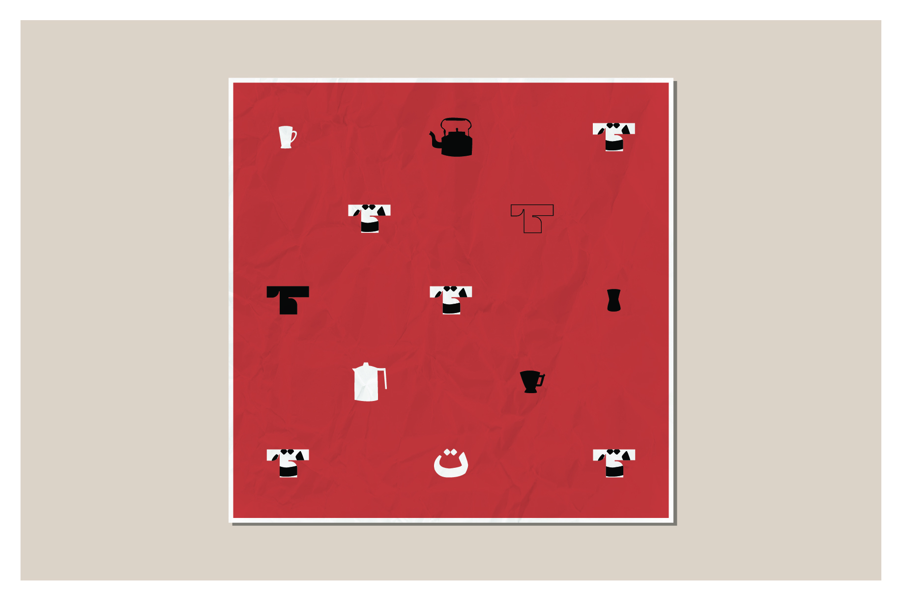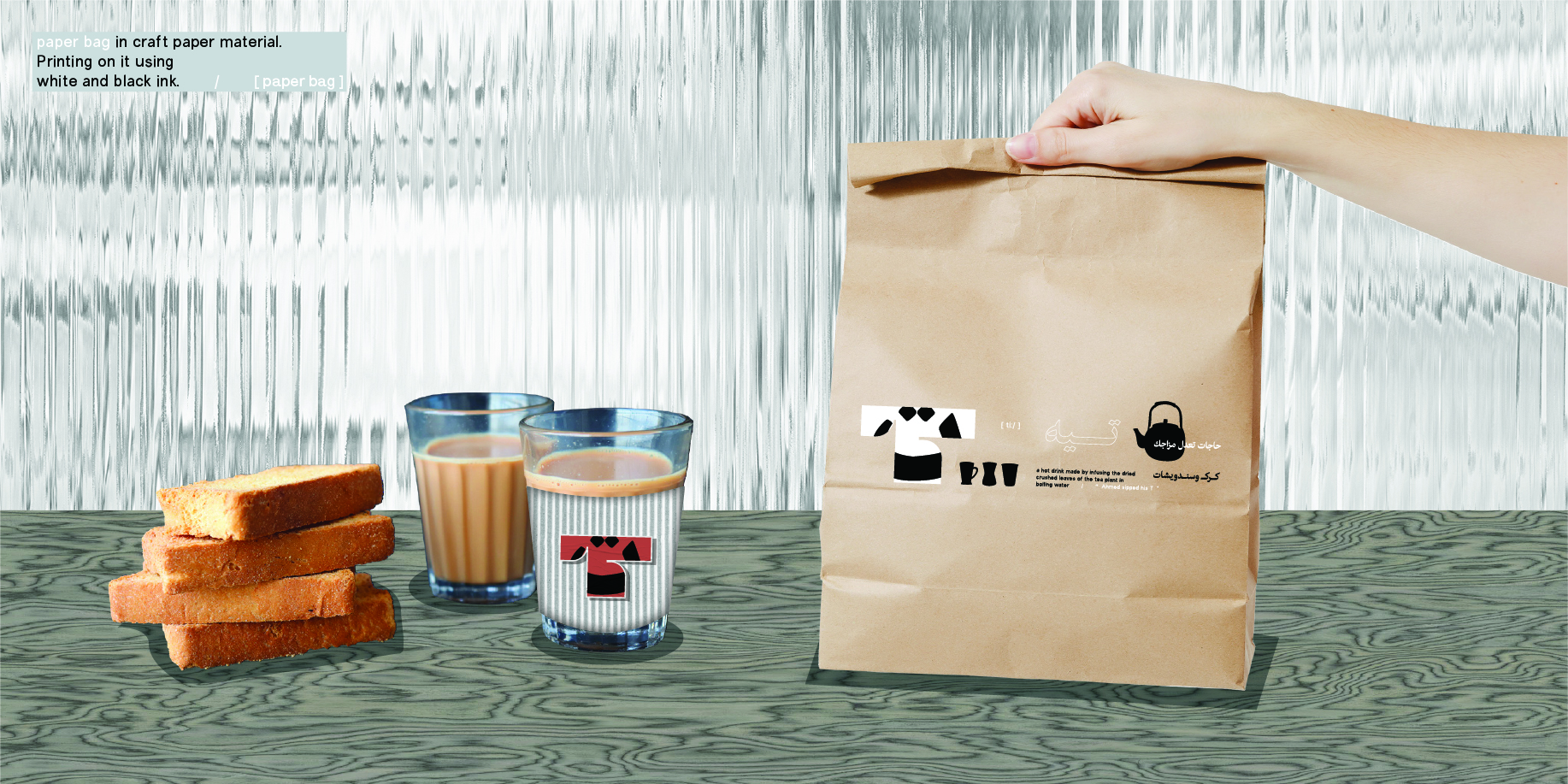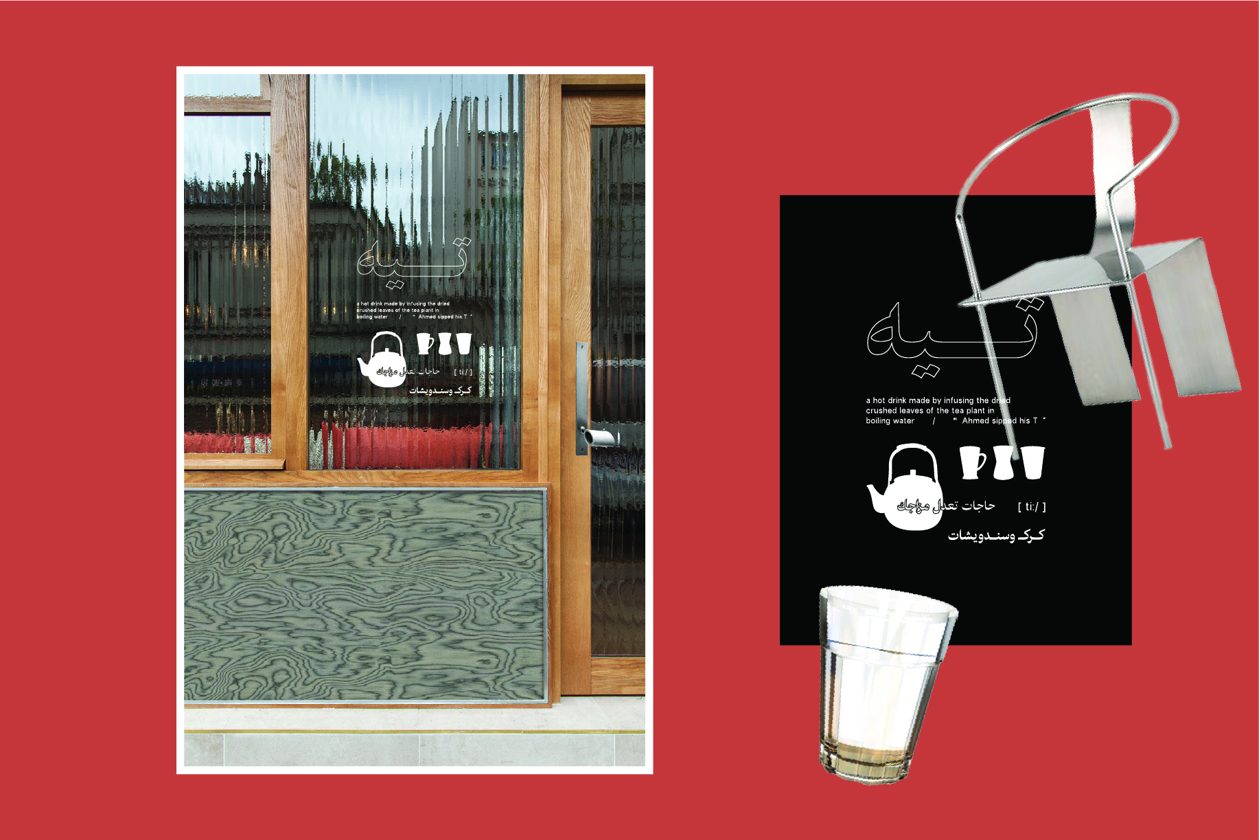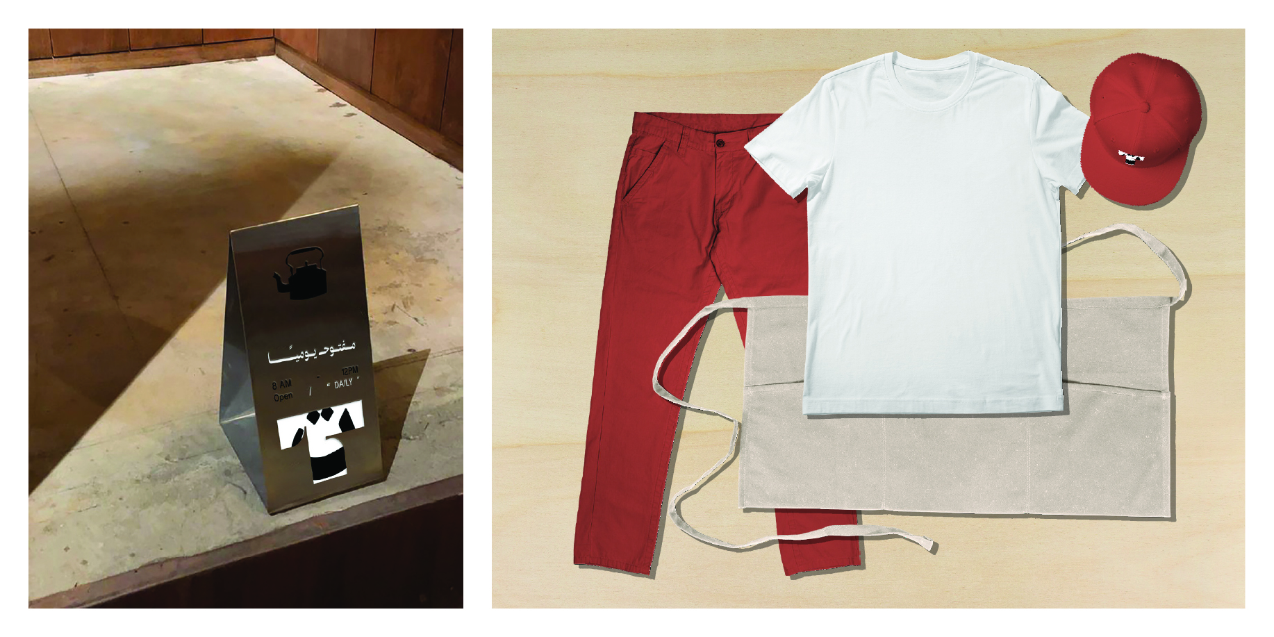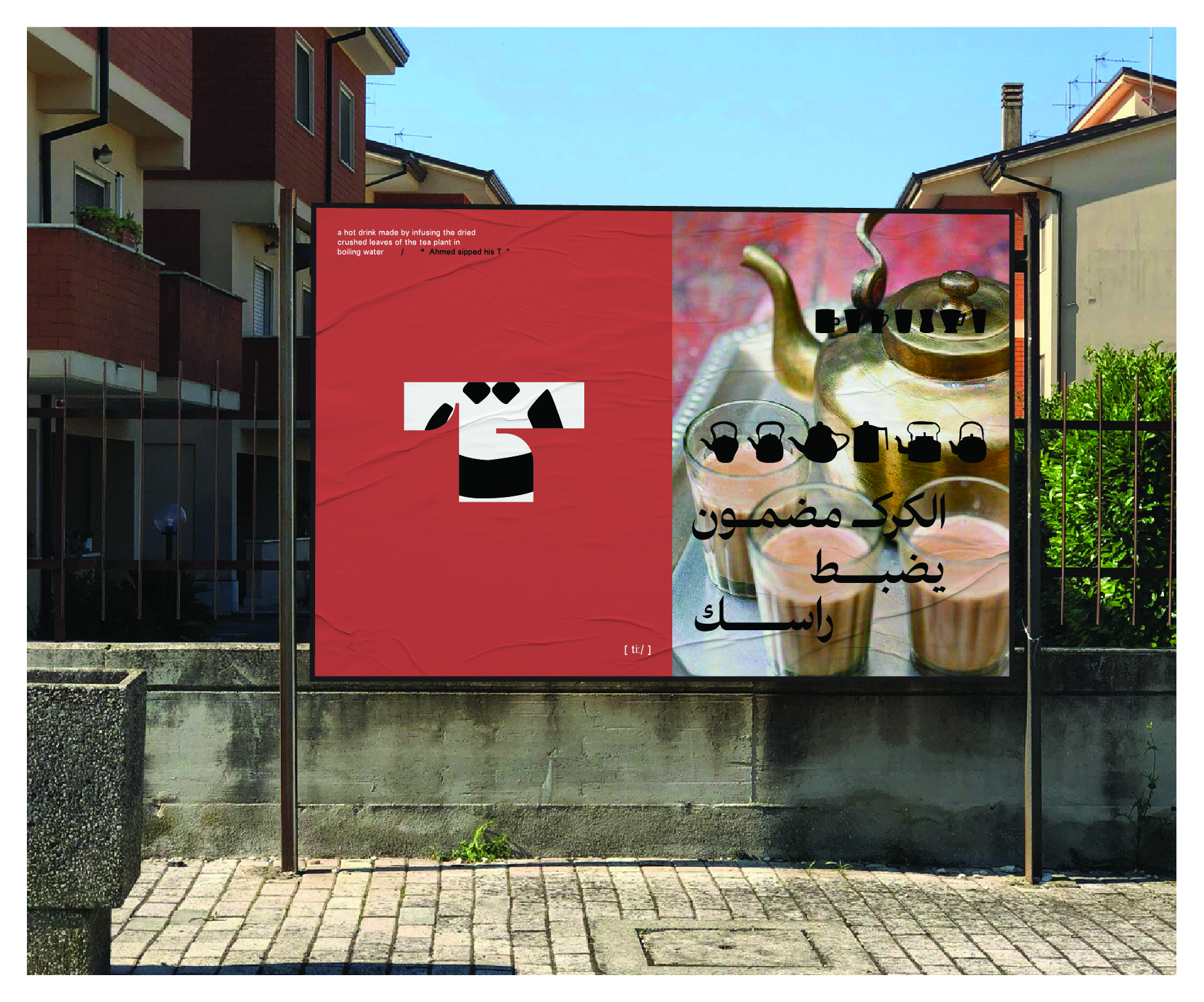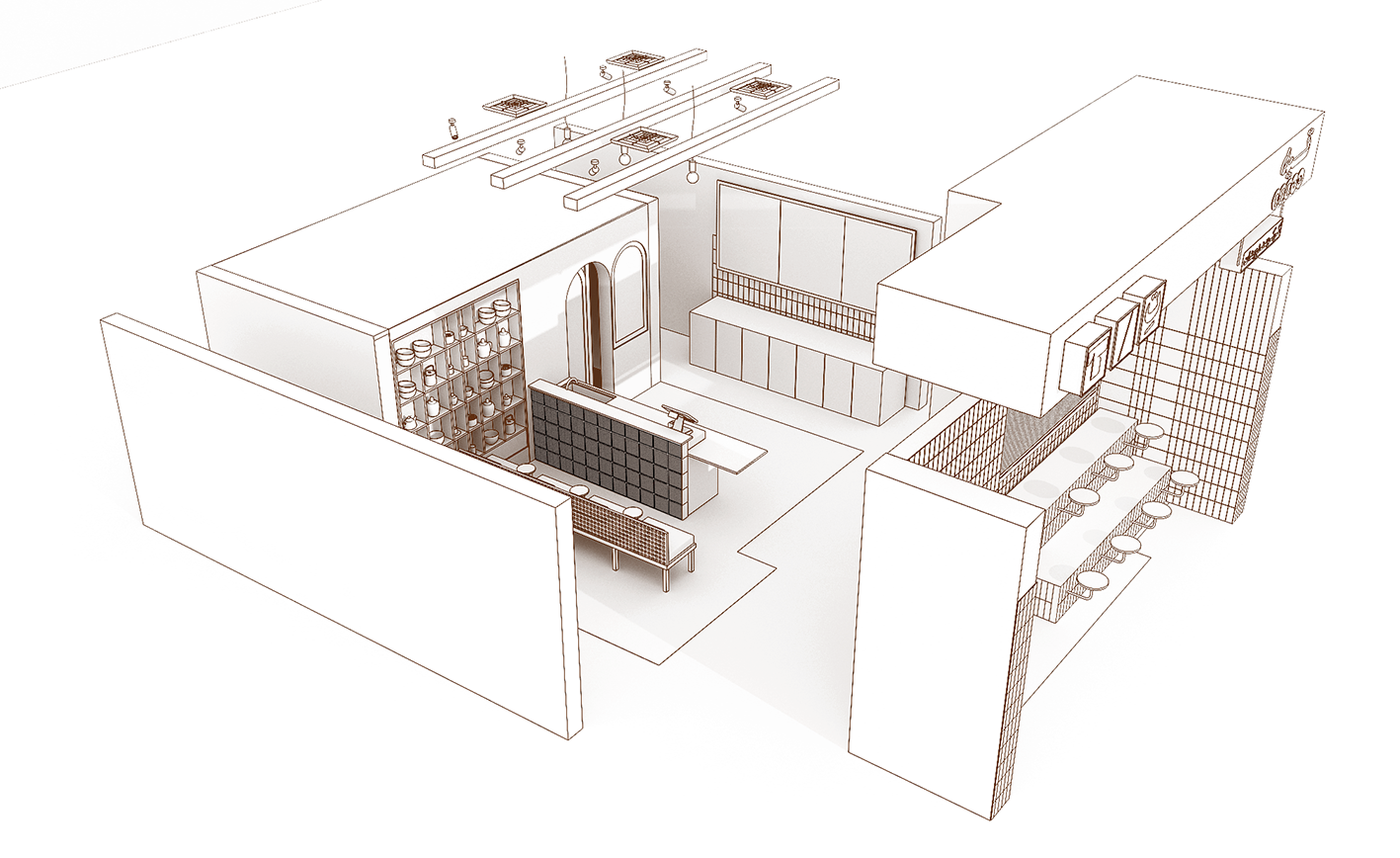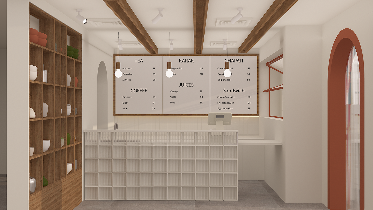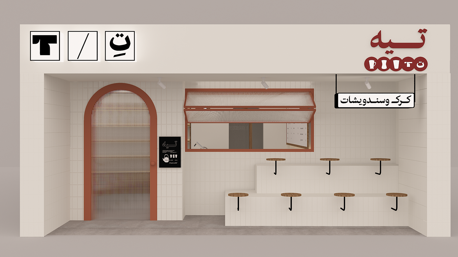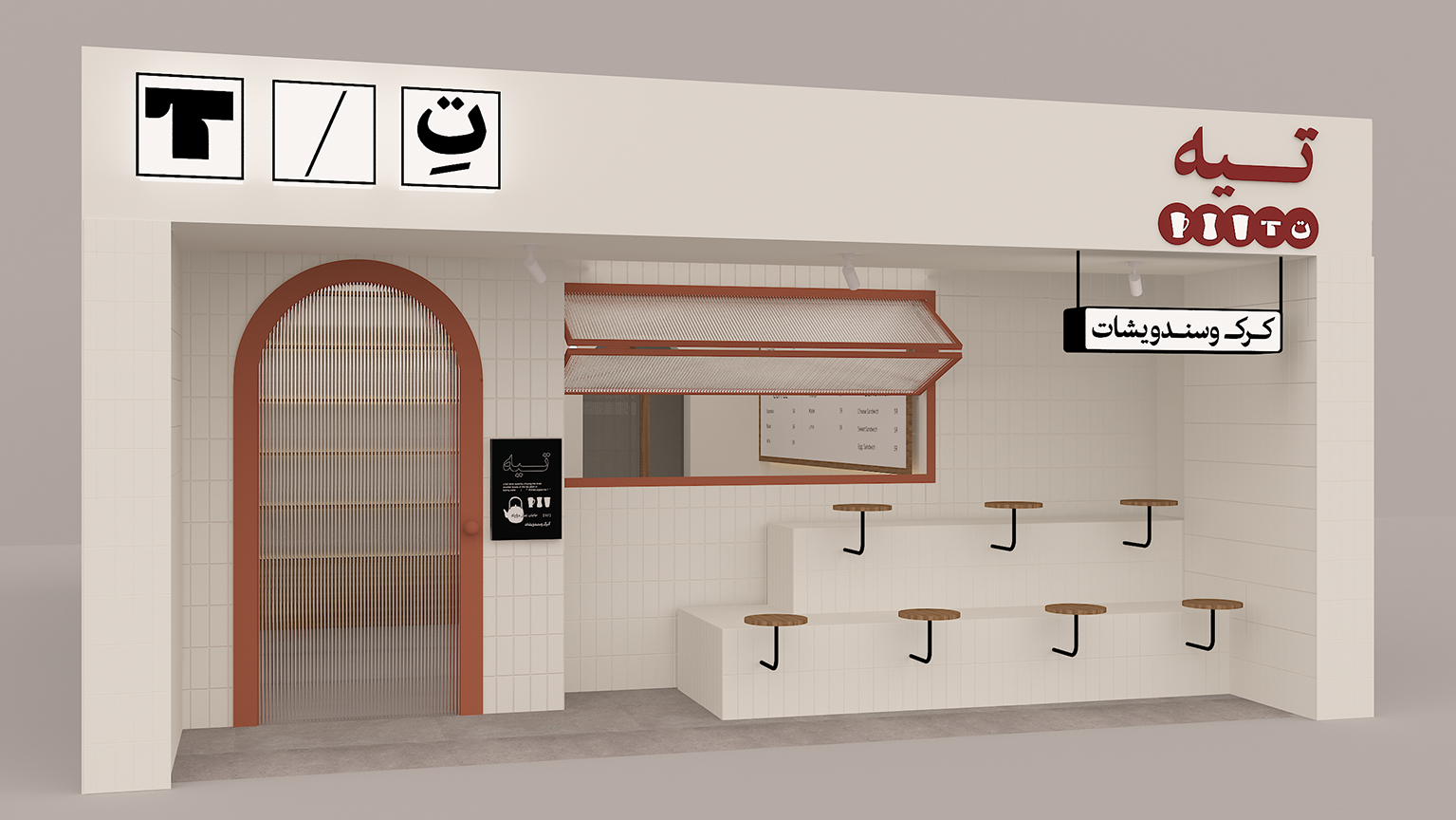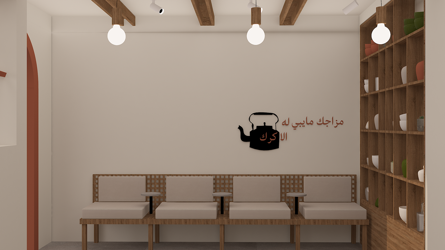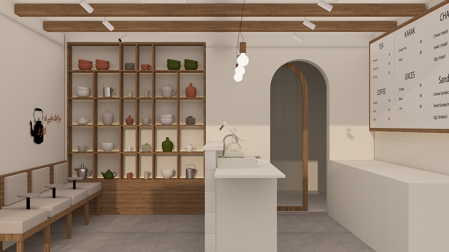
T تِ was built as a tea spot with a name as simple and direct as the drink itself. The identity pairs bold letterforms with a warm palette of cream, black, and clay orange, giving the brand a clear and memorable presence. Tea cups, kettles, and pouring gestures become part of the visual language, adding character without overcomplicating the system. The interior carries the same mood through tiled surfaces, wooden shelving, soft arches, and a clean open counter. T تِ feels casual, charming, and designed for people who take their tea seriously.