
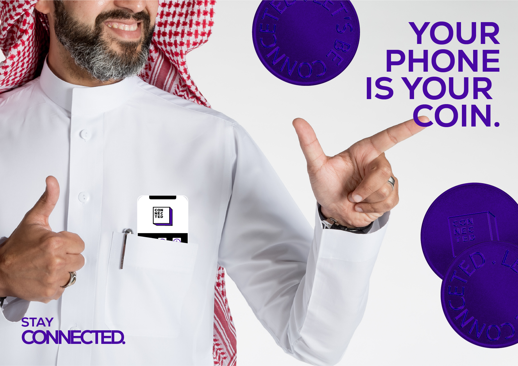
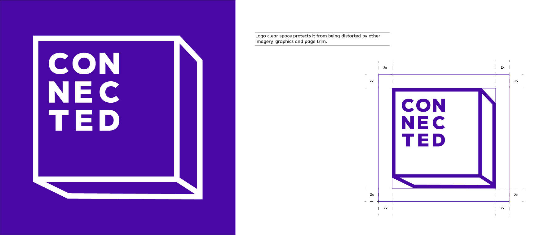
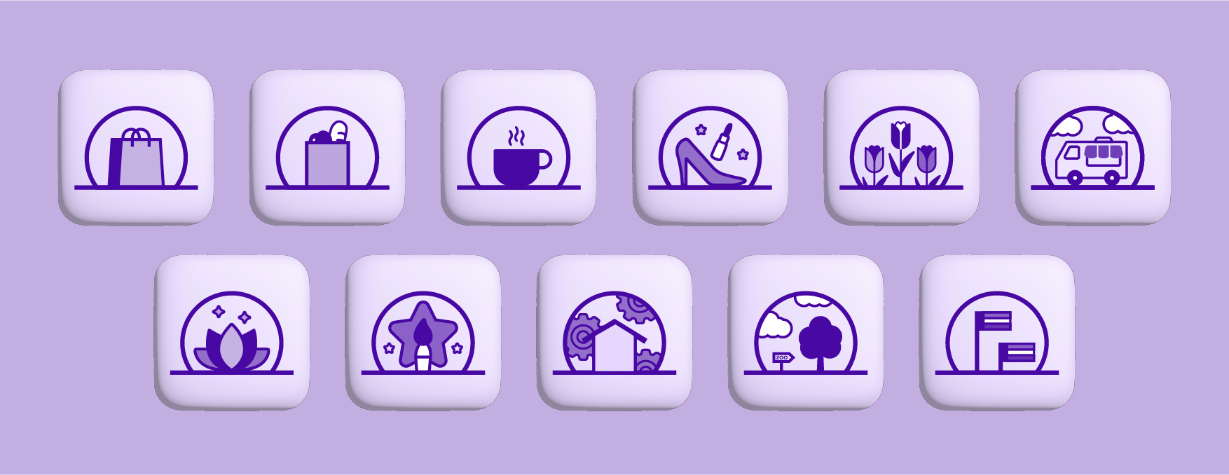
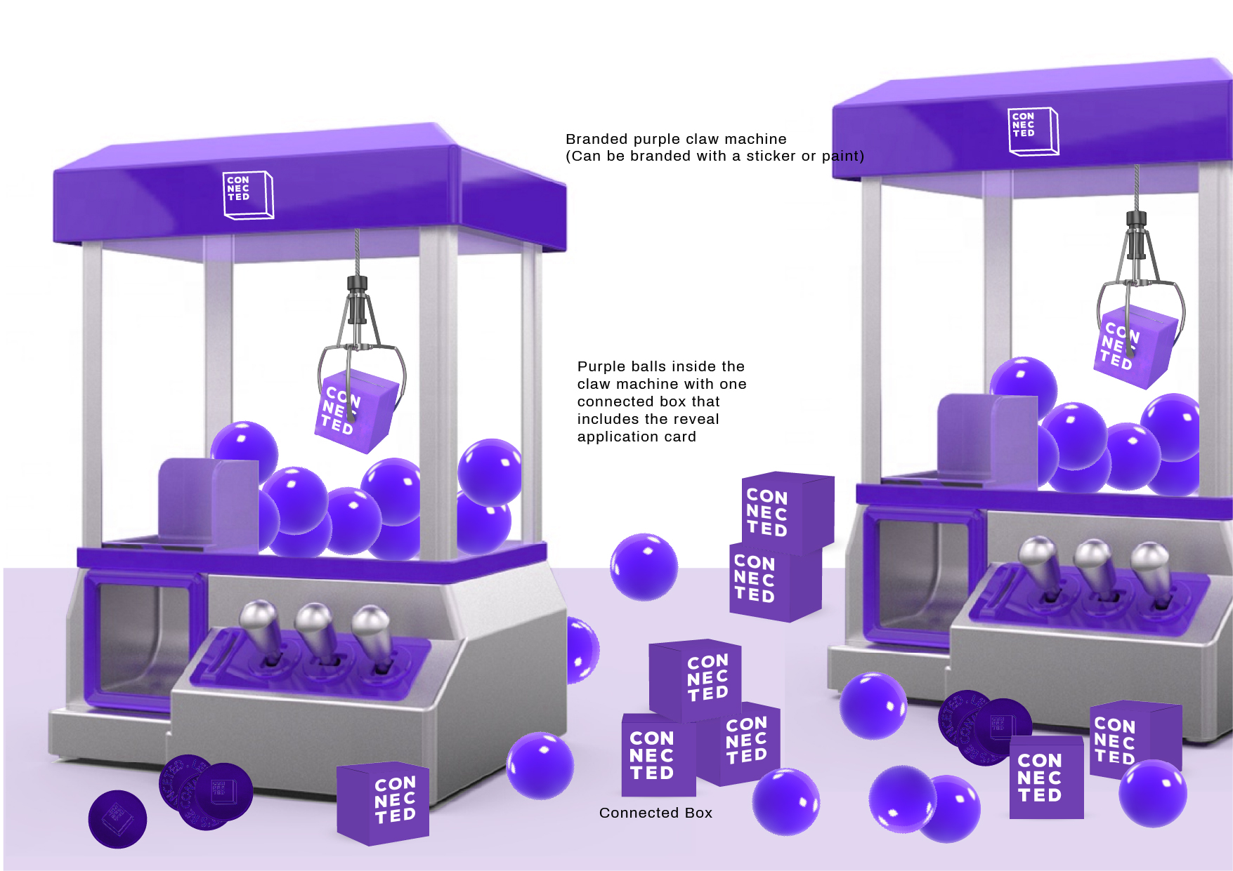
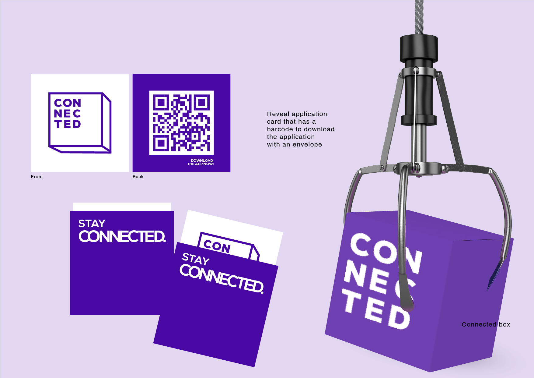
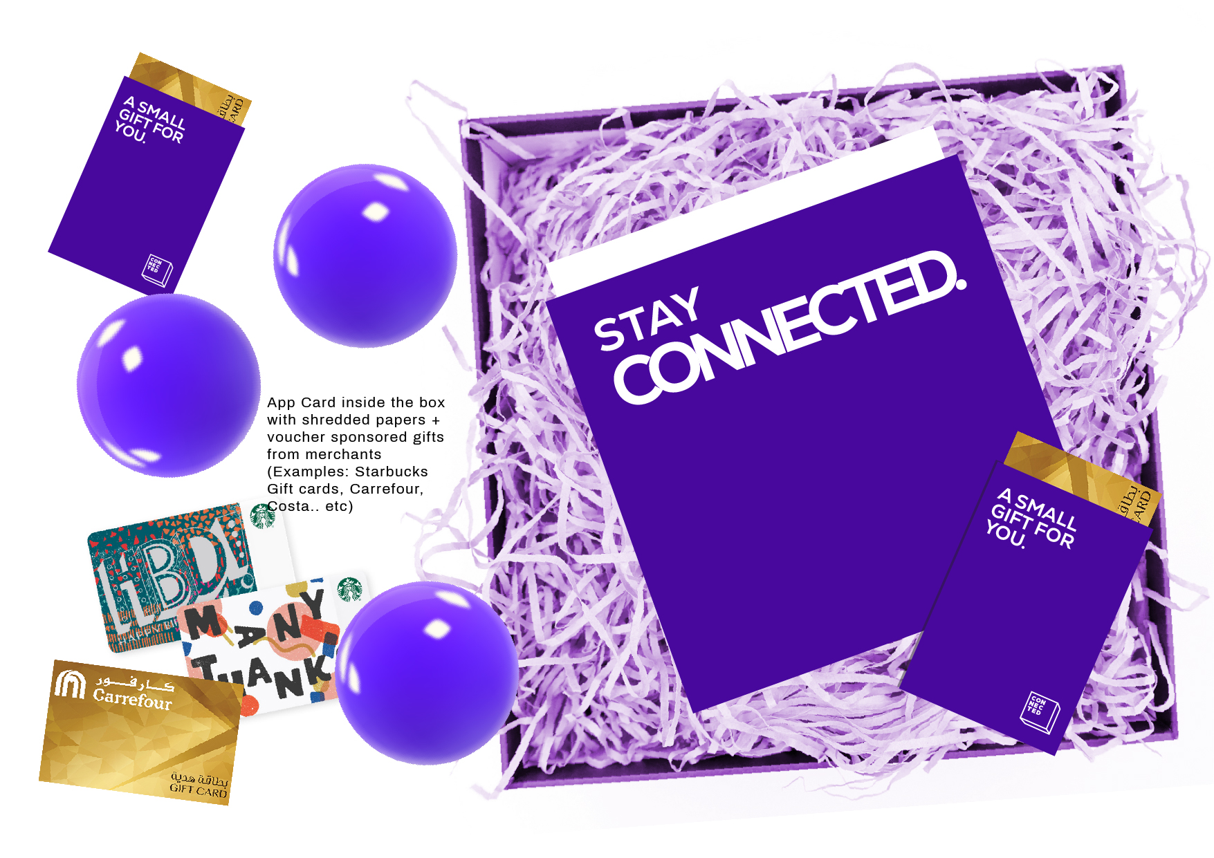
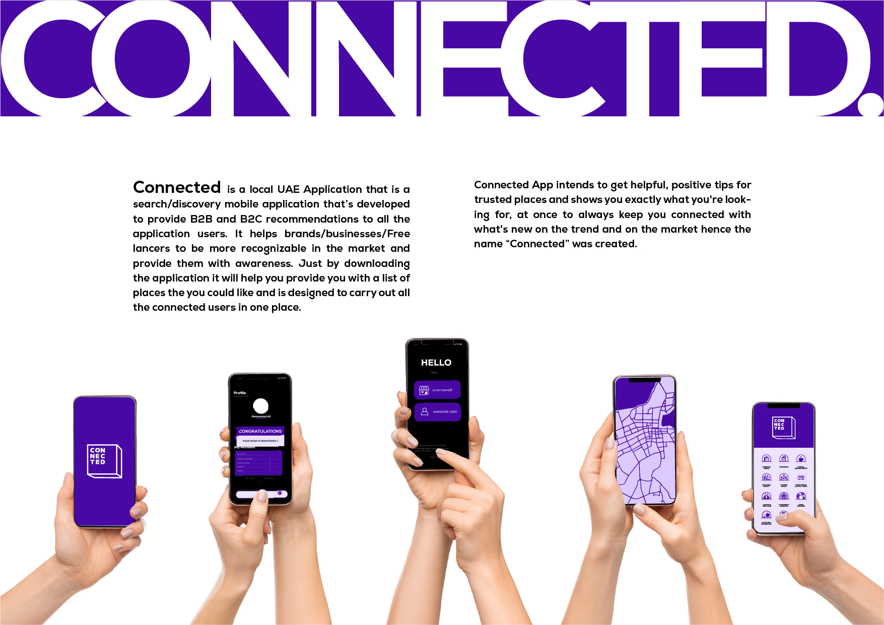
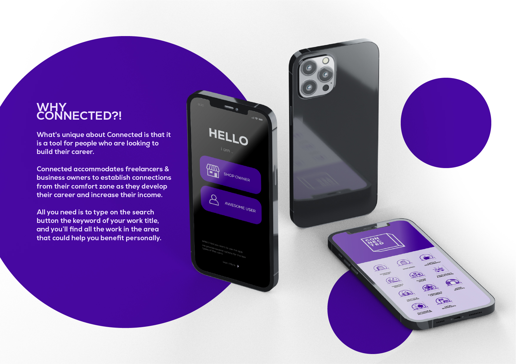
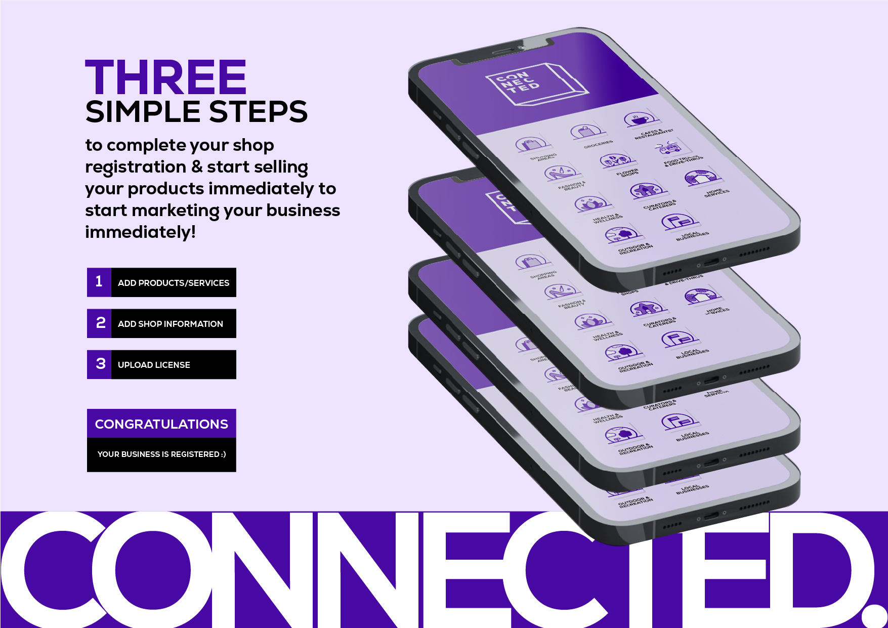
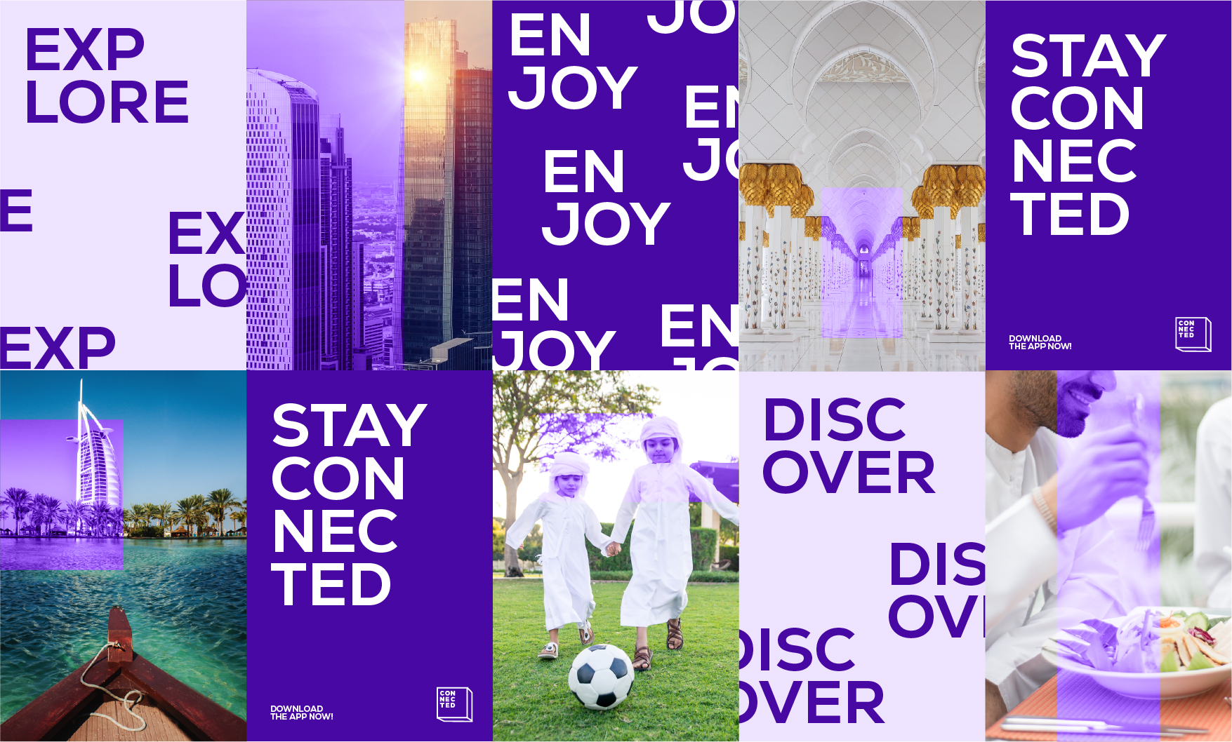
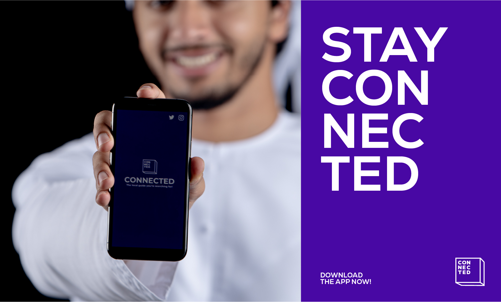
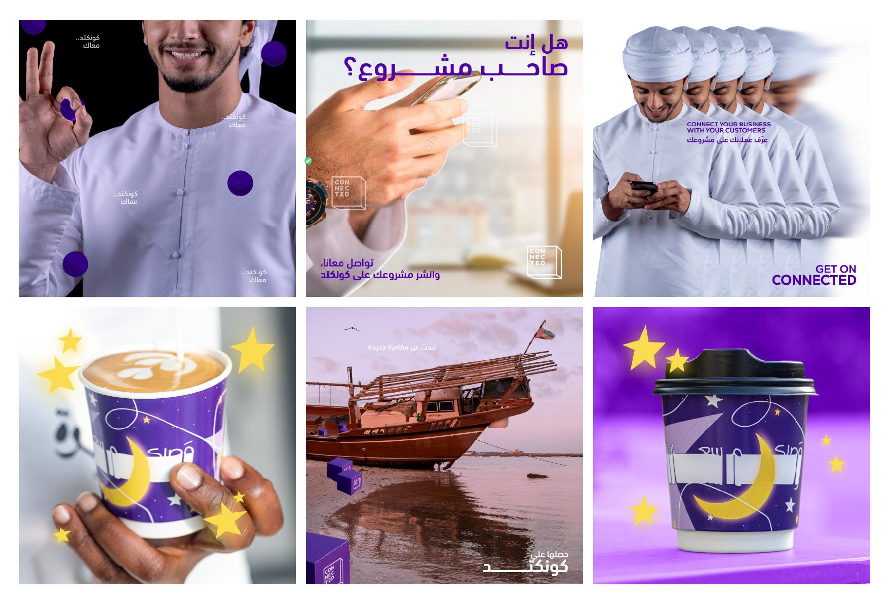
Connected’s rebrand gives the tech platform a bolder, more ownable visual language. The identity is built around a dimensional frame logo and a vivid purple palette that feels digital without becoming overly technical. A custom icon system brings consistency across categories, services, and app touchpoints. The campaign language keeps things direct and playful, turning everyday phone use into simple, memorable ideas. Connected feels sharper, more approachable, and easier to recognise wherever the brand shows up.
.gif)