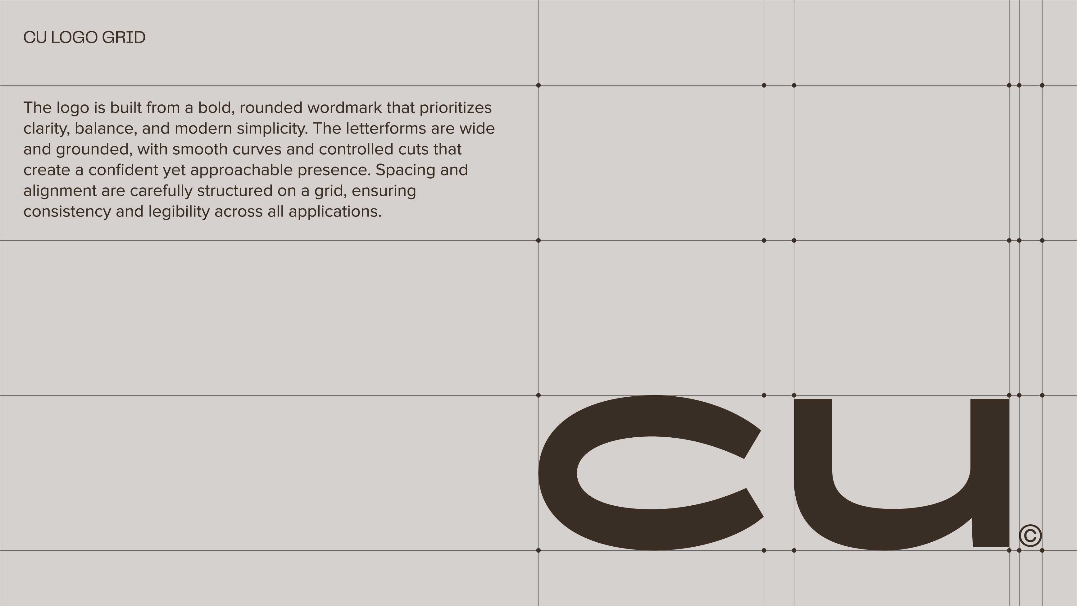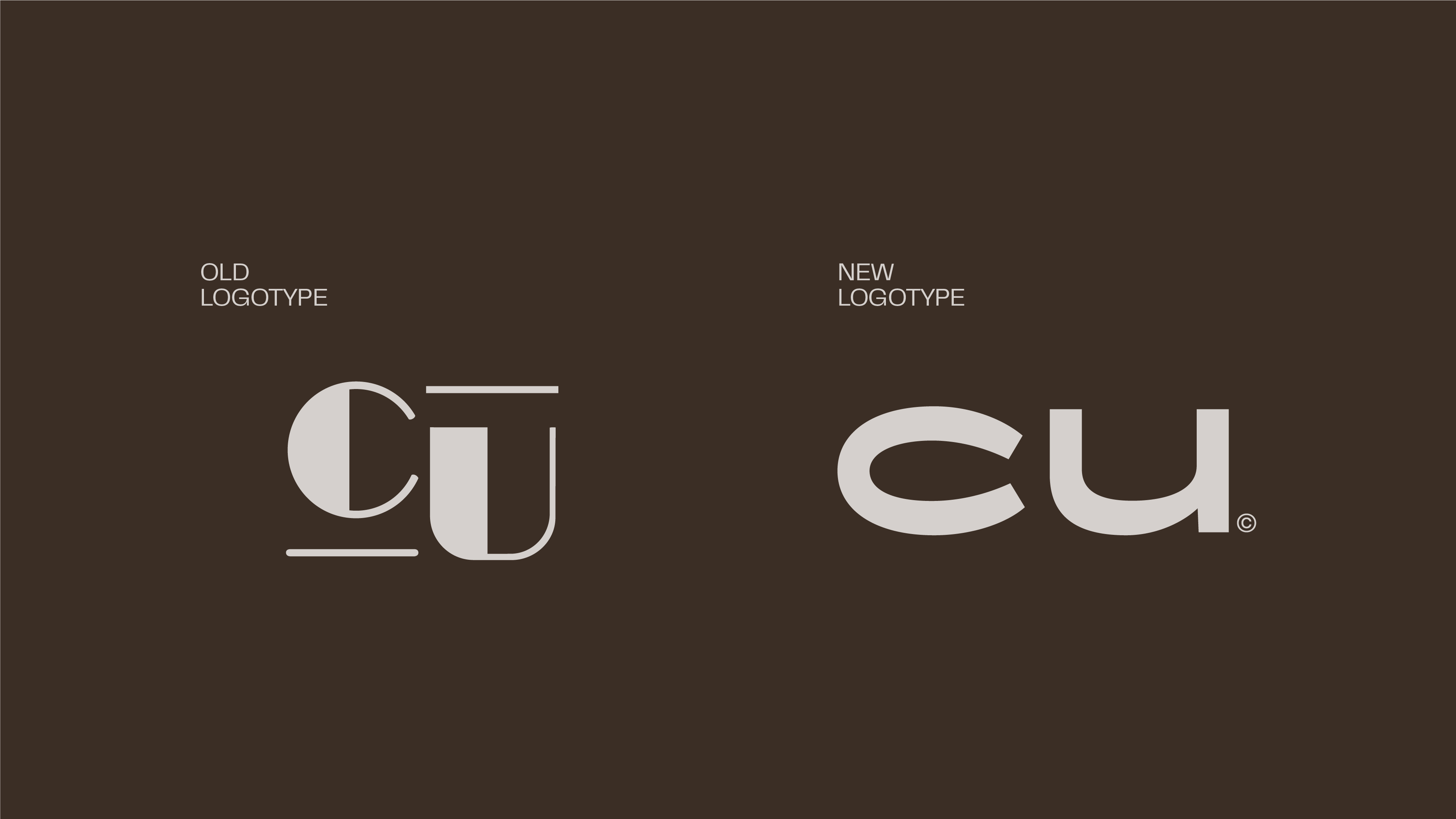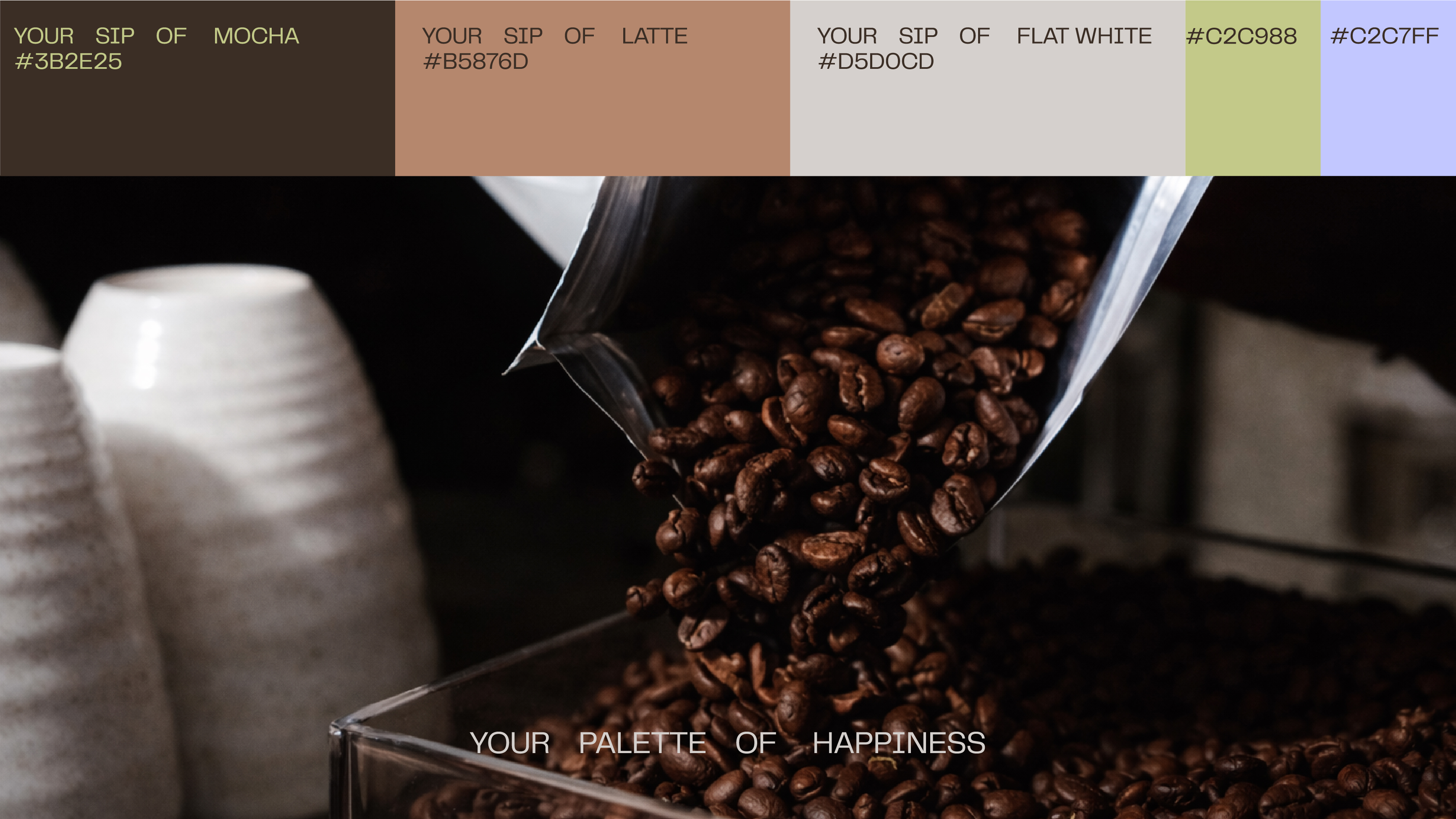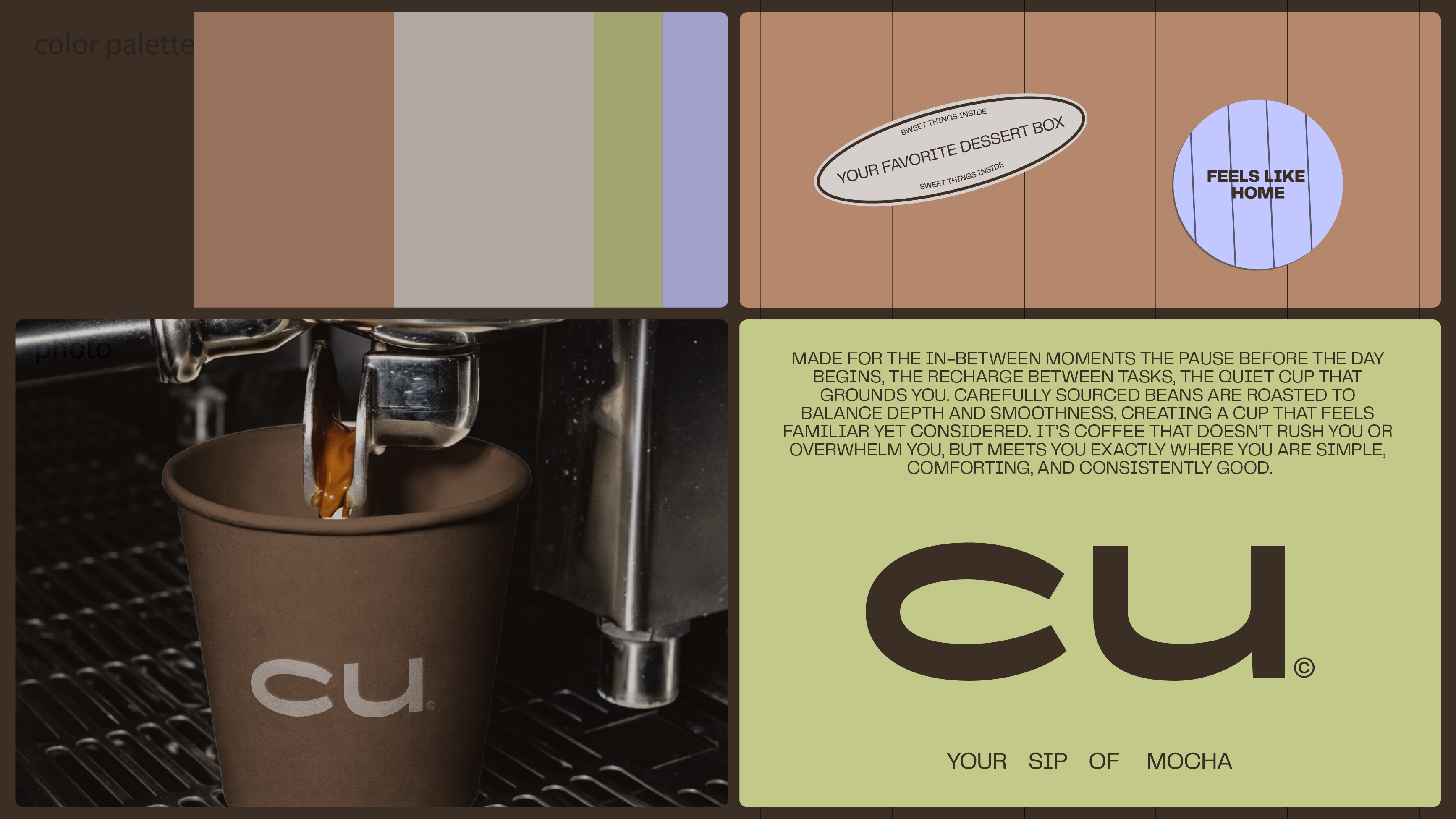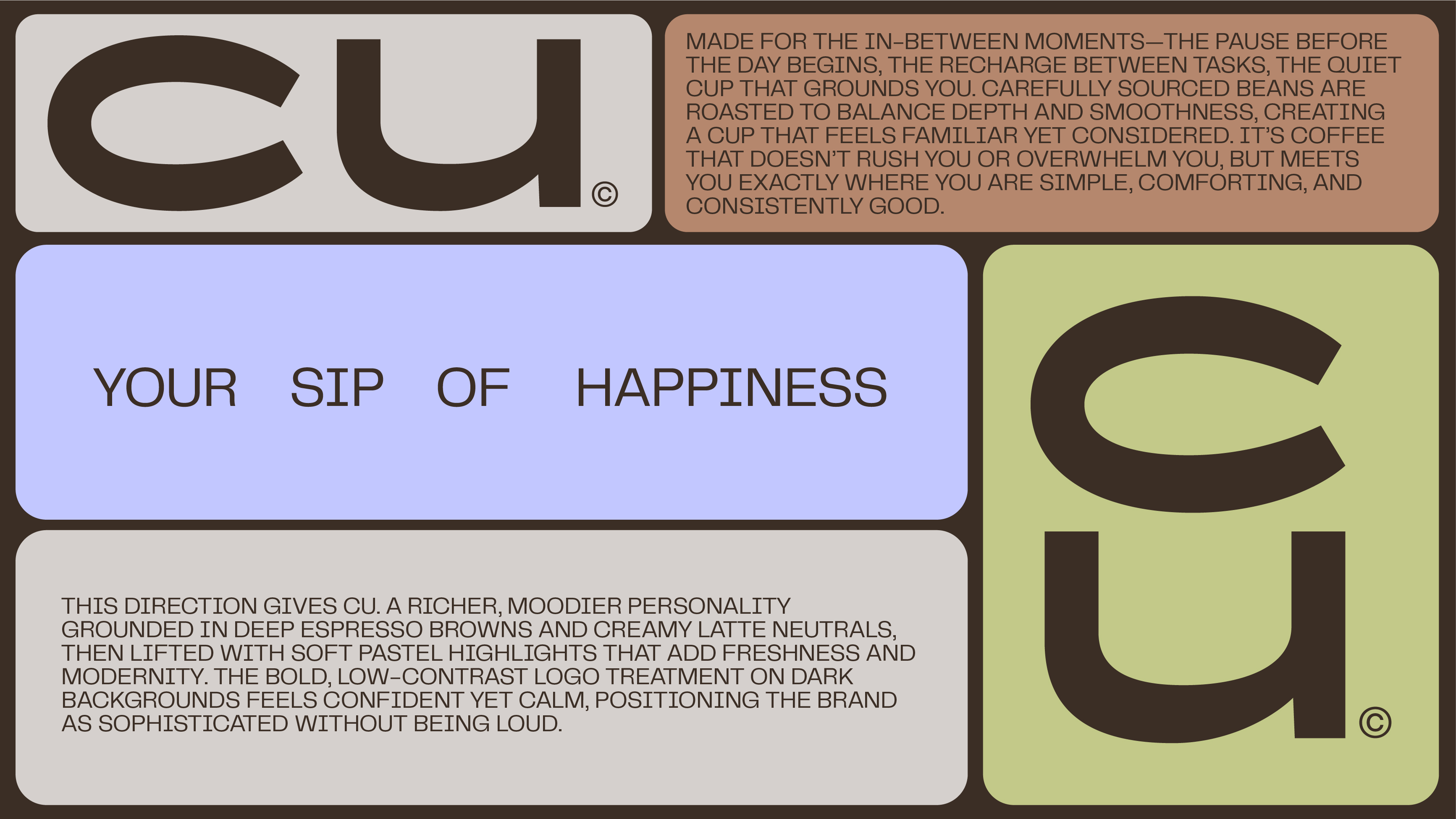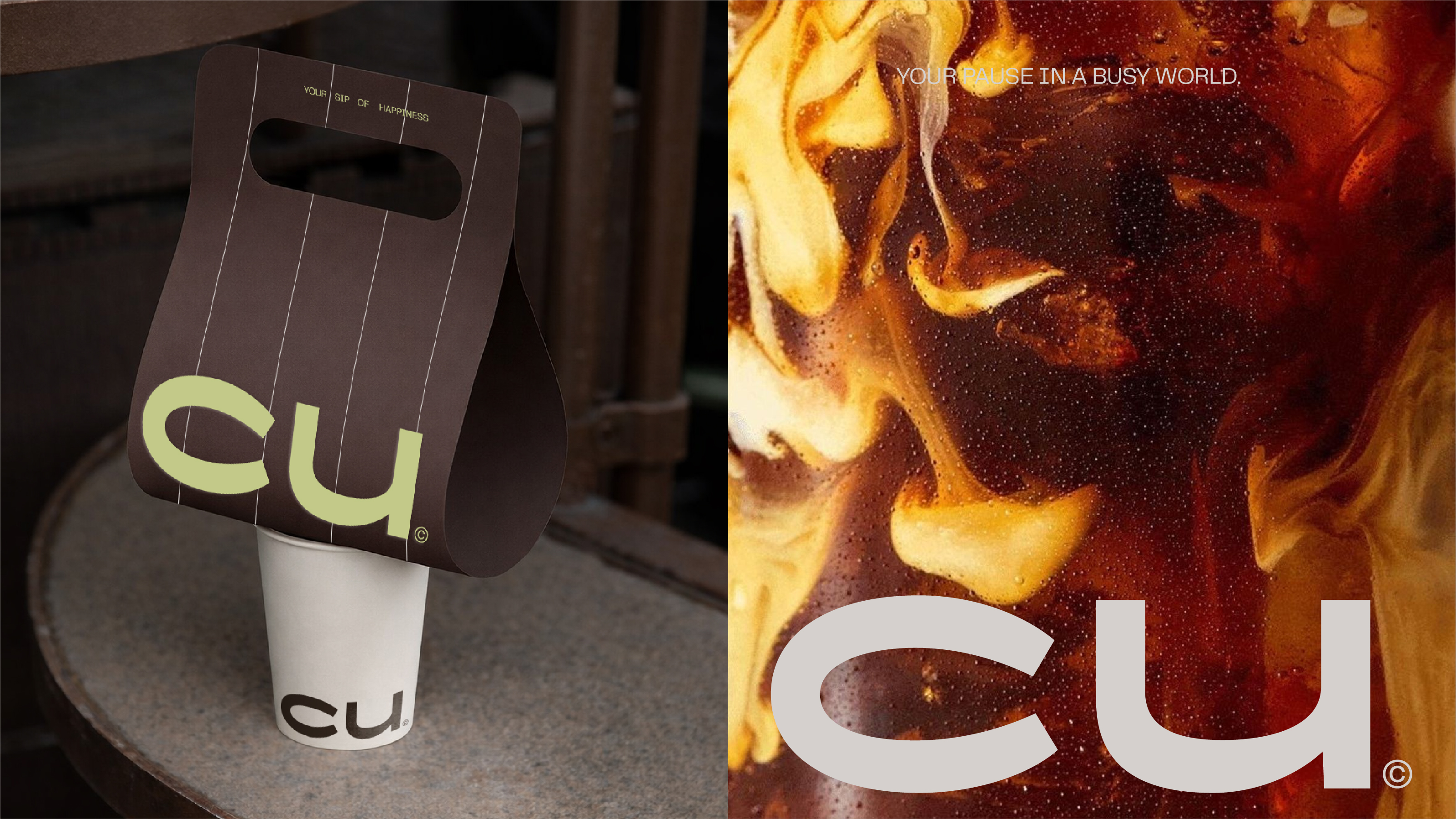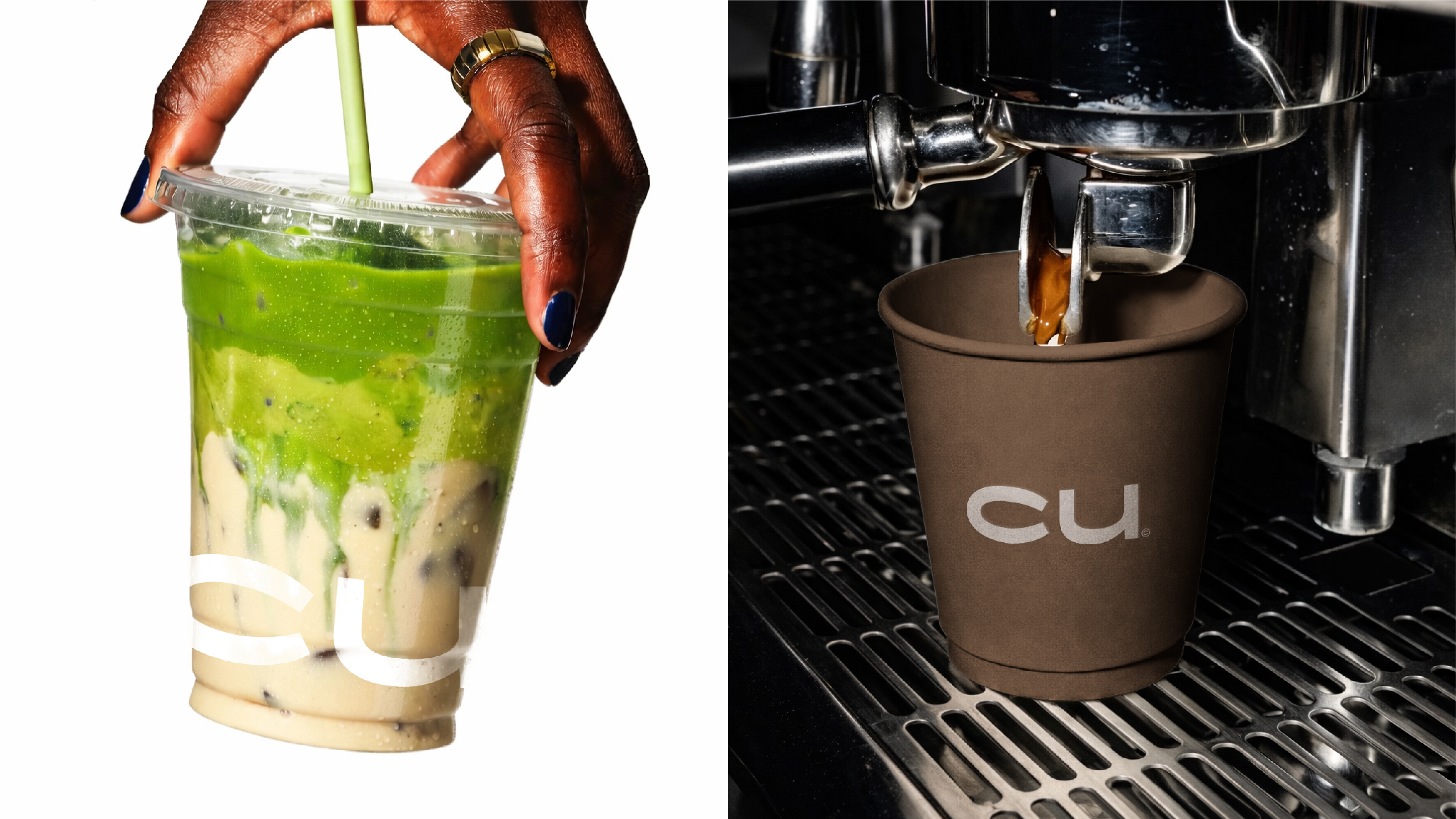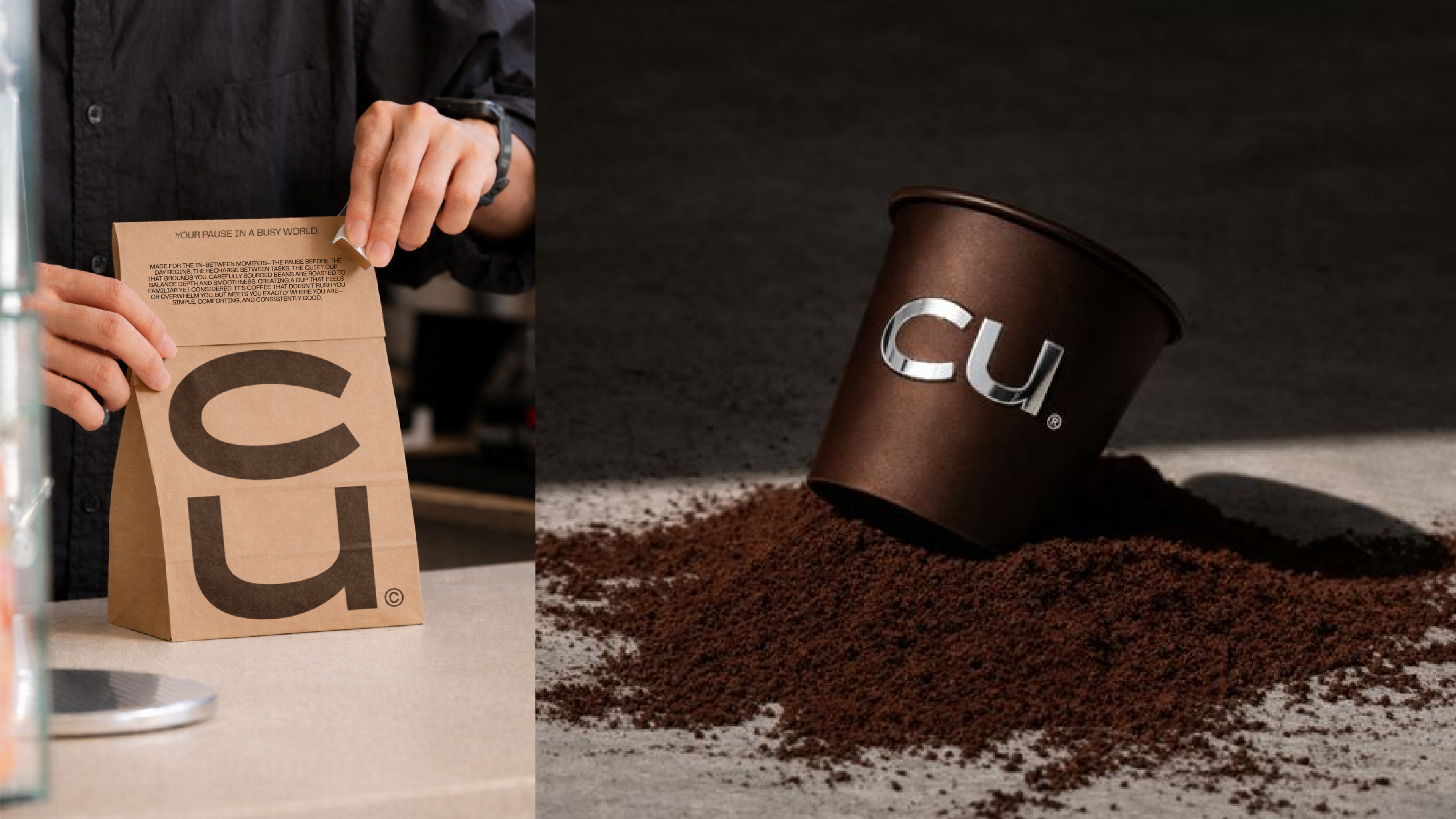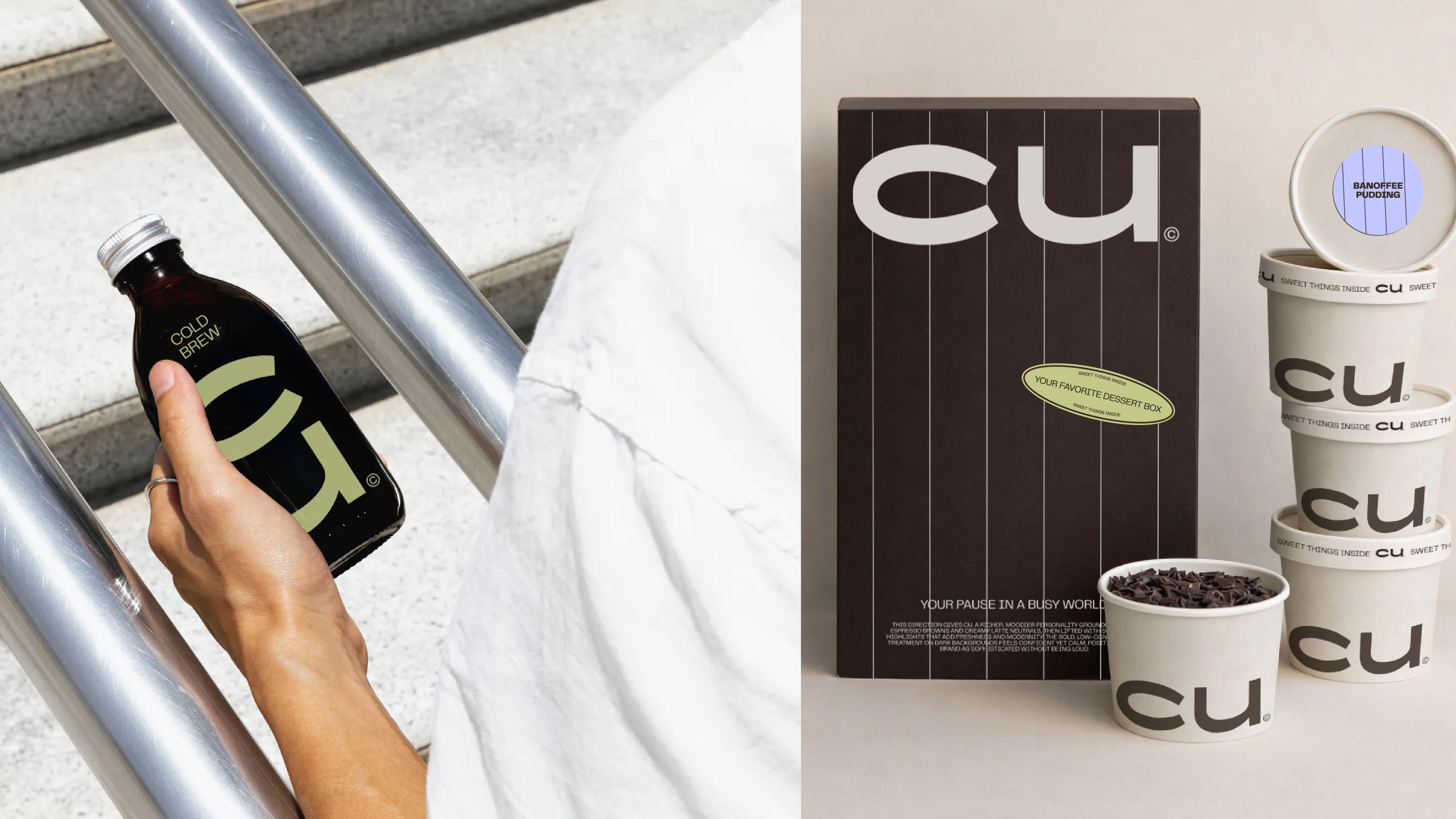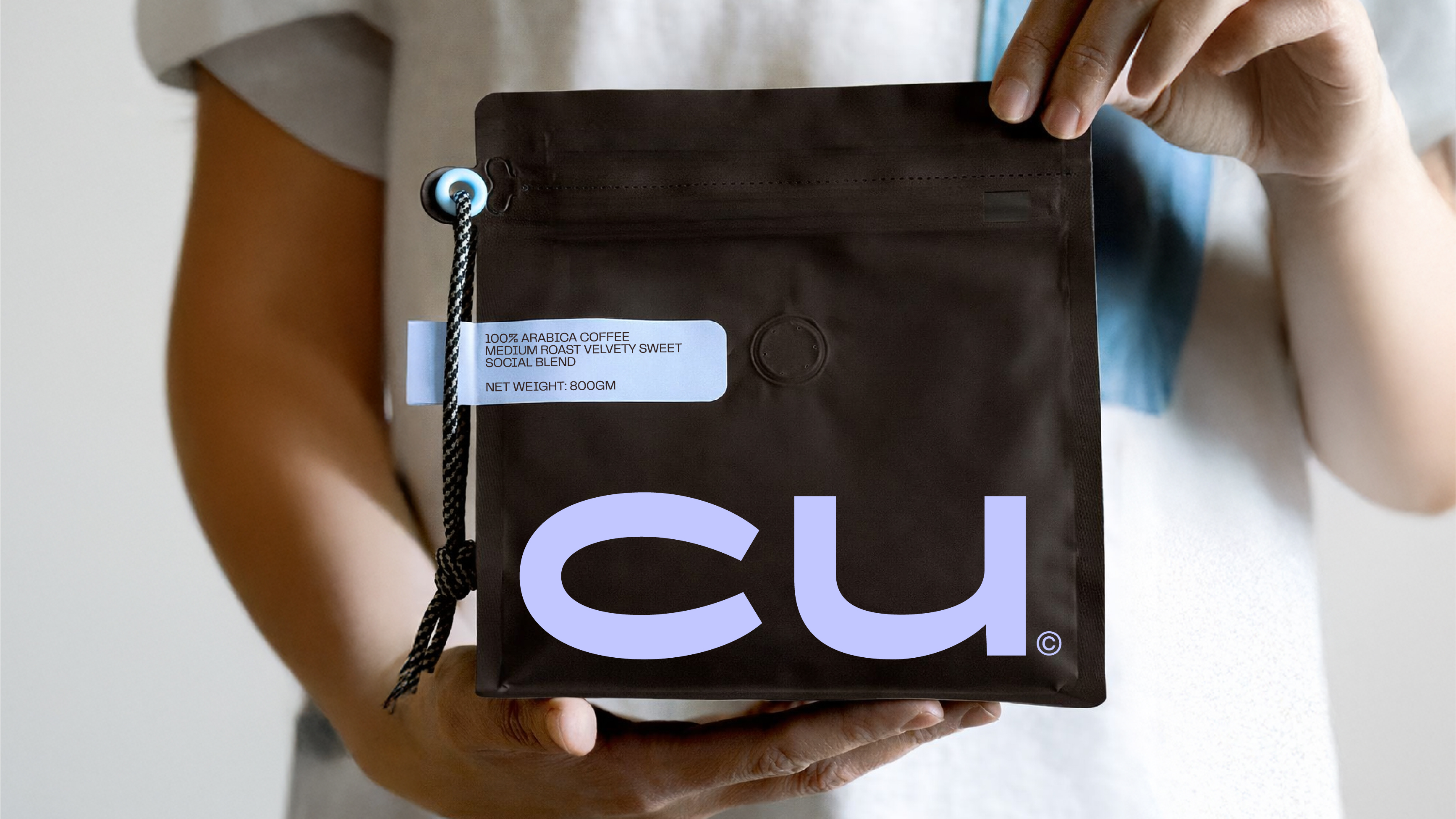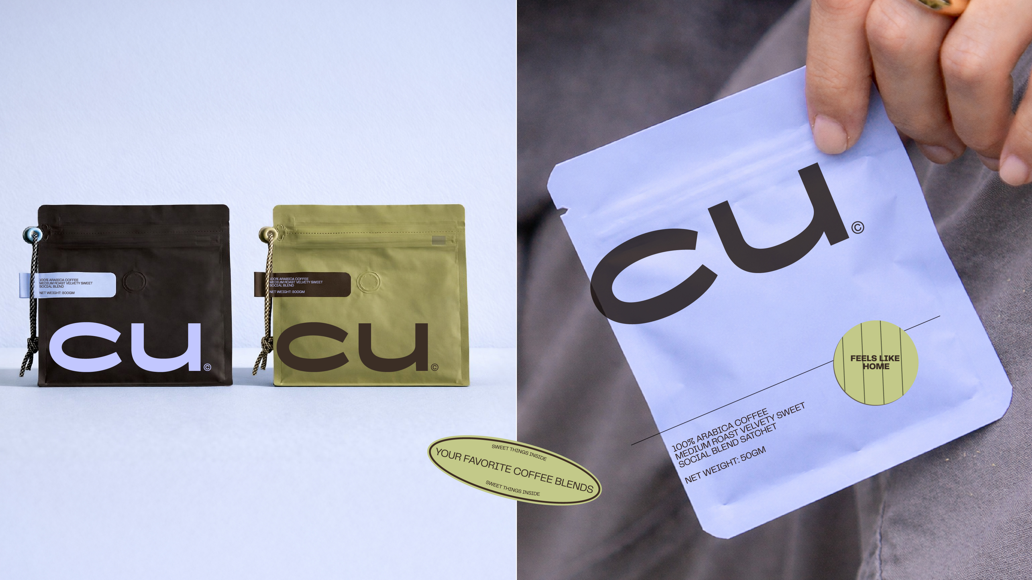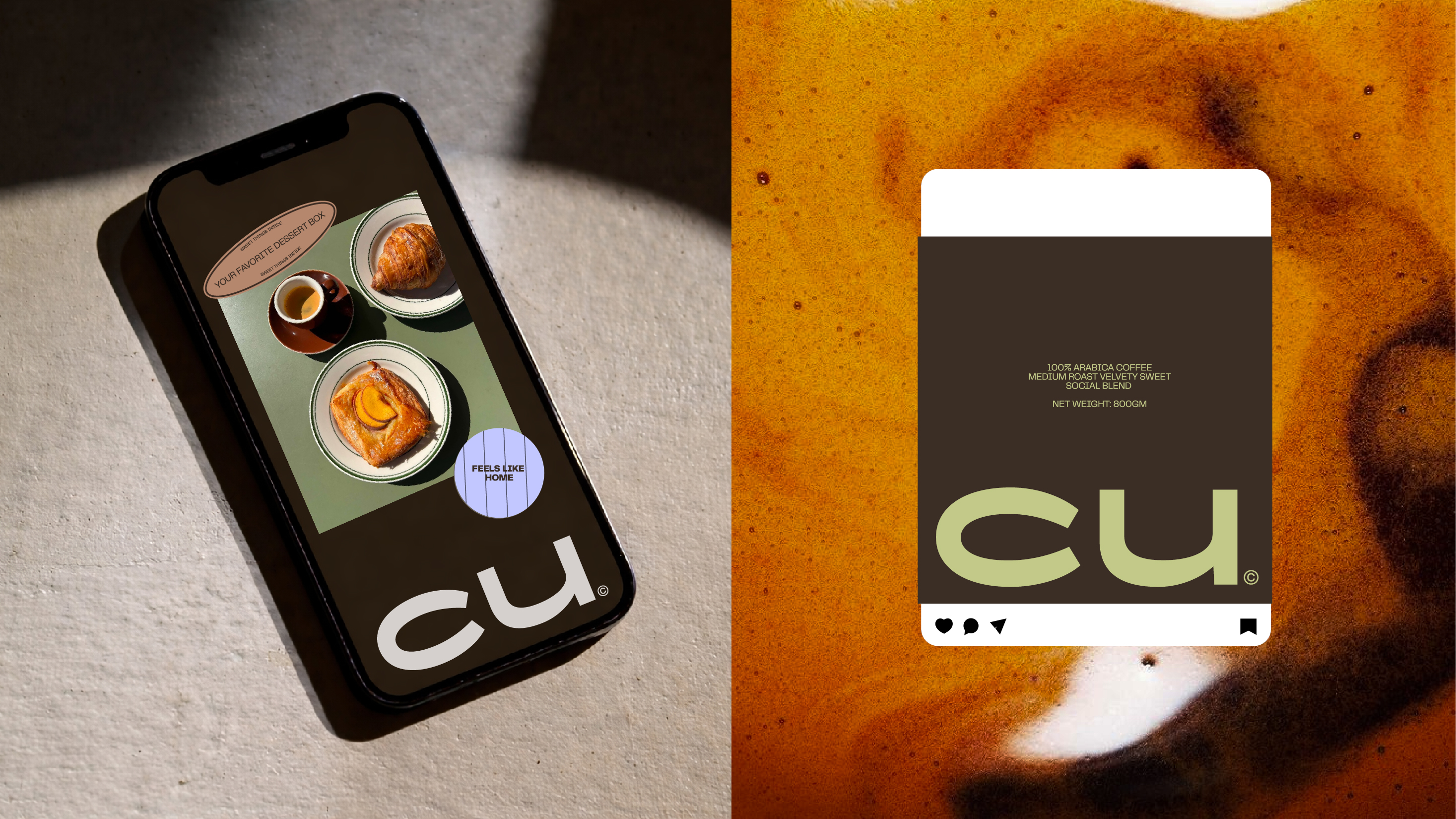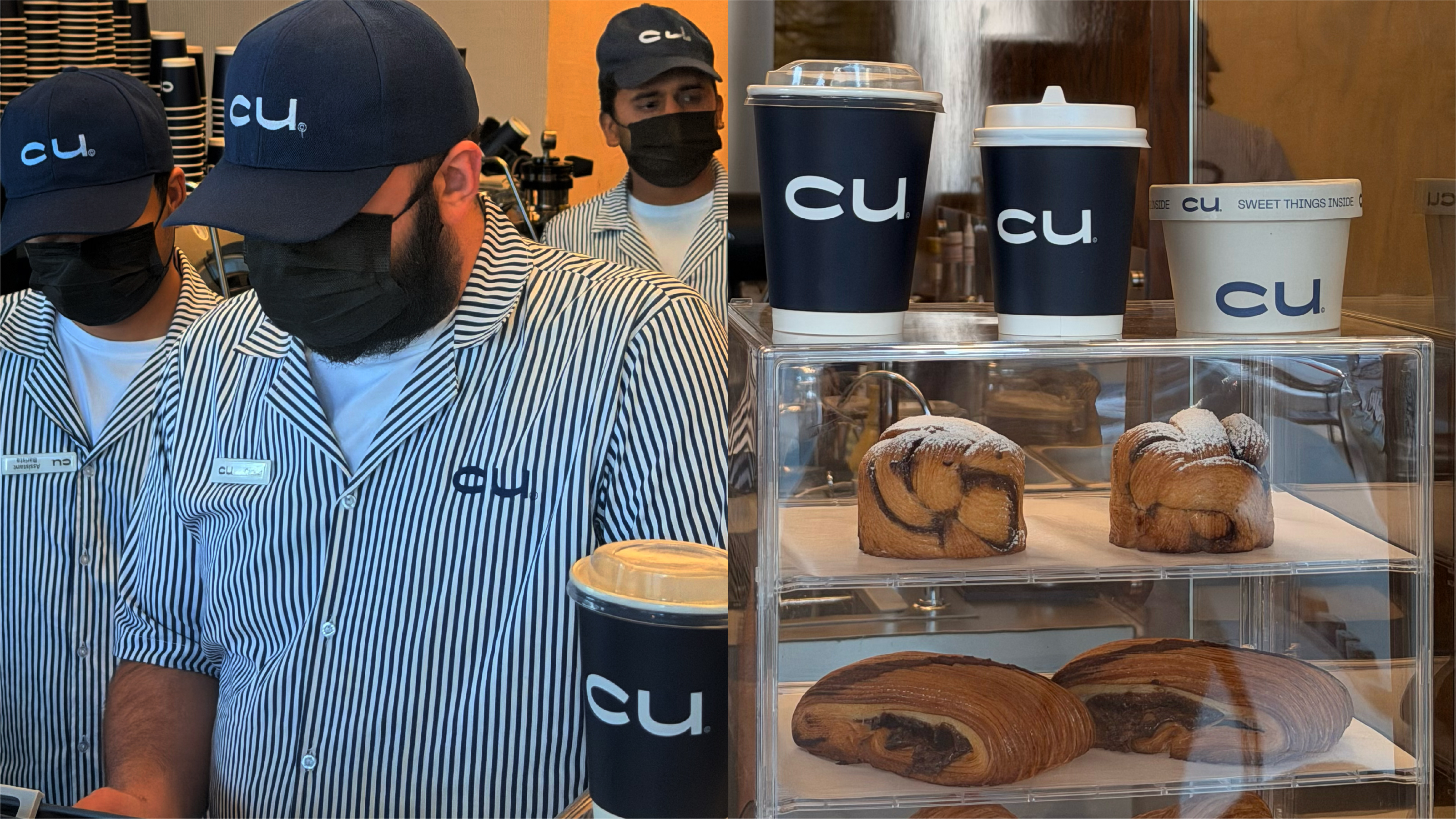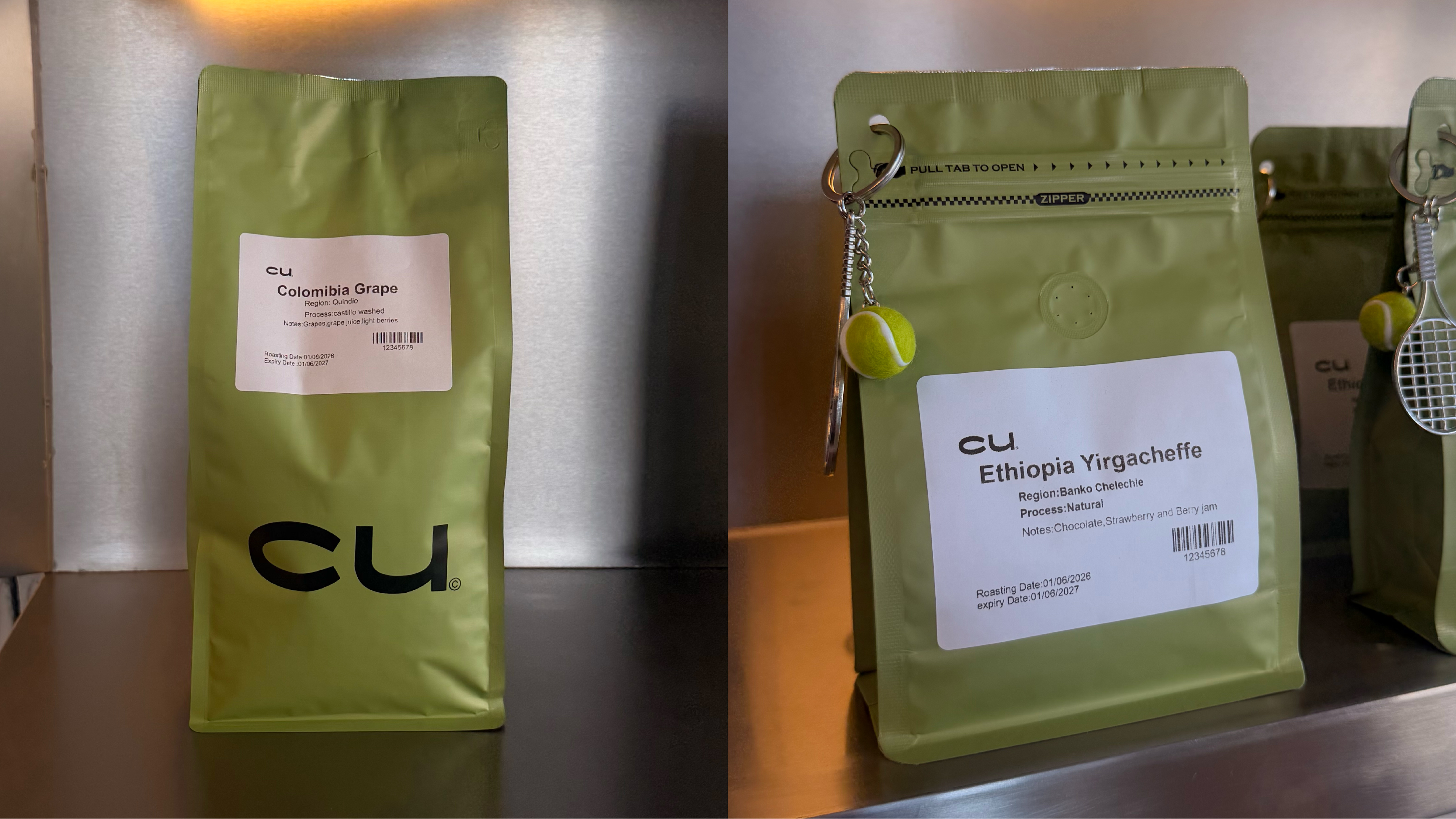
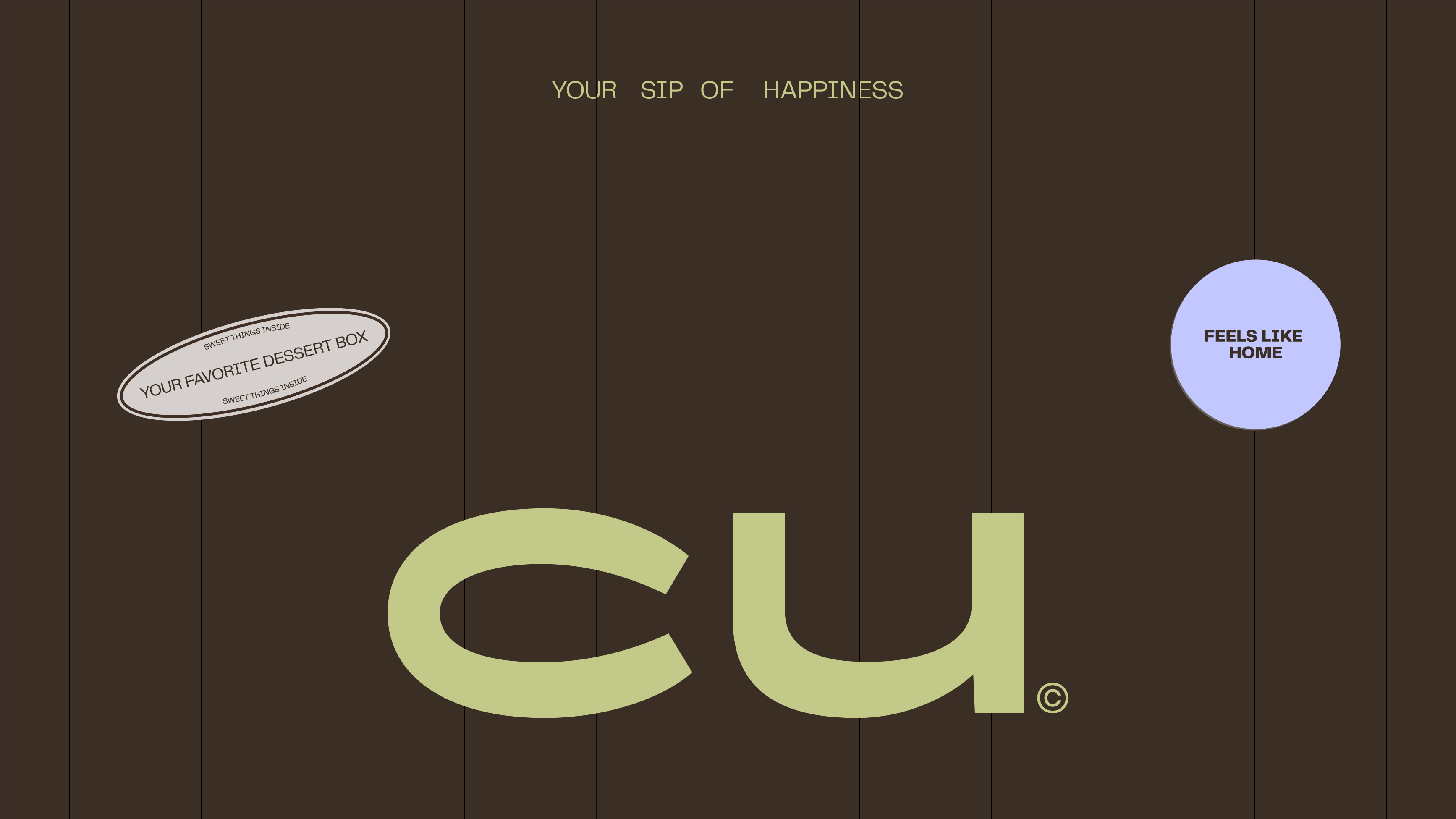
CU’s rebrand gives the coffee brand a bolder, more recognisable presence. The identity centres on a compact wordmark with a playful, confident character. Deep brown grounds the brand, while sharp lime accents bring energy and contrast. The visual system extends naturally across packaging, signage, interiors, and photography. CU now feels fresh, direct, and built for everyday coffee culture.