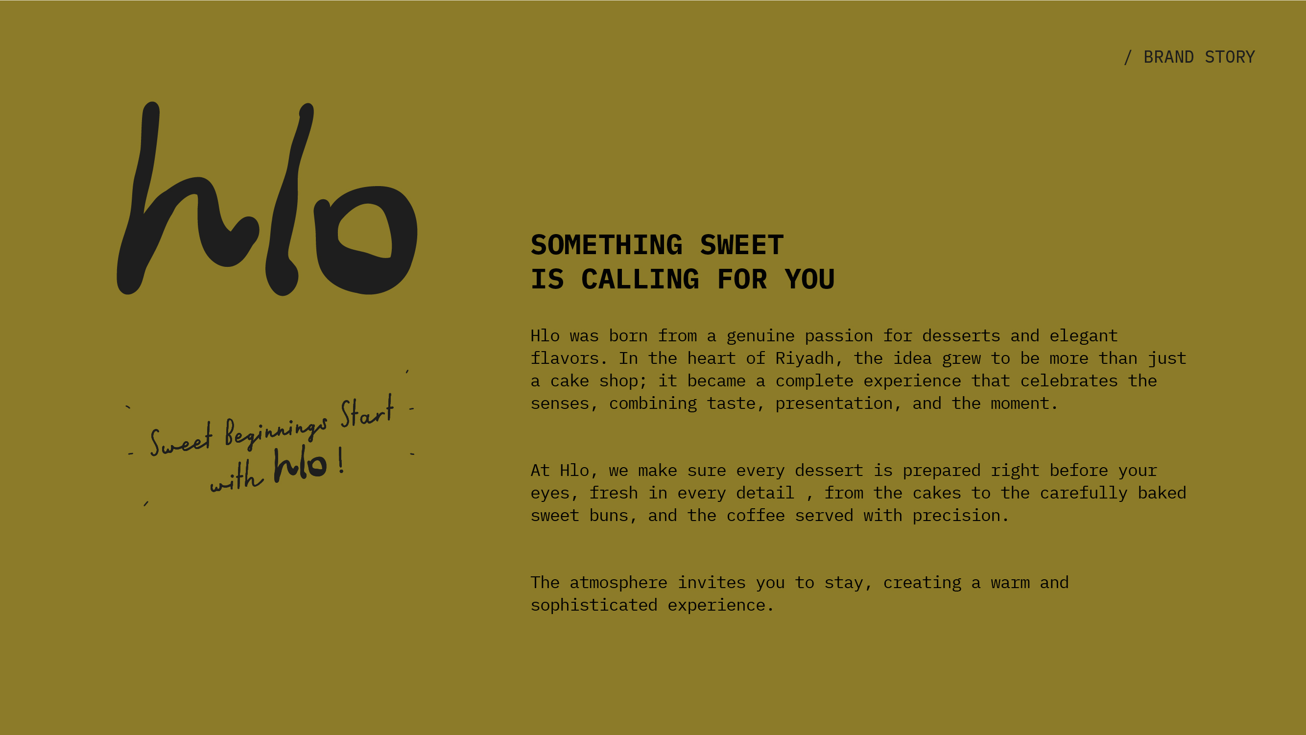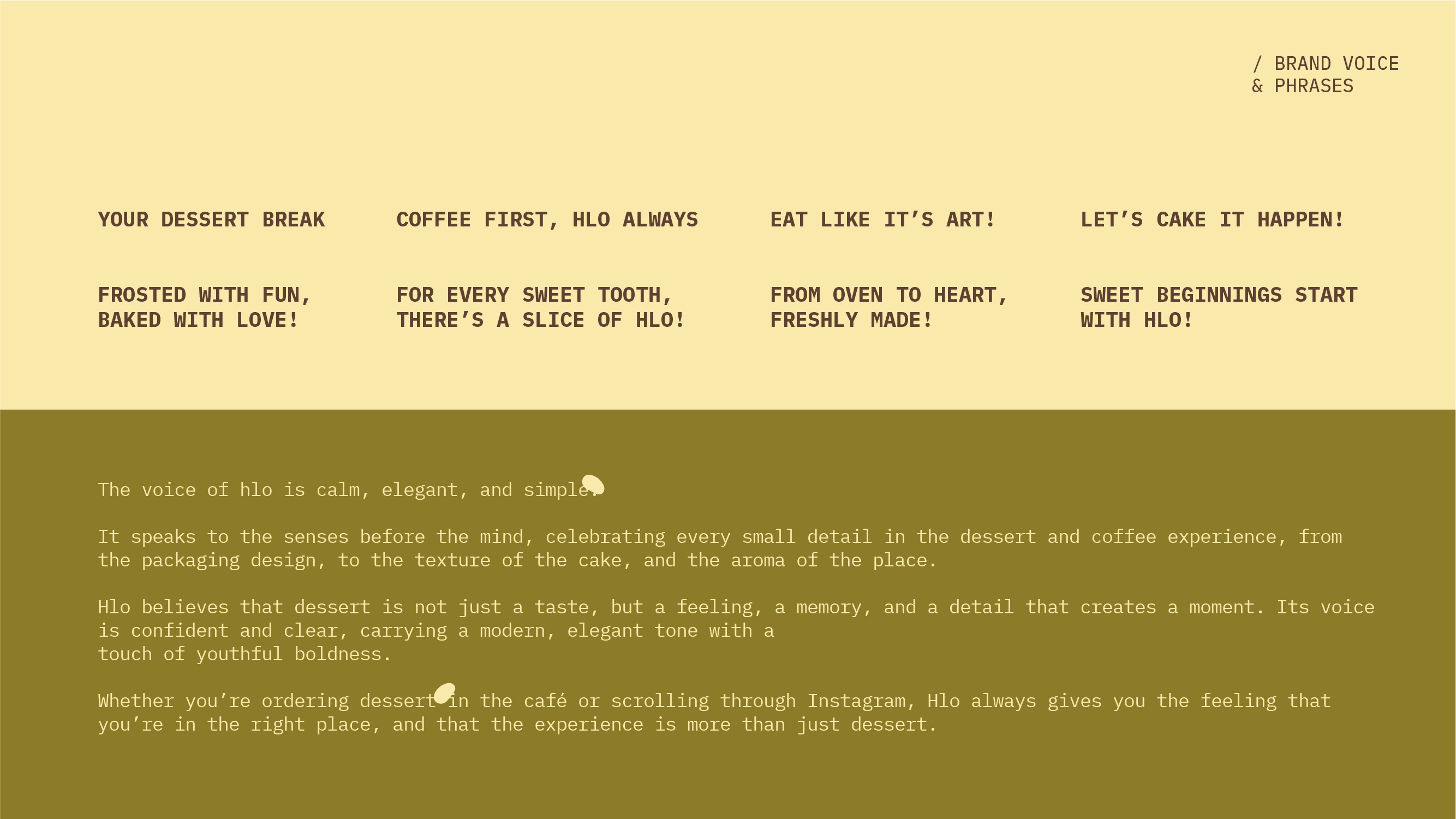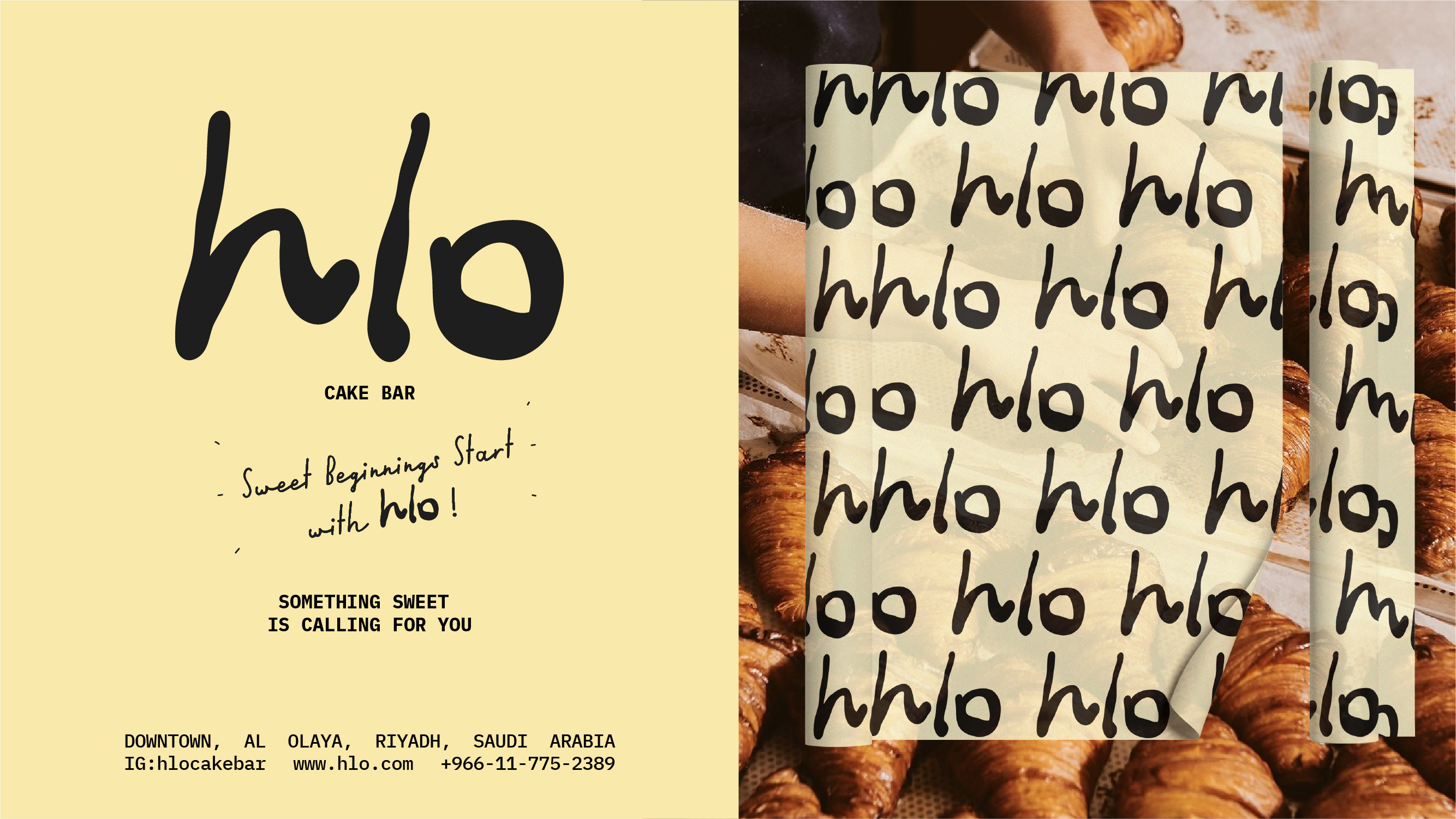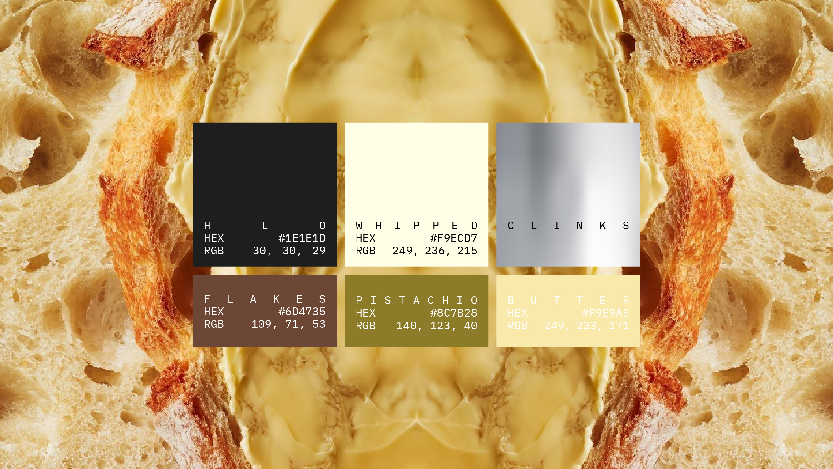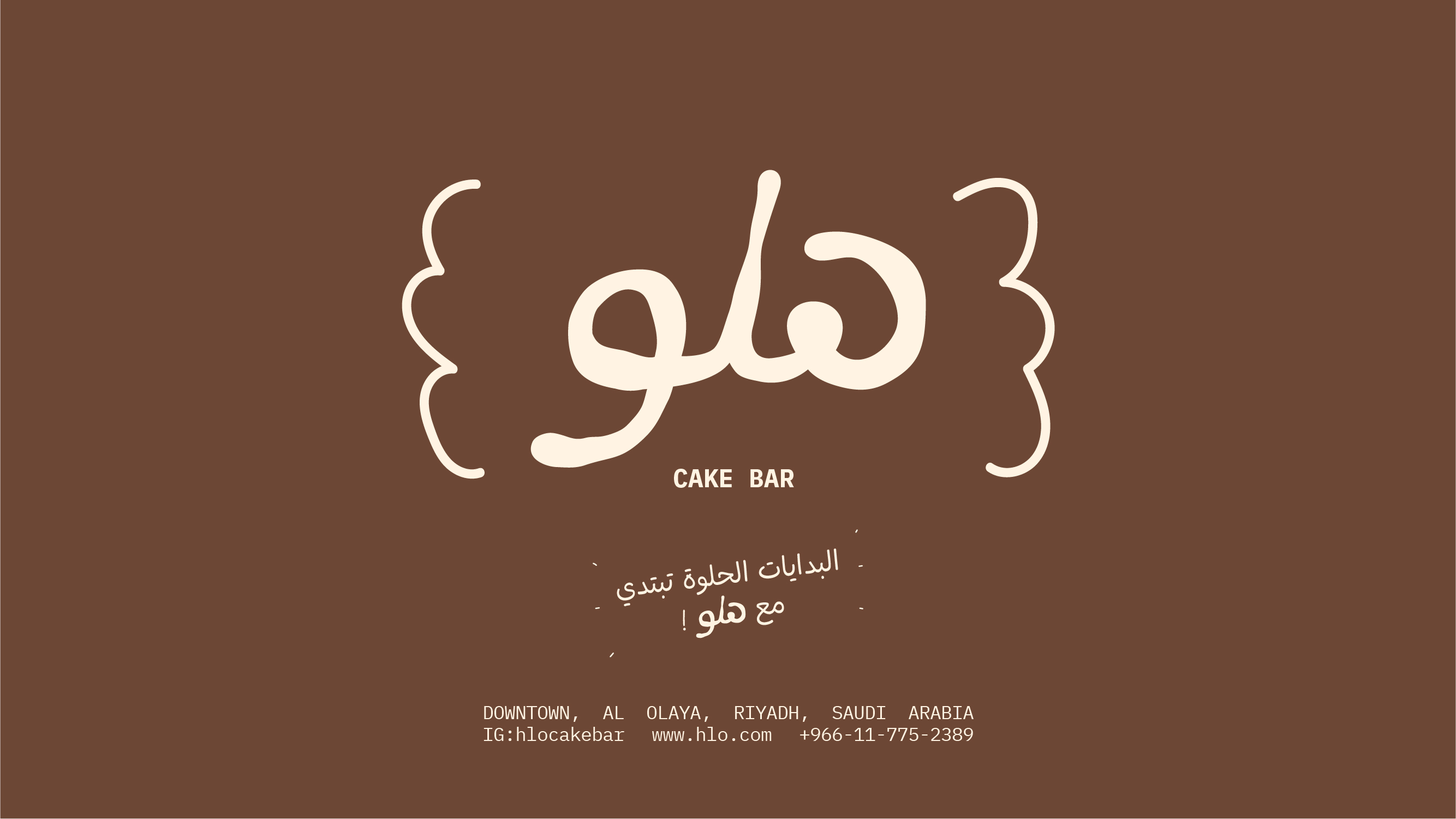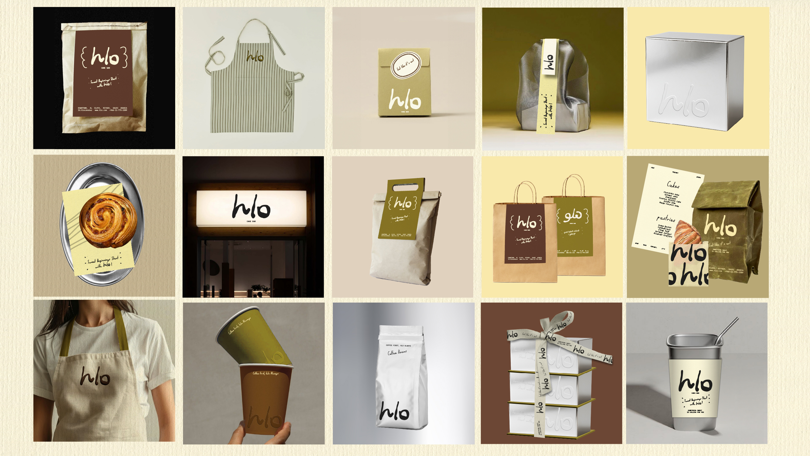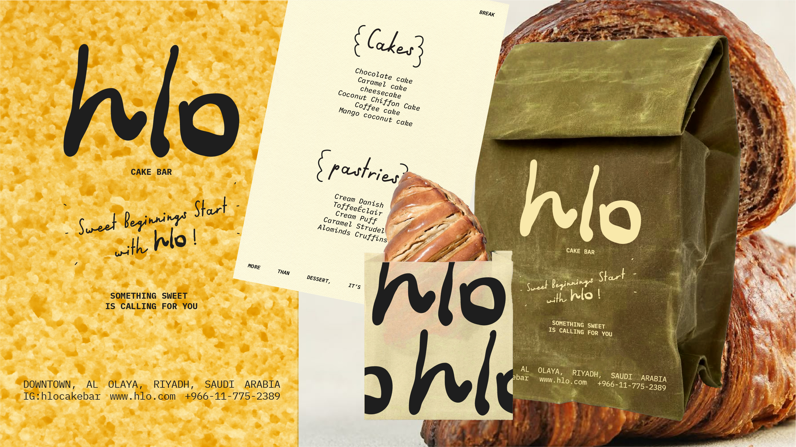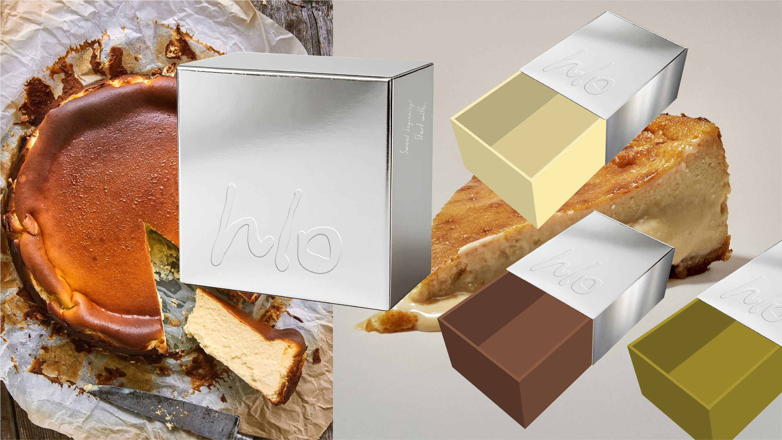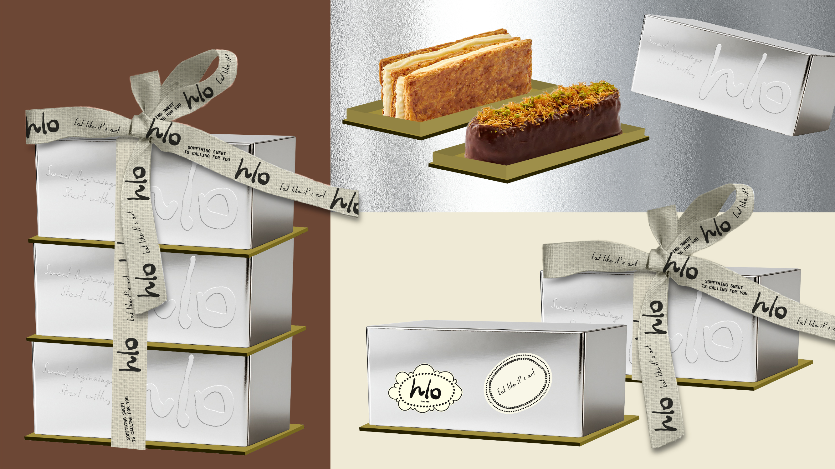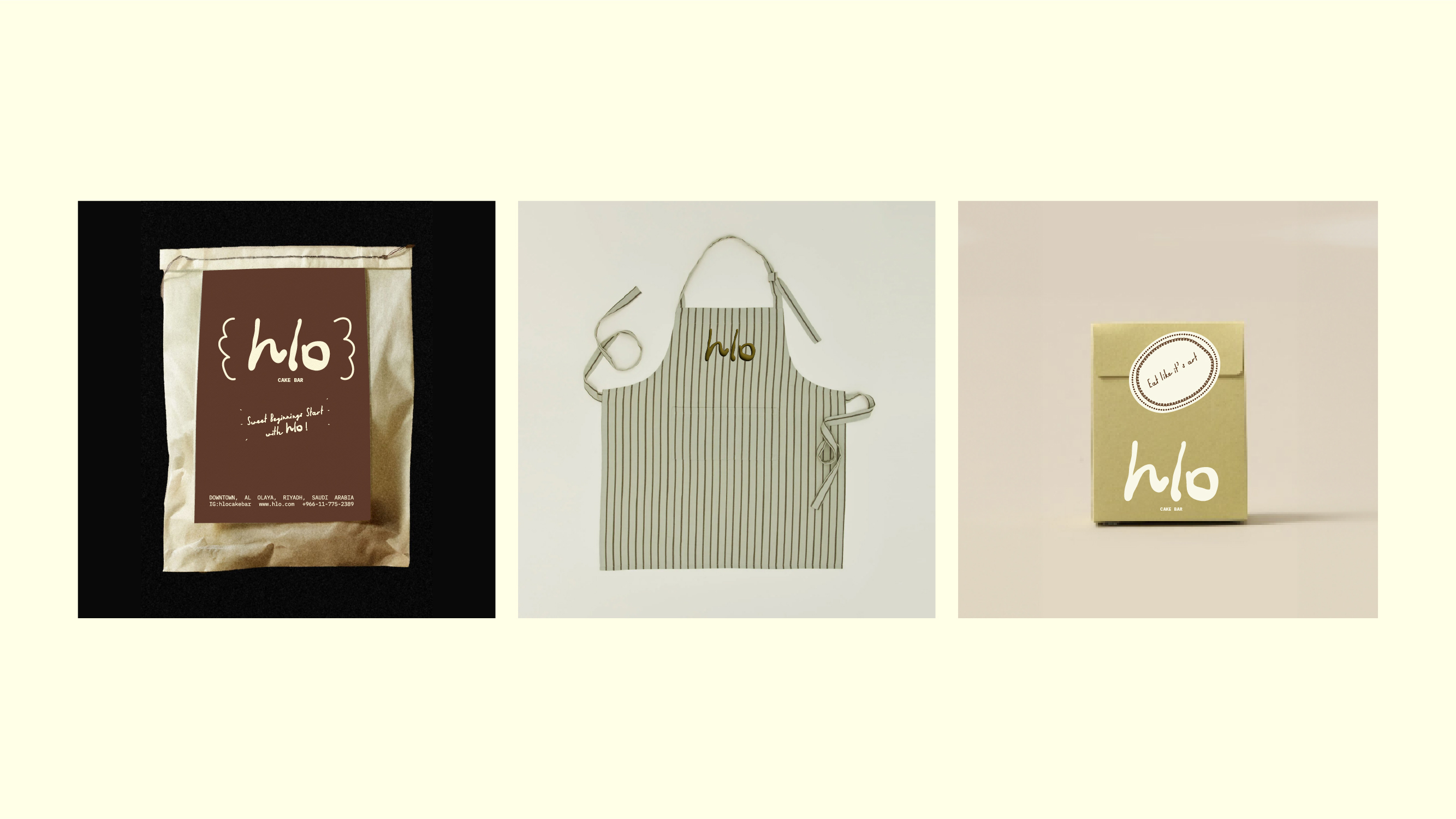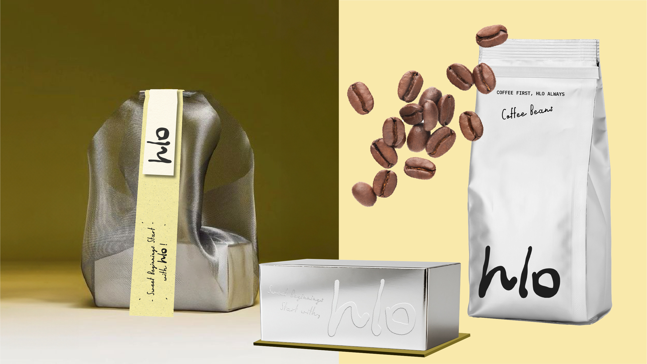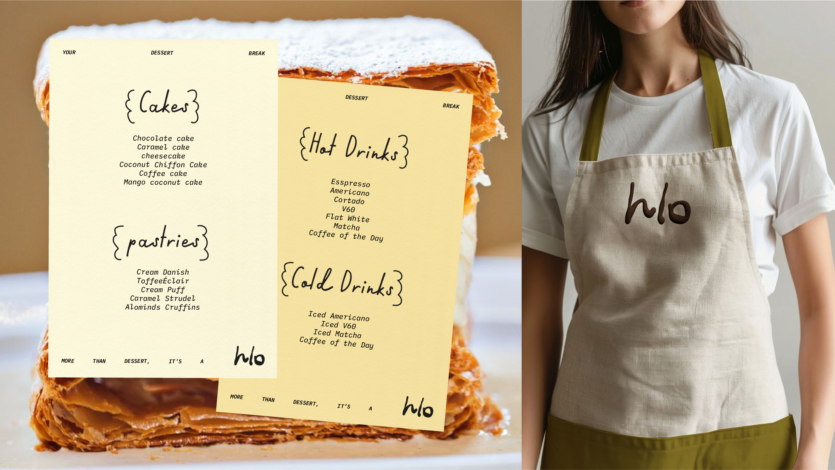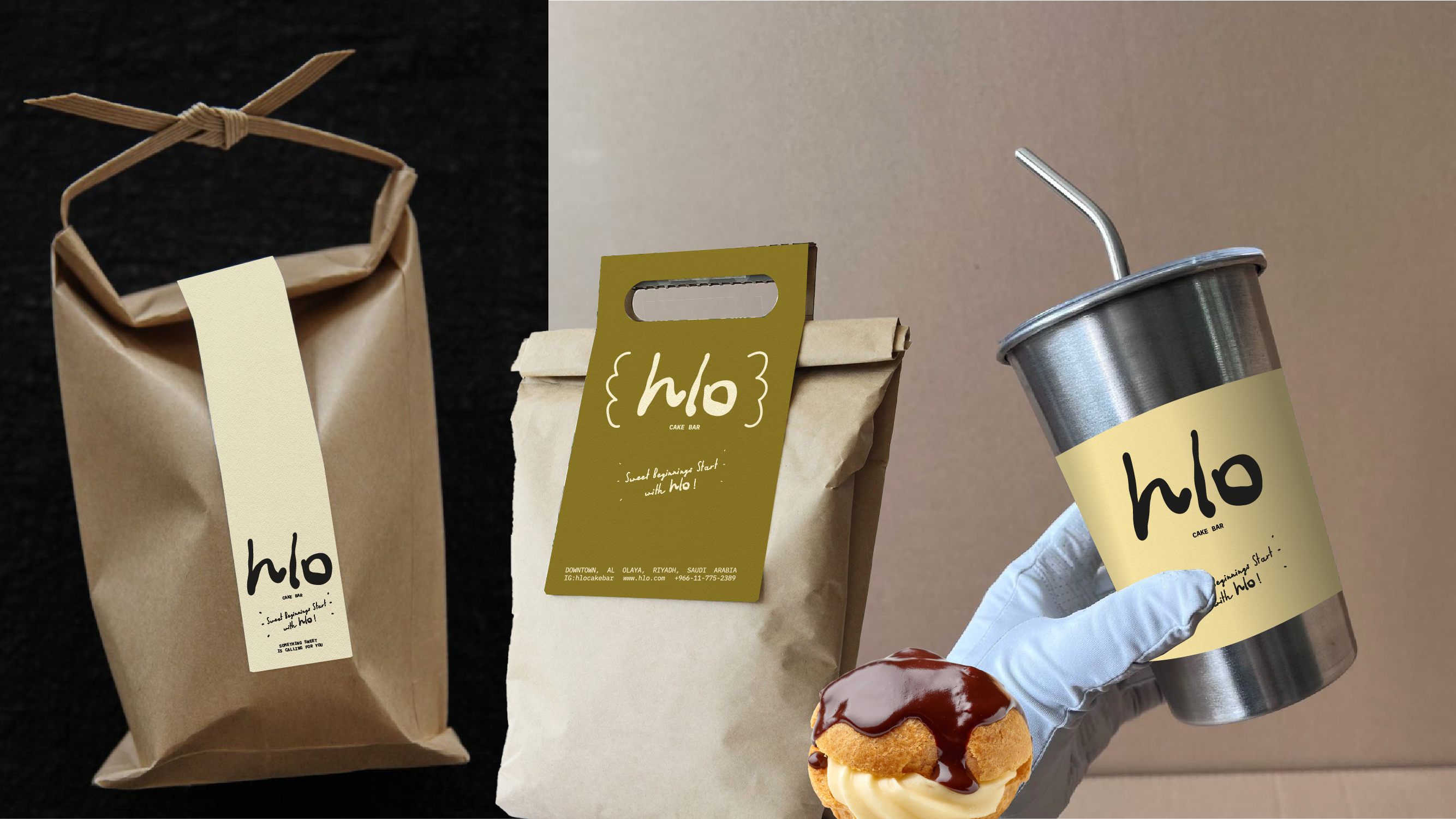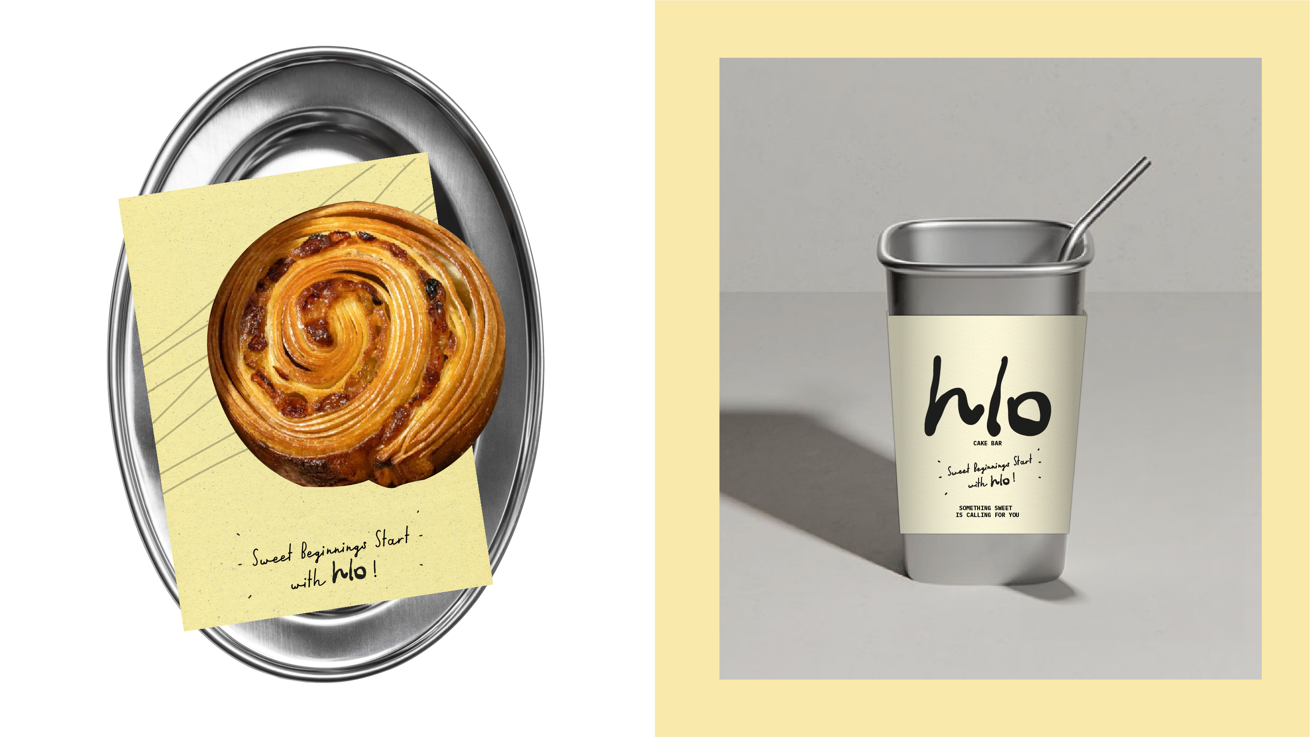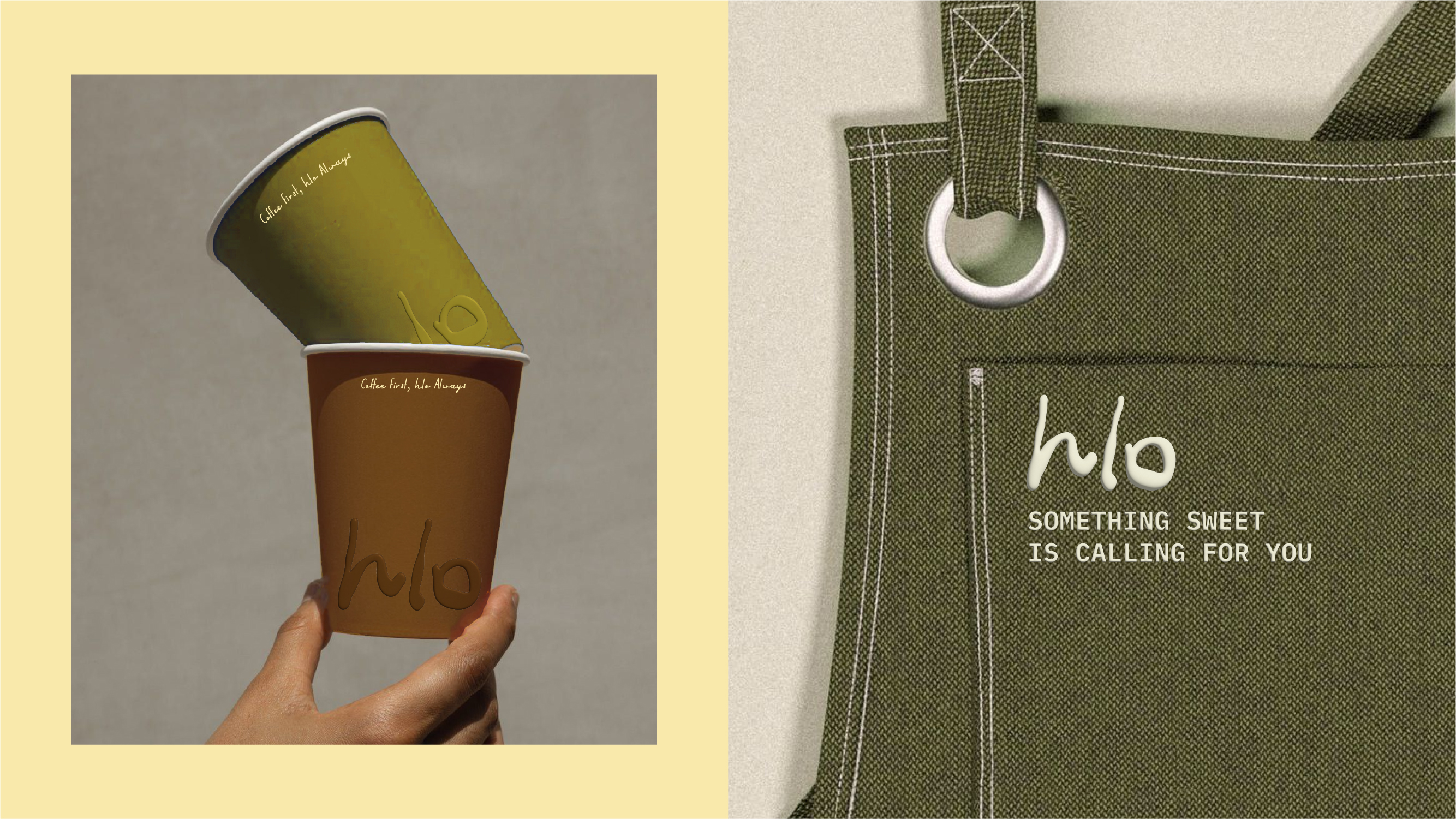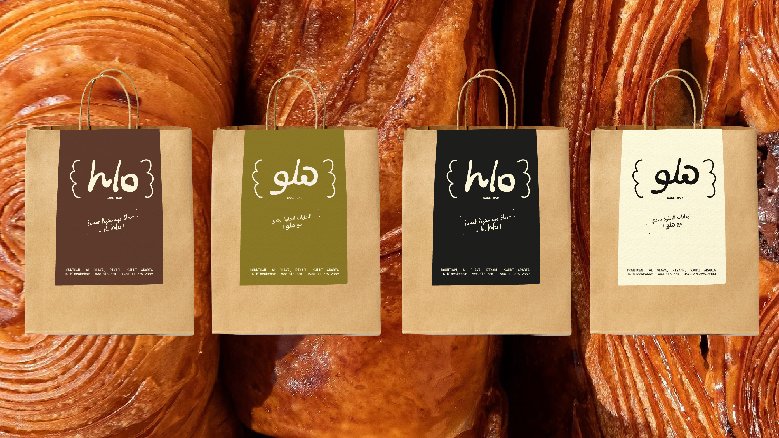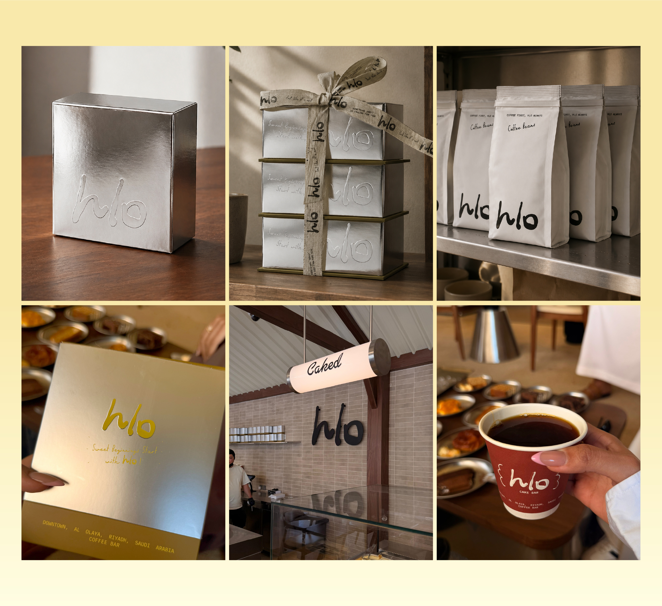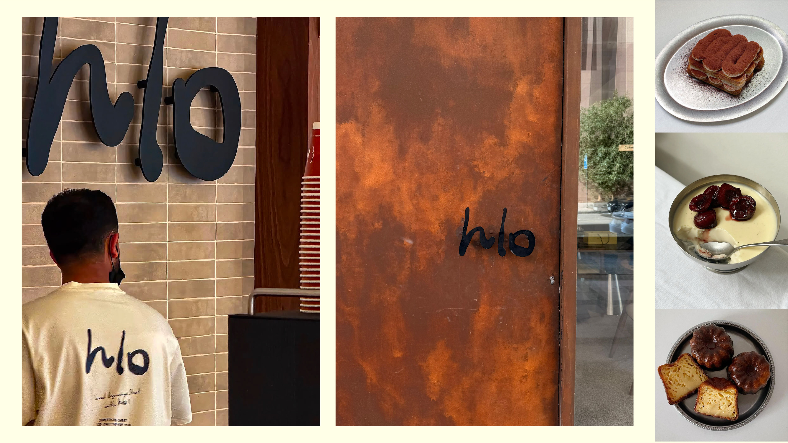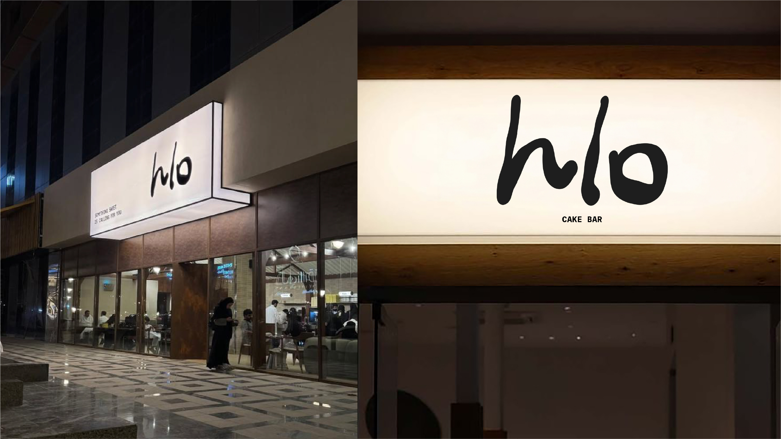
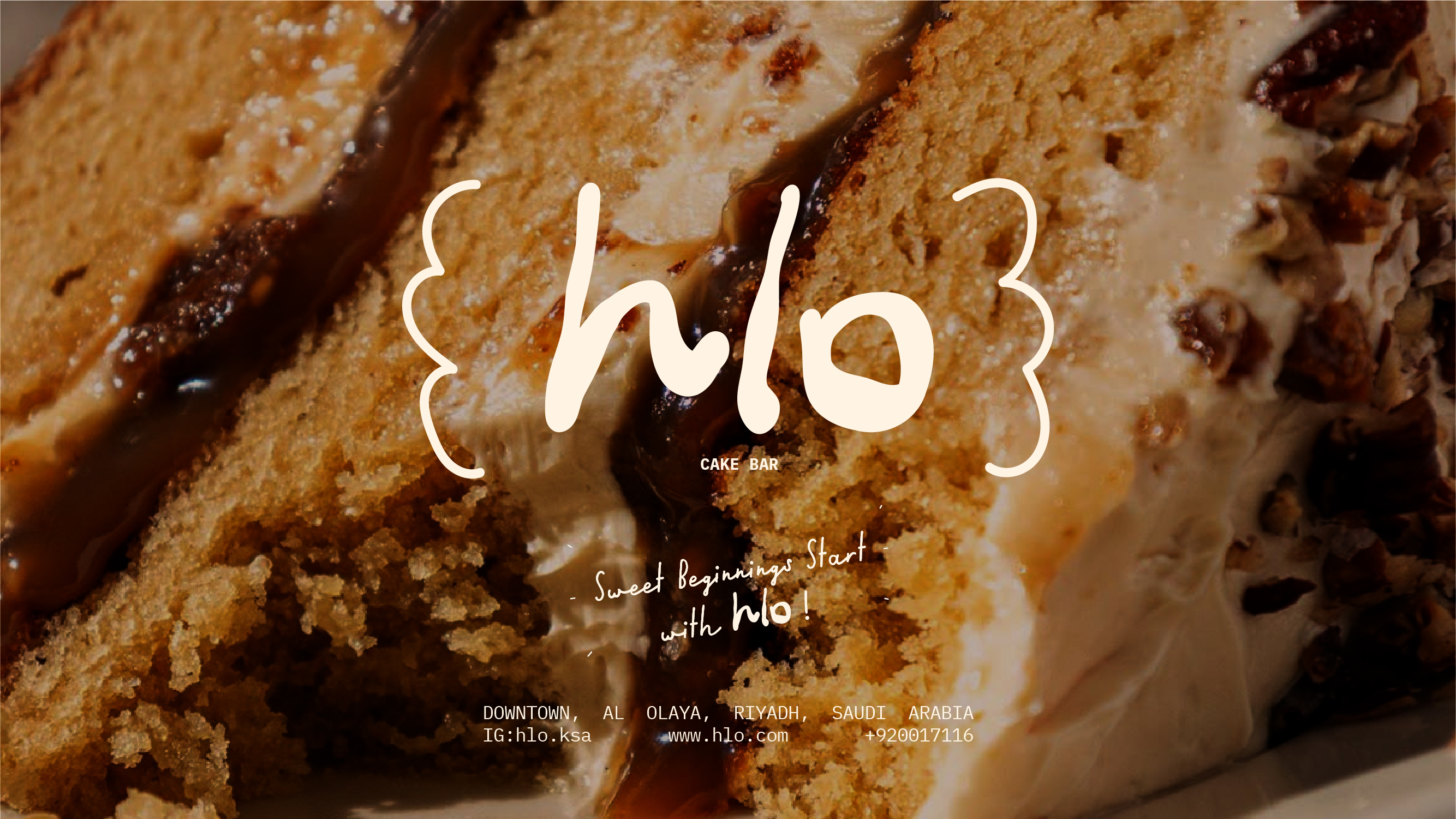
Hlo needed packaging that feels instantly recognizable in-store and on camera, so the identity is built around a simple, hand-written wordmark (hlo) used everywhere—bags, boxes, cup branding, and labels—so customers remember it after one order. The system uses a warm neutral base with bold olive-green panels, plus the brand stamp line (“Something sweet is calling for you”) to add a playful, signature tone. Packaging is designed to support product-first presentation: clean front layouts, clear logo placement, and consistent spacing for different box and bag formats without visual noise. Each variant keeps the same rules—logo as the hero, secondary copy as a supporting detail, and a repeating visual language that works across sleeves and trays. For Instagram-ready impact, the design uses high-contrast color blocks and strong typographic scale, so the packaging reads clearly even in fast delivery shots. Note: this project was the most viral and popular, and the packaging system’s consistent “hlo” presence + punchy copy helped it perform as a shareable brand asset.