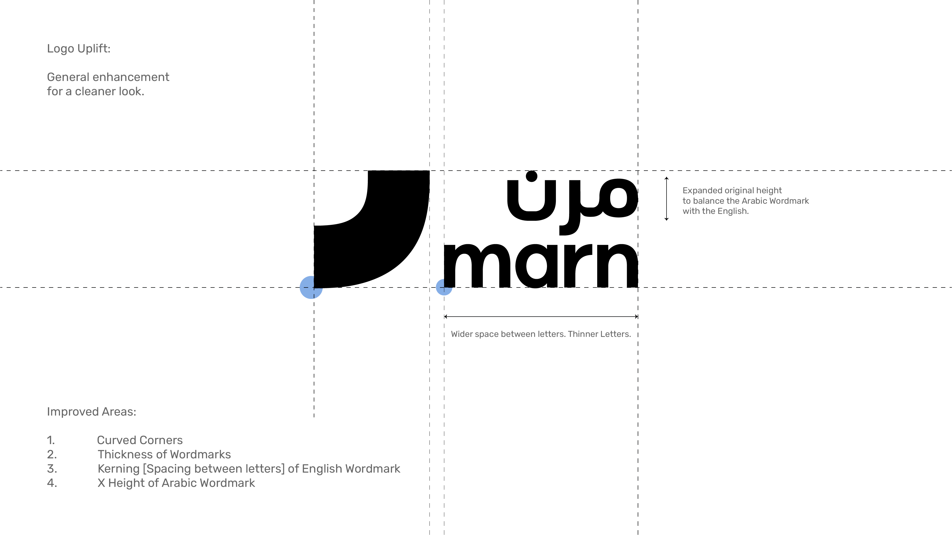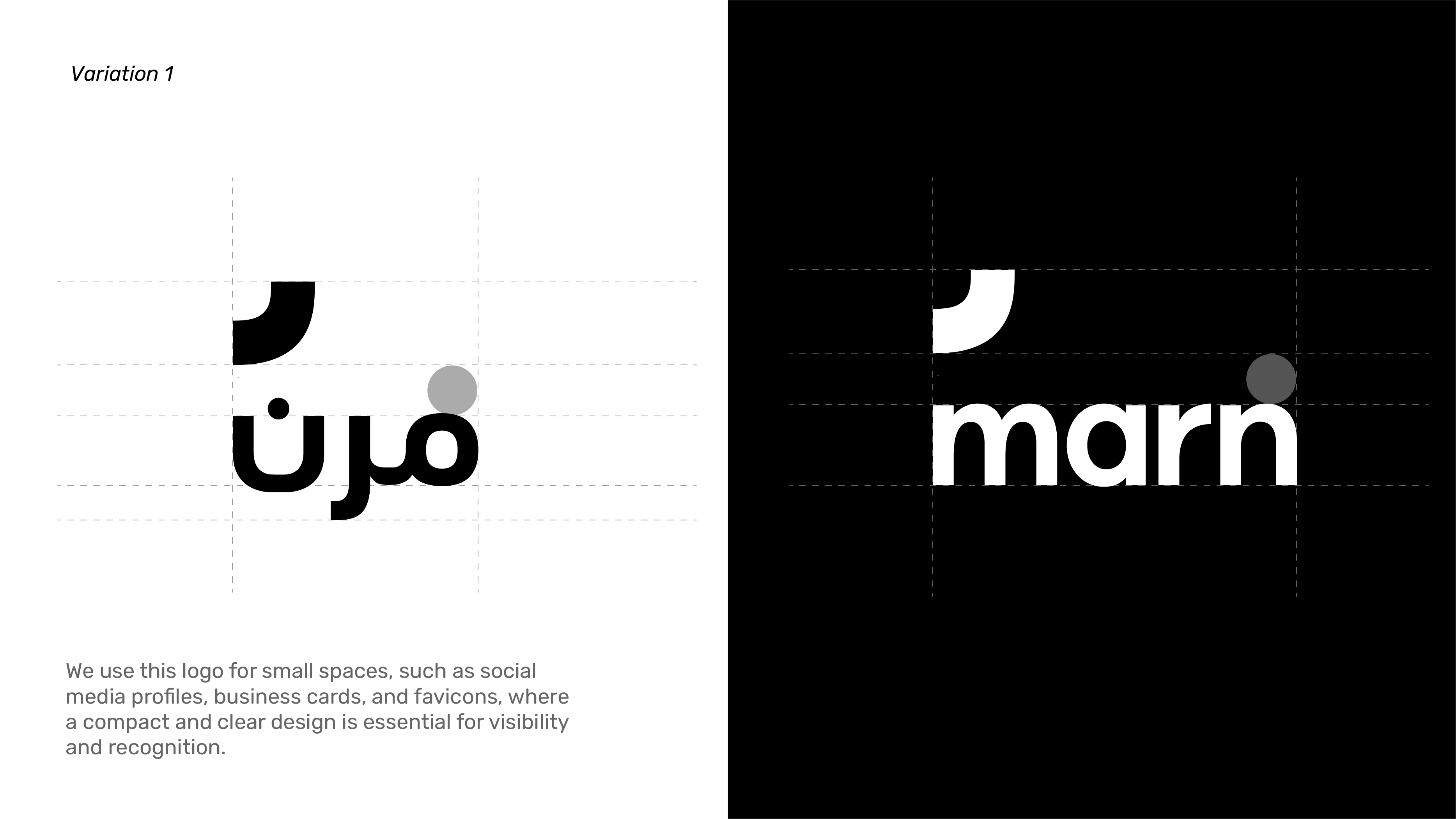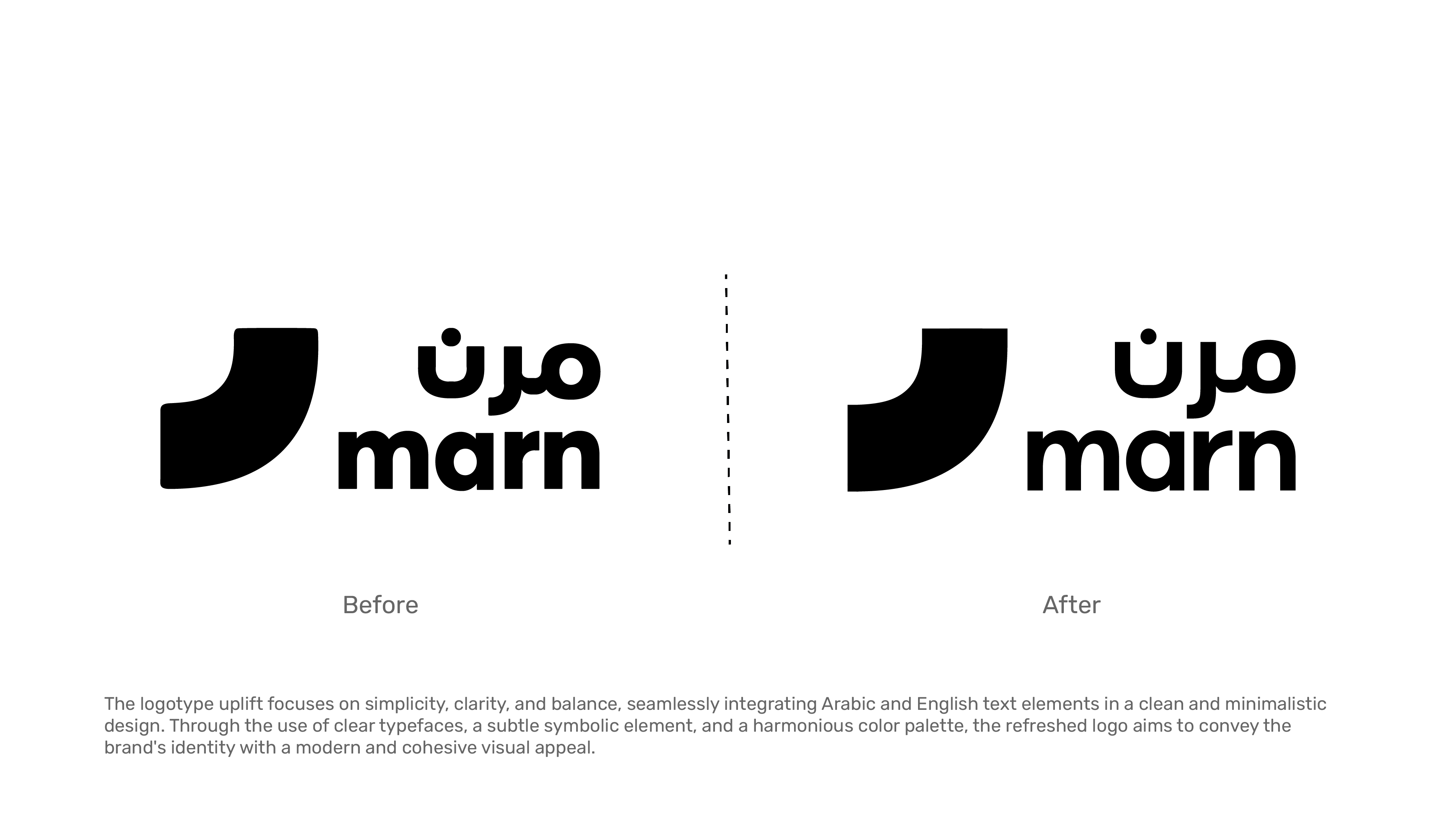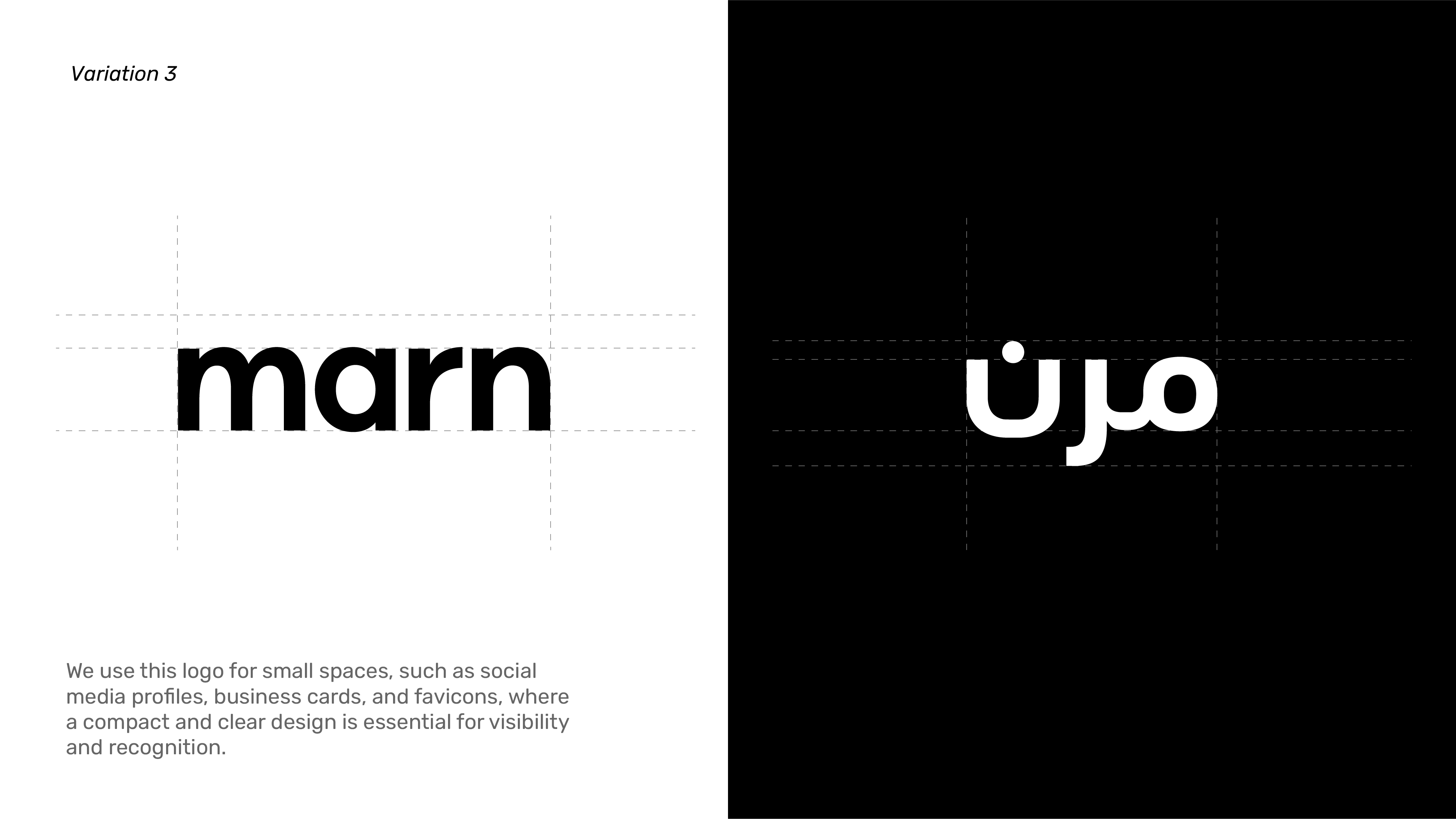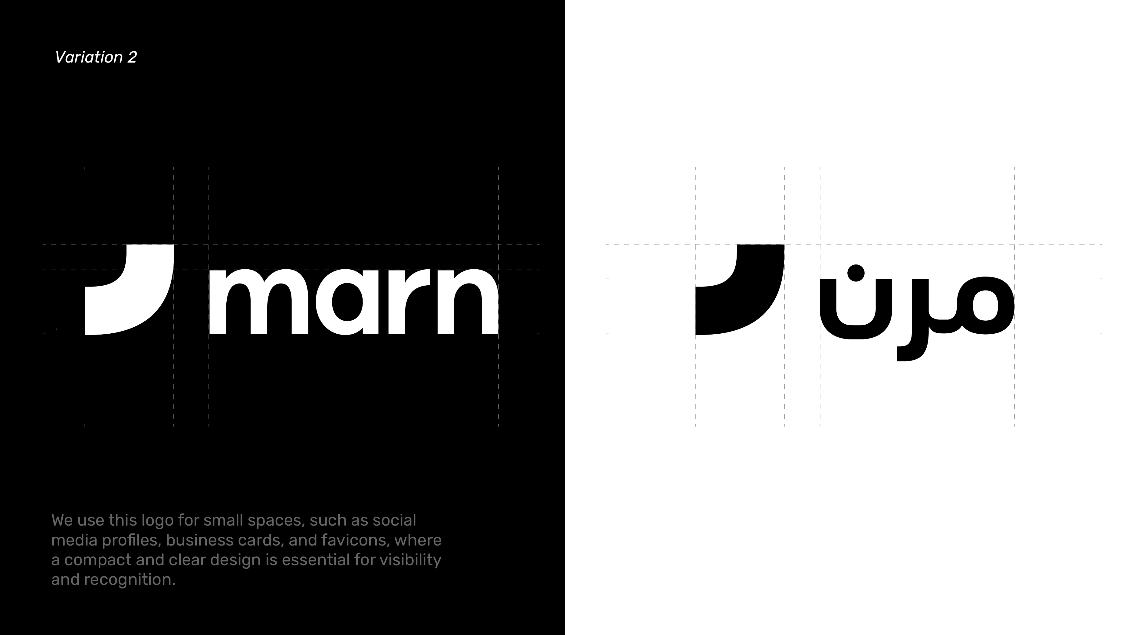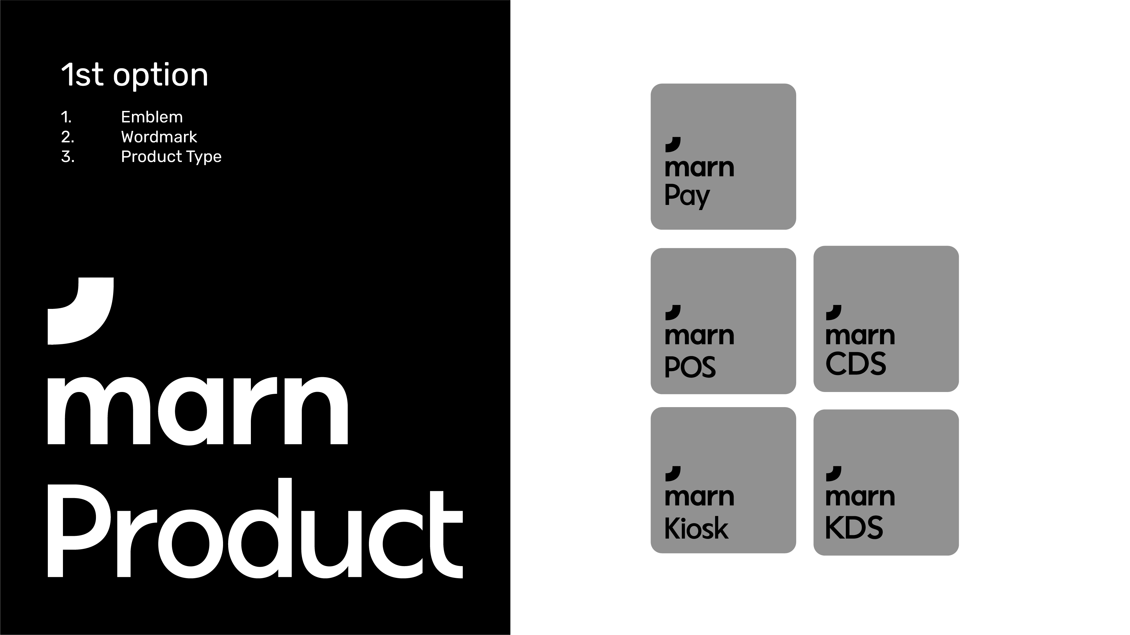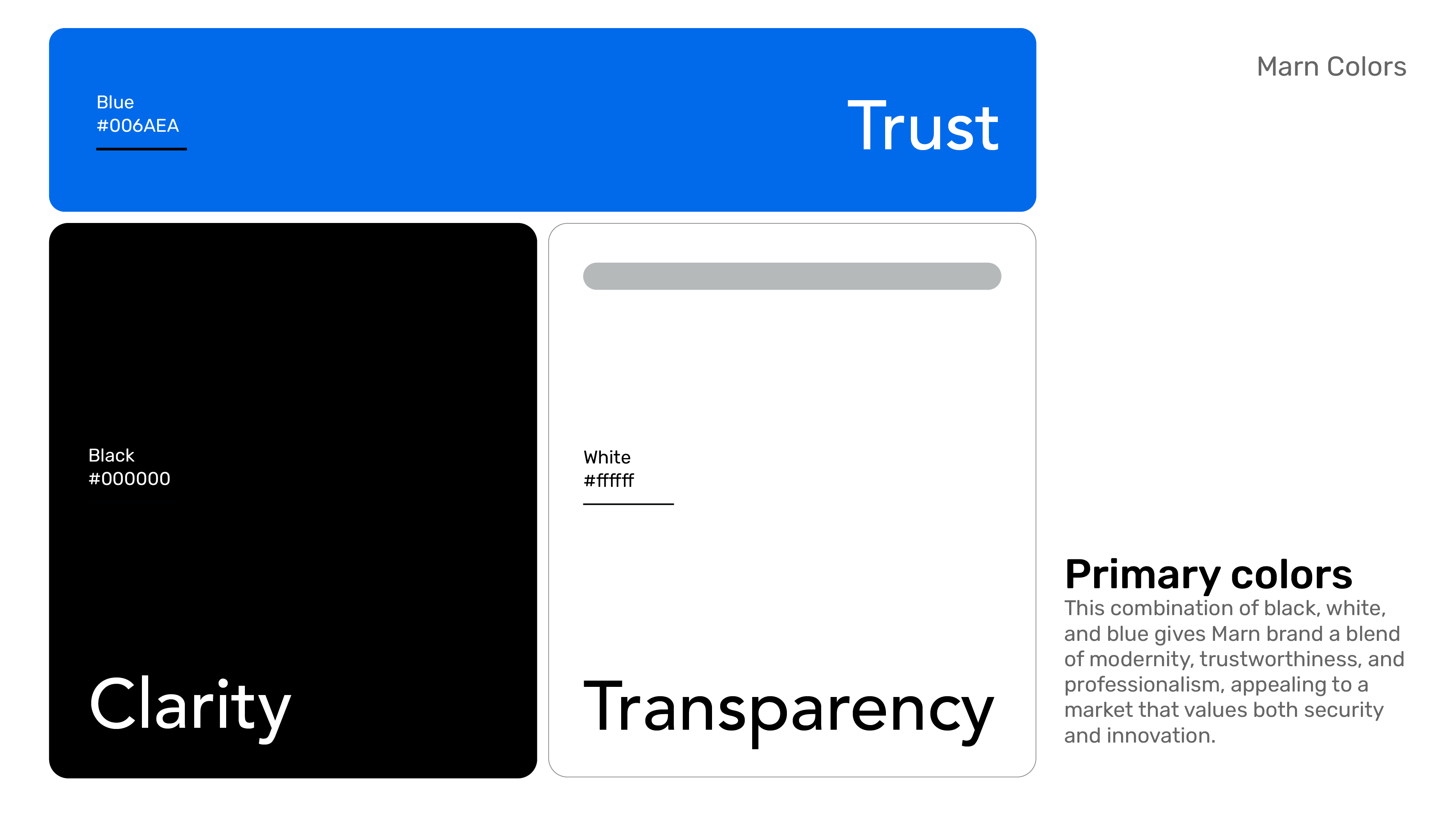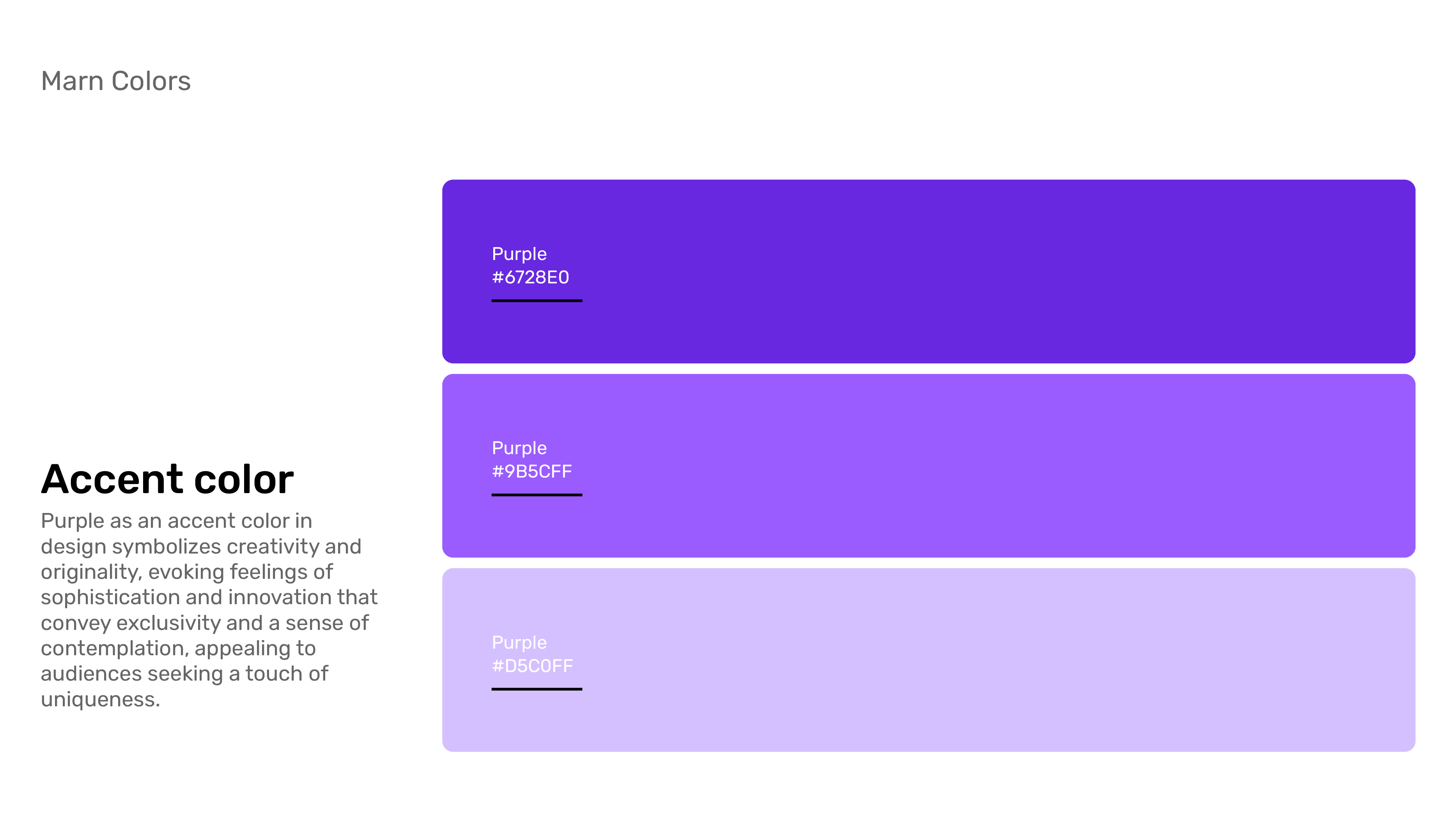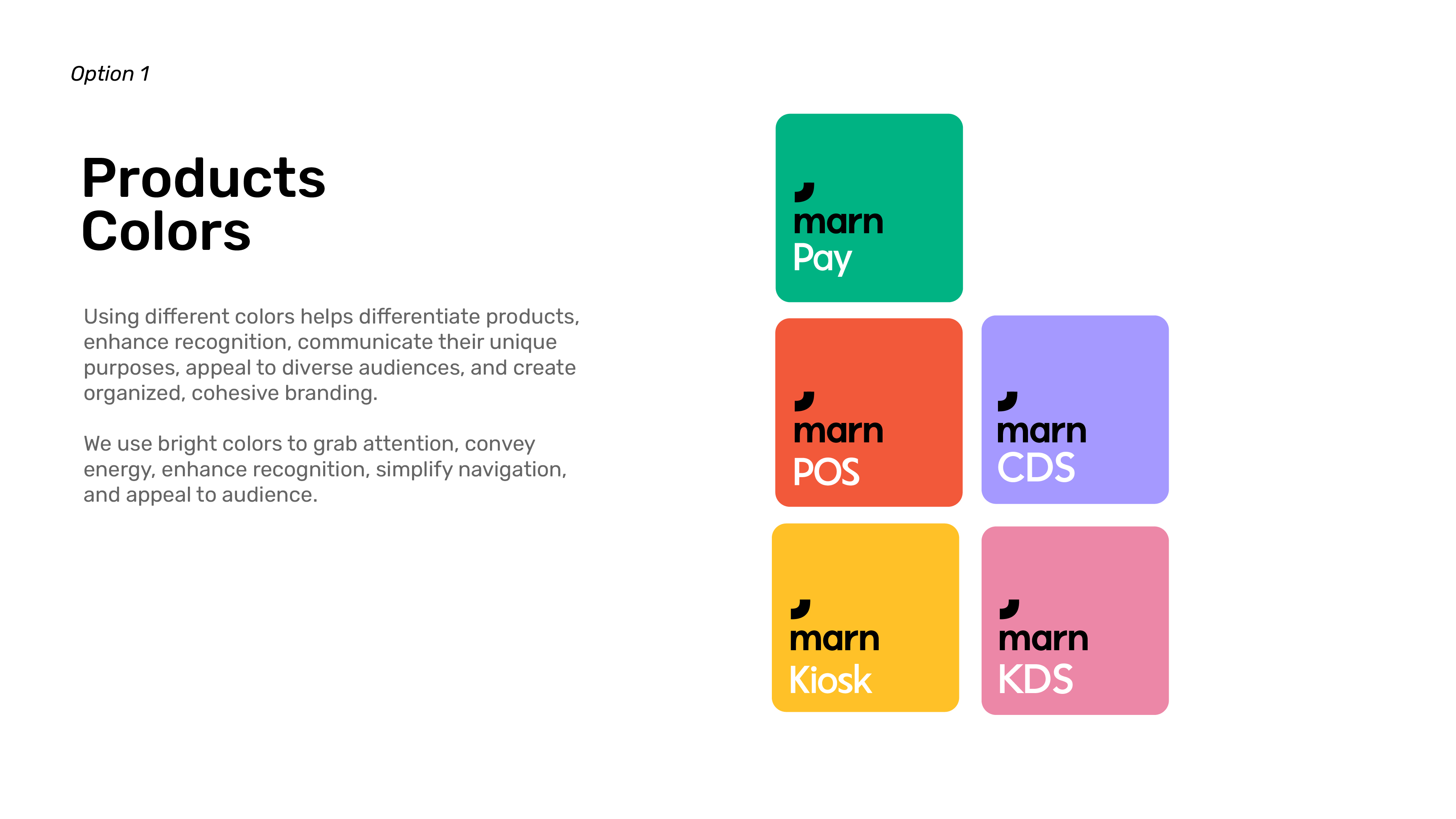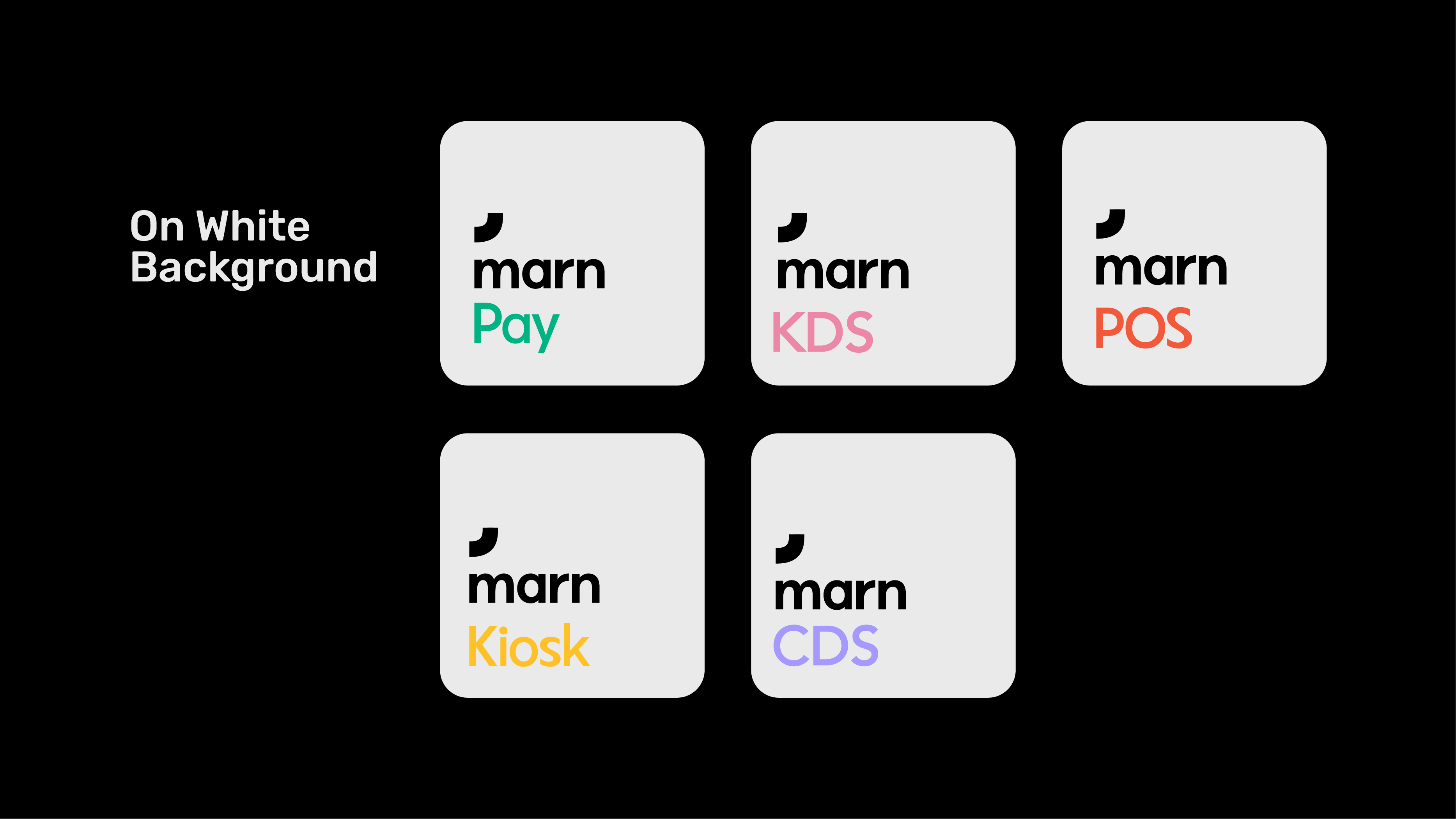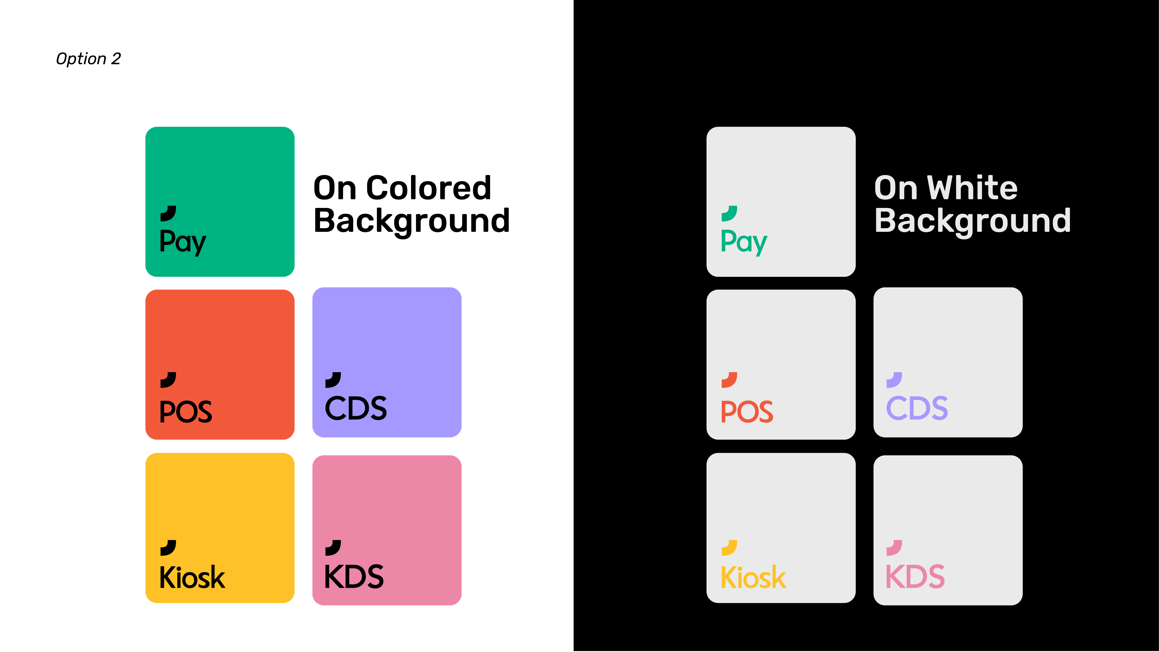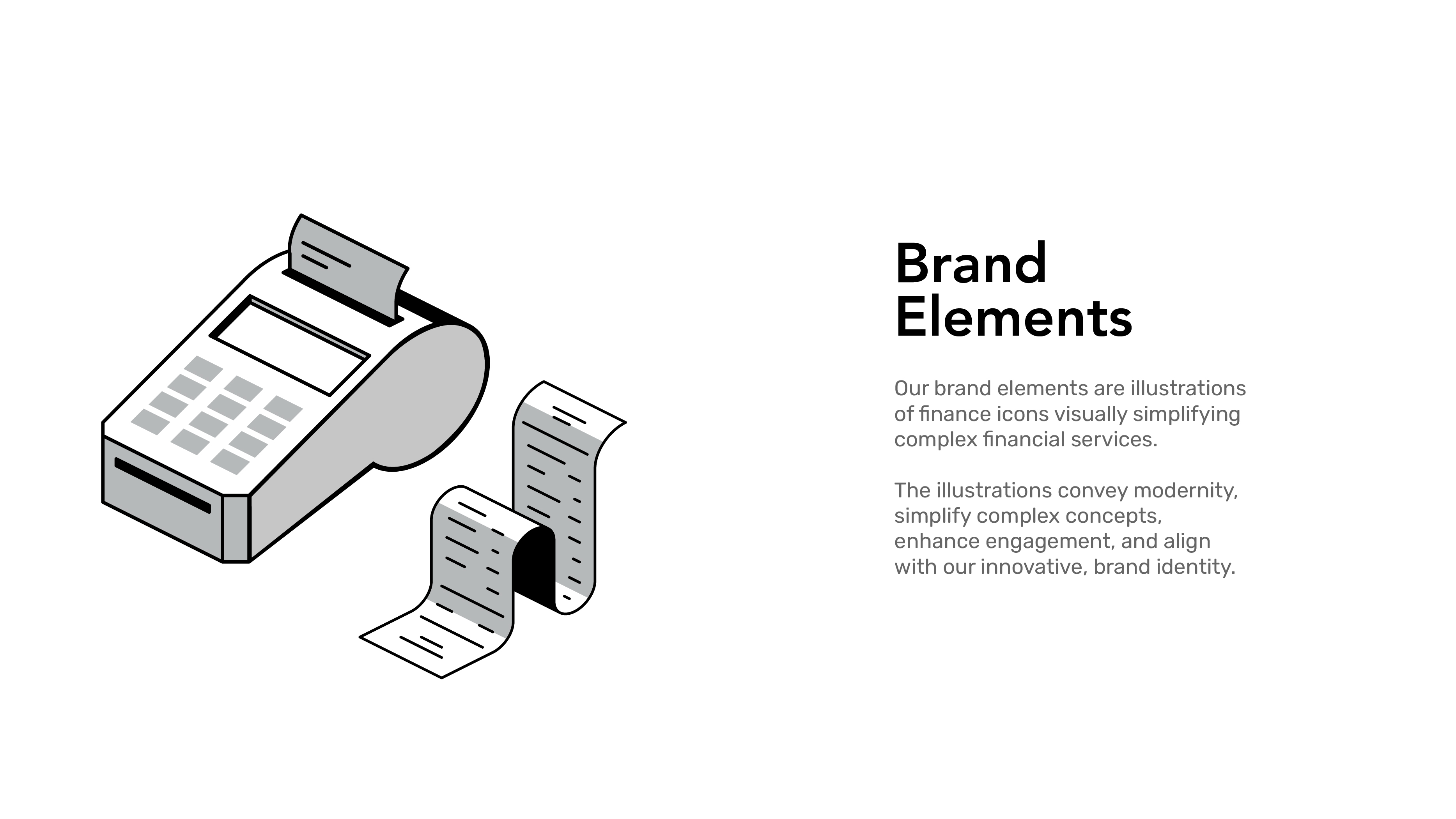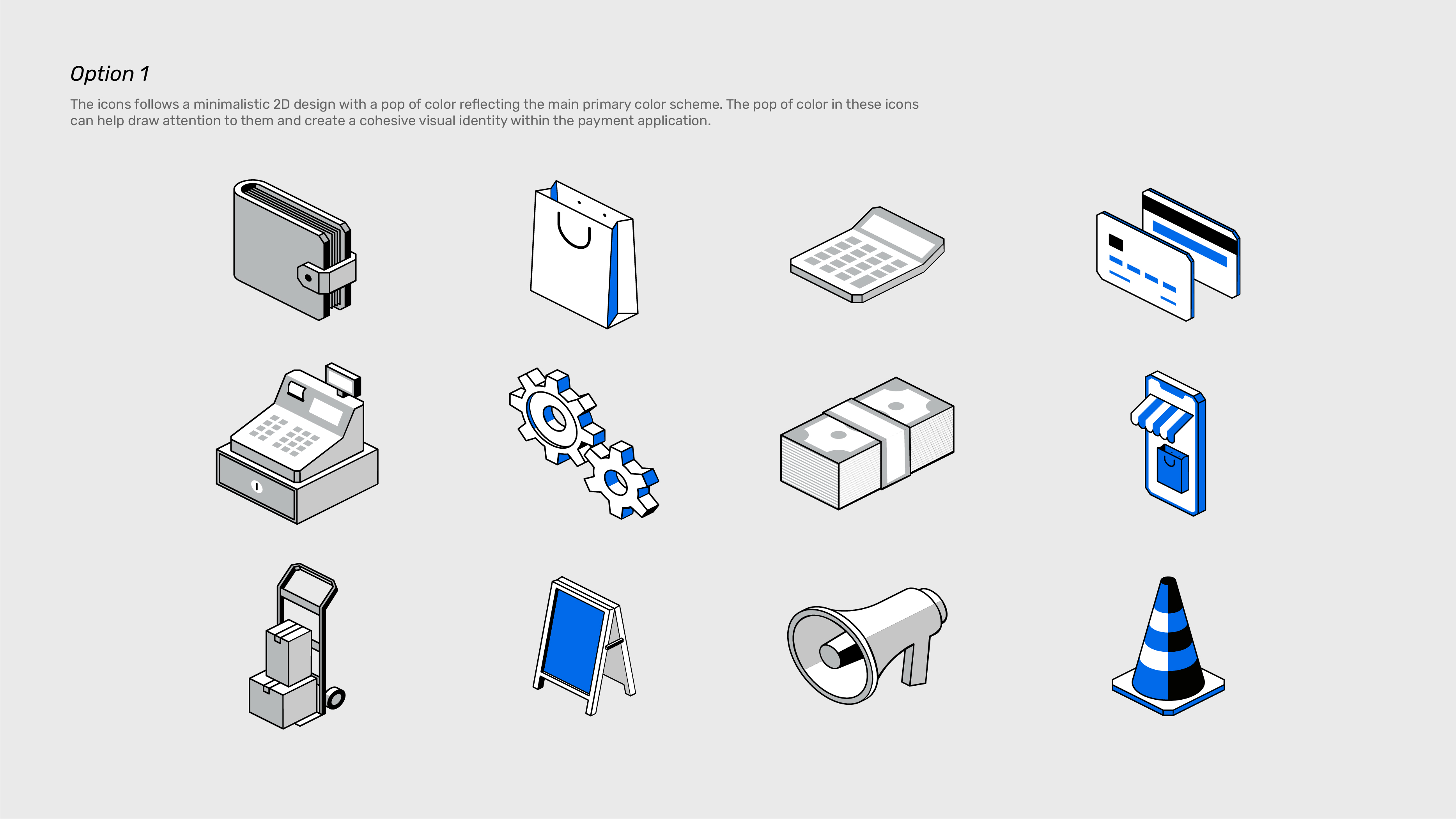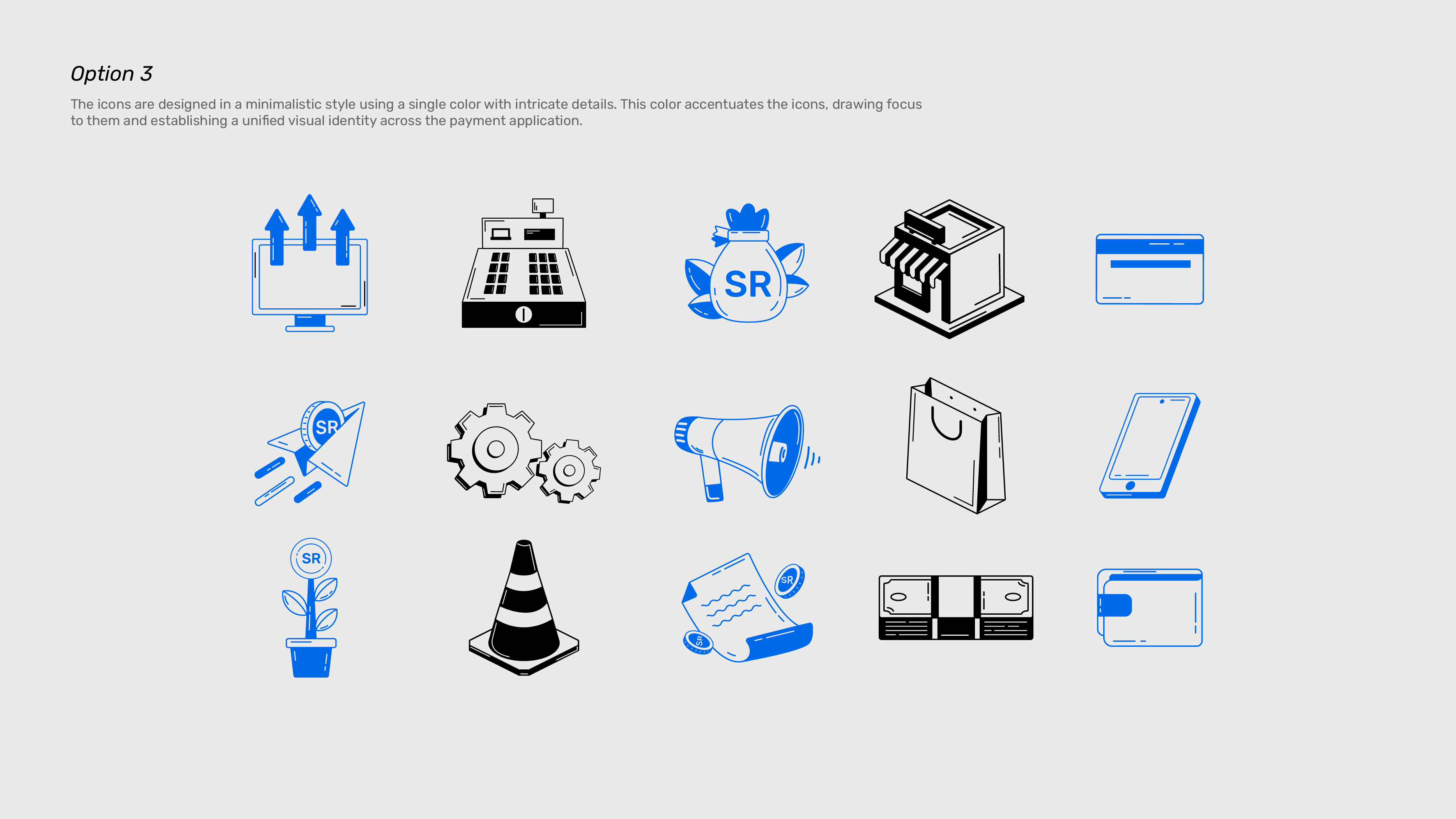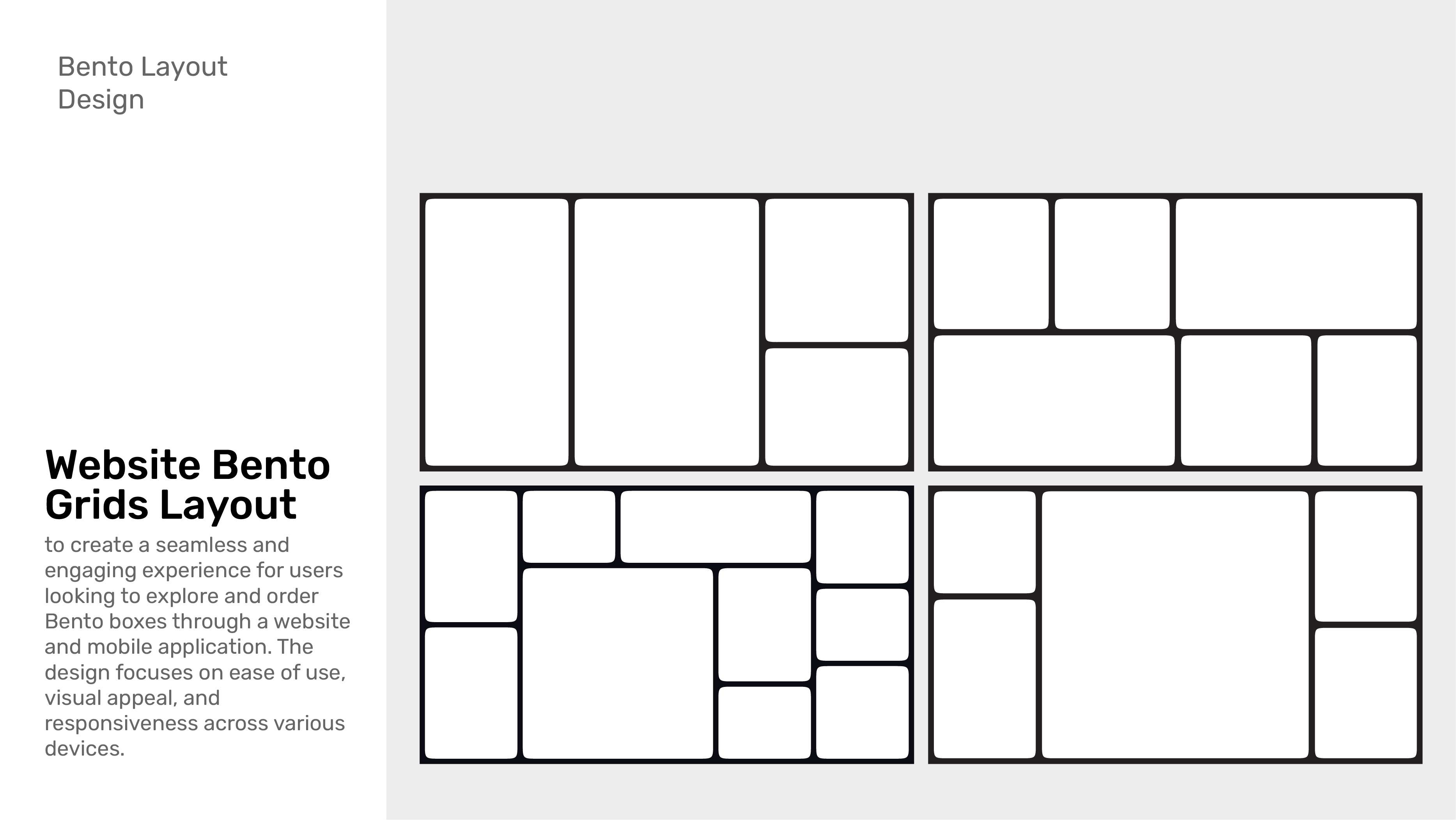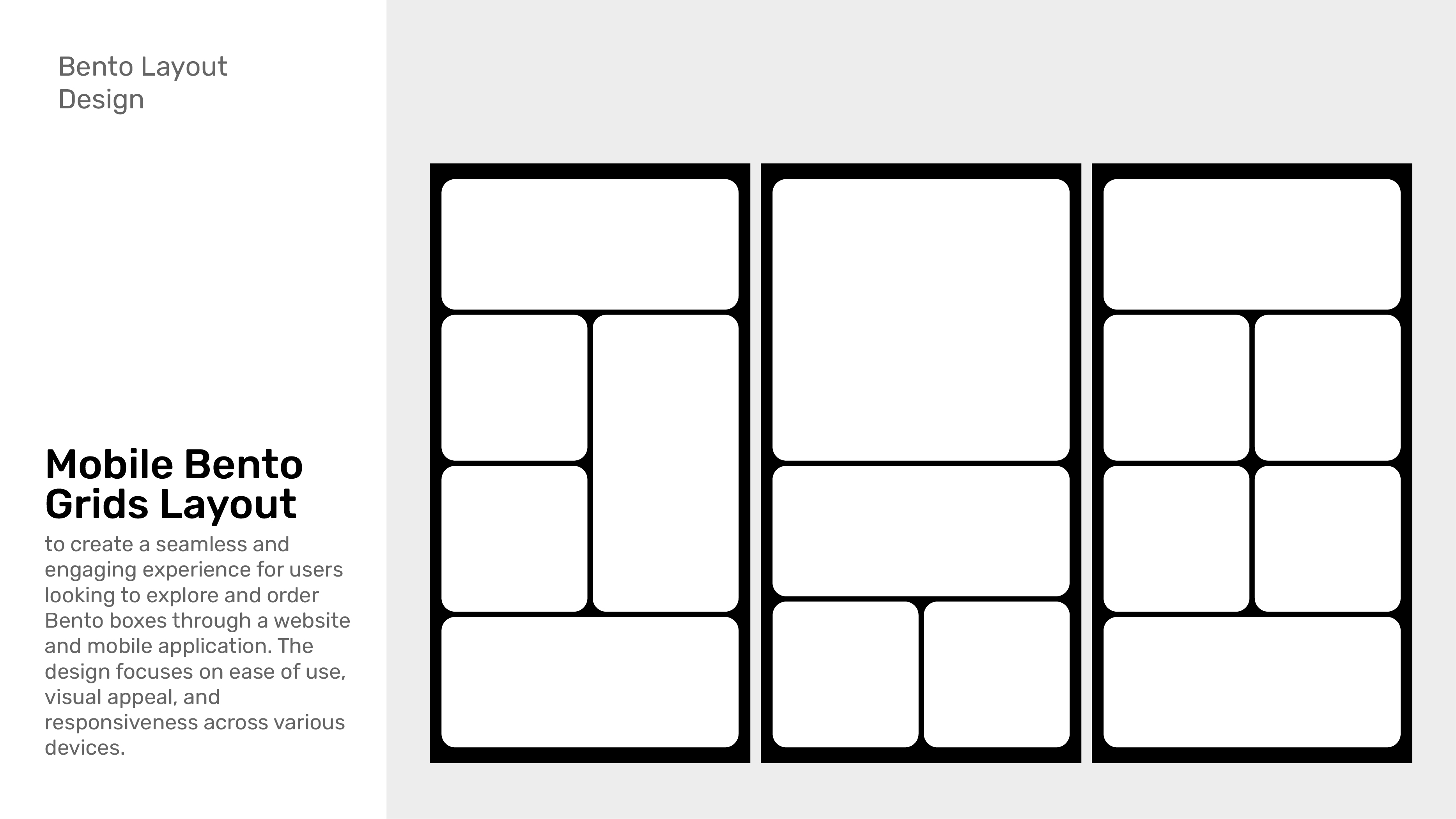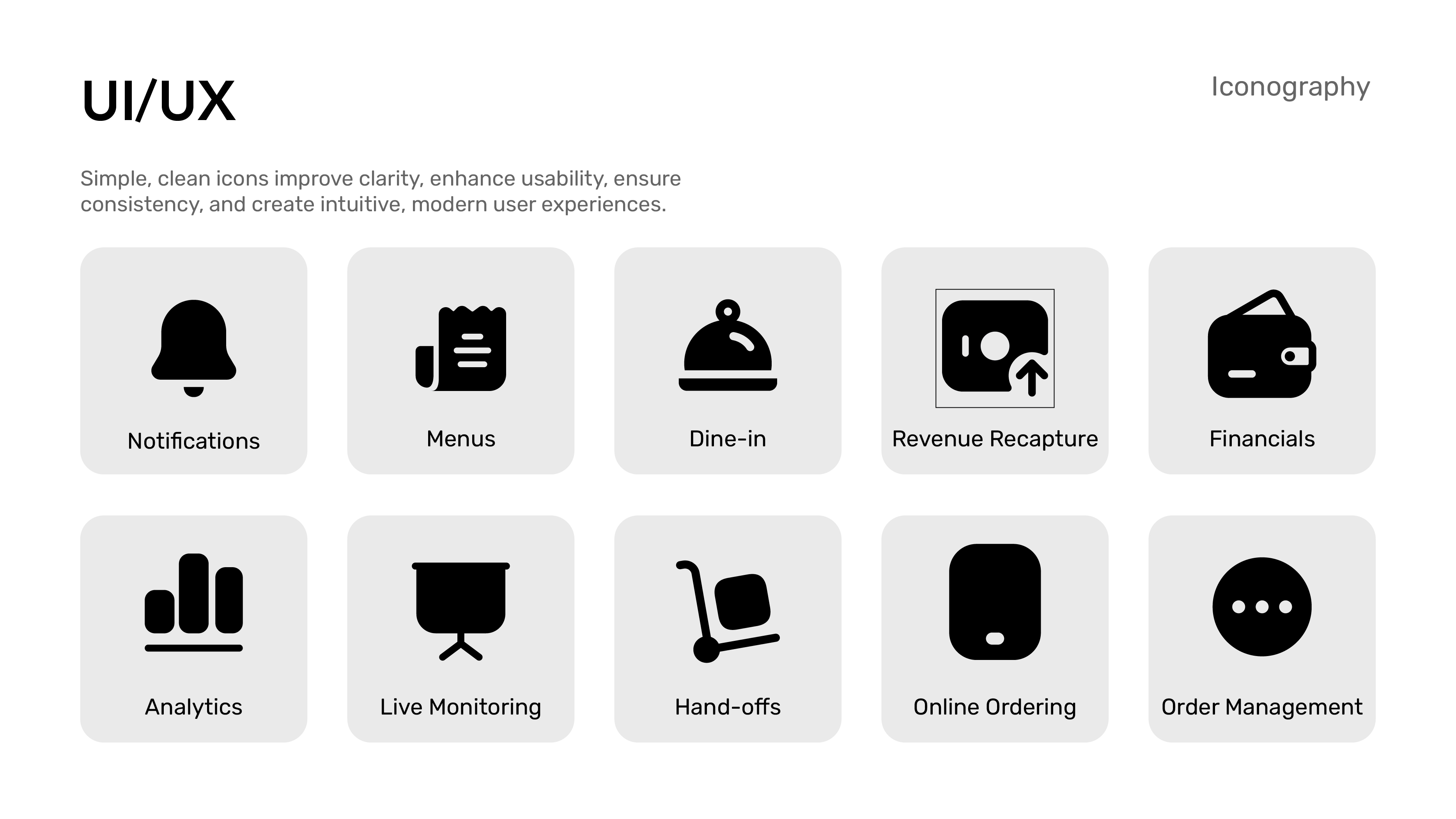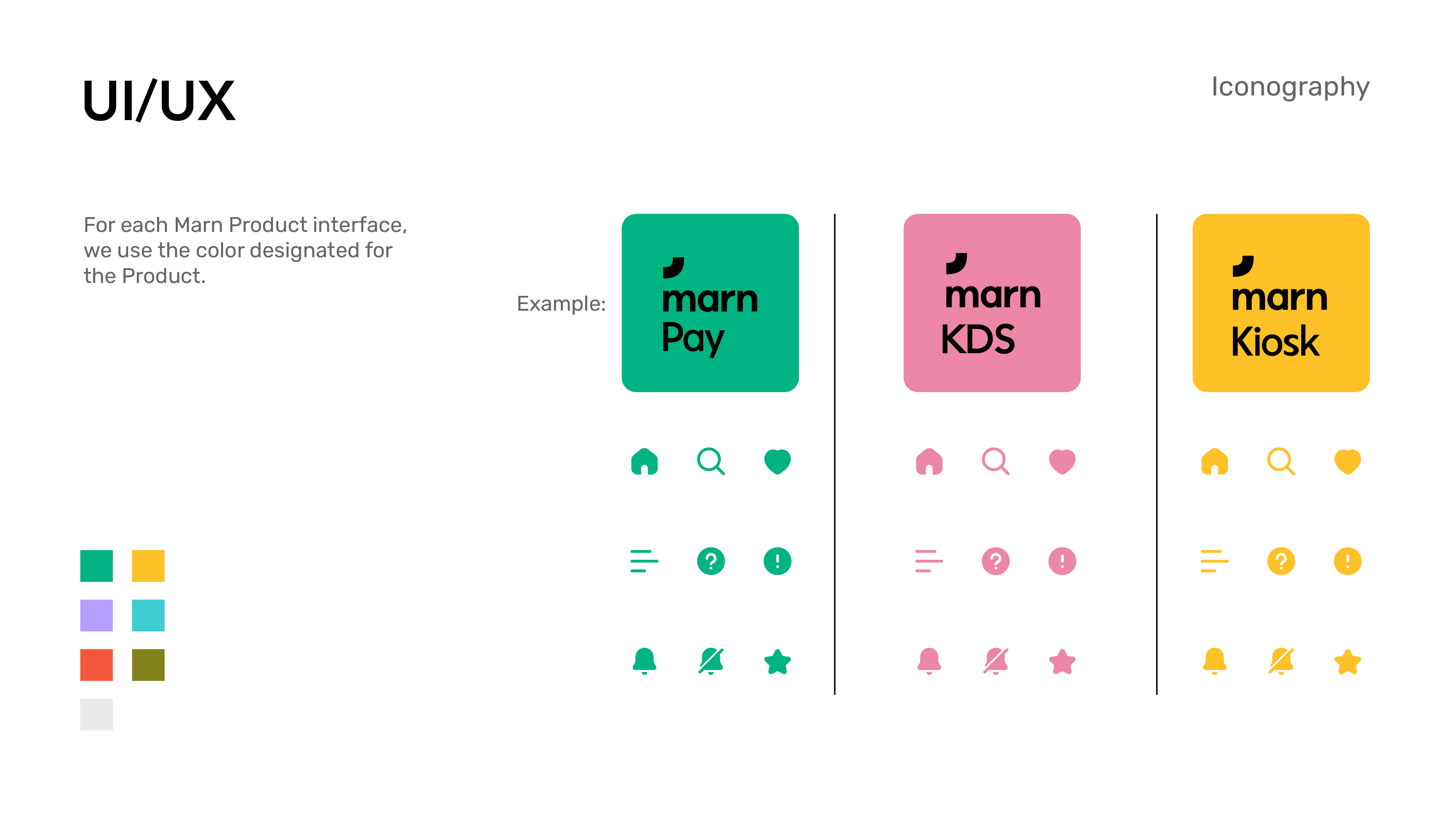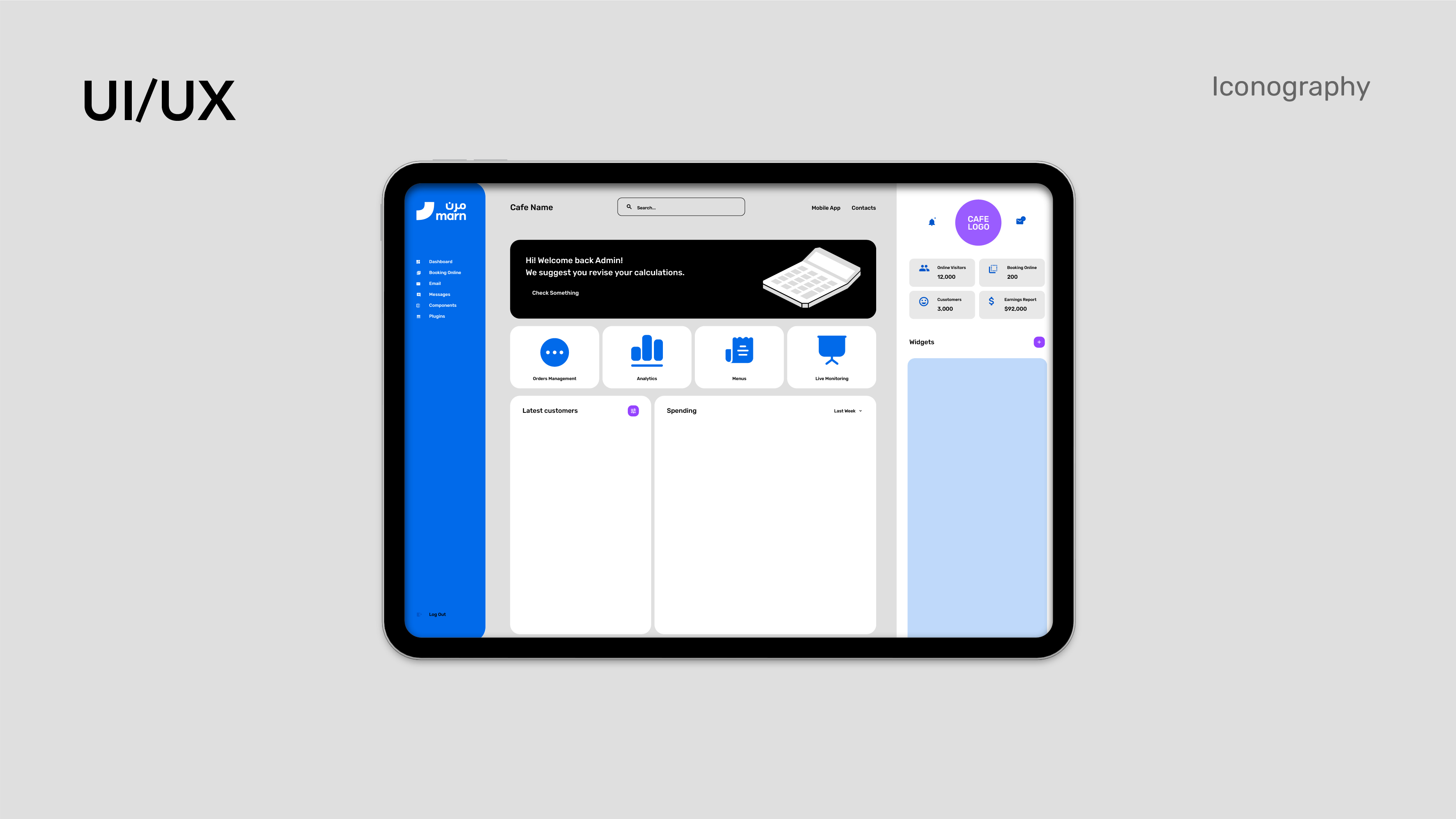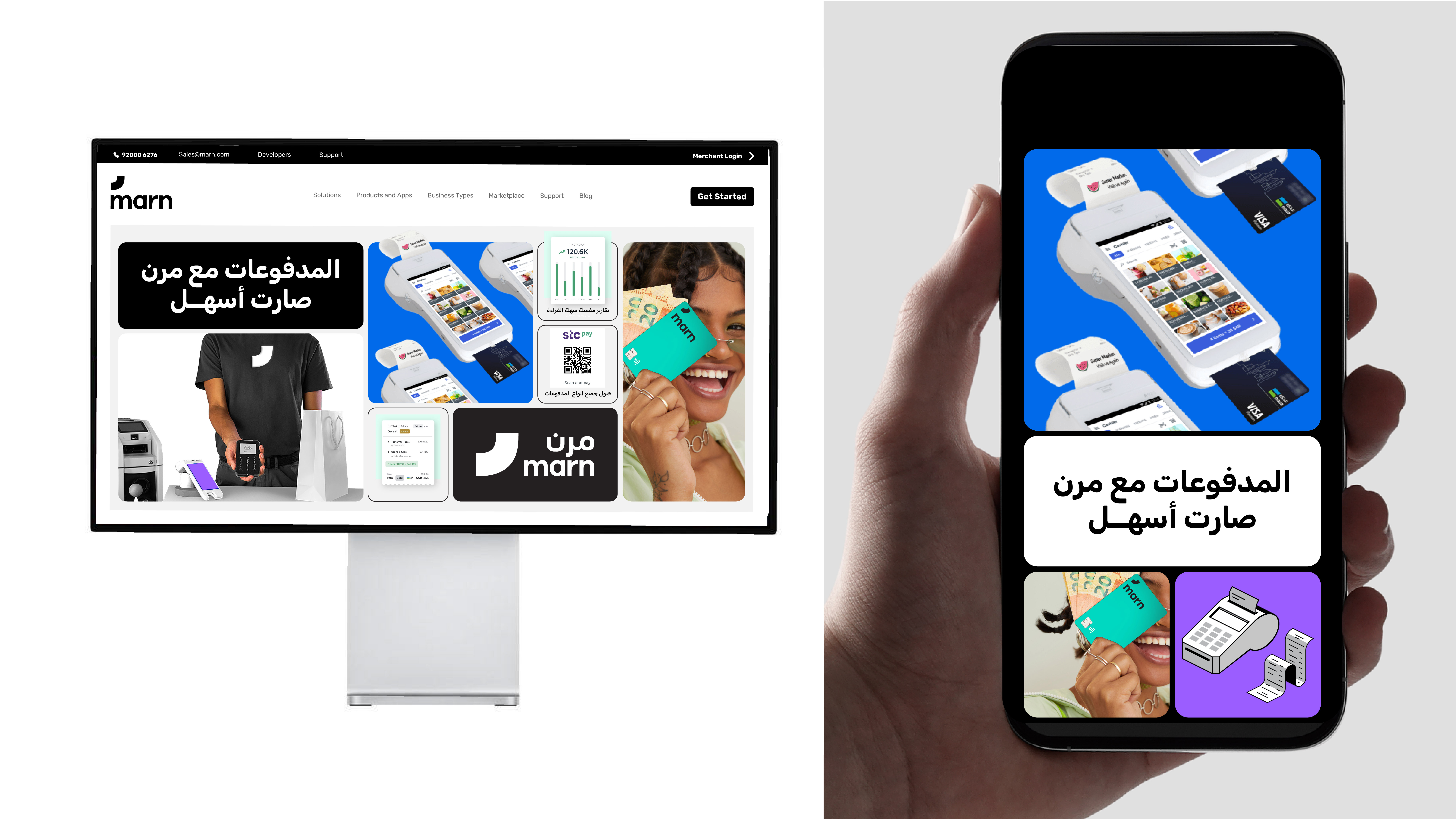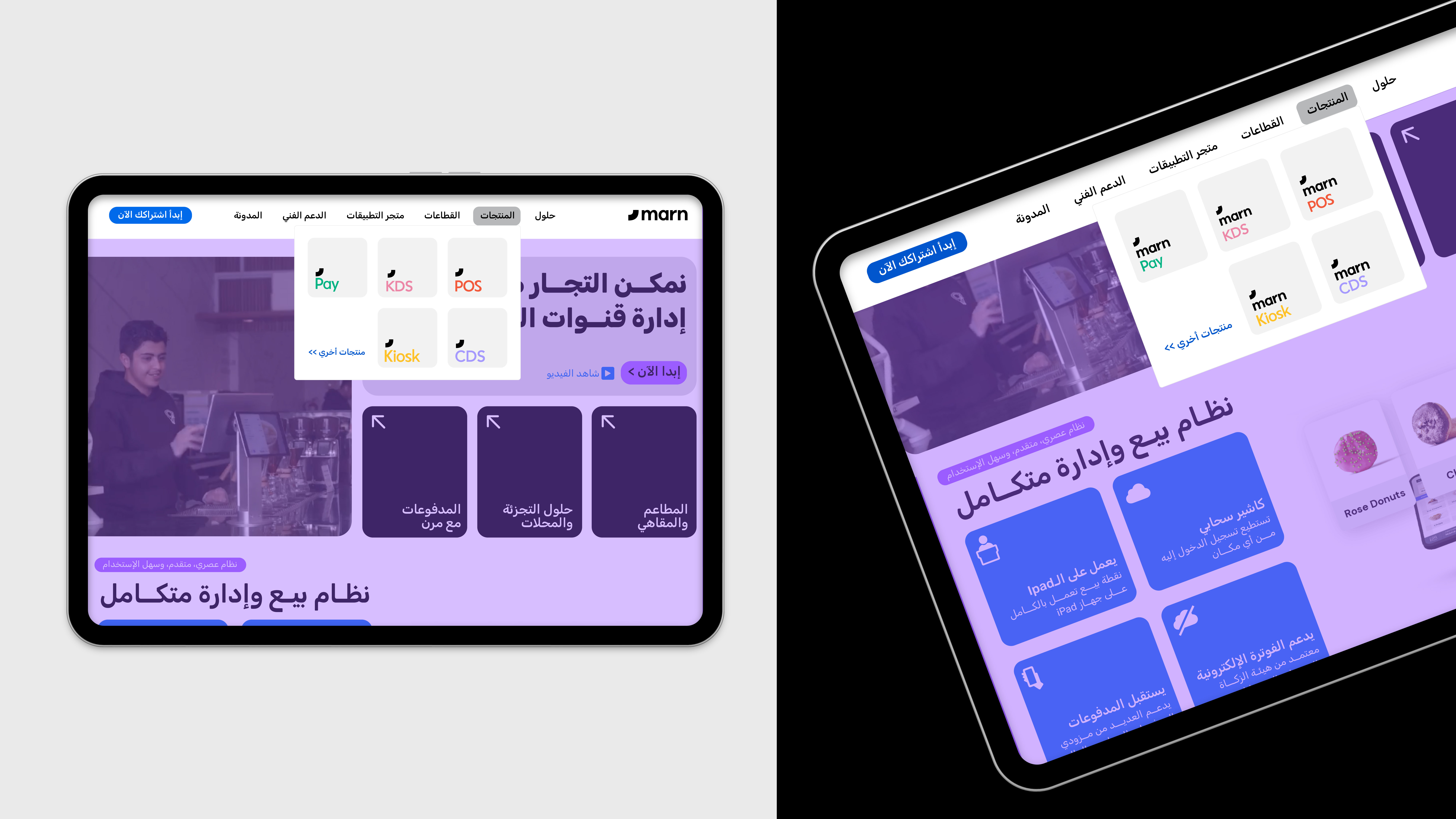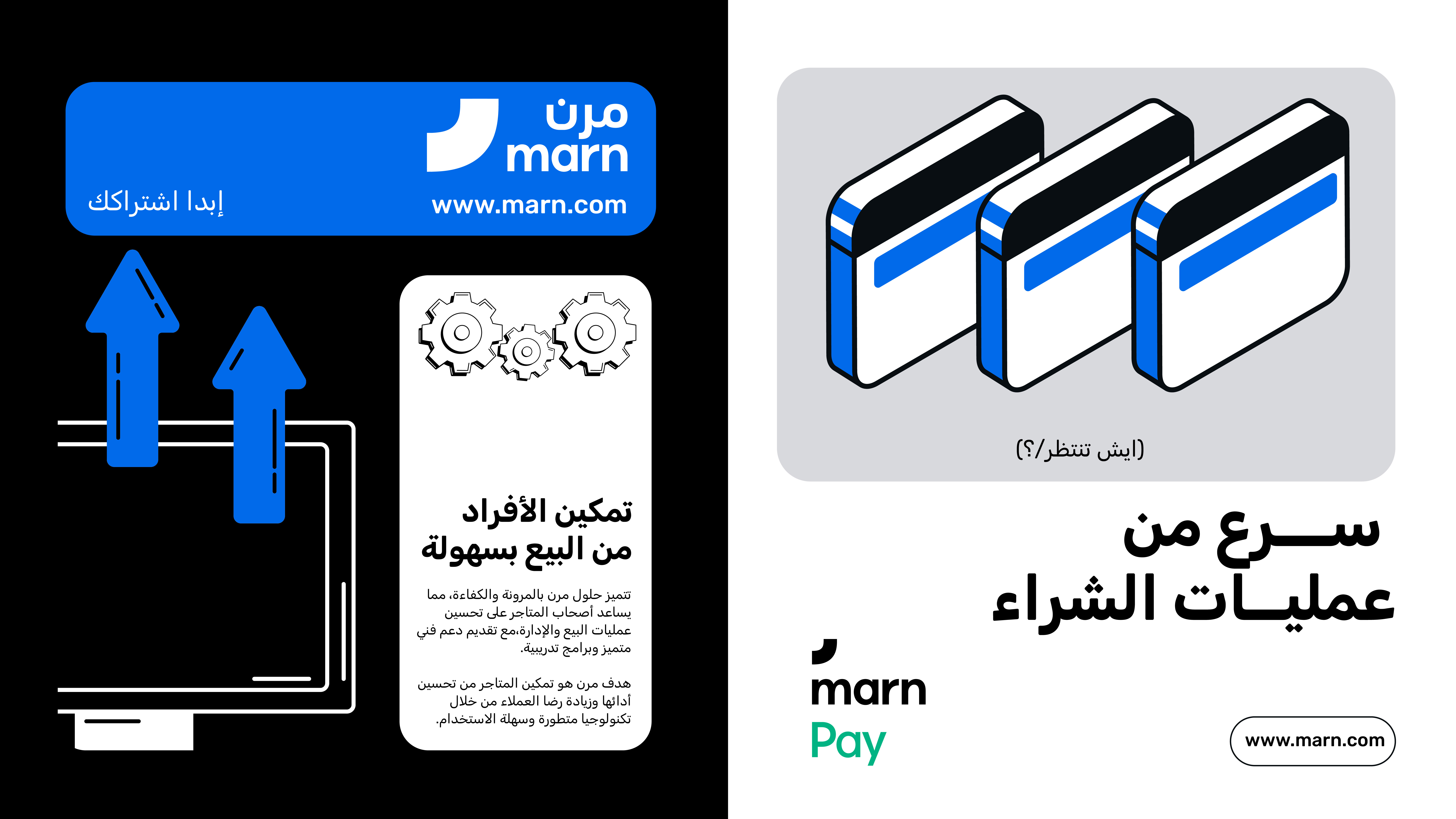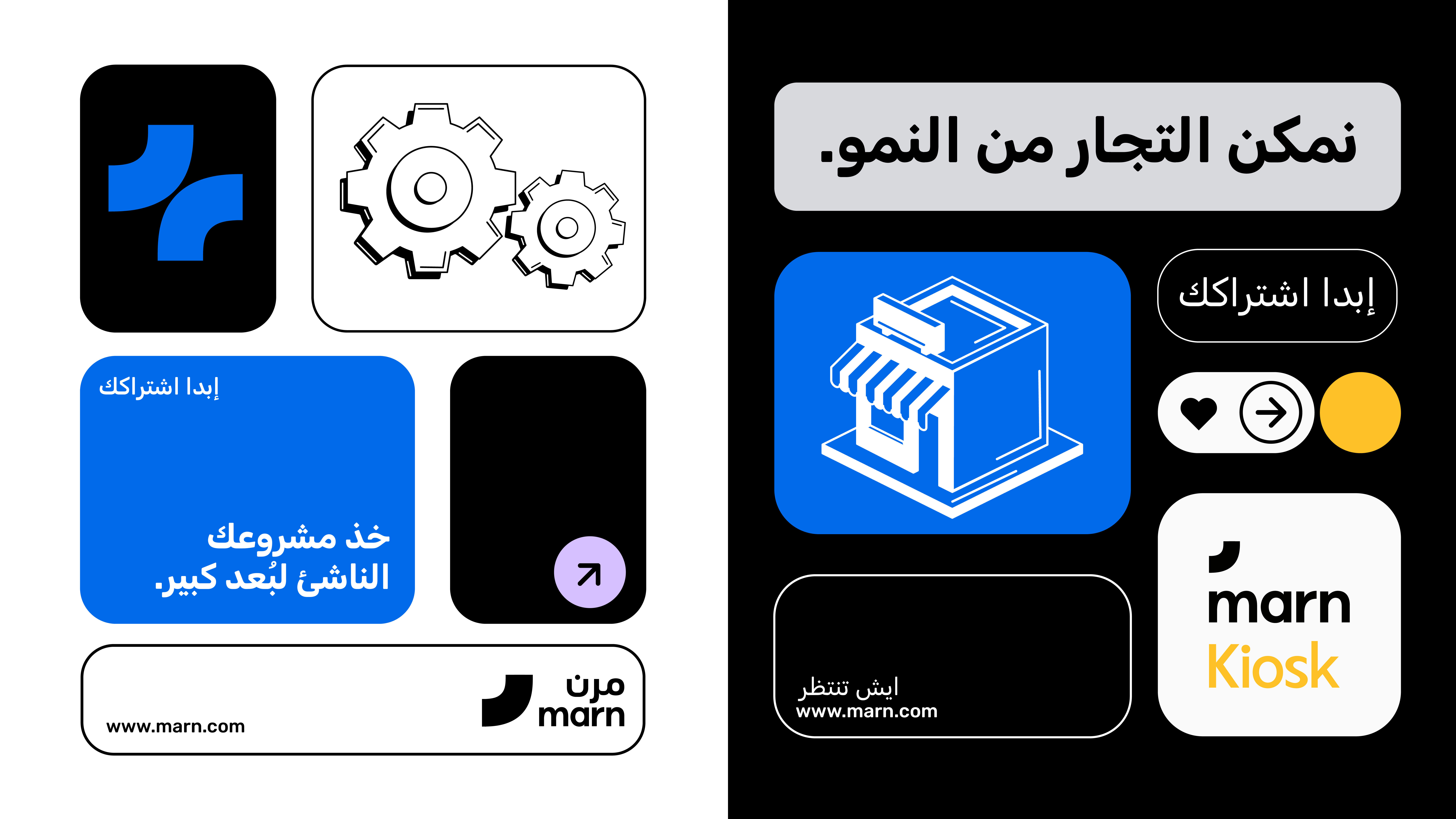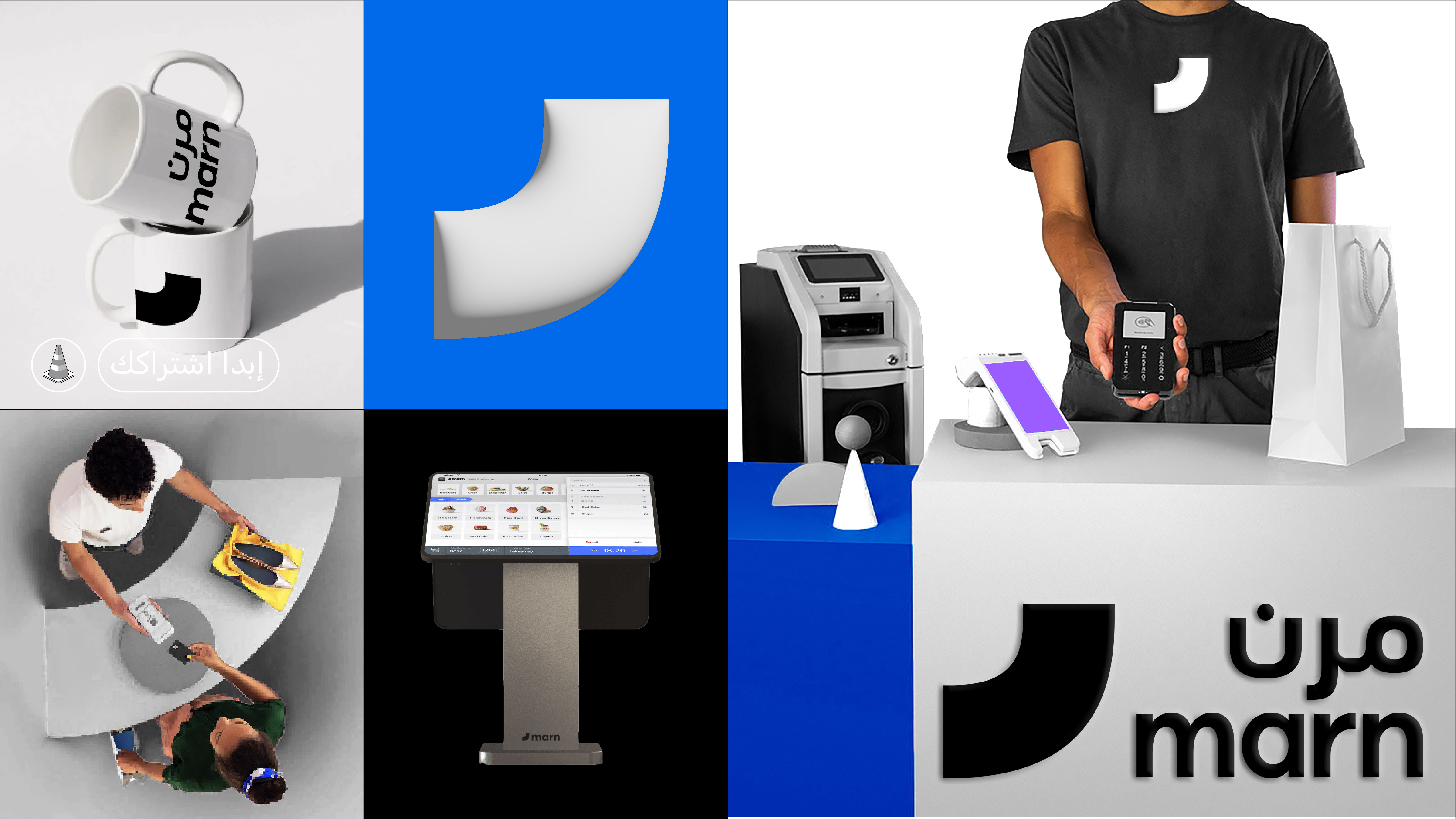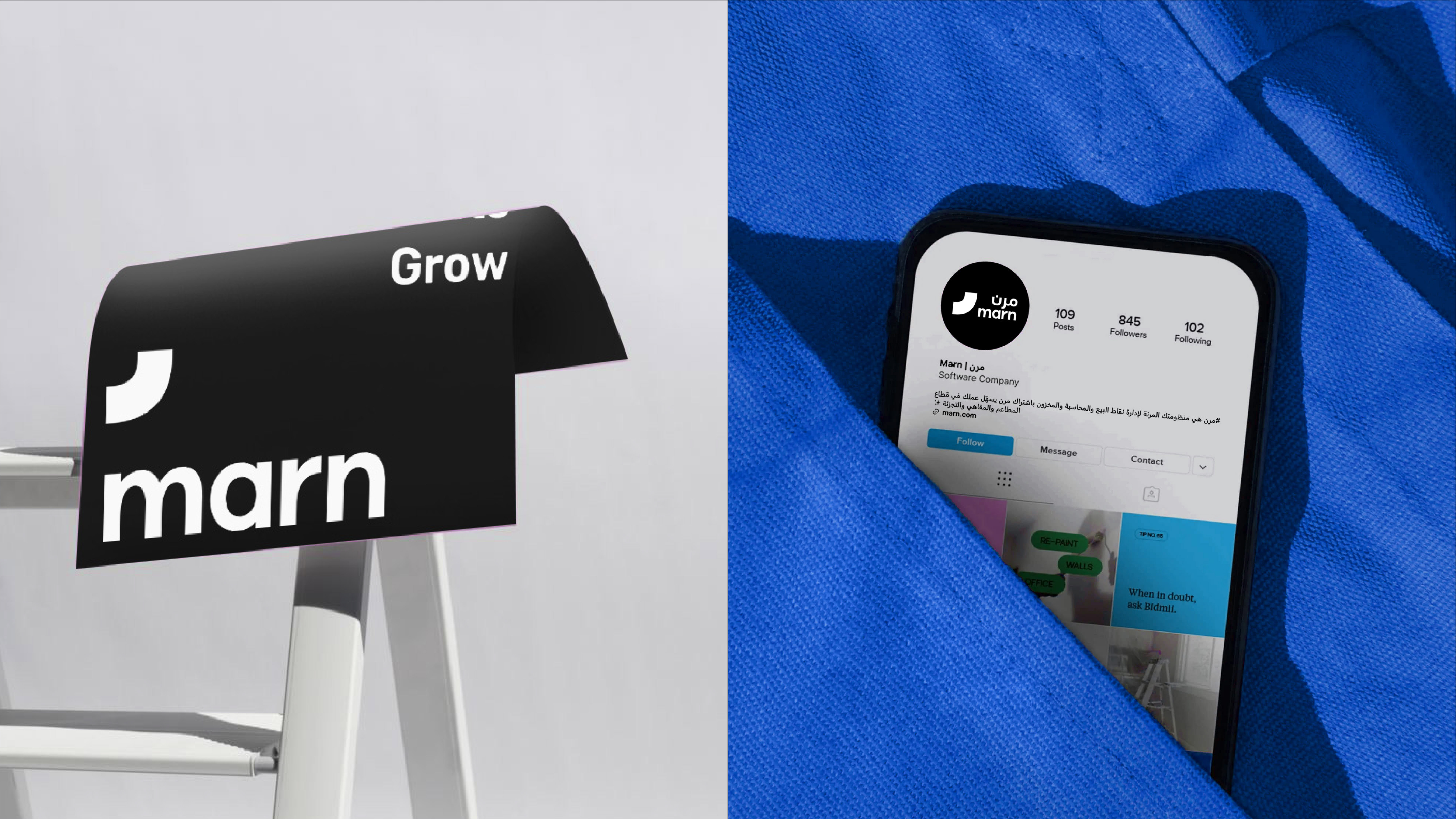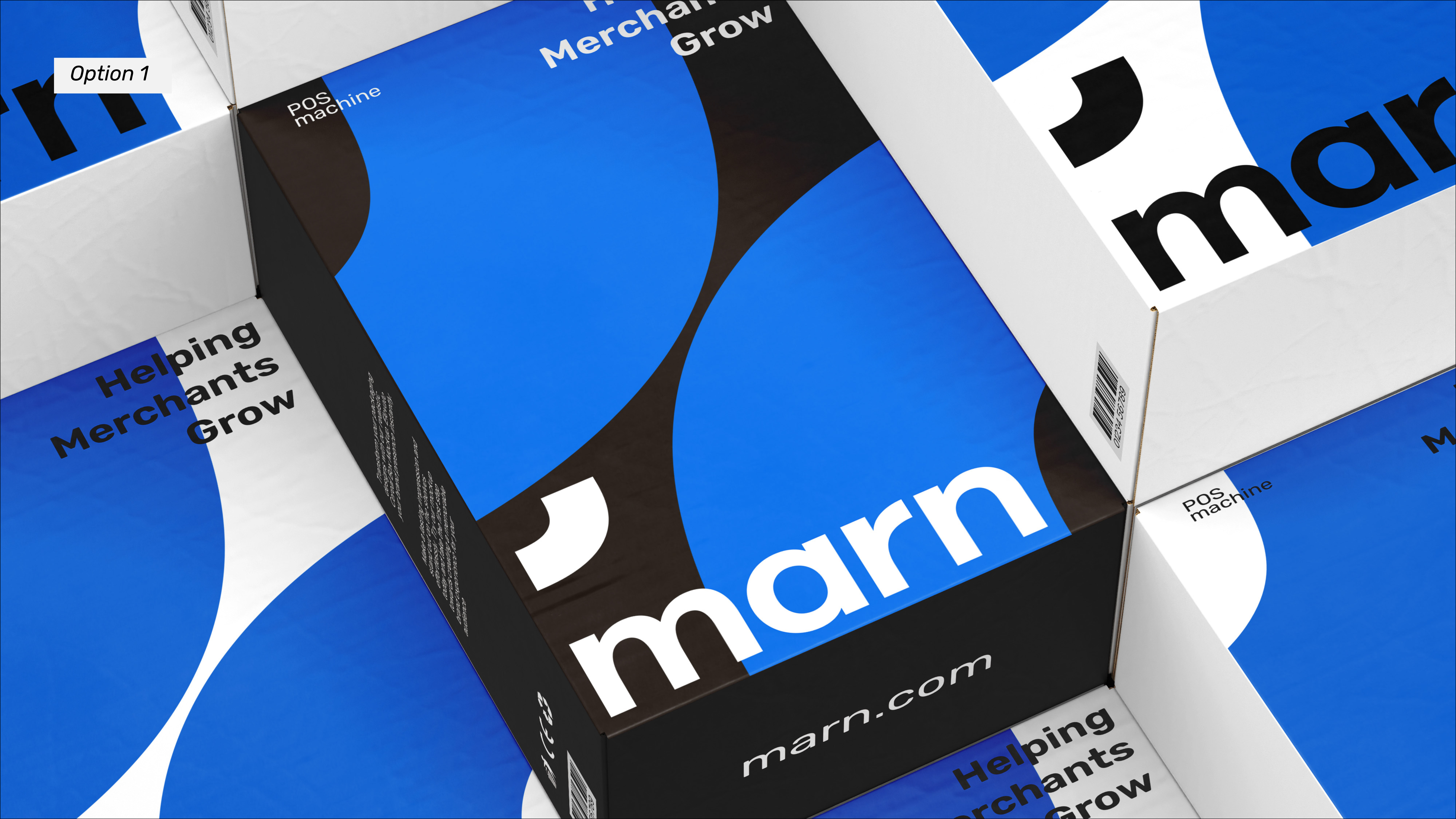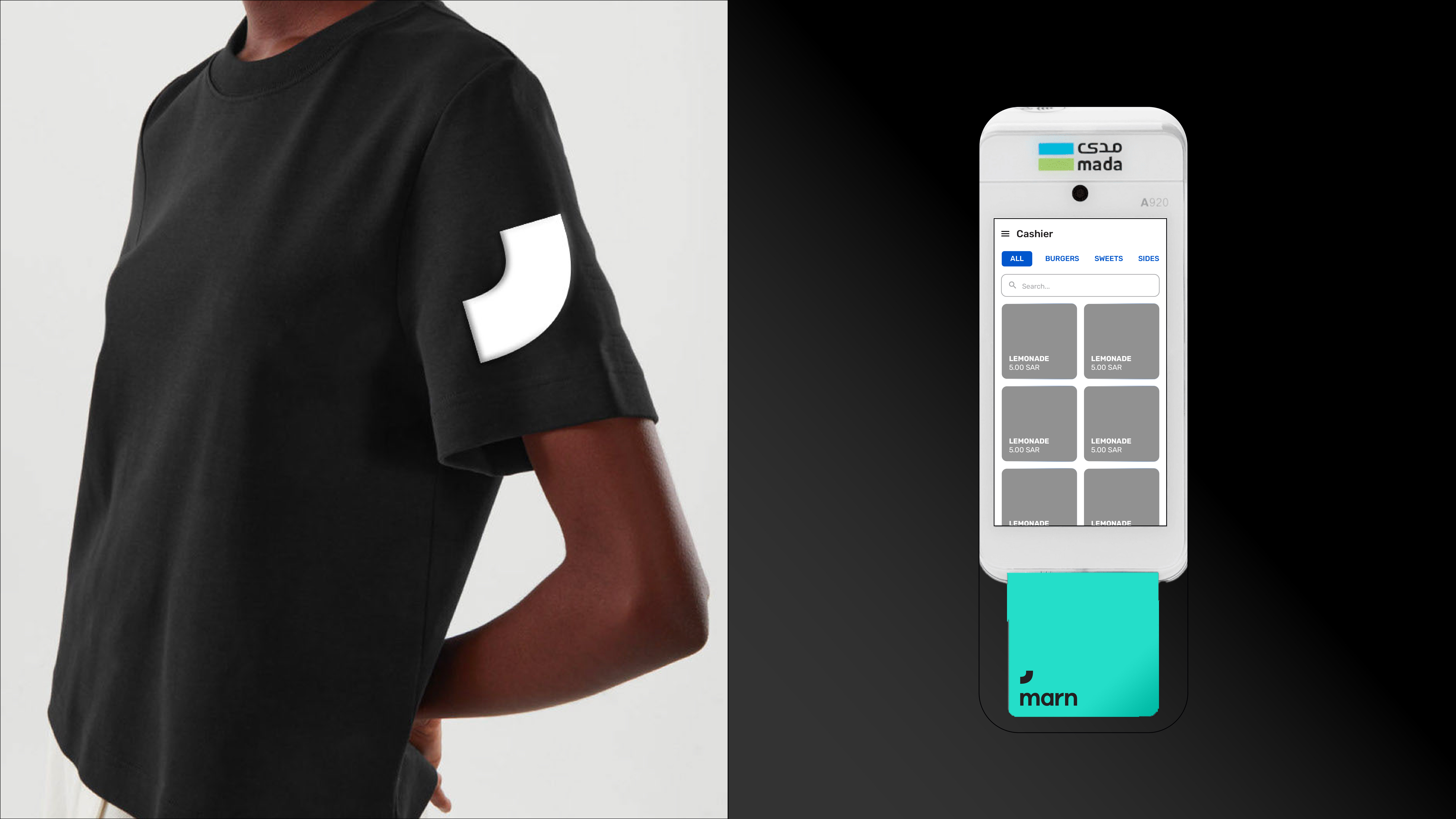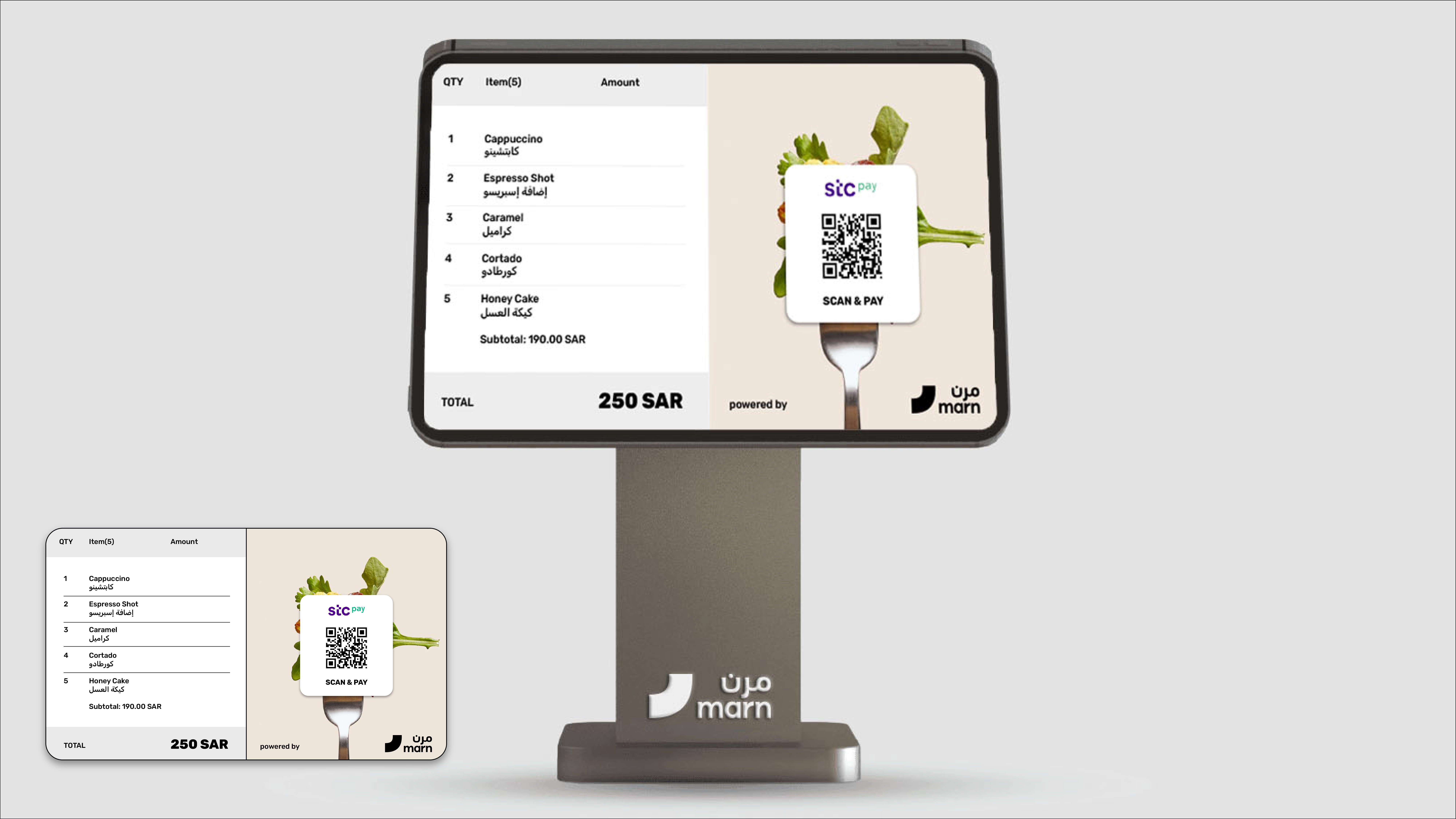

Marn’s rebrand brings clarity to a fast-moving fintech brand built for merchants. The refreshed bilingual logo is cleaner, tighter, and easier to recognise across screens and devices. A bold black, white, and blue foundation is paired with distinct colours for Pay, POS, KDS, CDS, and Kiosk. Illustration, iconography, and modular layouts give the identity a practical digital rhythm. Packaging, interfaces, campaigns, and merchant touchpoints now speak in one direct, confident language.