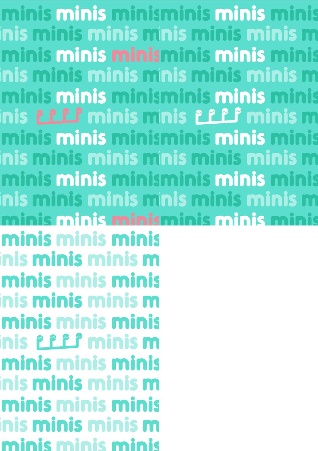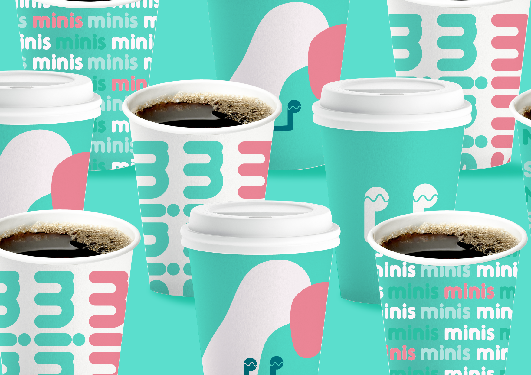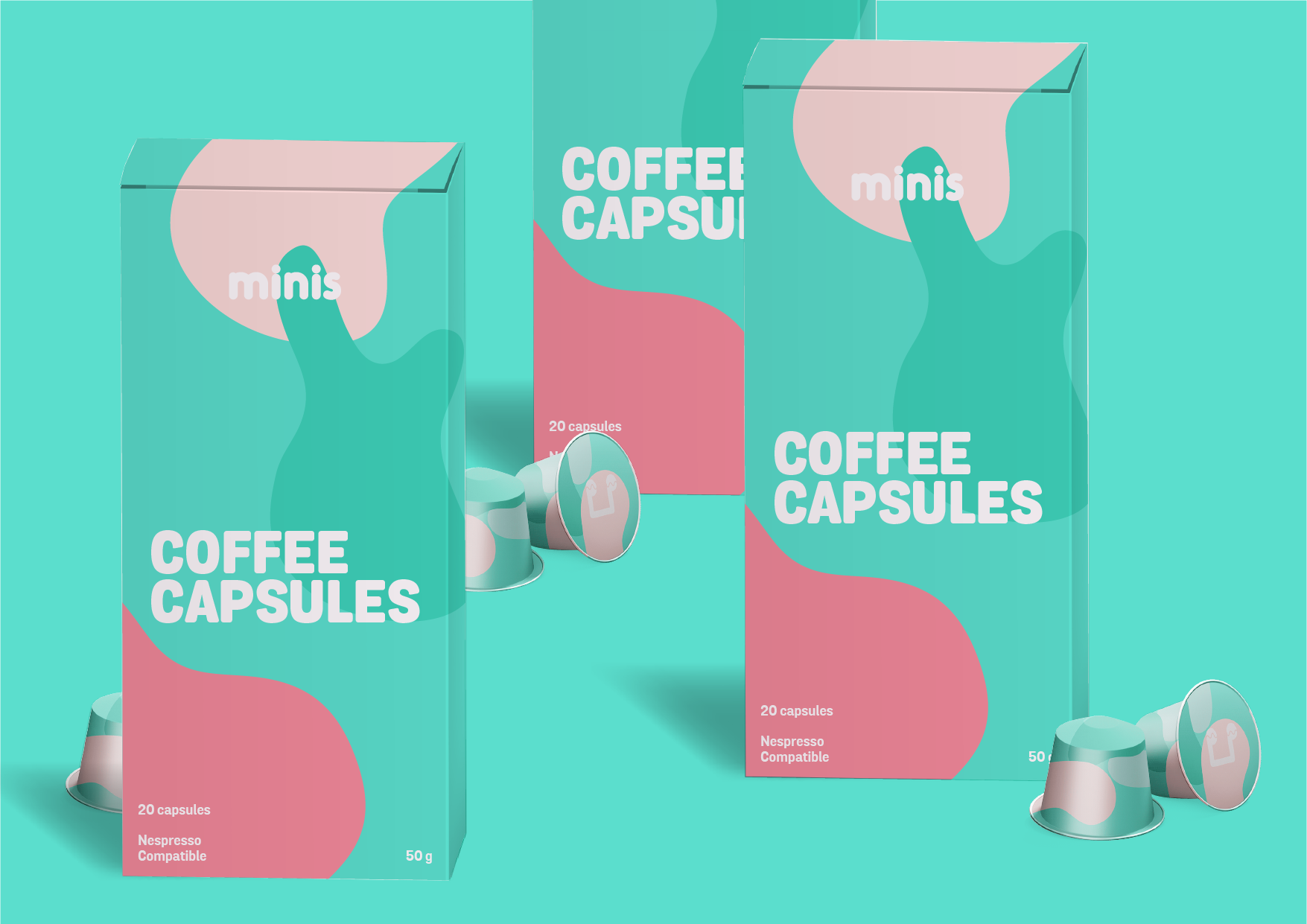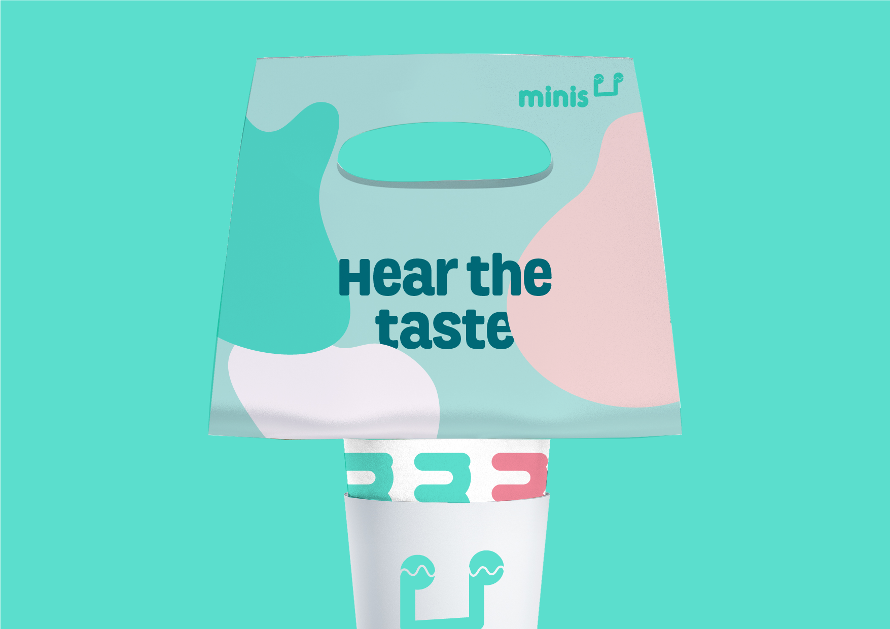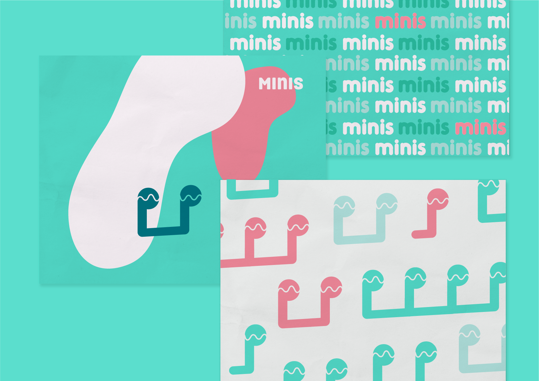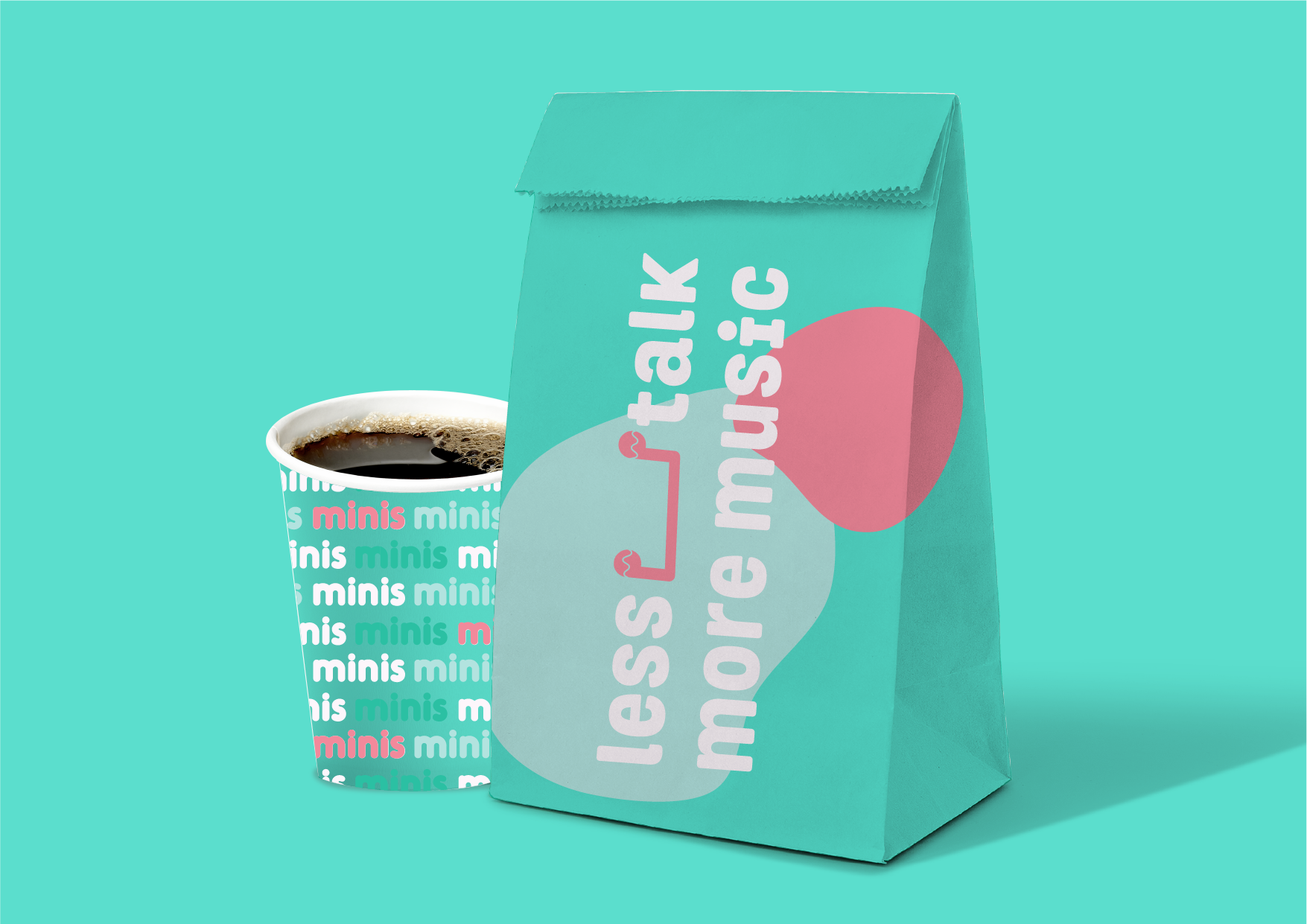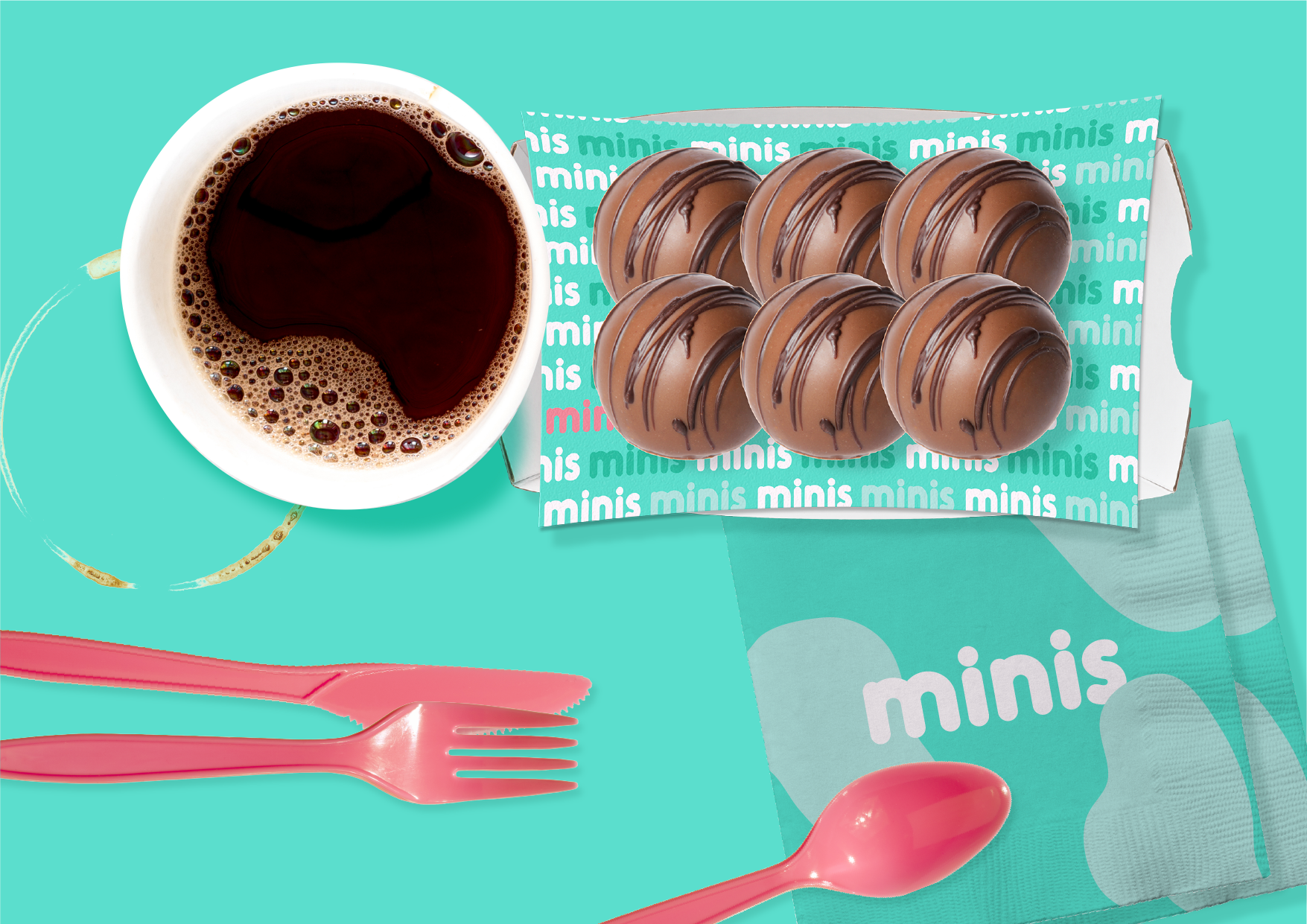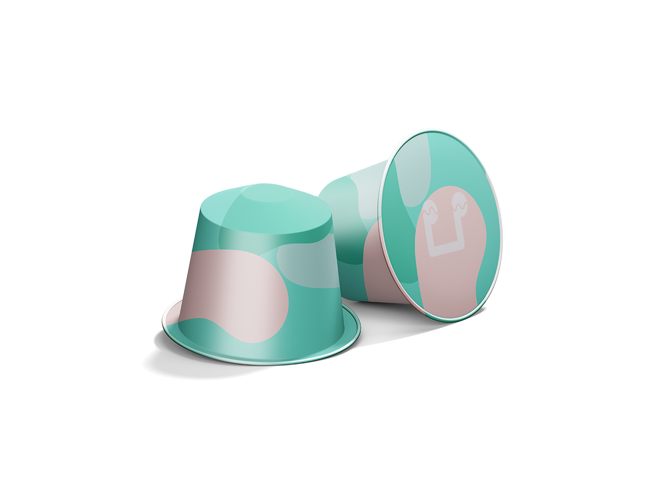
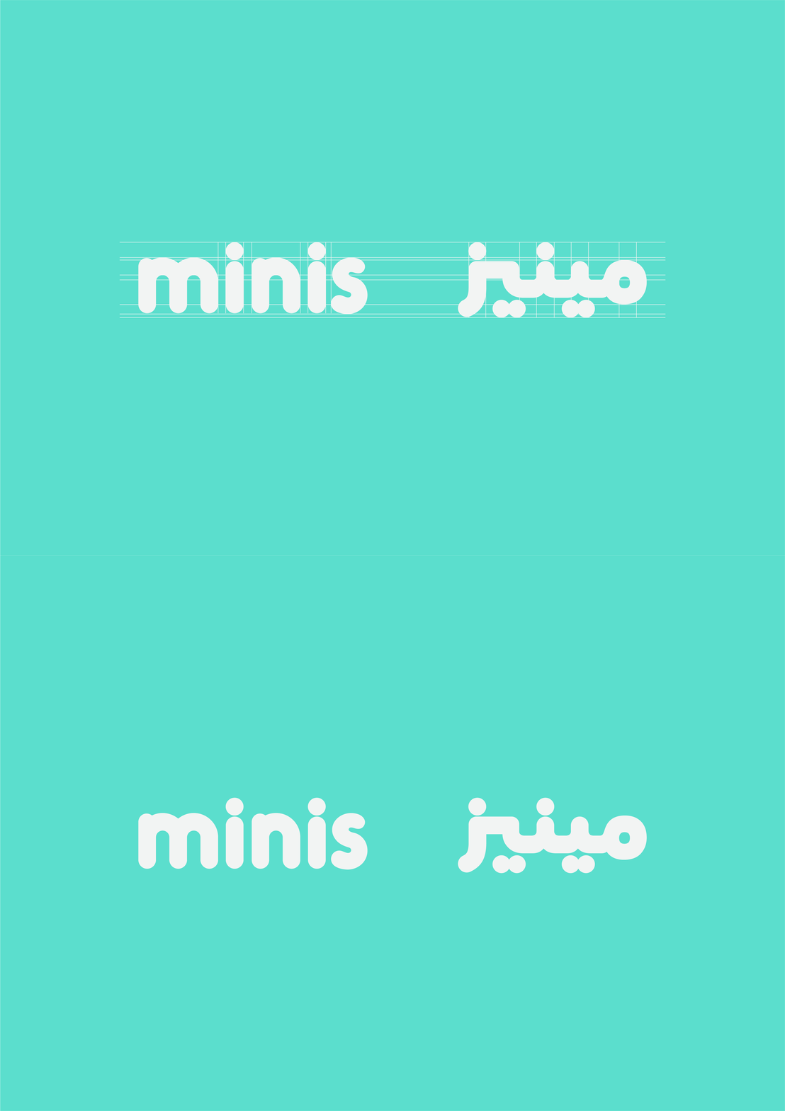
Minis may be small by name, but the rebrand was designed with plenty of personality. The refreshed identity uses rounded typography, fluid shapes, and a bright mix of turquoise, pink, and deep navy. A playful graphic system gives the brand an easy, recognisable rhythm without overcomplicating it. Coffee capsules, takeaway packaging, and everyday touchpoints carry the same energetic visual language. Minis feels light, colourful, and made to bring a little fun into the coffee routine.