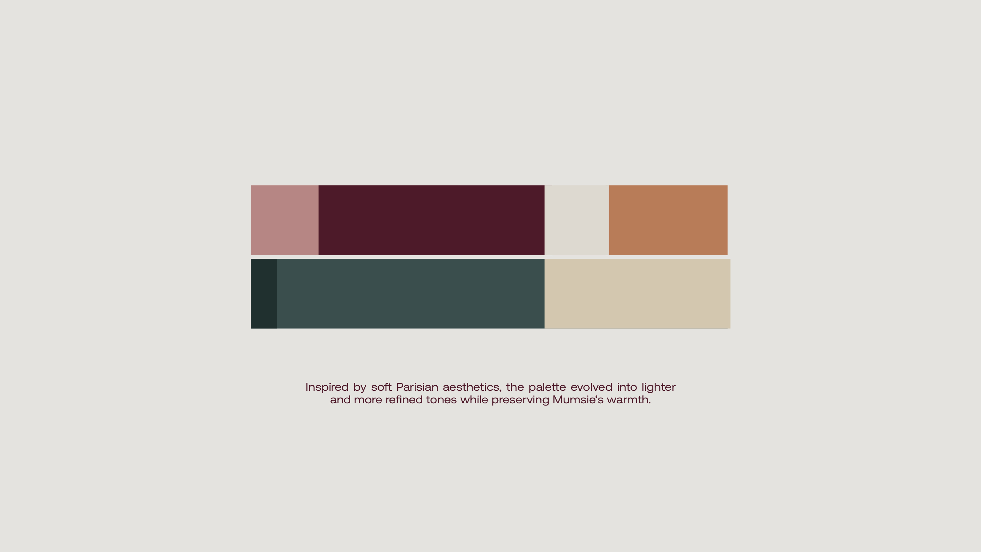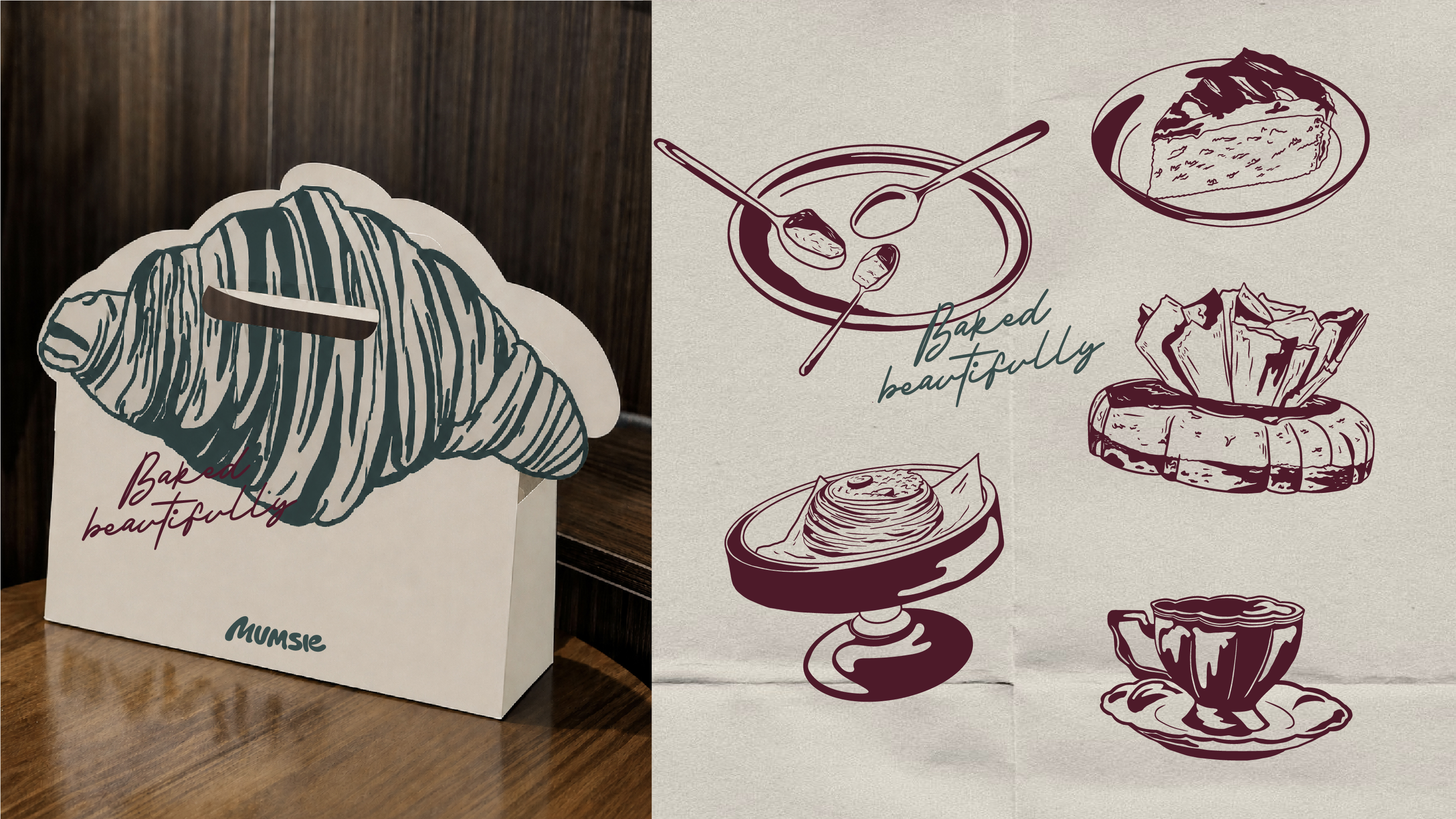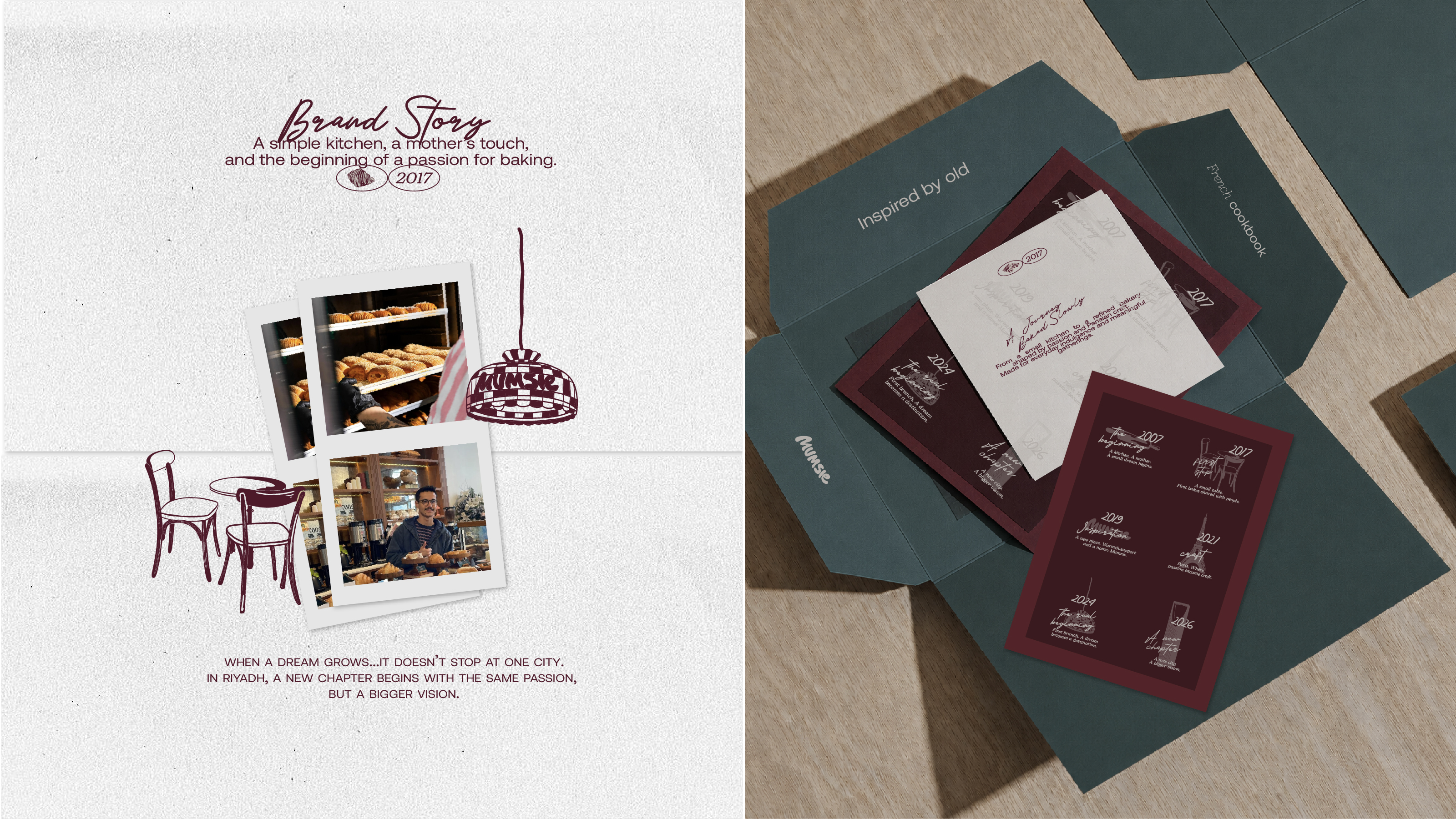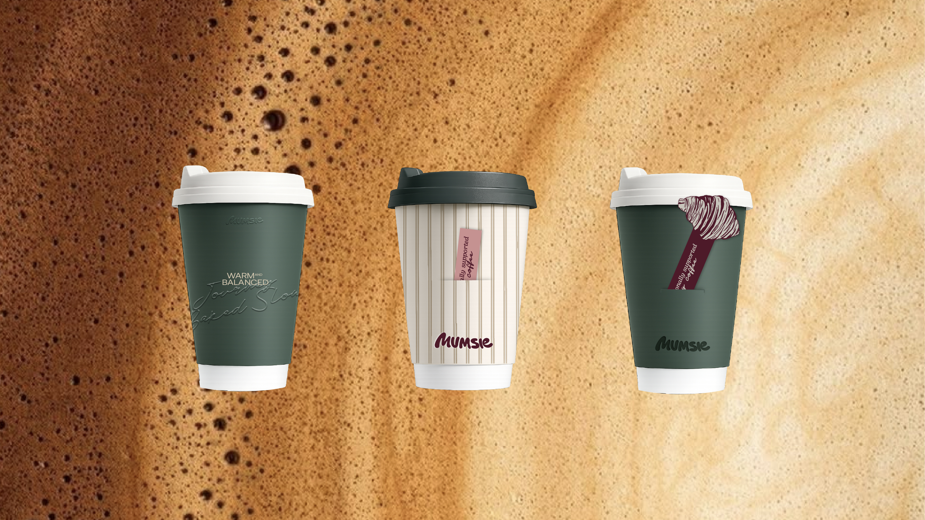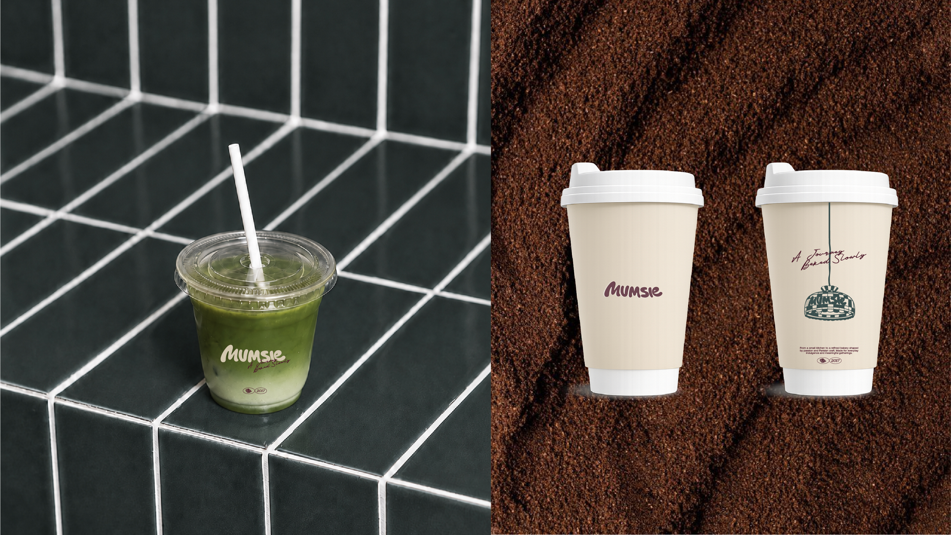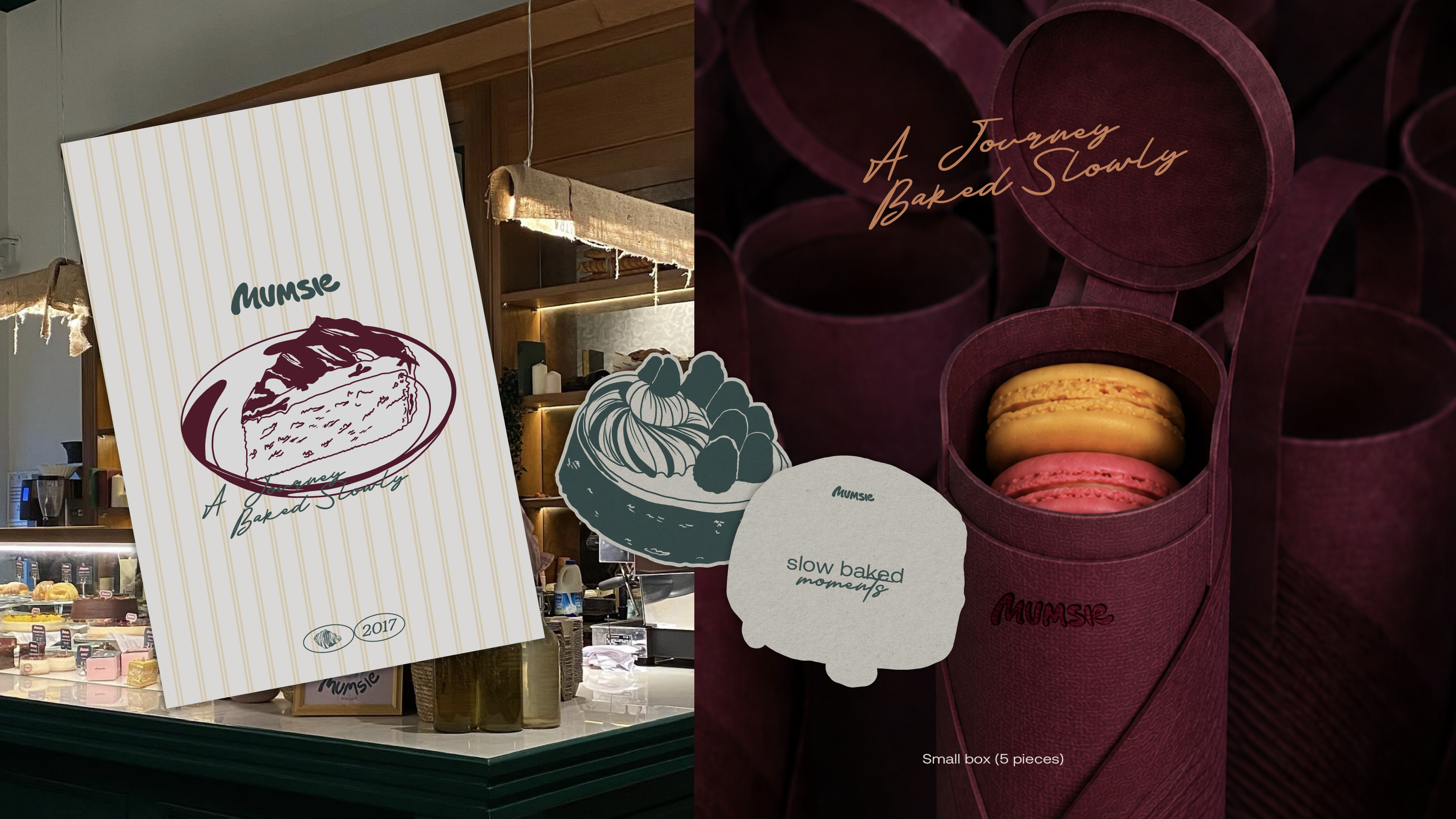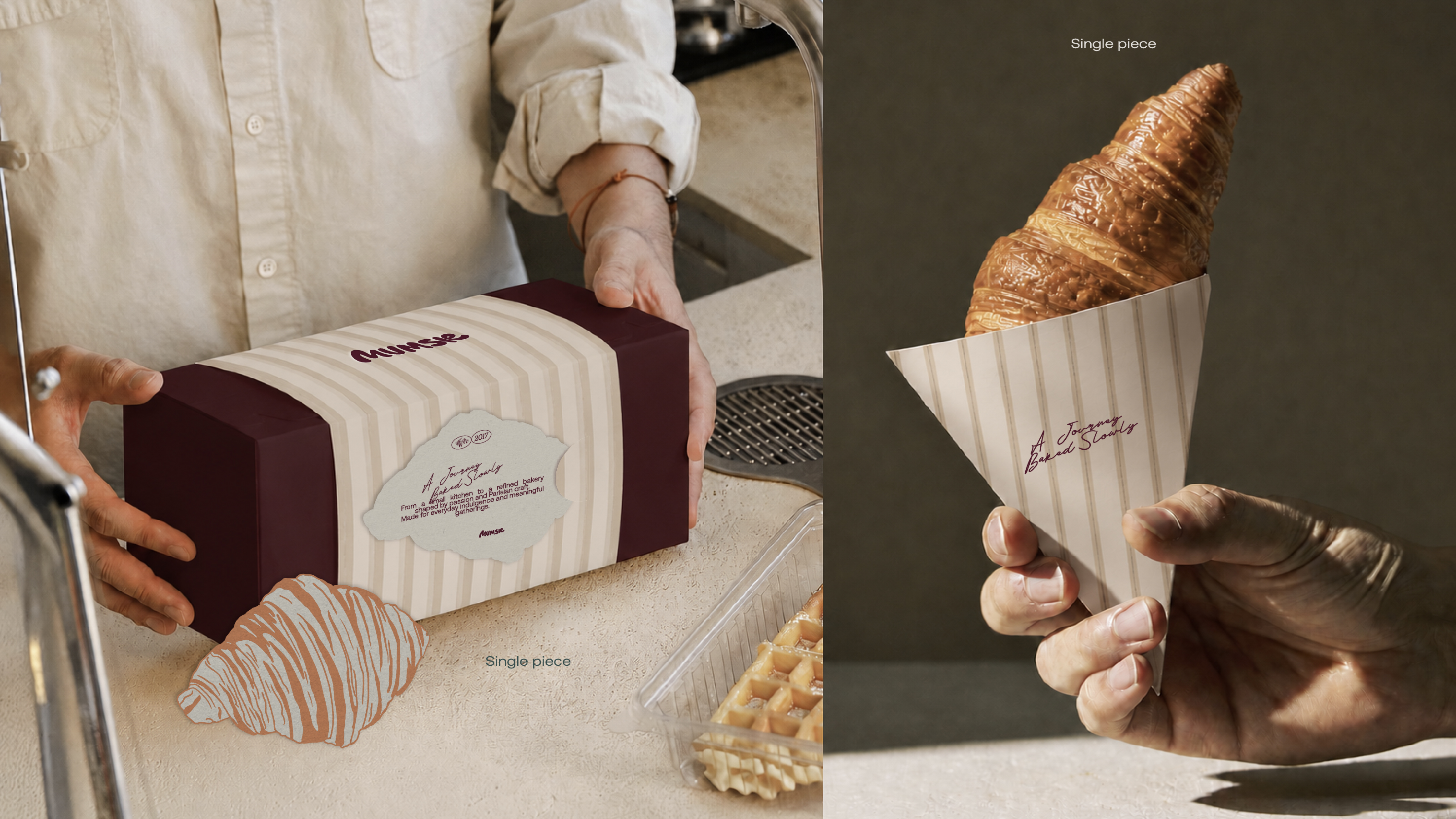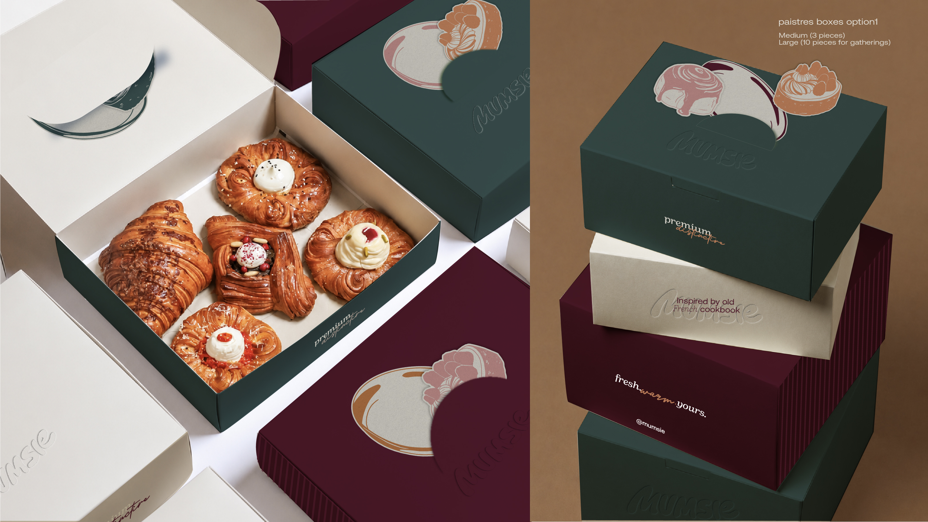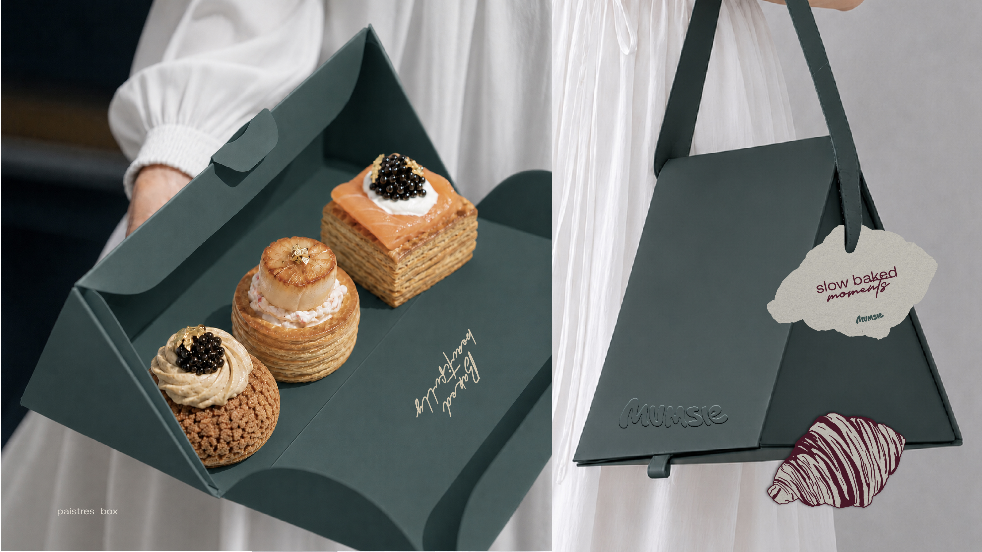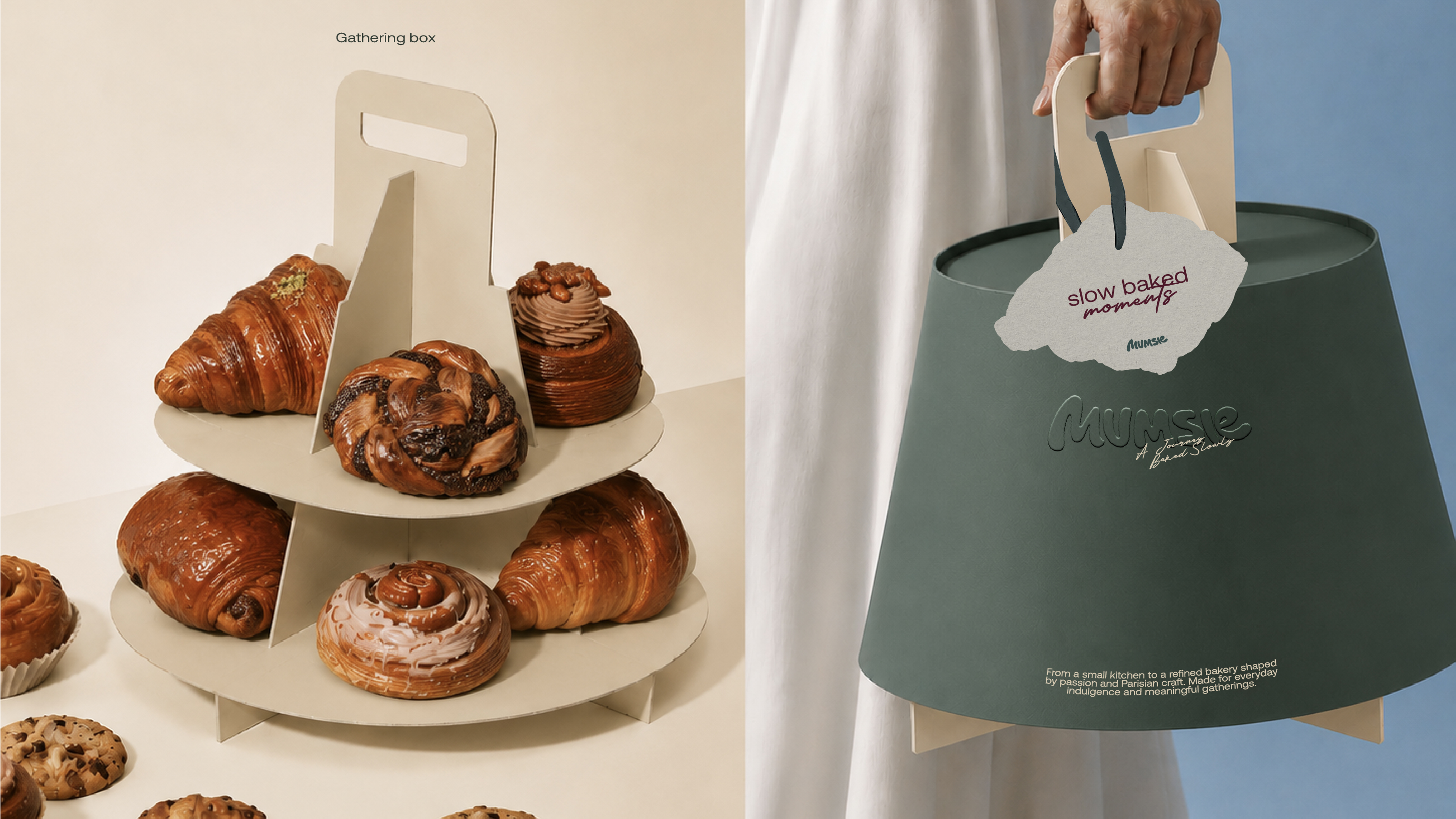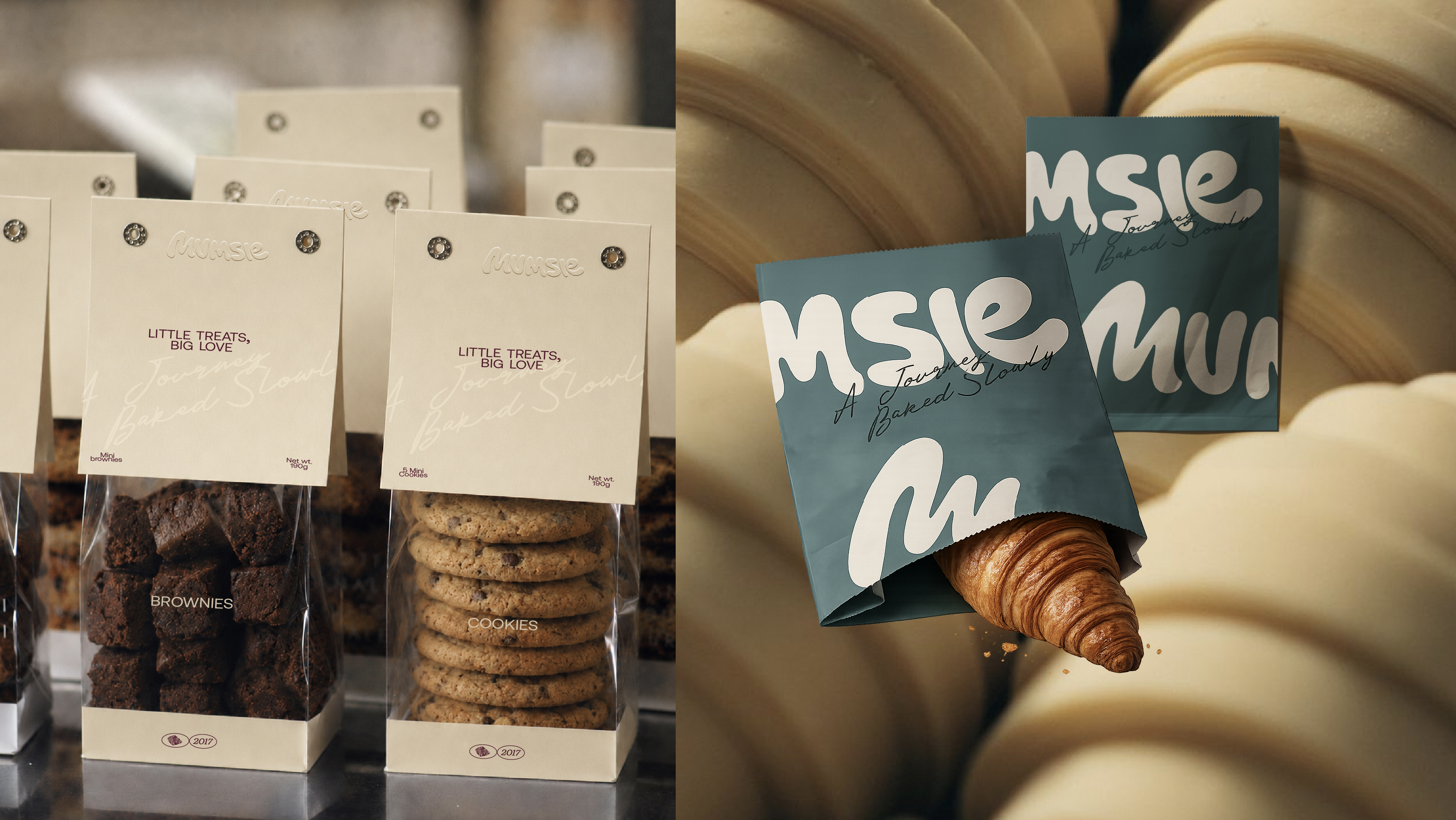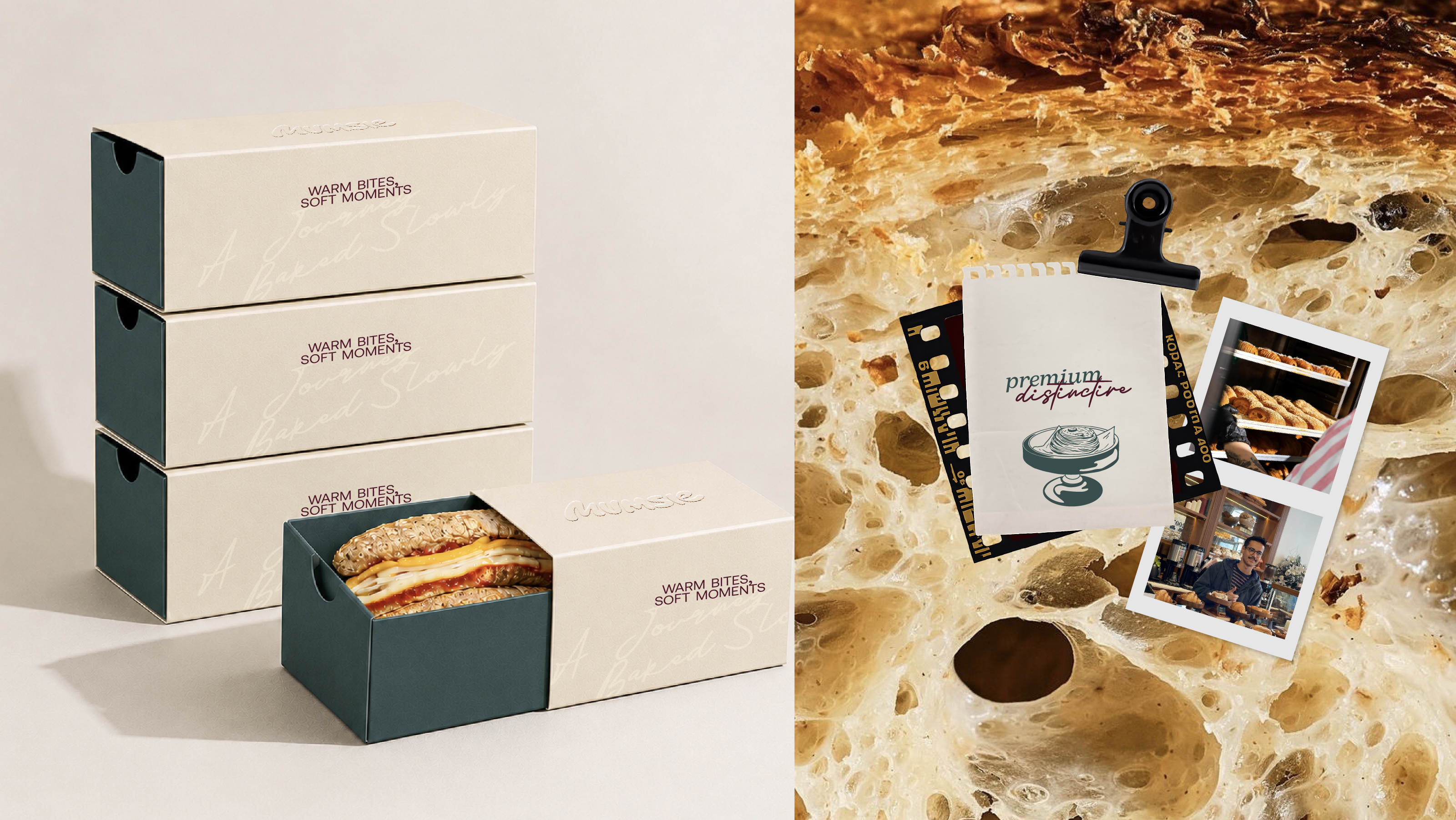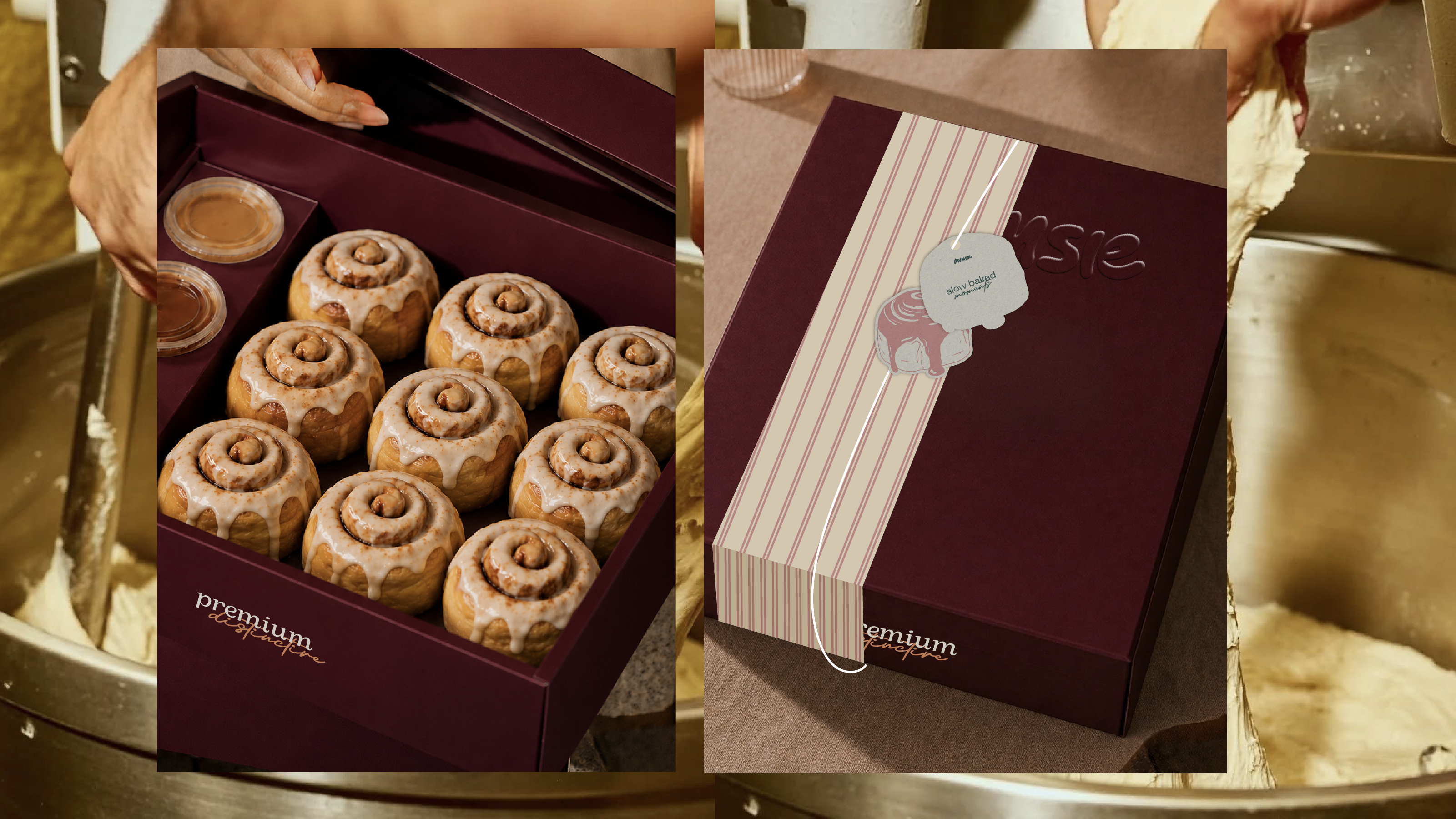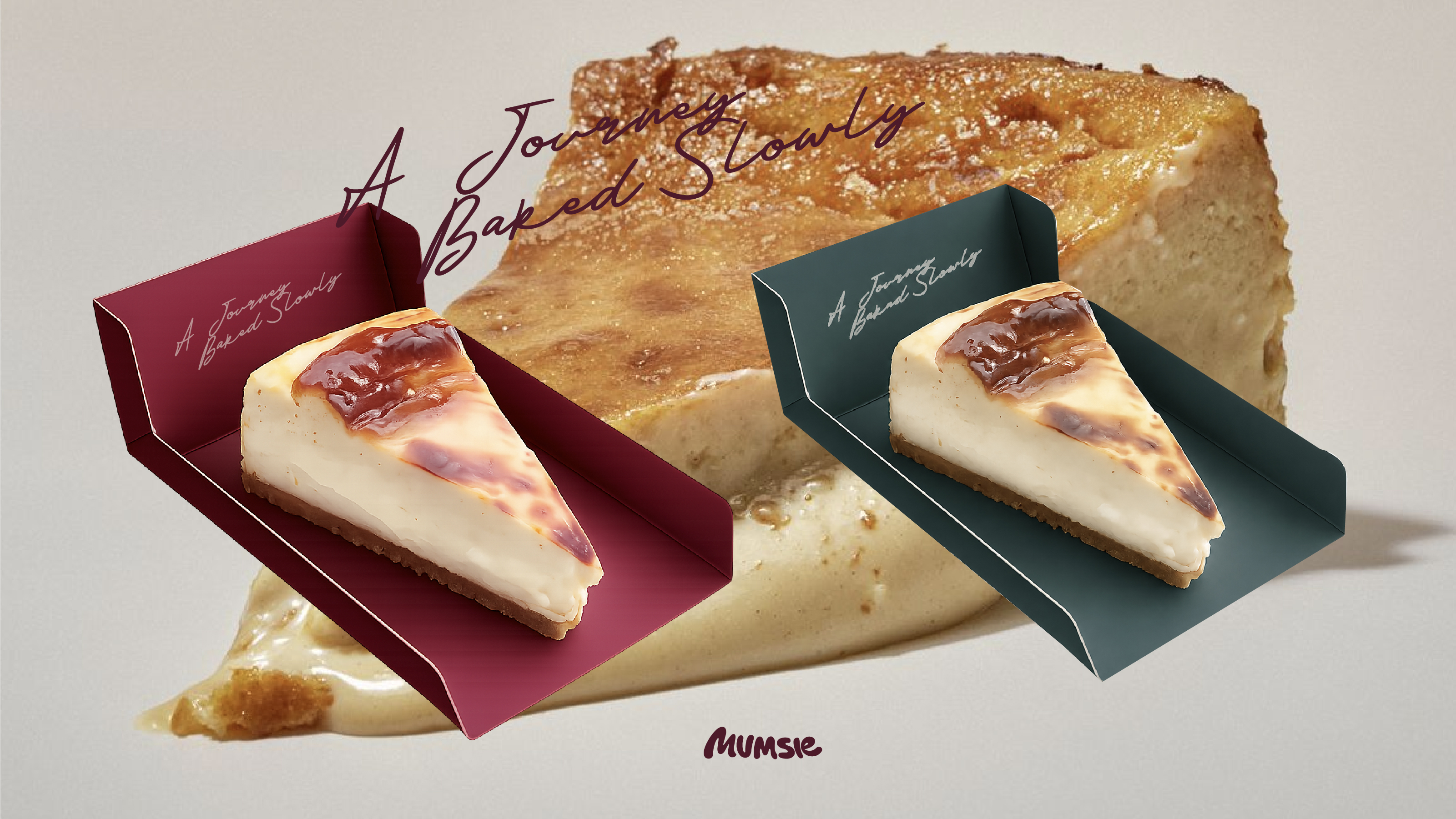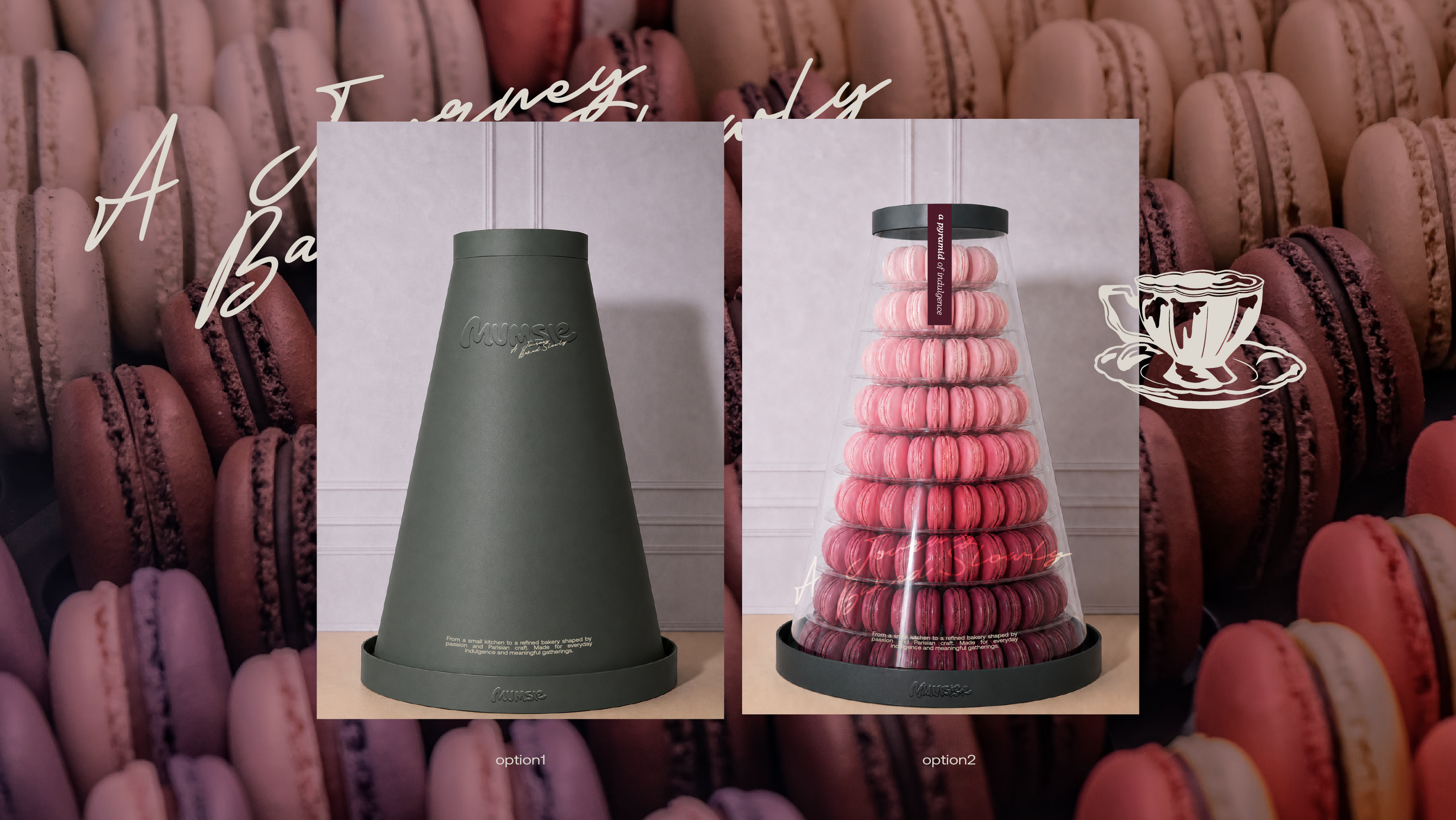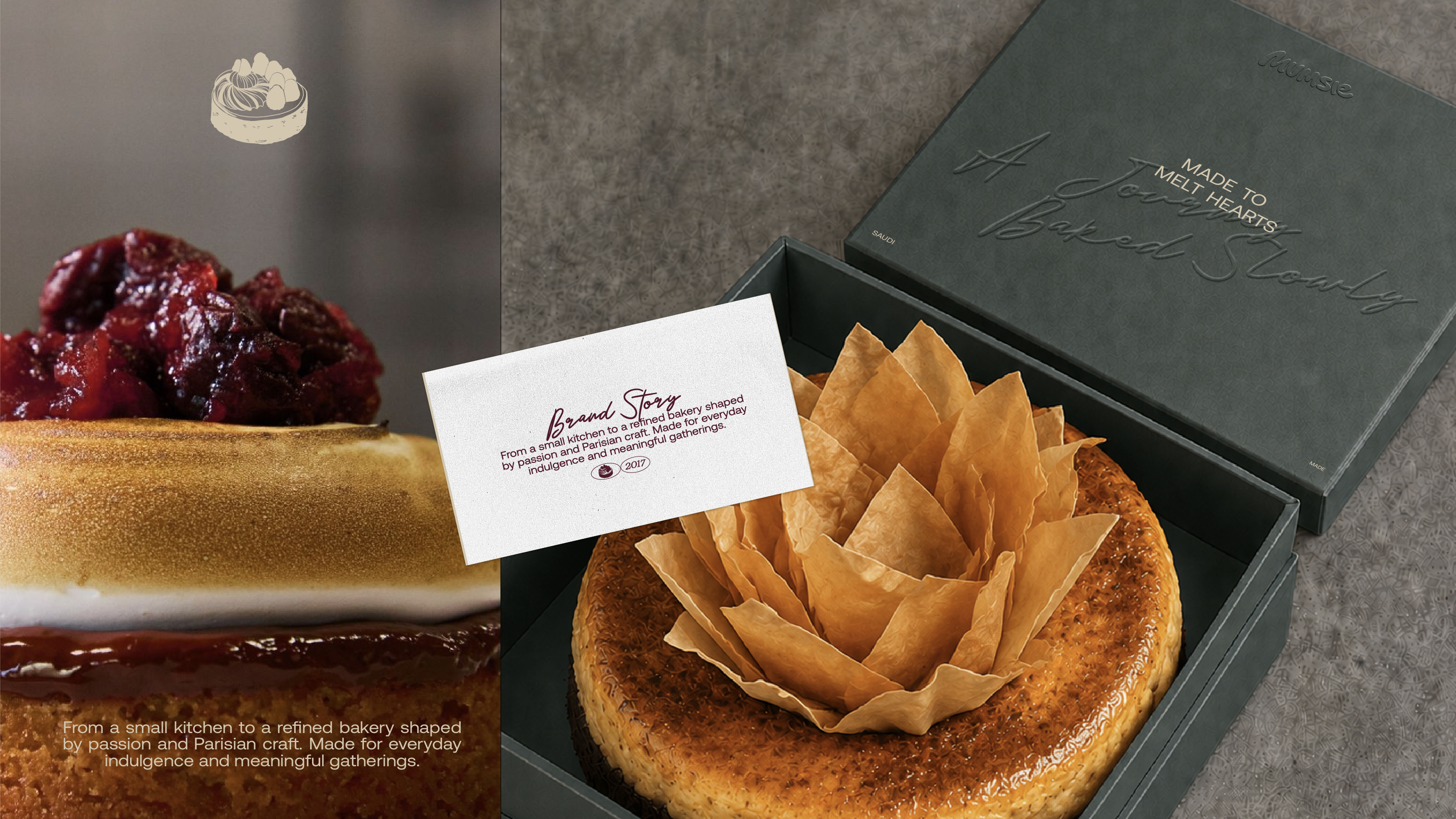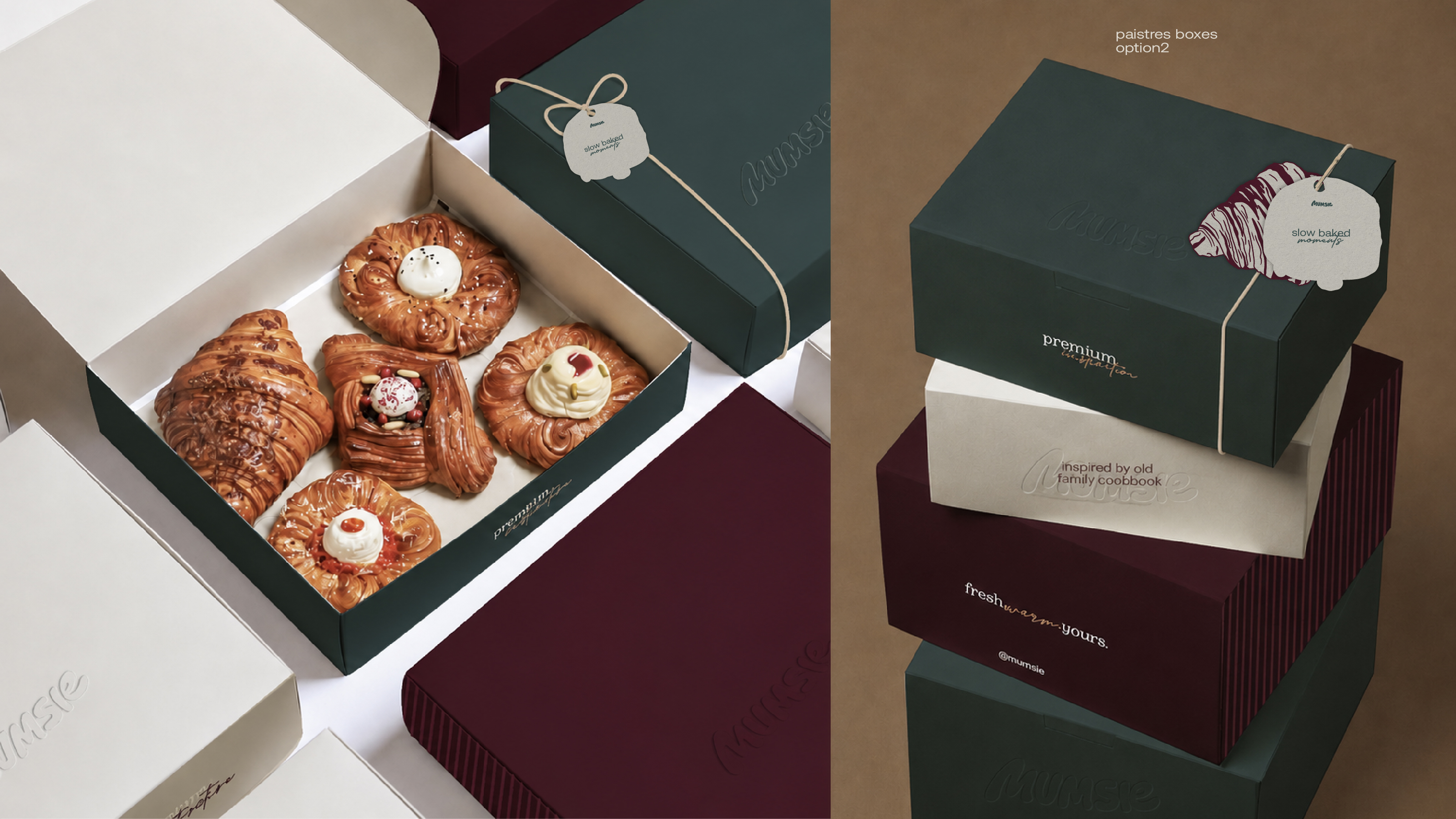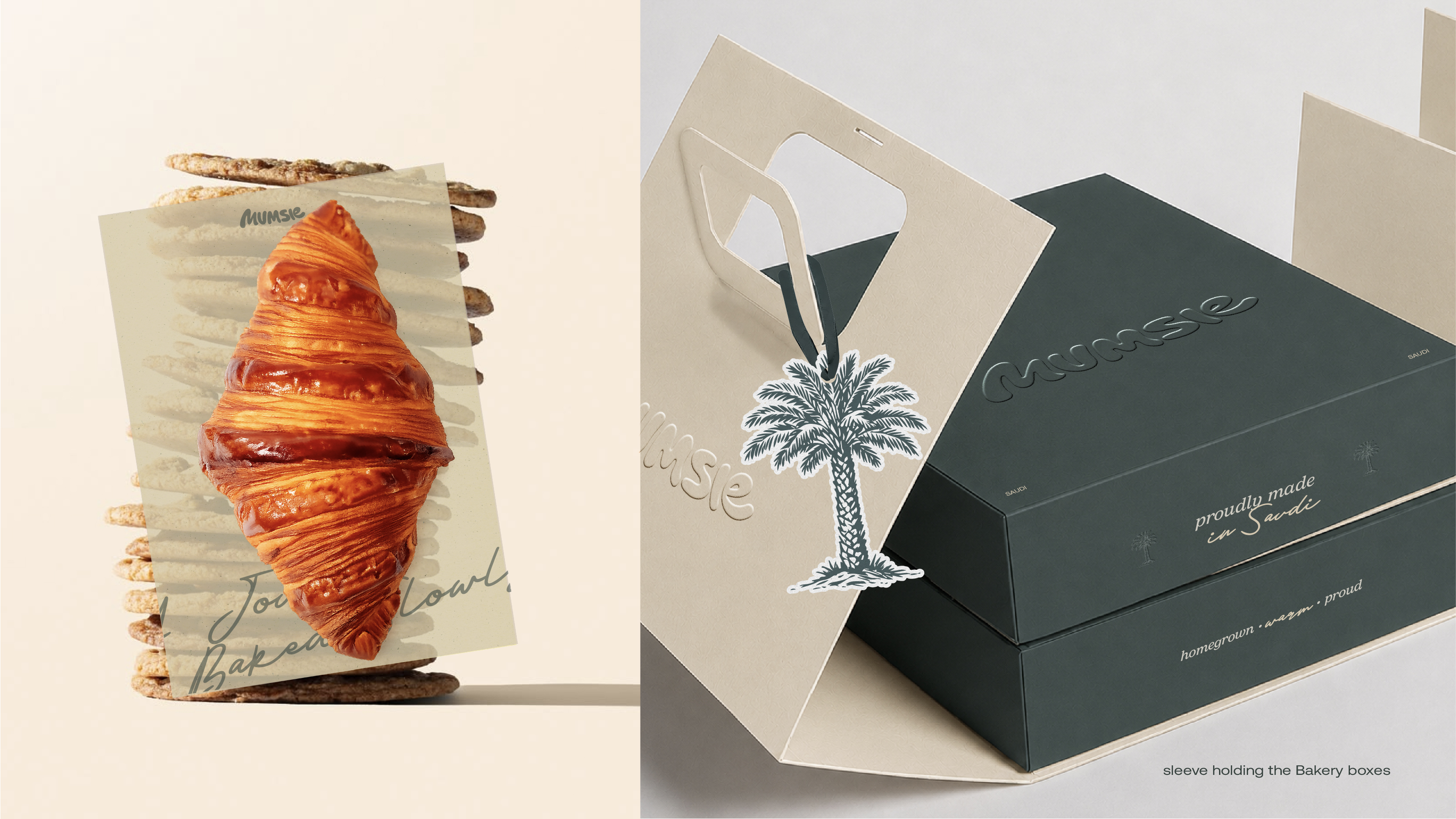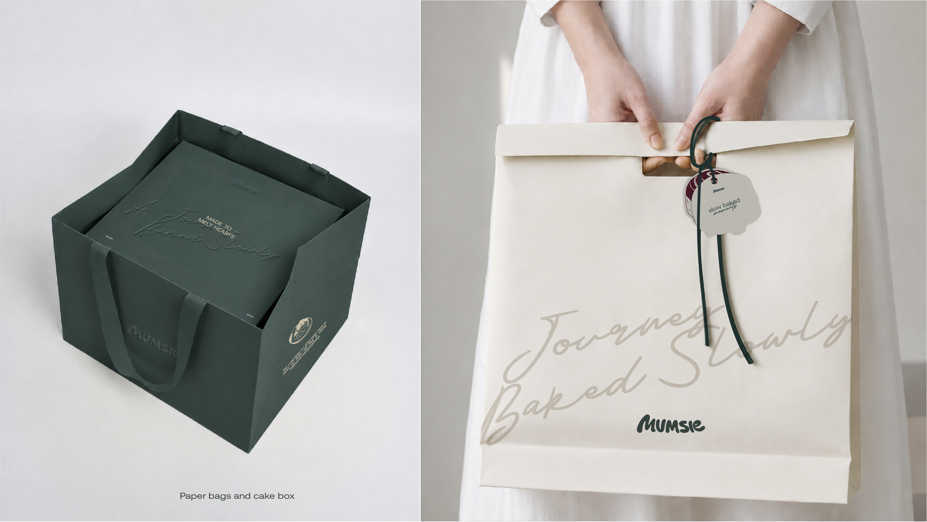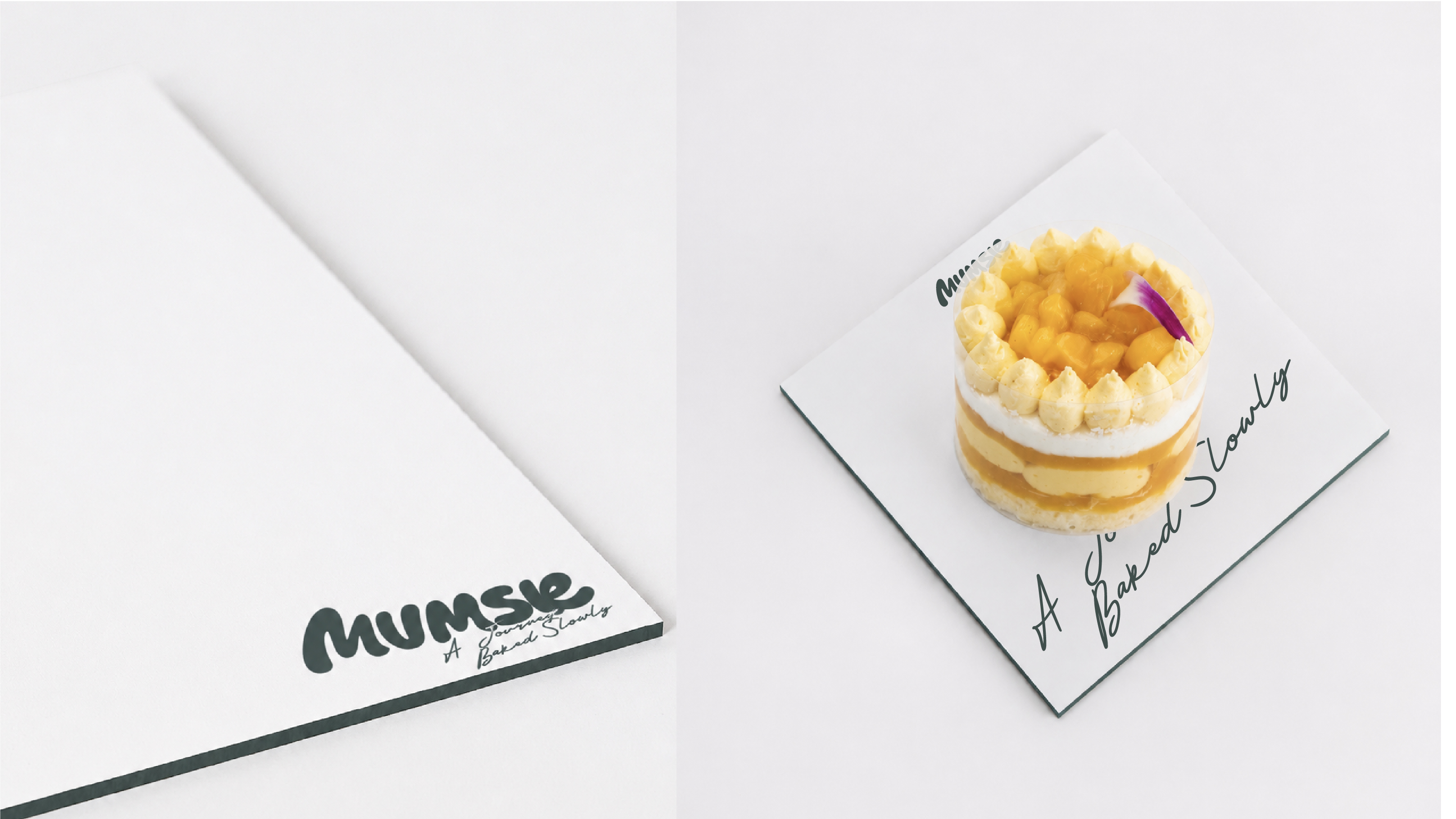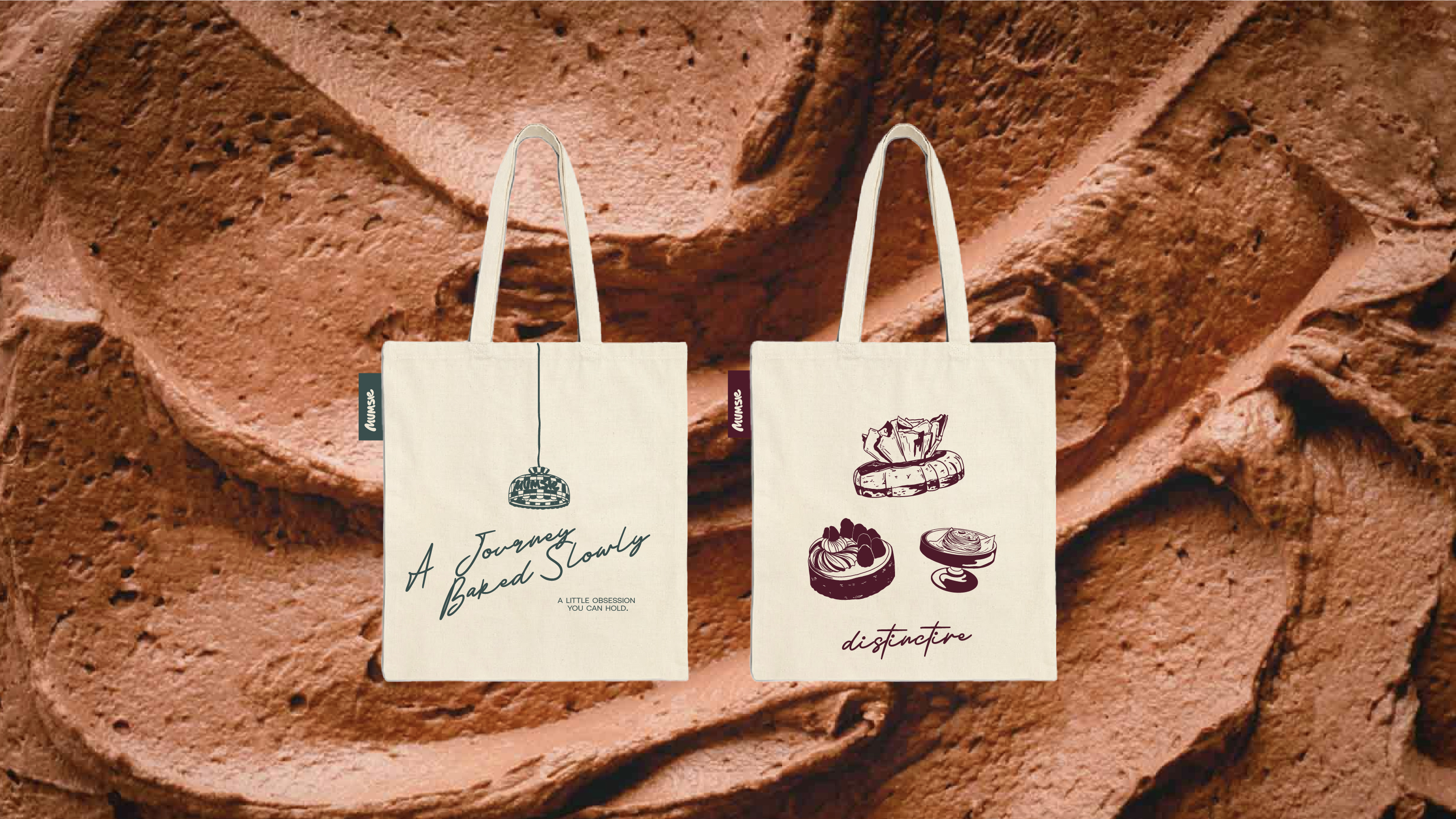
Mumsie’s rebrand refreshes the bakery without losing the warmth people already know. The identity pairs a softer wordmark with deep green, burgundy, cream, and warm pastry tones. Illustrated products, handwritten details, and layered textures bring a crafted, personal feel to the system. Packaging was redesigned to make every order feel considered, whether it holds one pastry or a full gathering. The brand now feels more refined, more expressive, and still unmistakably Mumsie.