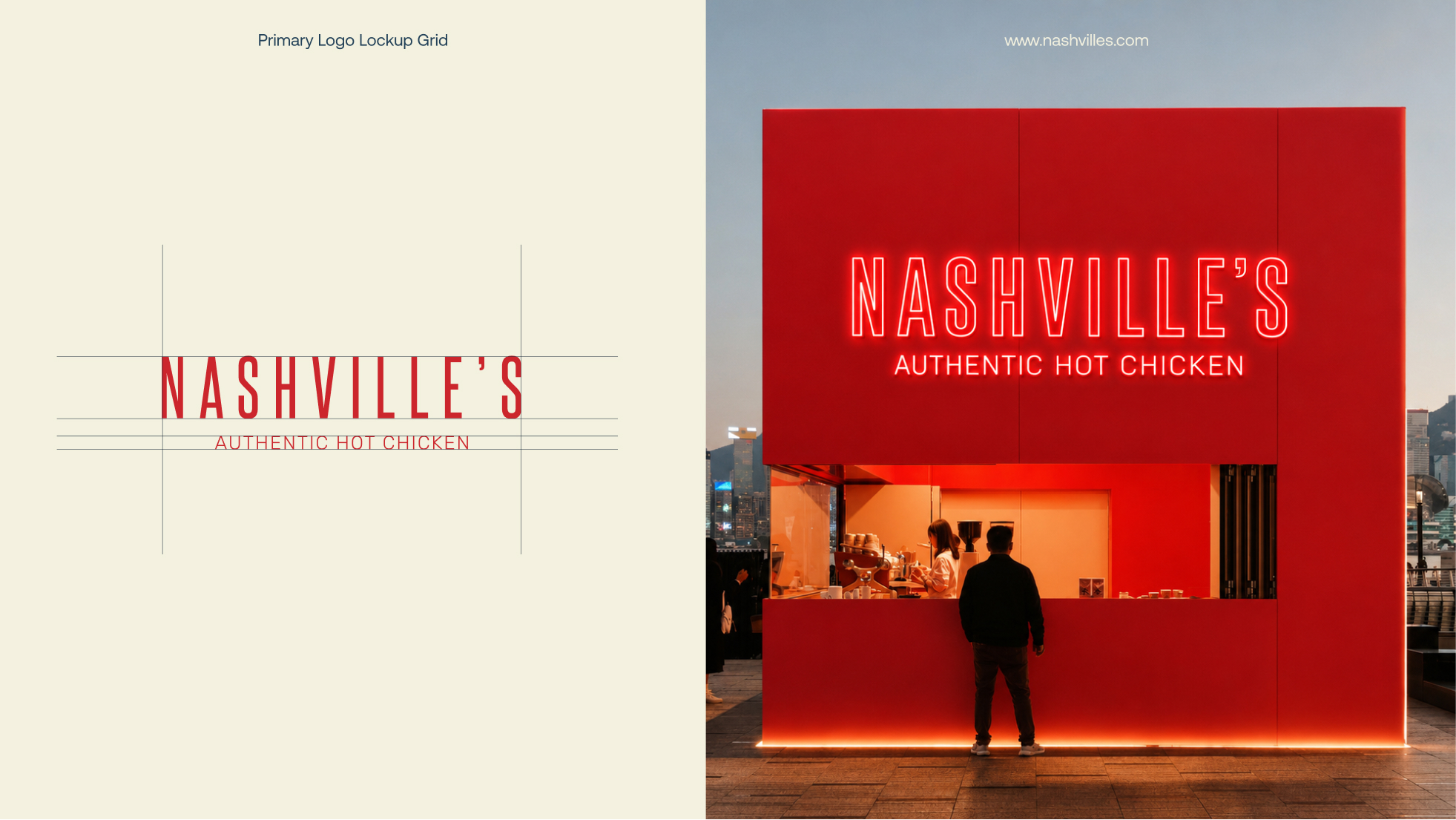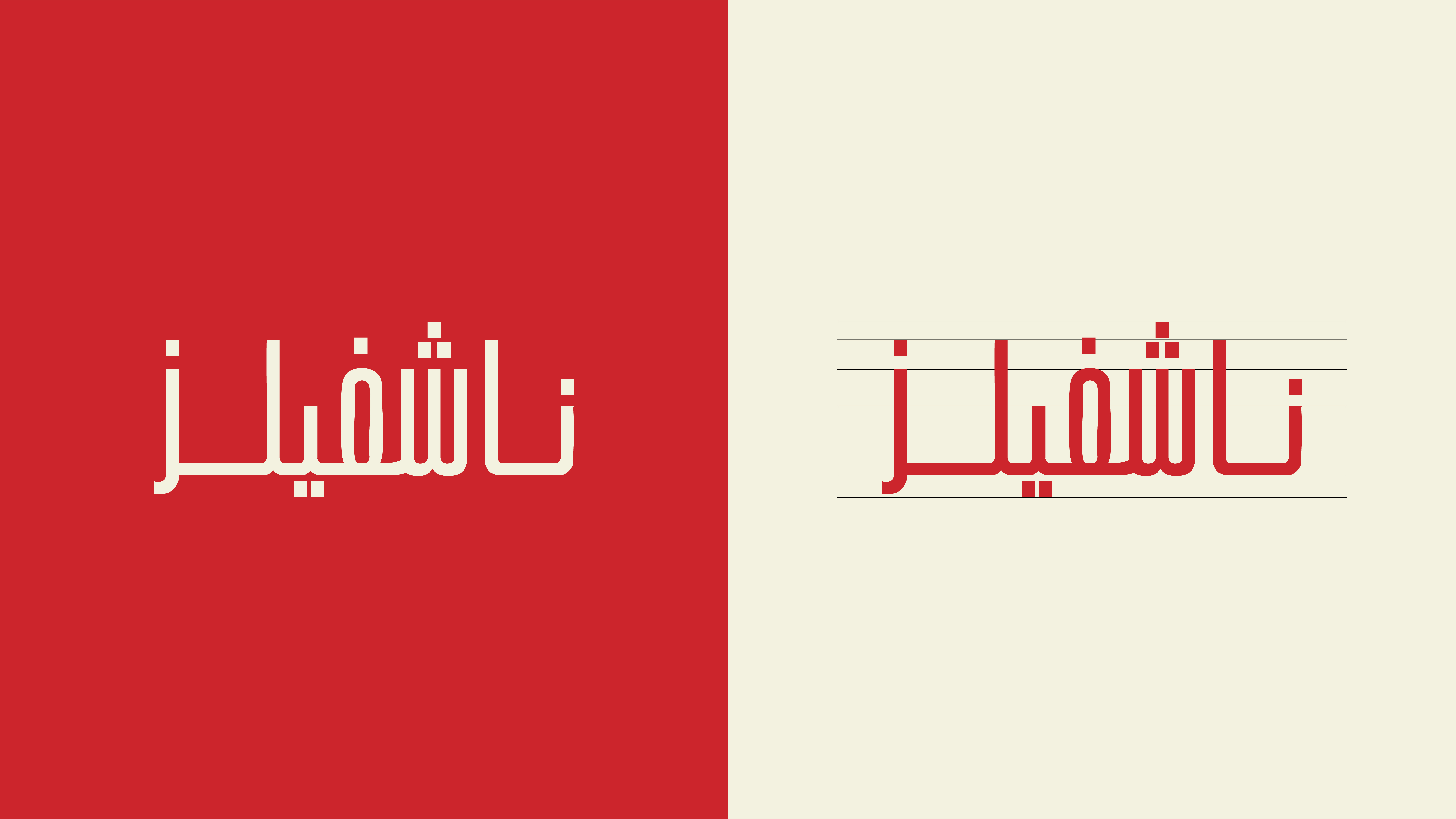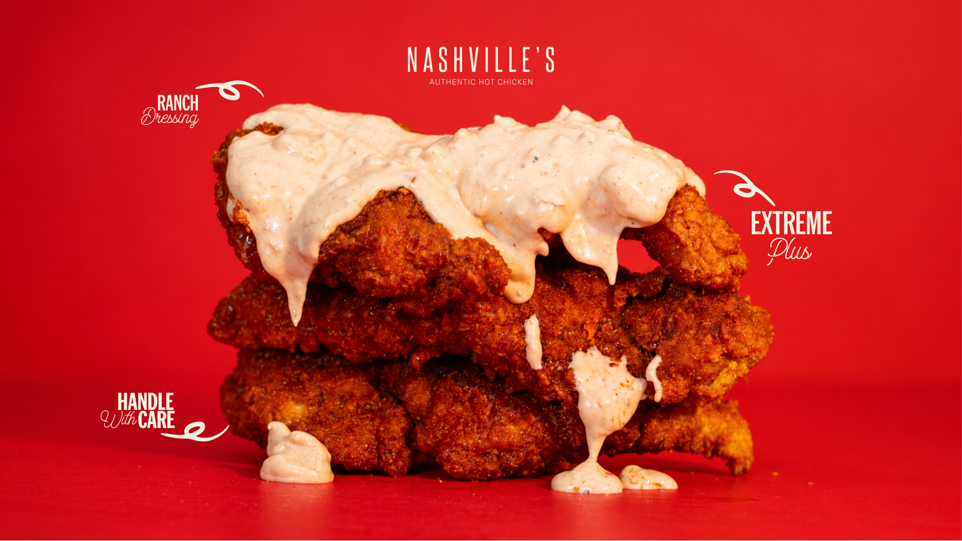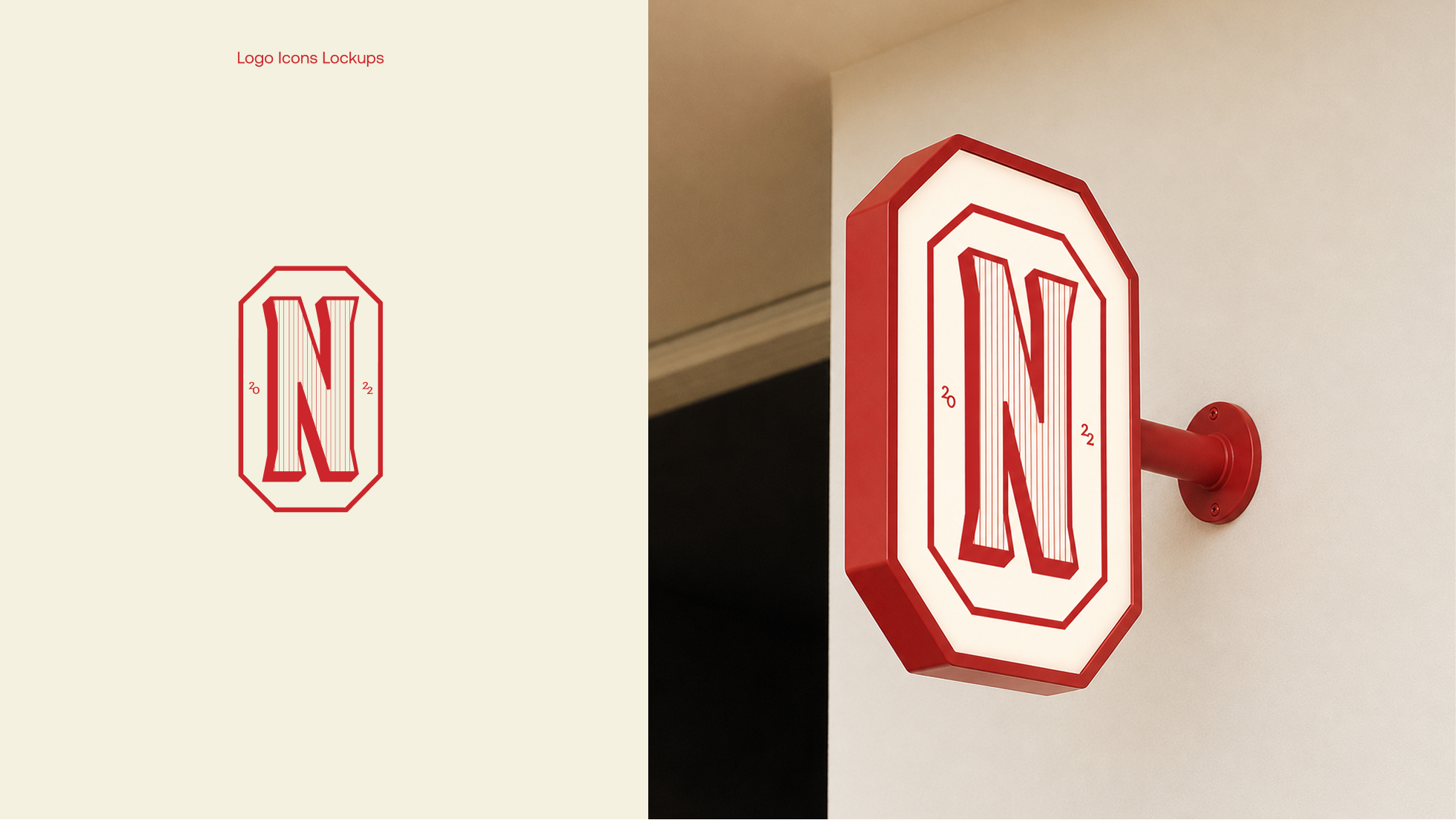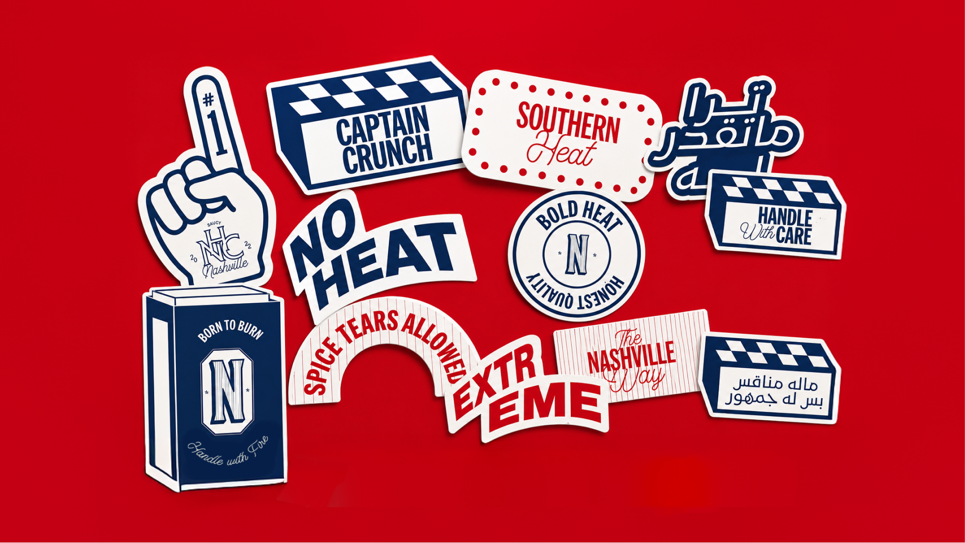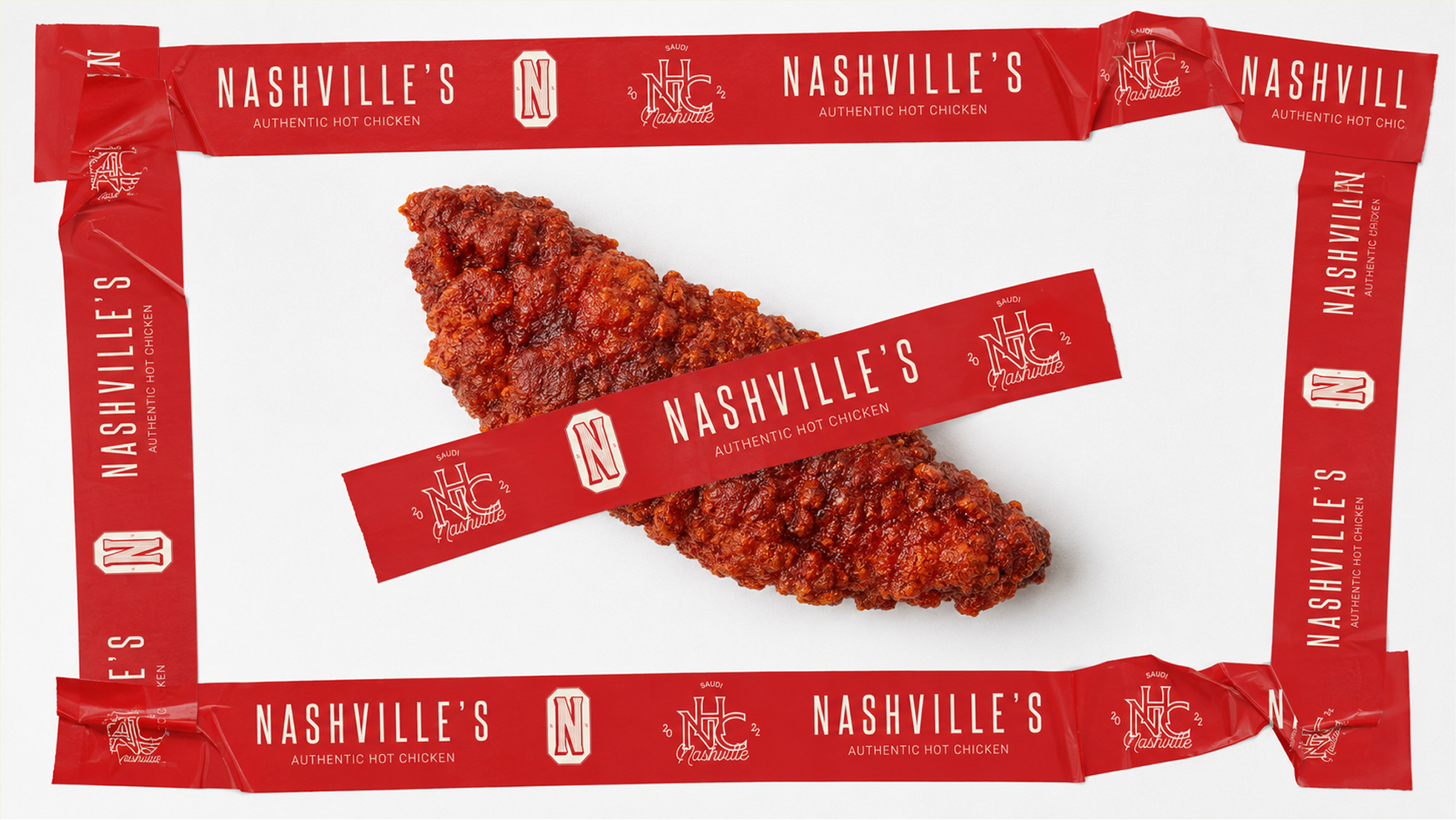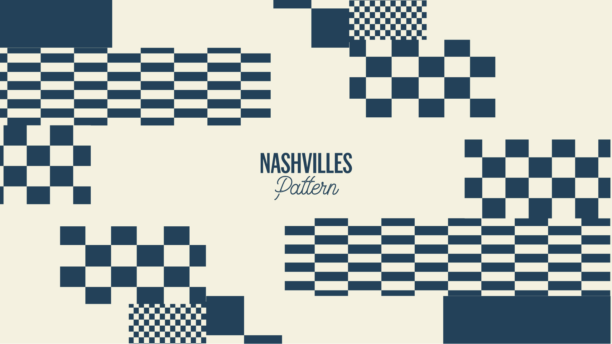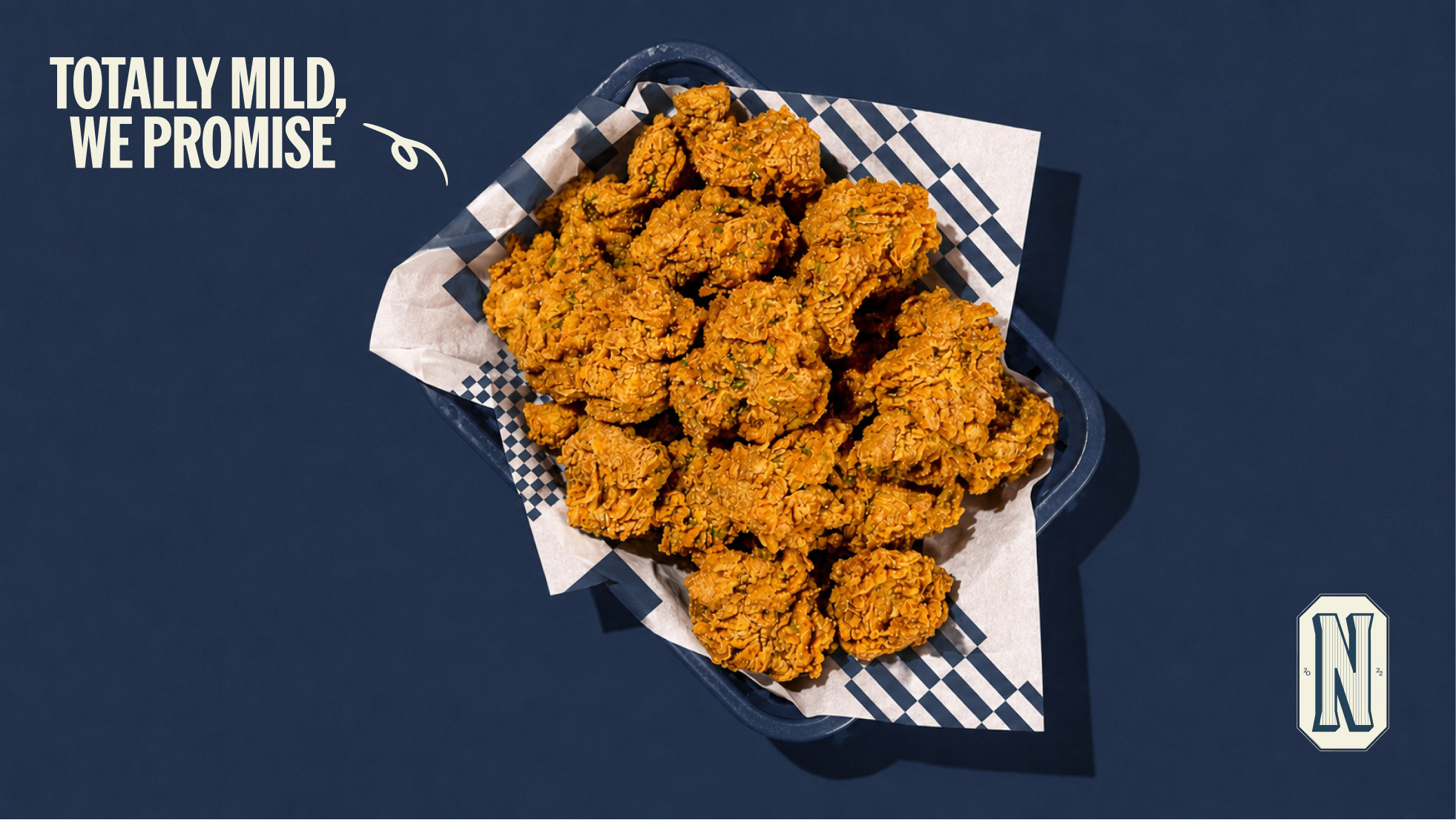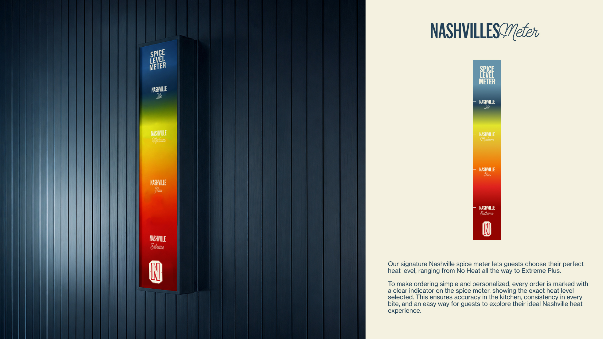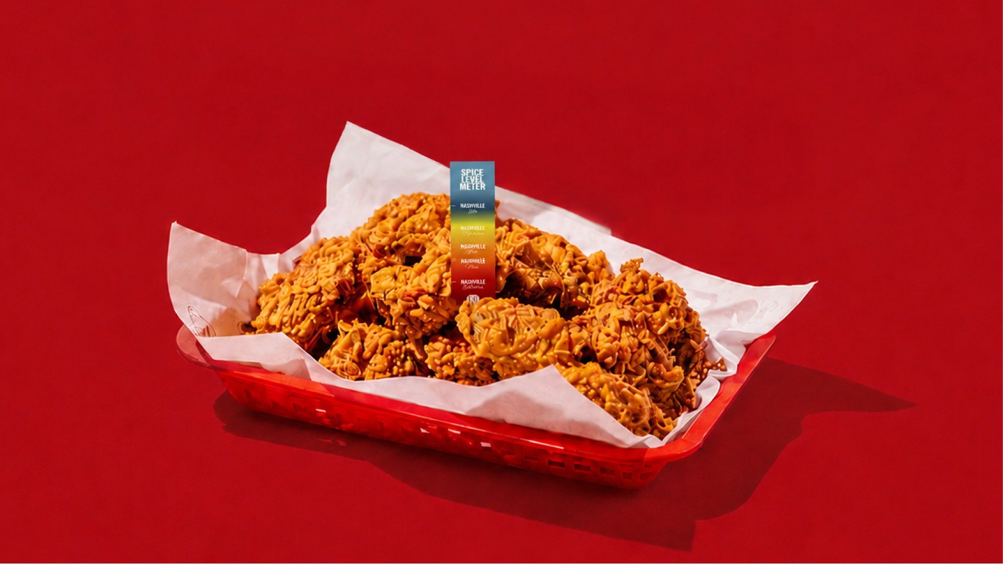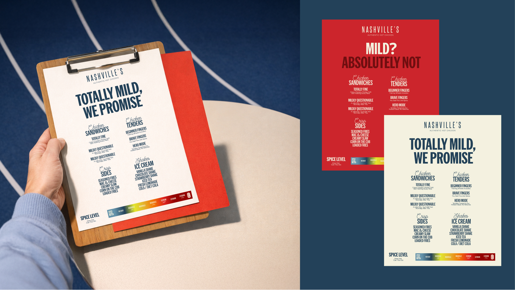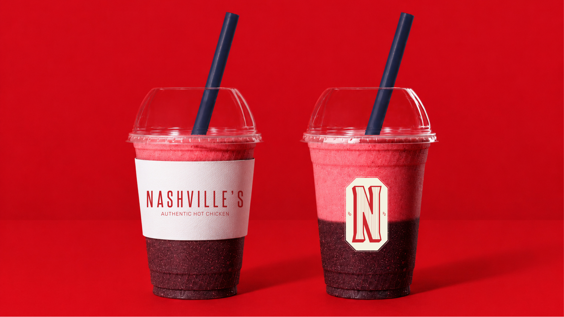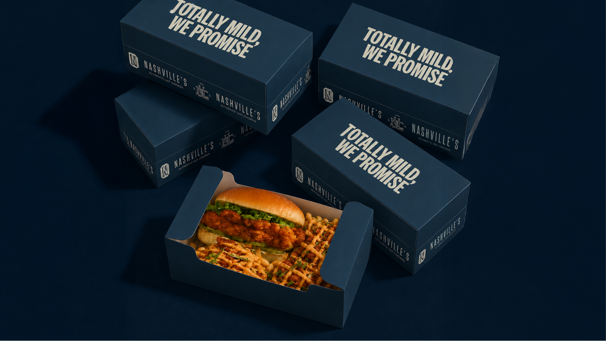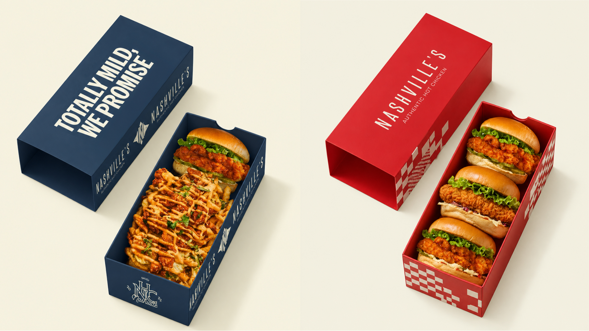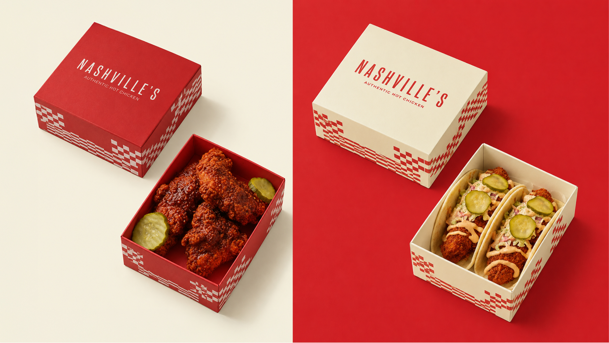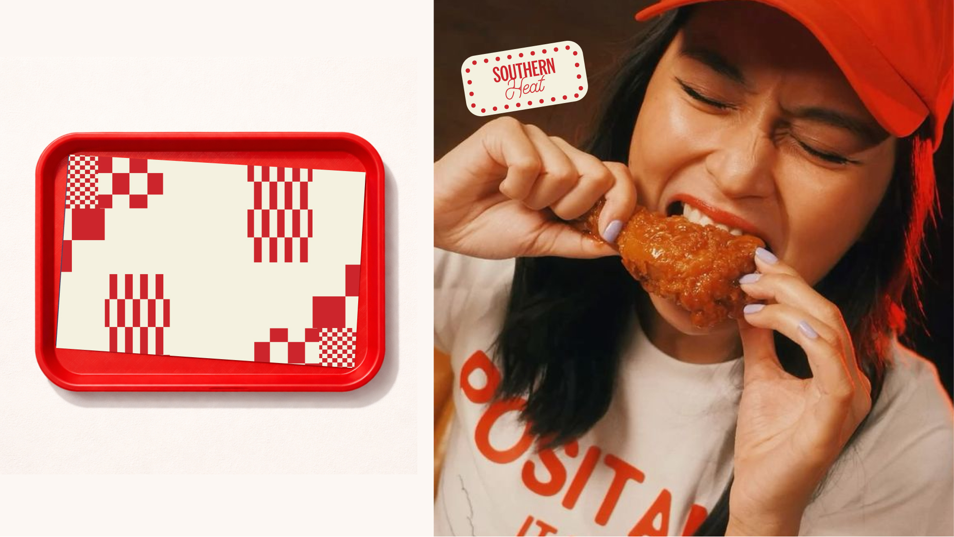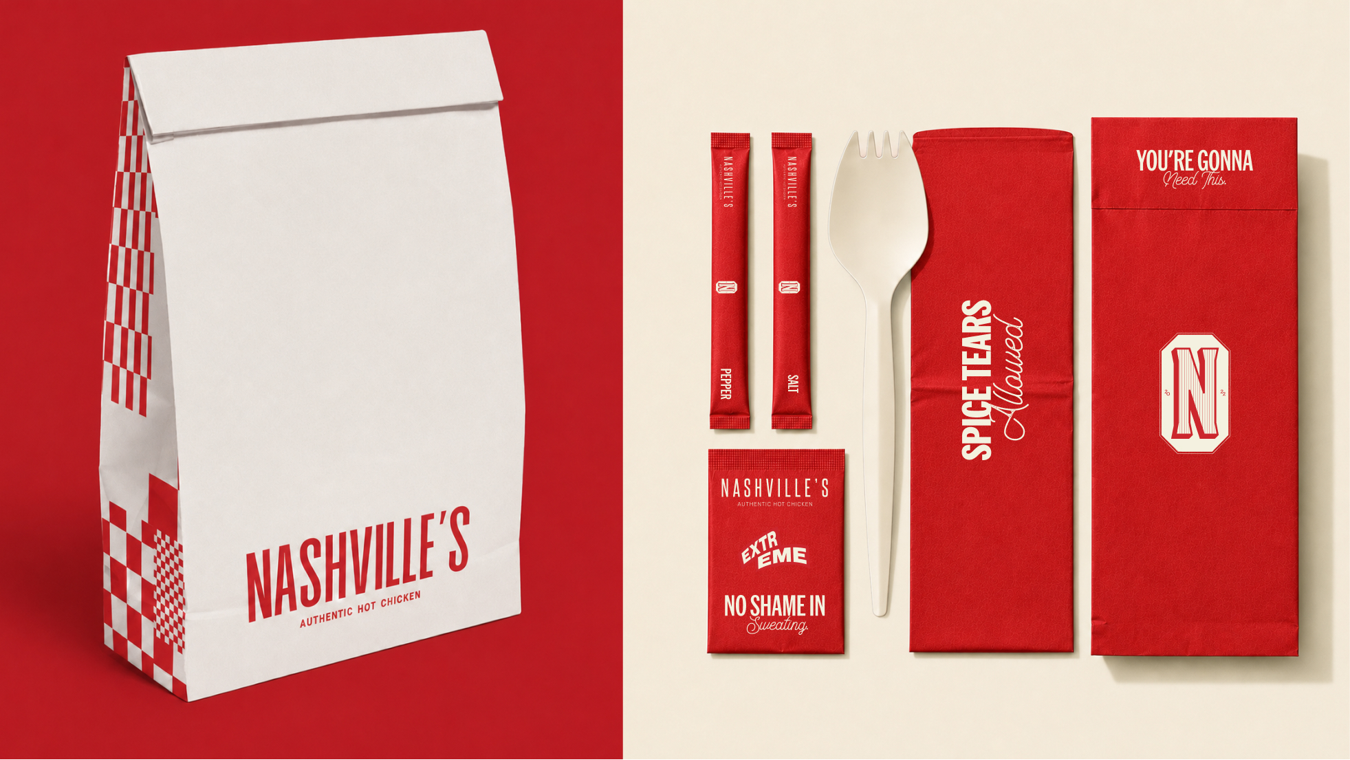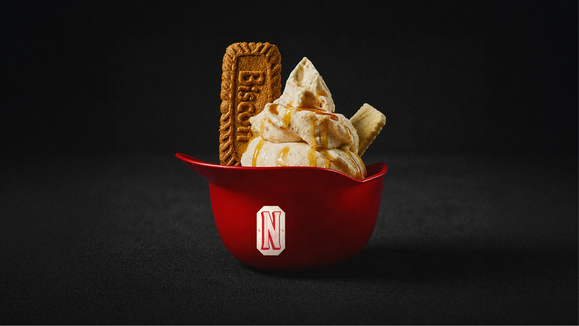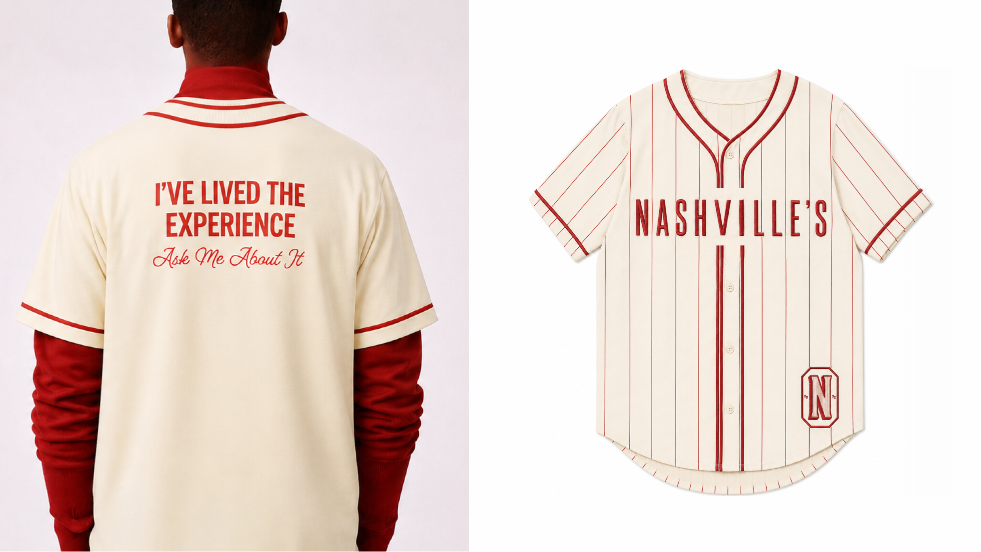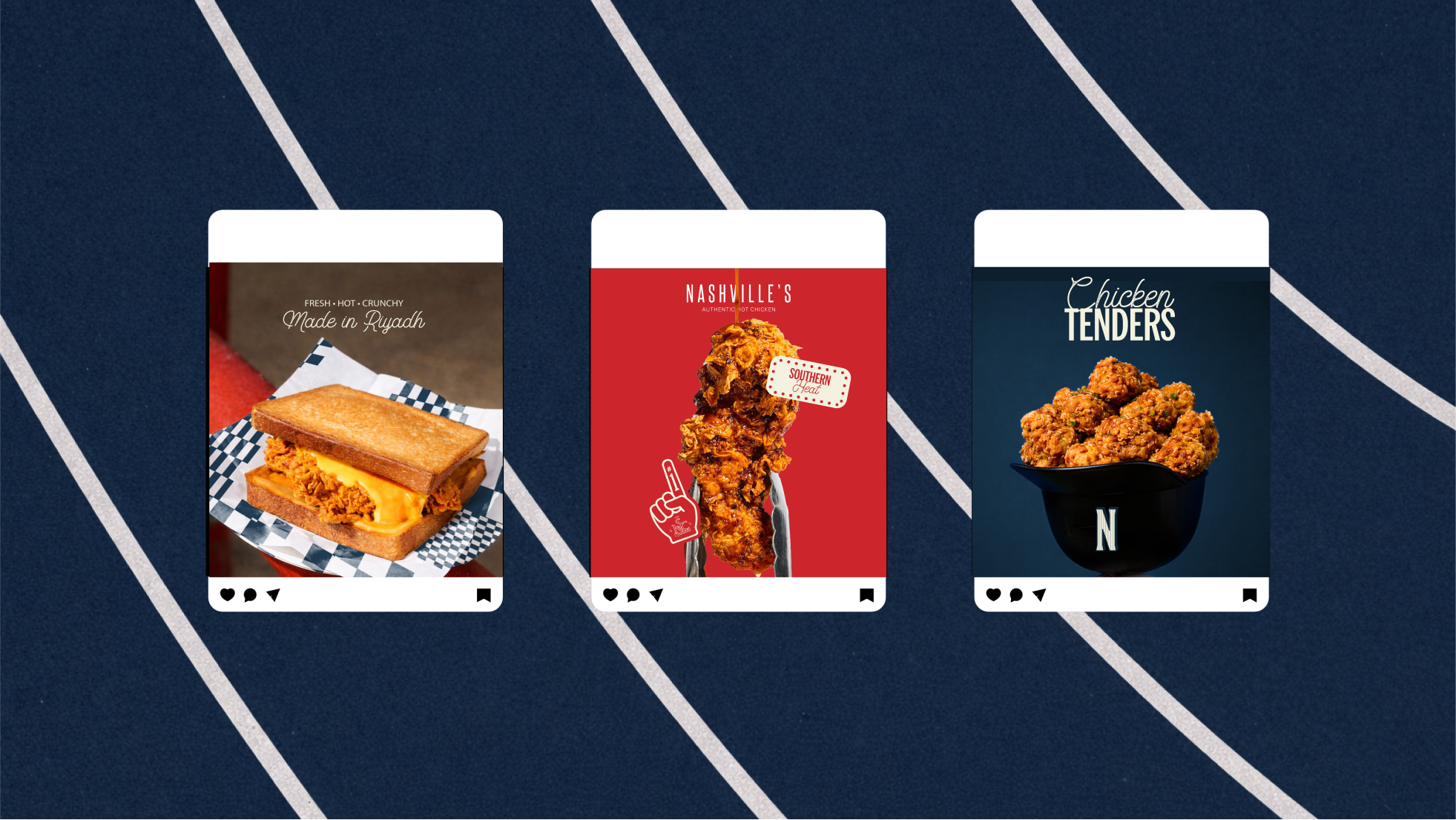
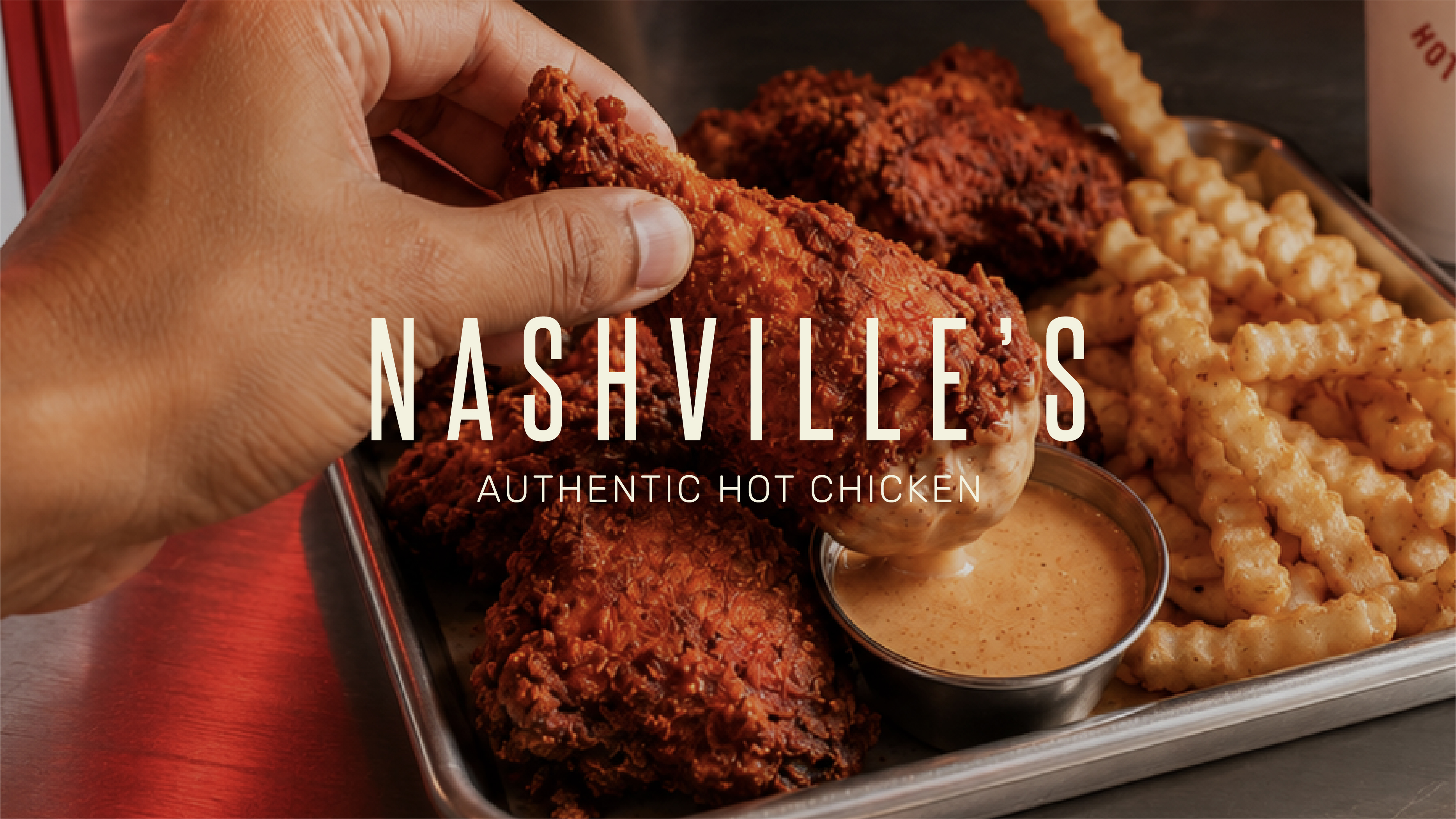
Nashville’s was built around one clear promise: hot chicken with attitude. The identity uses condensed typography, a sharp red-and-cream palette, and a matching Arabic wordmark with the same visual rhythm. Packaging carries the boldness through strong colour blocking, direct copy, and details that feel unapologetically fast-food. Food photography keeps the focus on heat, crunch, sauce, and generous portions. Every touchpoint feels loud enough to be noticed, without losing its clarity.