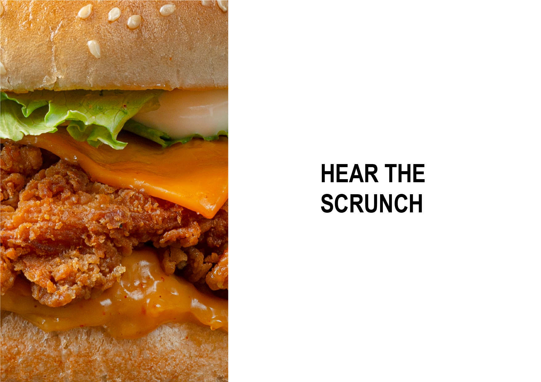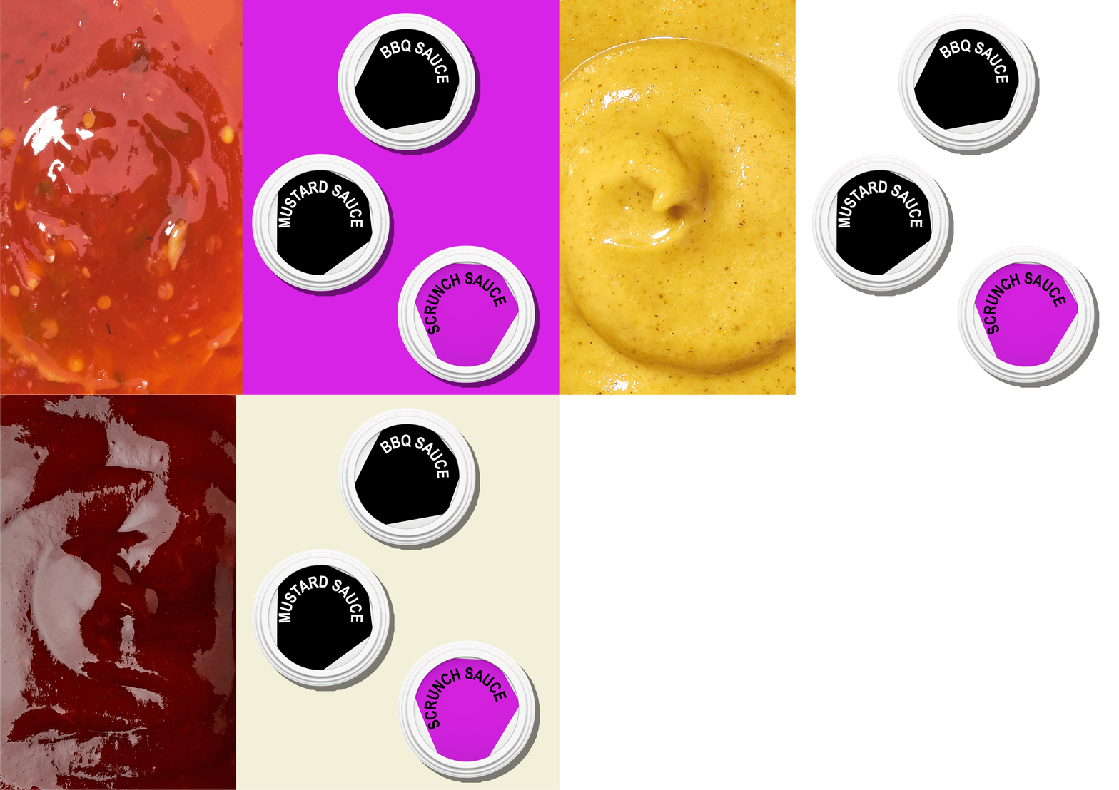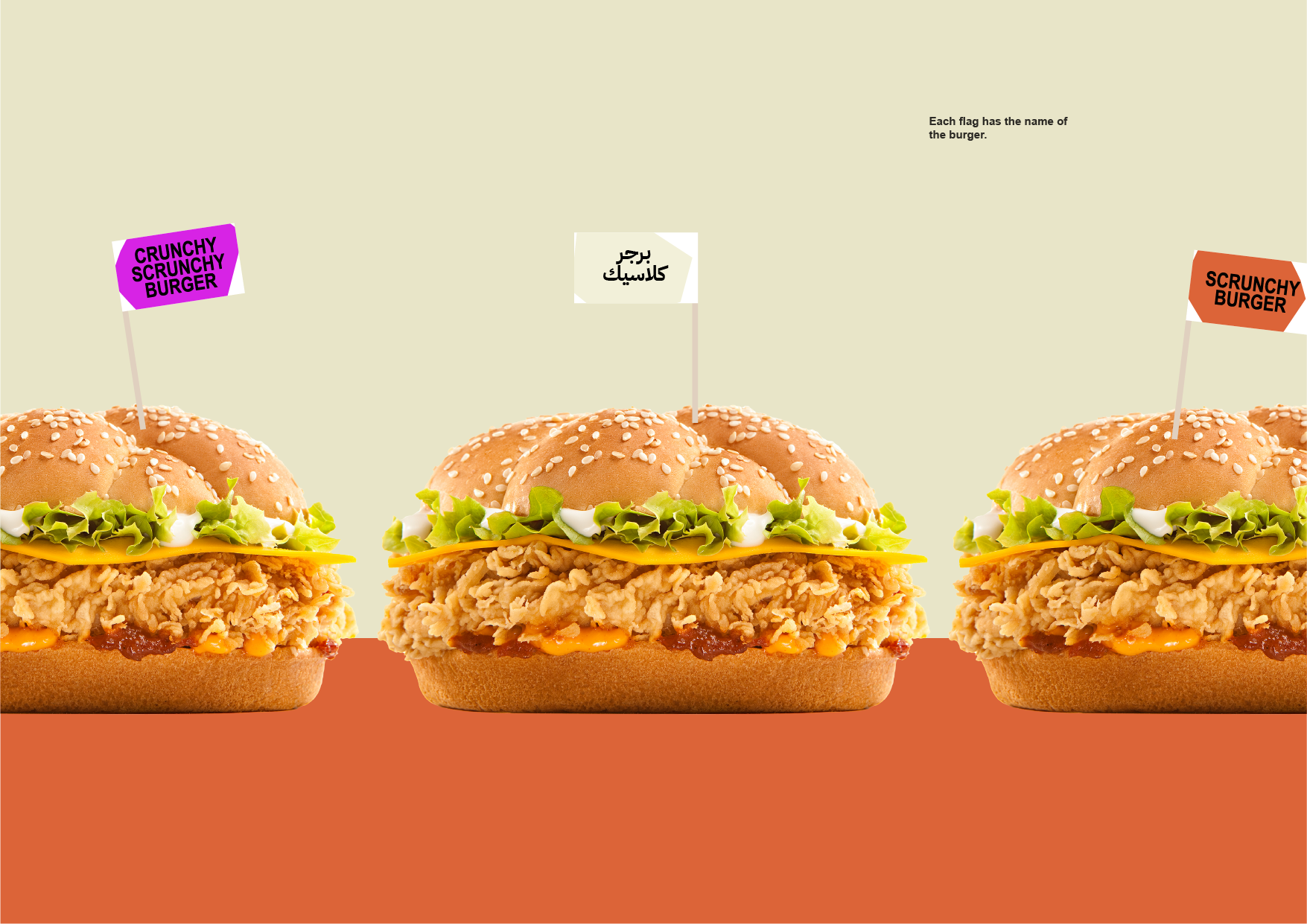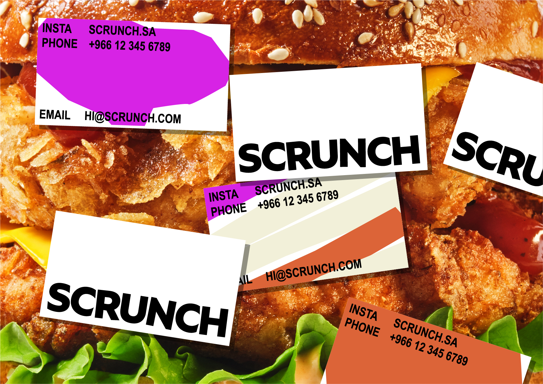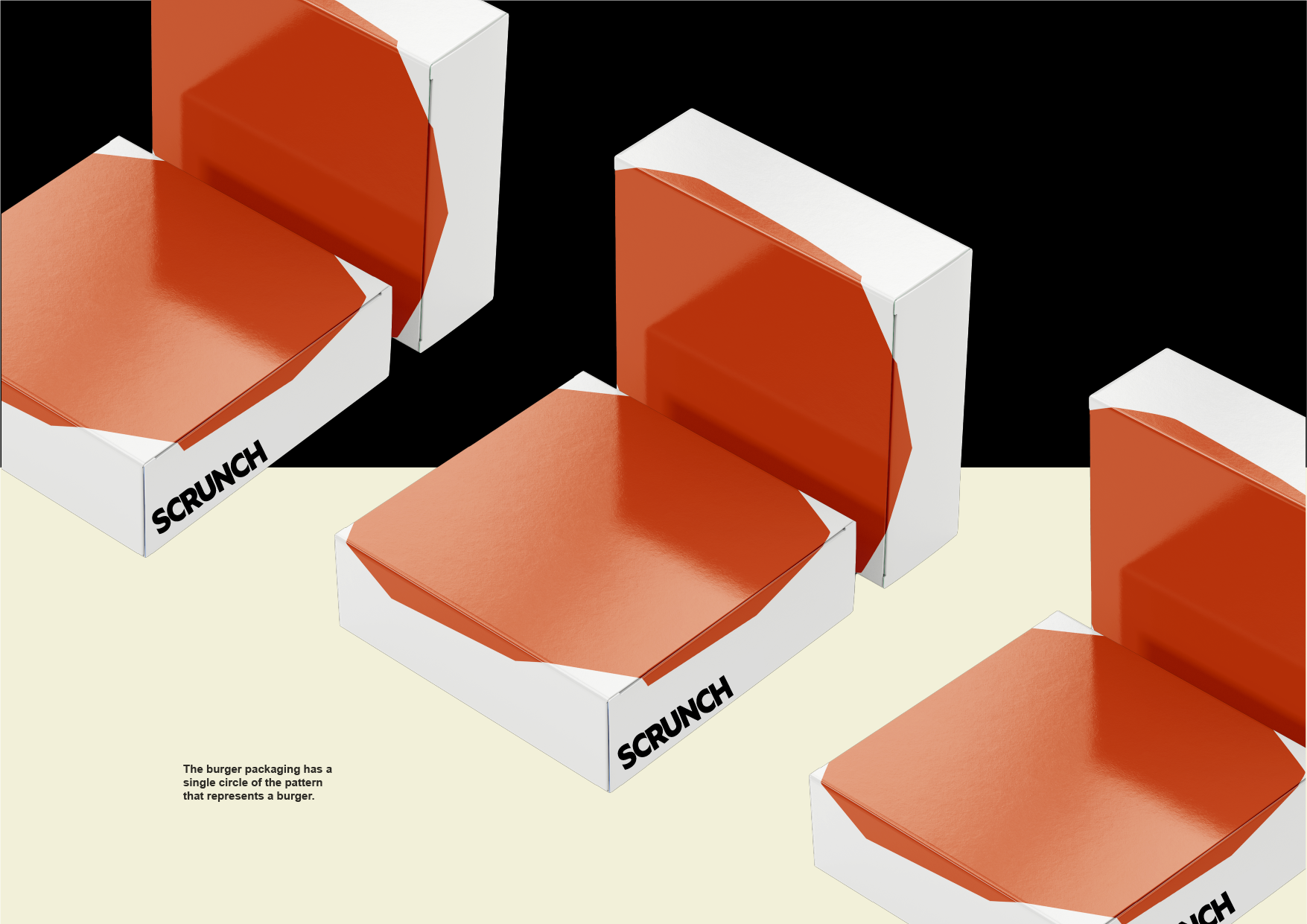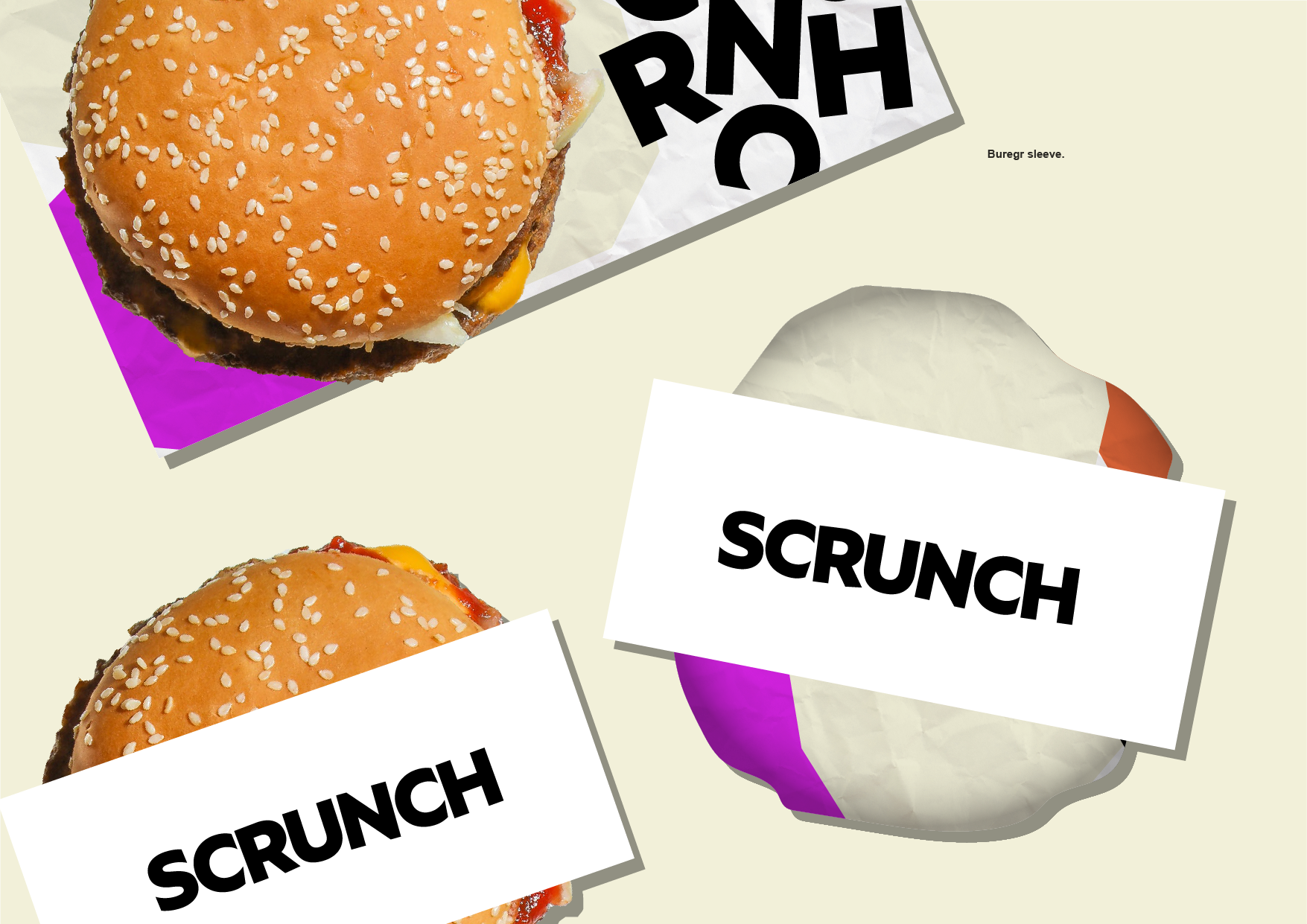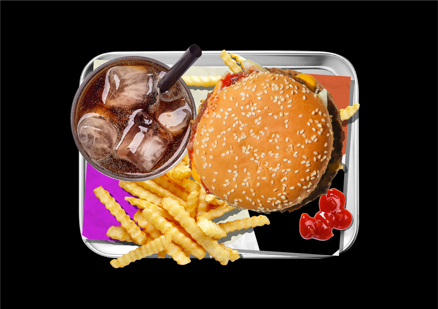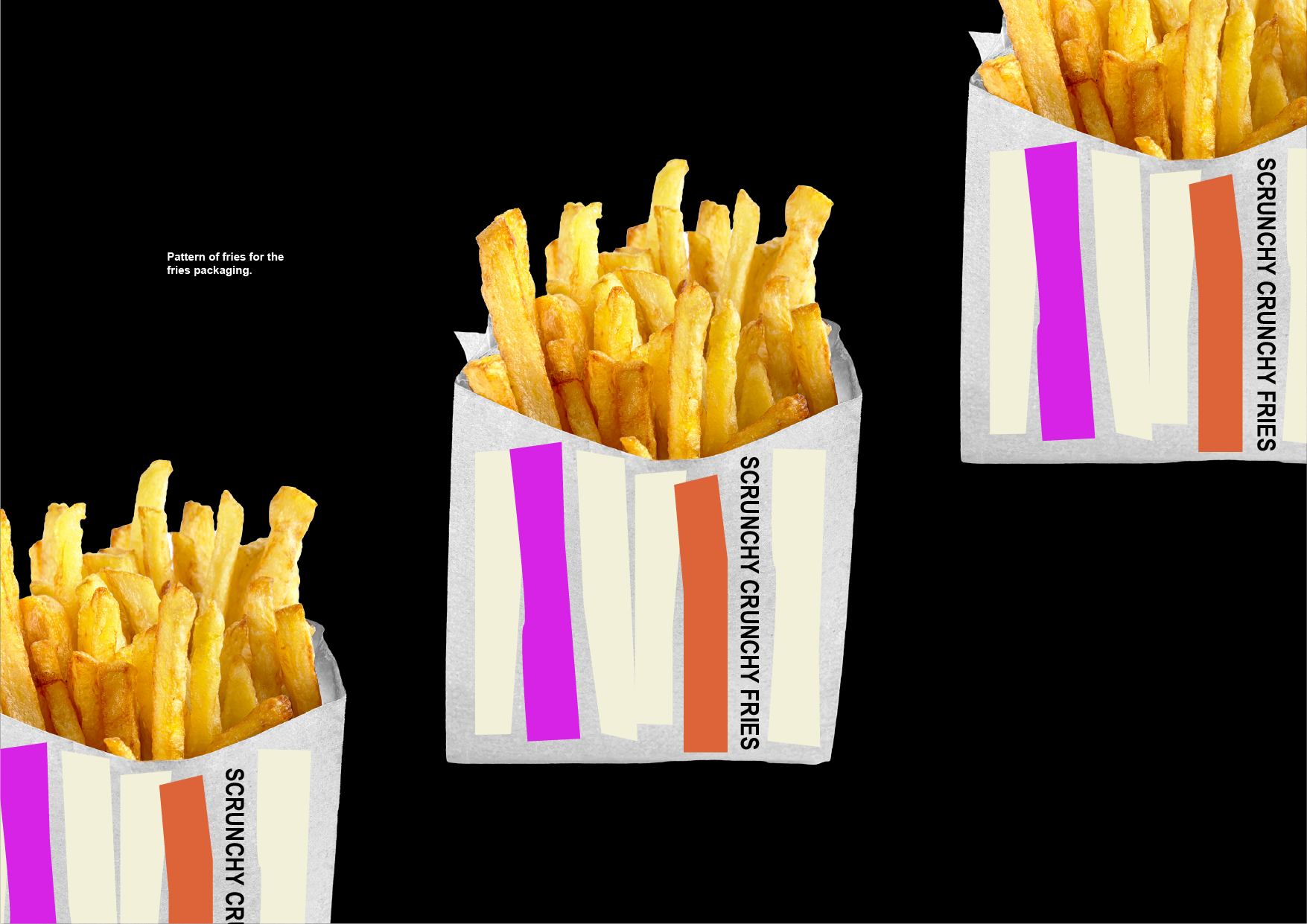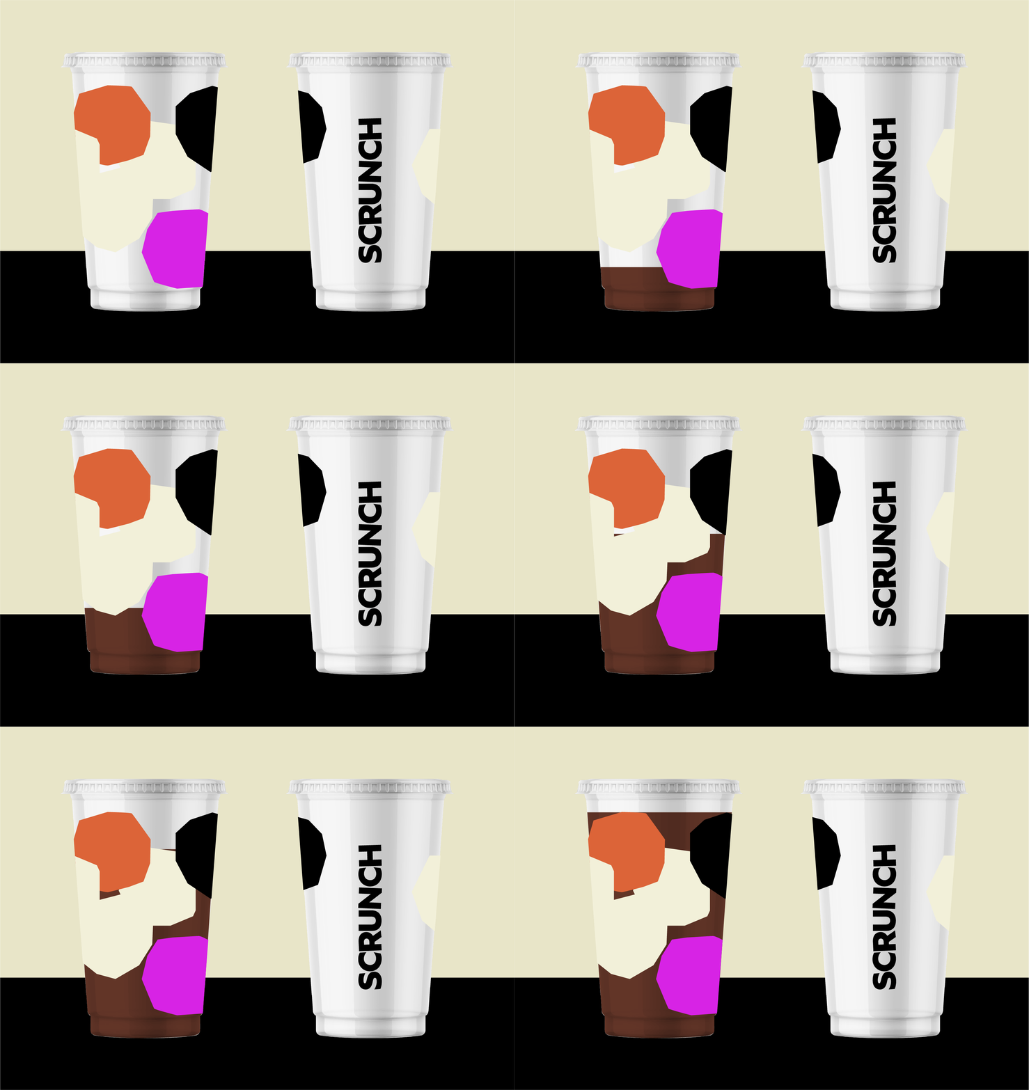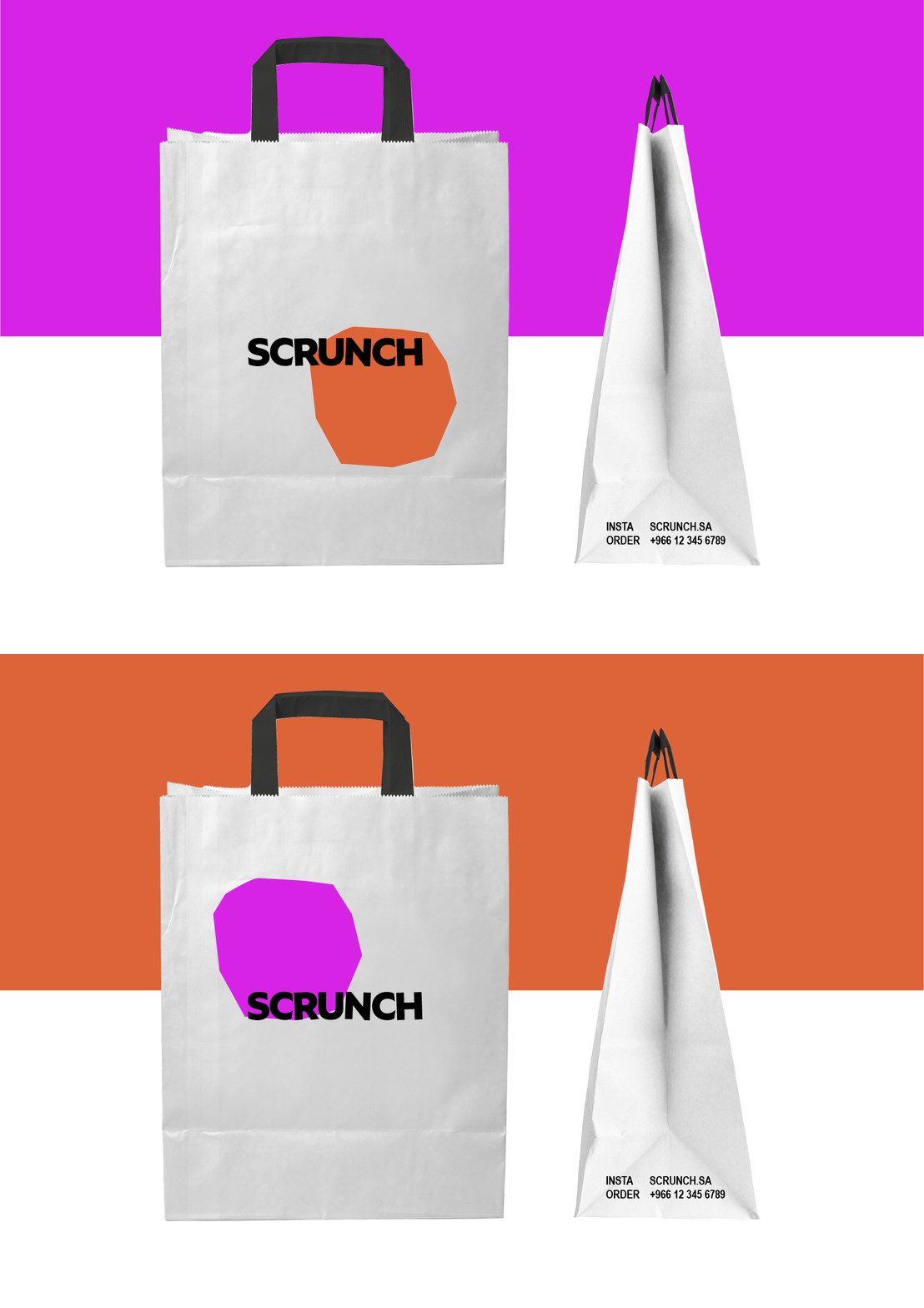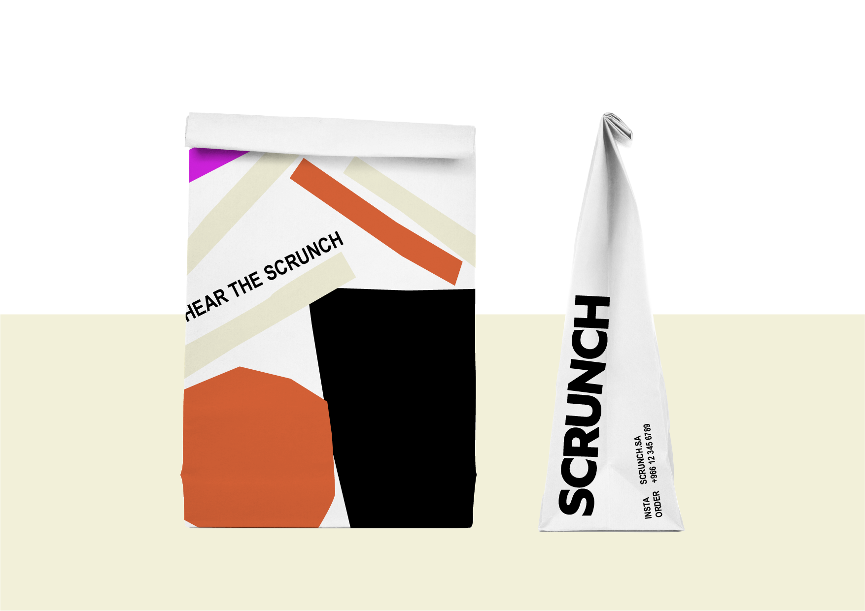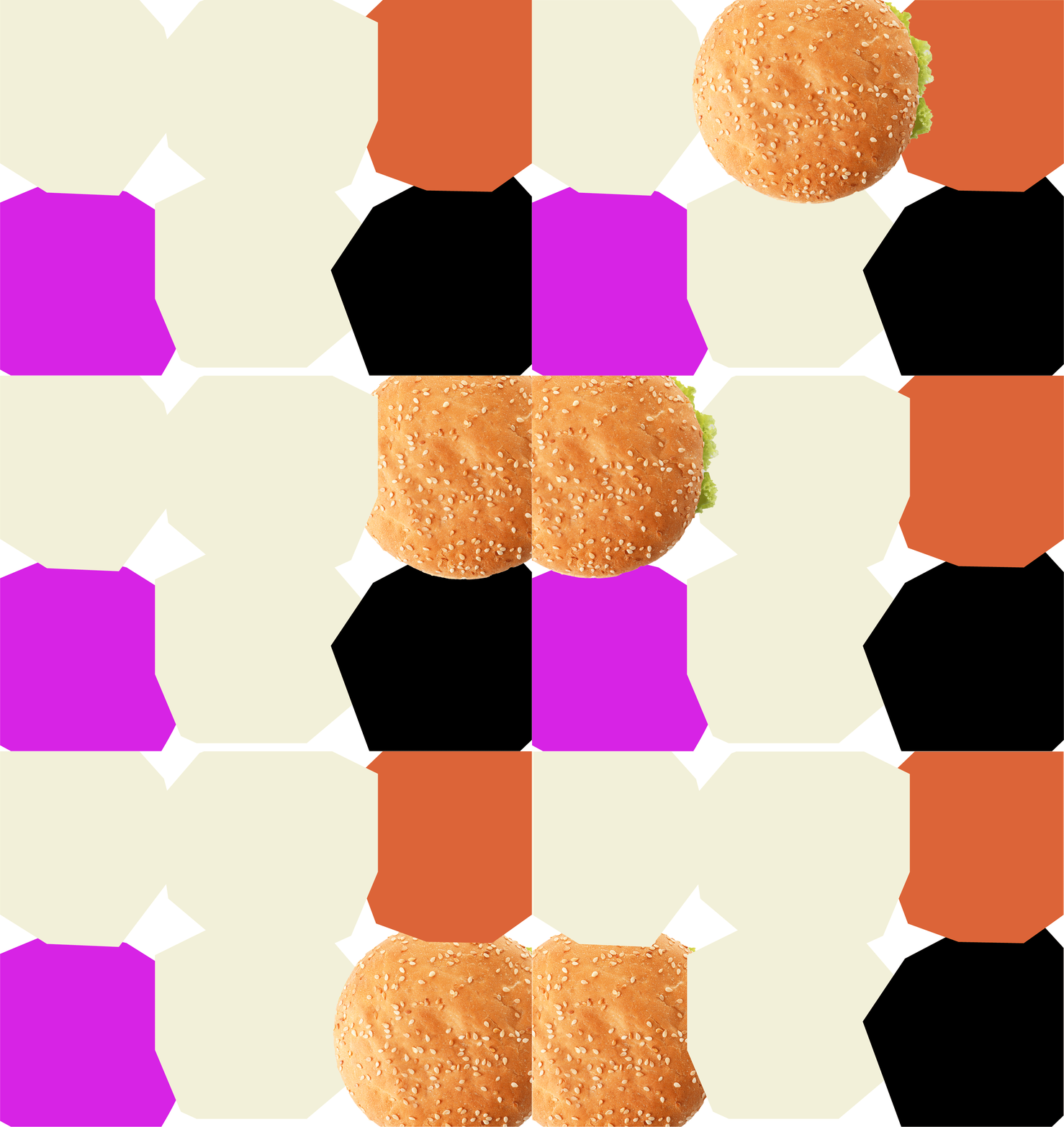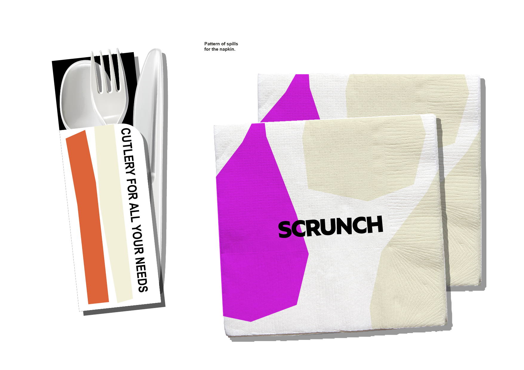
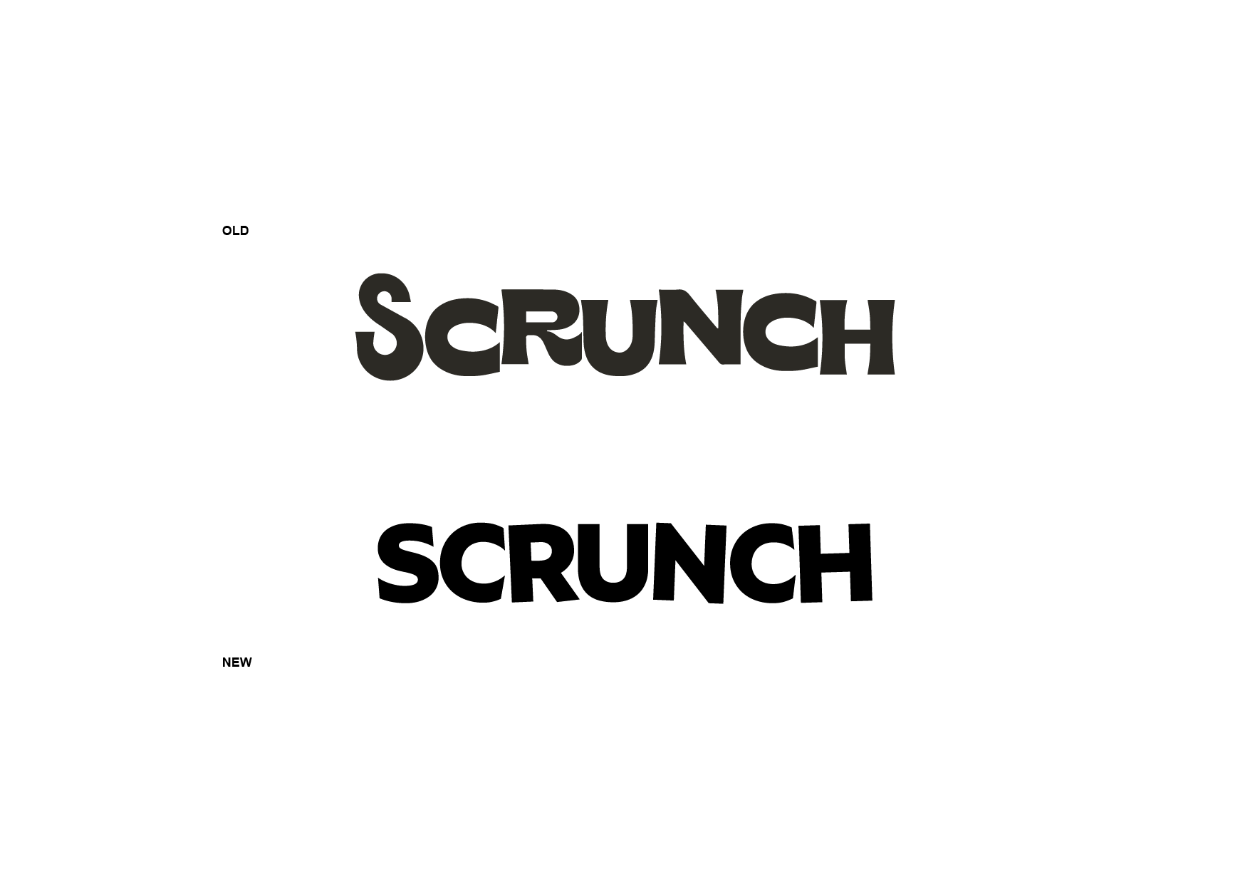
Experience the Scrunchiest, crunchiest, loudest chicken burger! Scrunch approached us to create a rebrand which represents them more. We started by giving the typeface a new look and working on new patterns with fresh colors. The goal is for people to feel the crunch and scrunch through the brand, so we created circles with harsh lines made of bright funky colors that represent the burgers. And long rectangular lines that represent the fries. When put on the packaging, it shows that even when the meal is gone, its impact will still be there!